Wixx — For today or forever
Wixx
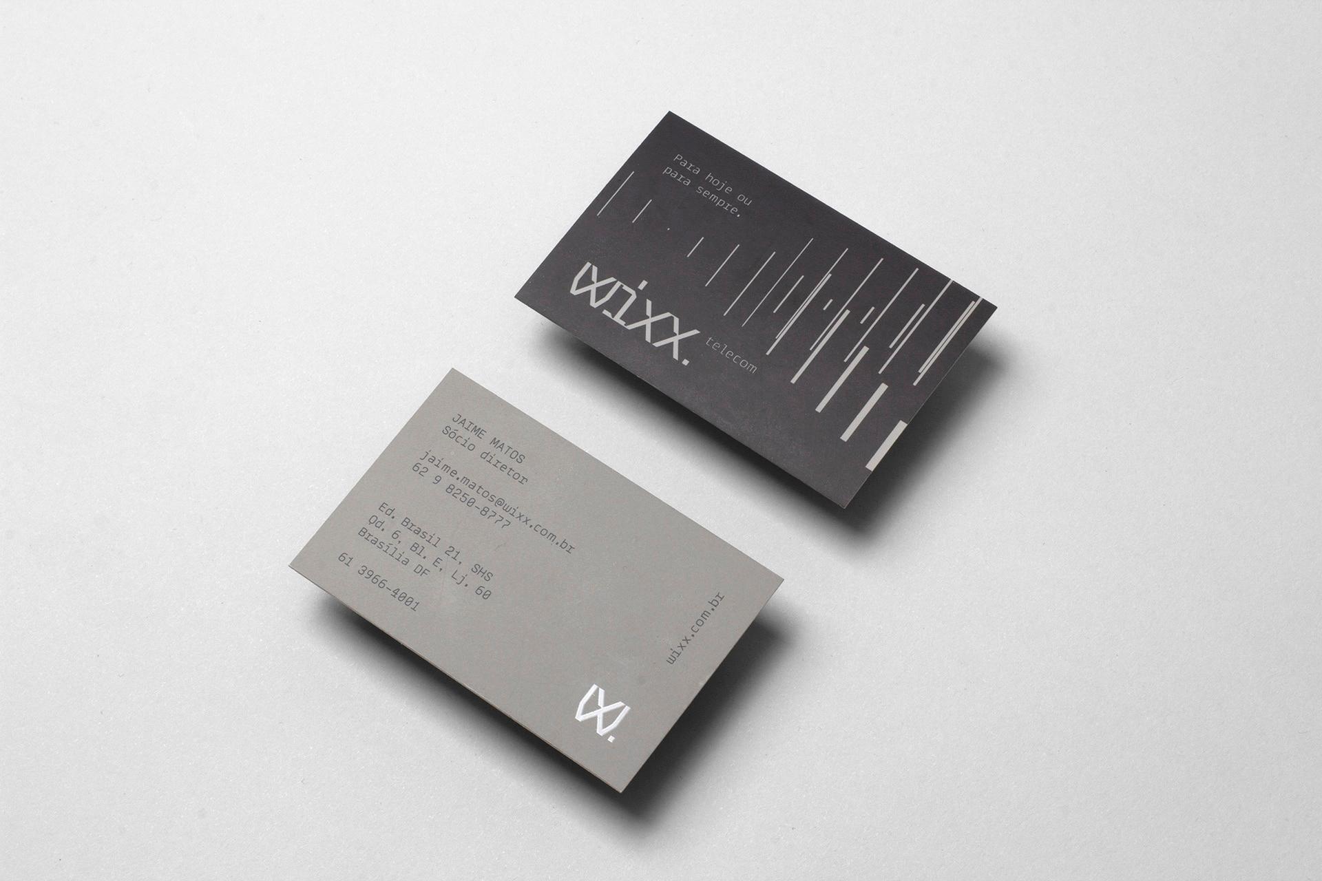
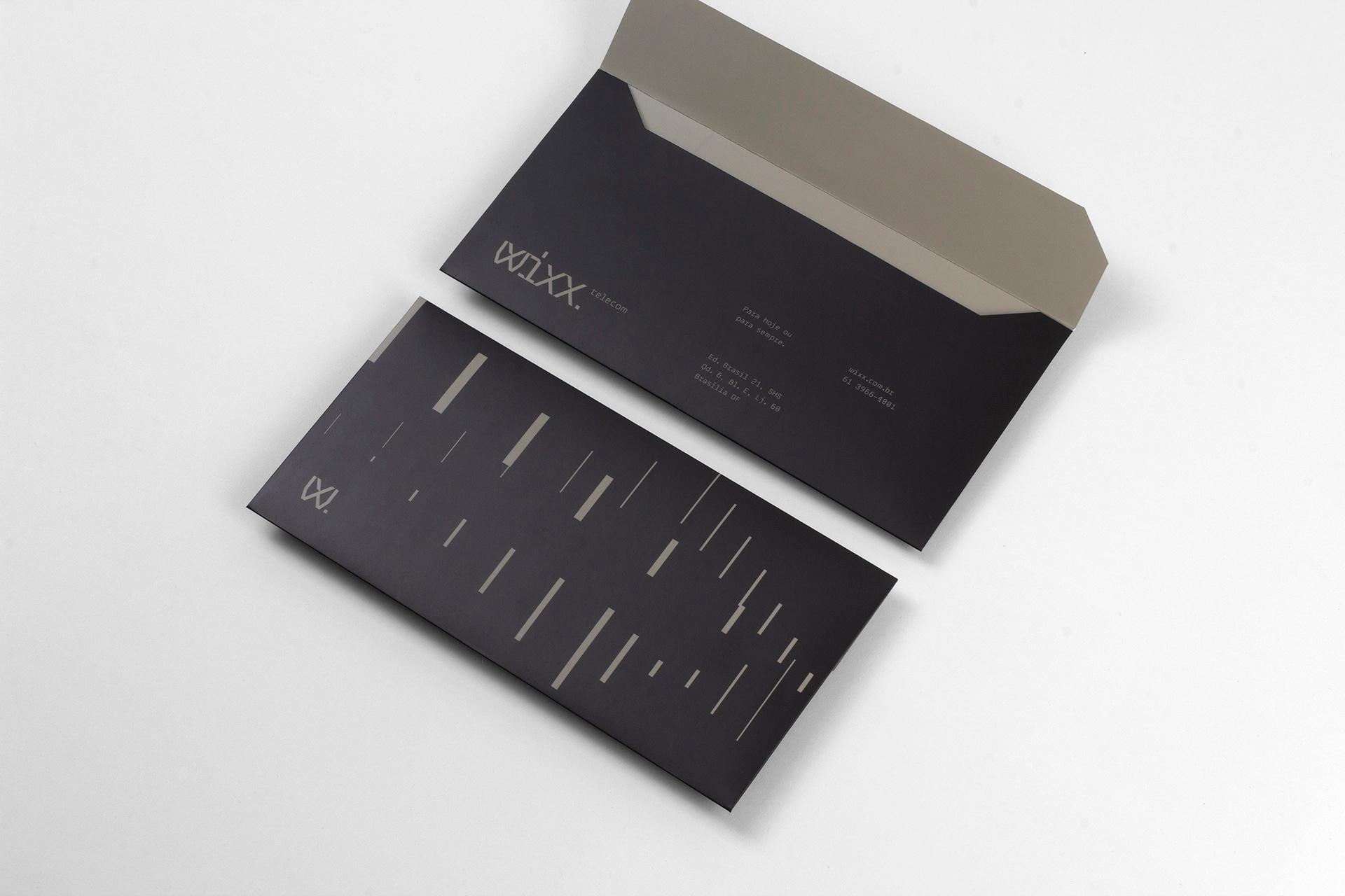
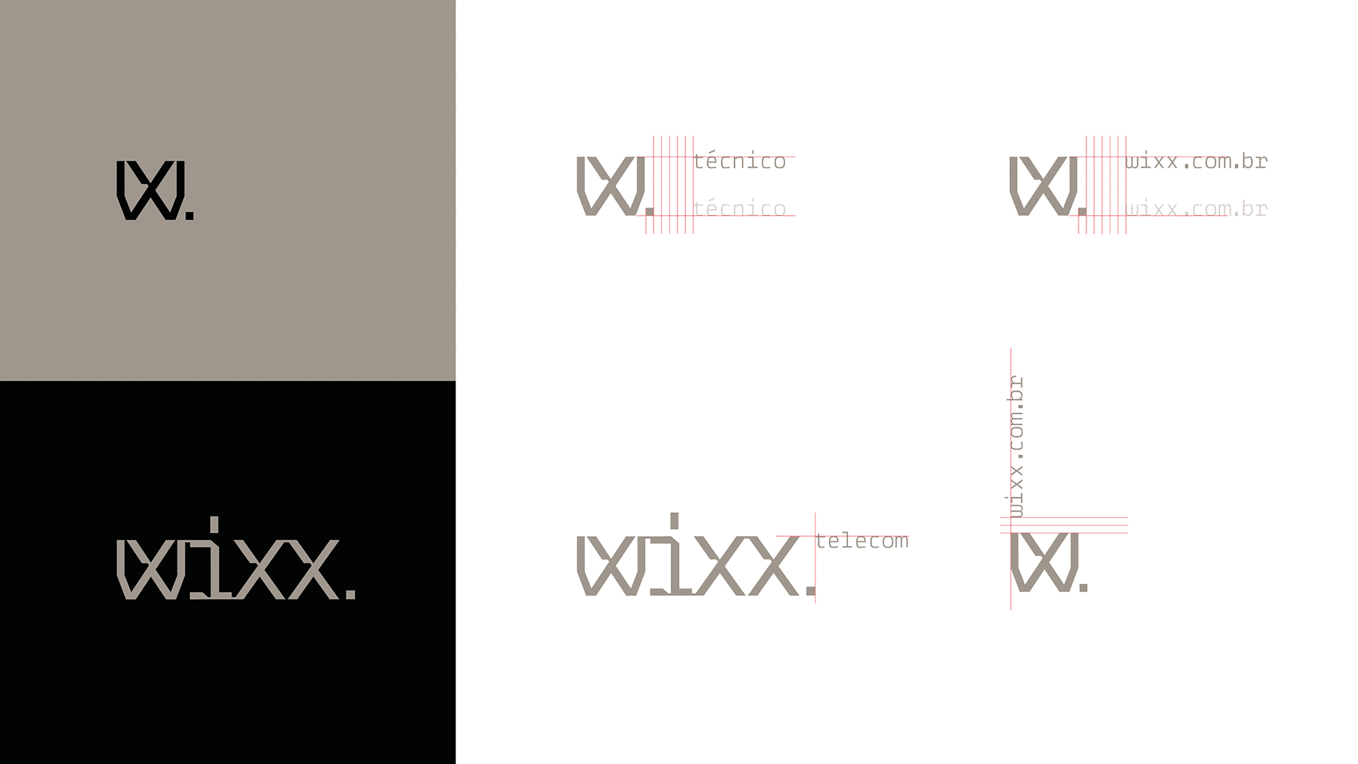
Wixx is a telecommunications company that shifted from B2C to the corporate market, offering fixed and temporary network infrastructure for large events. BRBAUEN led this transition through design, turning the perception of a 'small generic telecom' into a 'specialist' — with an objective visual identity, a reduced black-and-copper palette, a custom monospaced typeface and the slogan 'for today or forever'.
About
Founded in 2009 and operating across B2C and B2B segments, Wixx recognized that — due to its location, expertise, and financial results — serving corporate clients (fixed or temporary infrastructures) was the most viable path for growth.
The challenge was to use design to guide this brand repositioning alongside a specialisation of its offering, shifting focus not only to customised fixed network infrastructure, but also to temporary networks deployed at large corporate events.
- Client
- Wixx
- Year
- 2019
- Sector
- Technology
- Services
- BrandingIdentidade VisualCustom TypographyDesign Gráfico
Abordagem
Approach
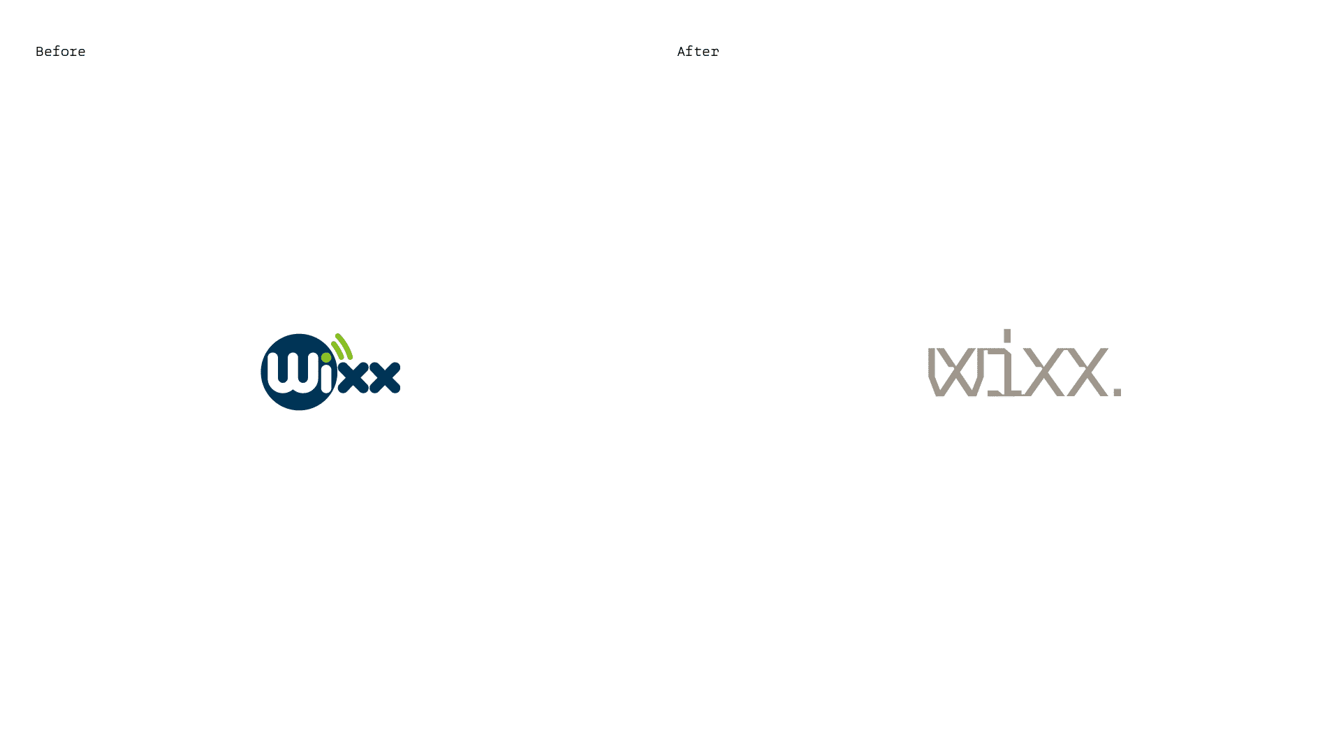
During the process we diagnosed that the way Wixx identified itself was a reflection of market norms: overly friendly verbal identities, excessively playful visual identities, illustrations and graphics inspired by what is perceived as "wireless" or "wifi," combined with generic advertising language — even the logo symbol was an allusion to Wi-Fi connectivity, a visual language typically found in smaller B2C telecom companies in Brazil.
Understanding the context of the shift, we sought to define the verbal and visual language needed to move Wixx from a "generic small telecom" to a "specialist corporate telecom." The first step was to define, through brand archetypes, the persona whose personality would guide the process: the Ruler — who, with technical mastery, expresses their expertise objectively through a direct tone of voice and total control.
Resultados
Results
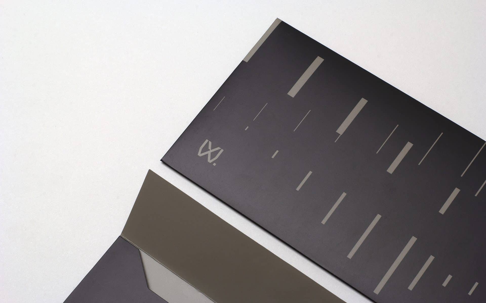
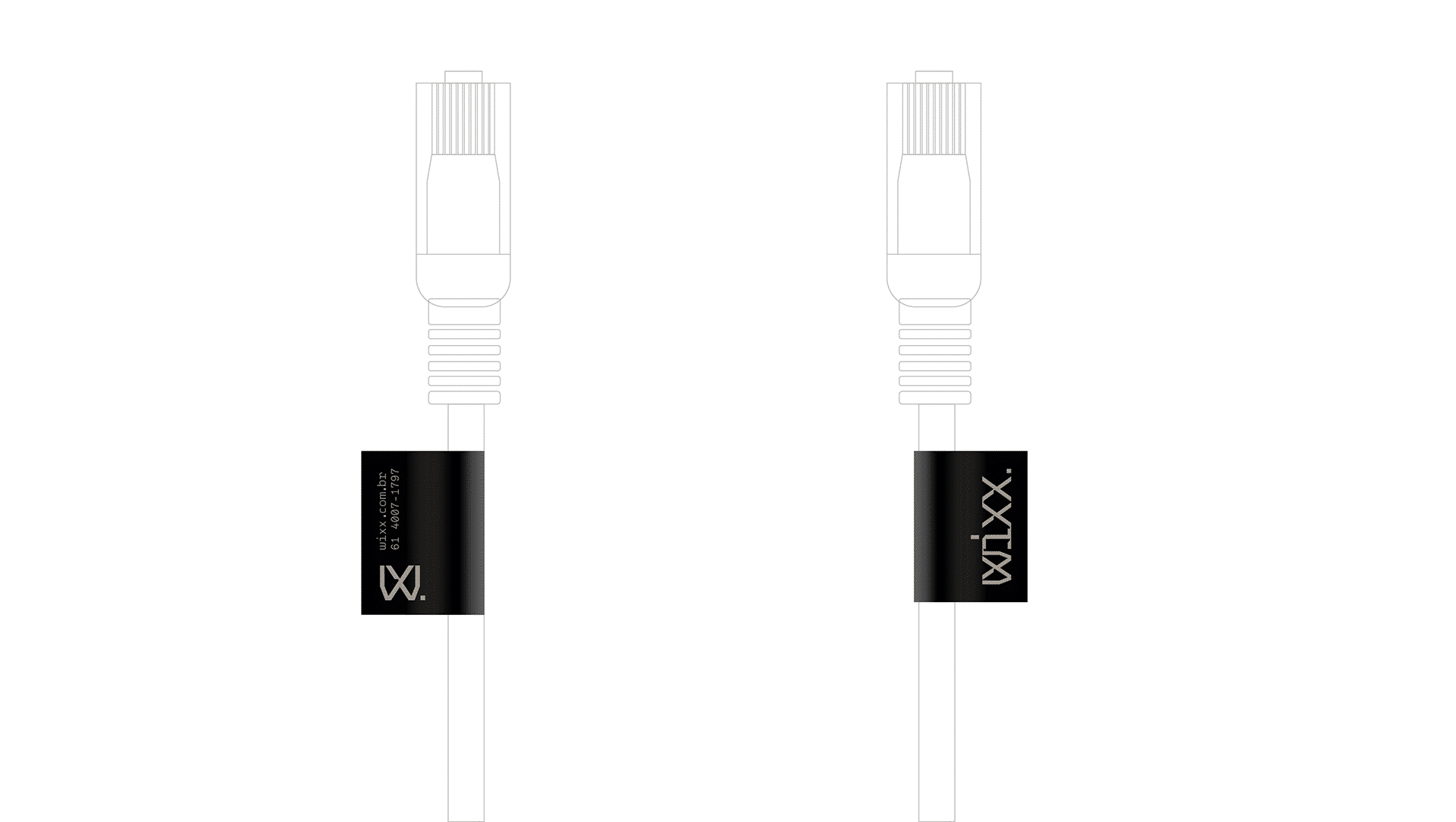
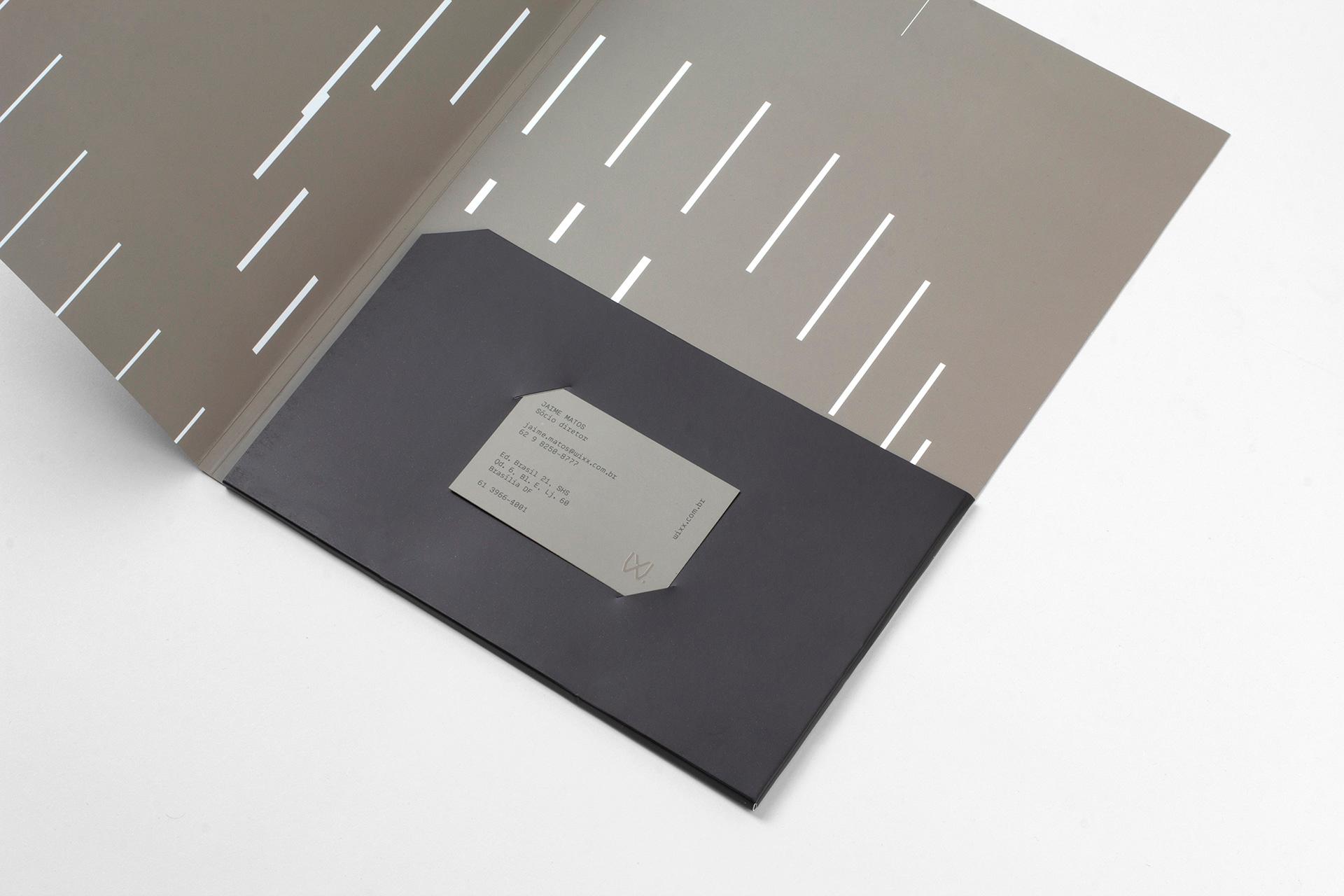
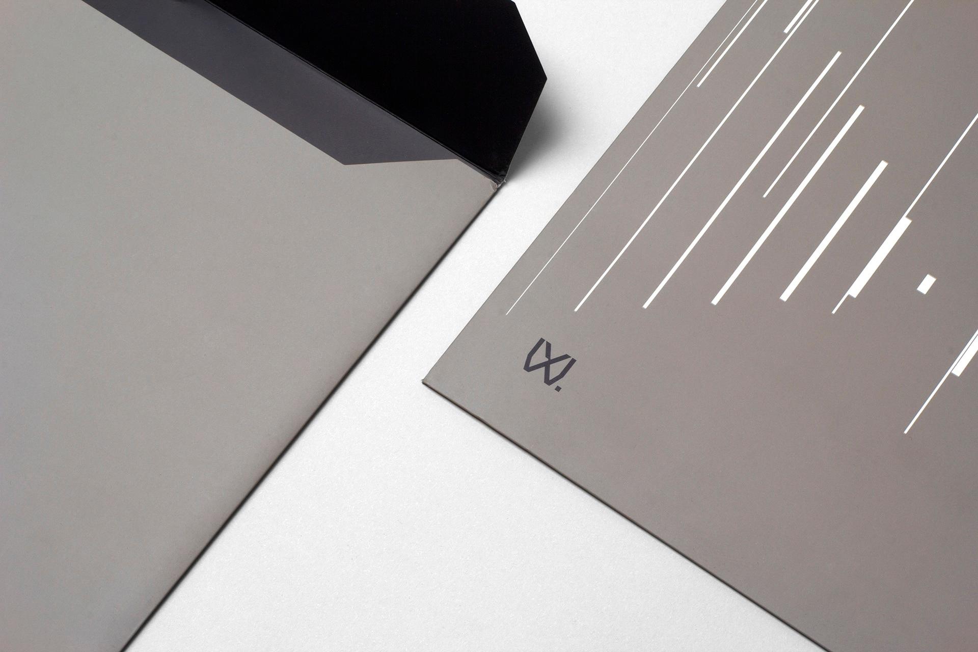
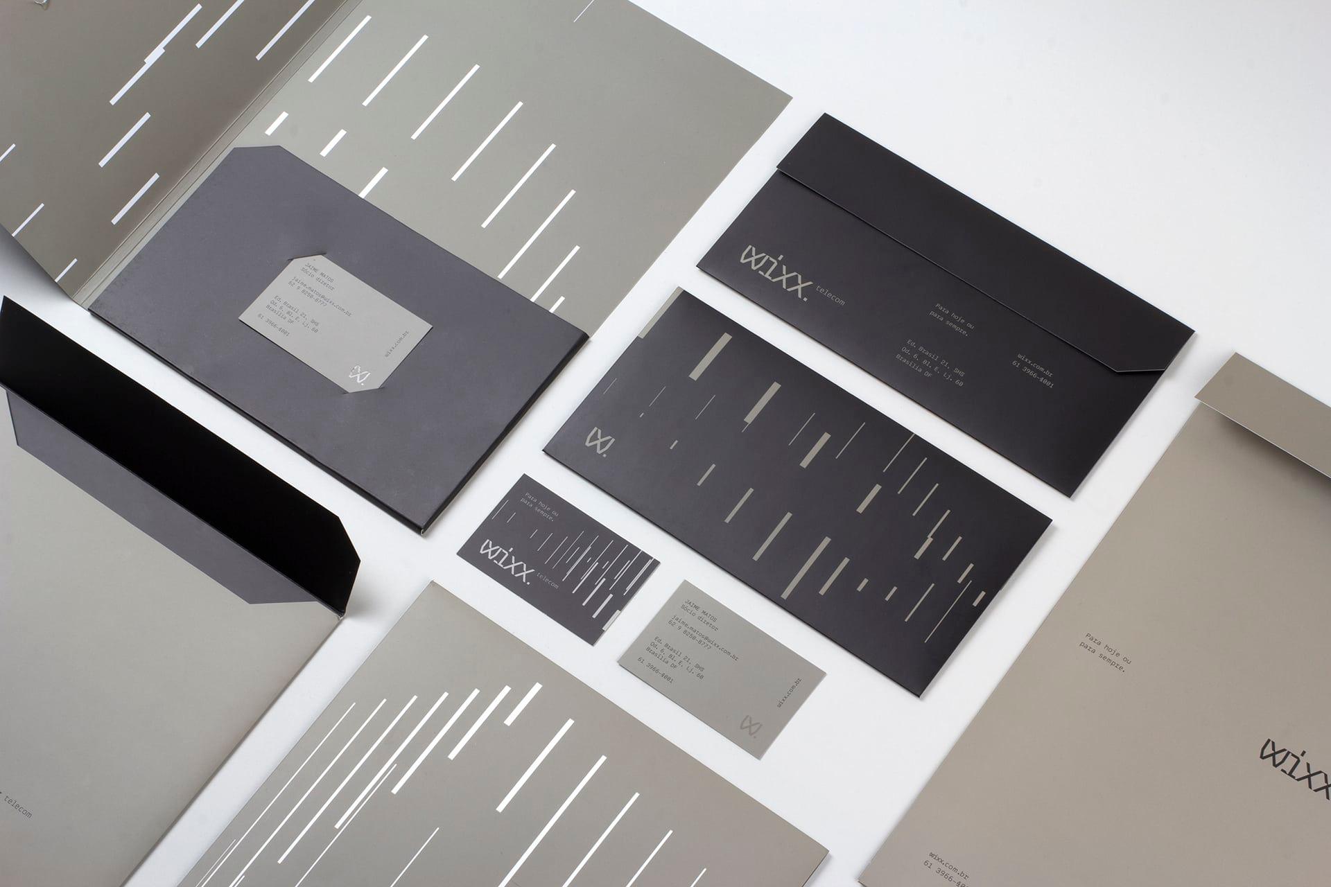
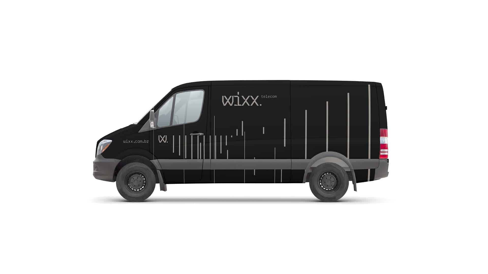
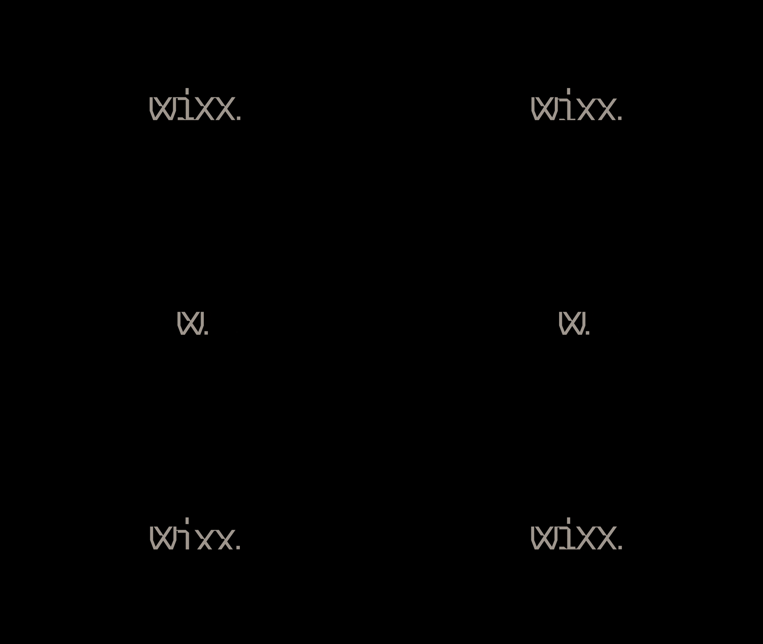
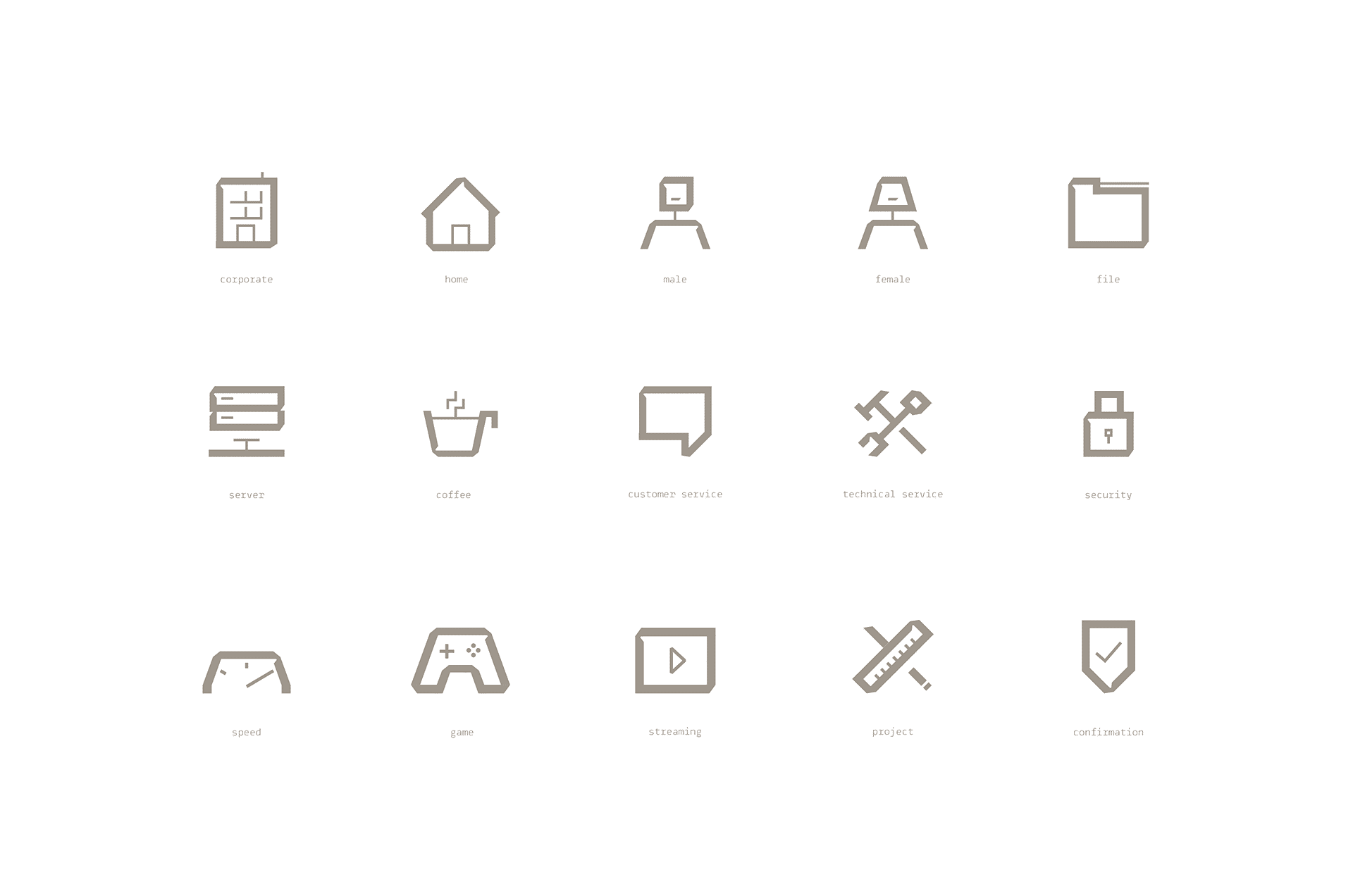
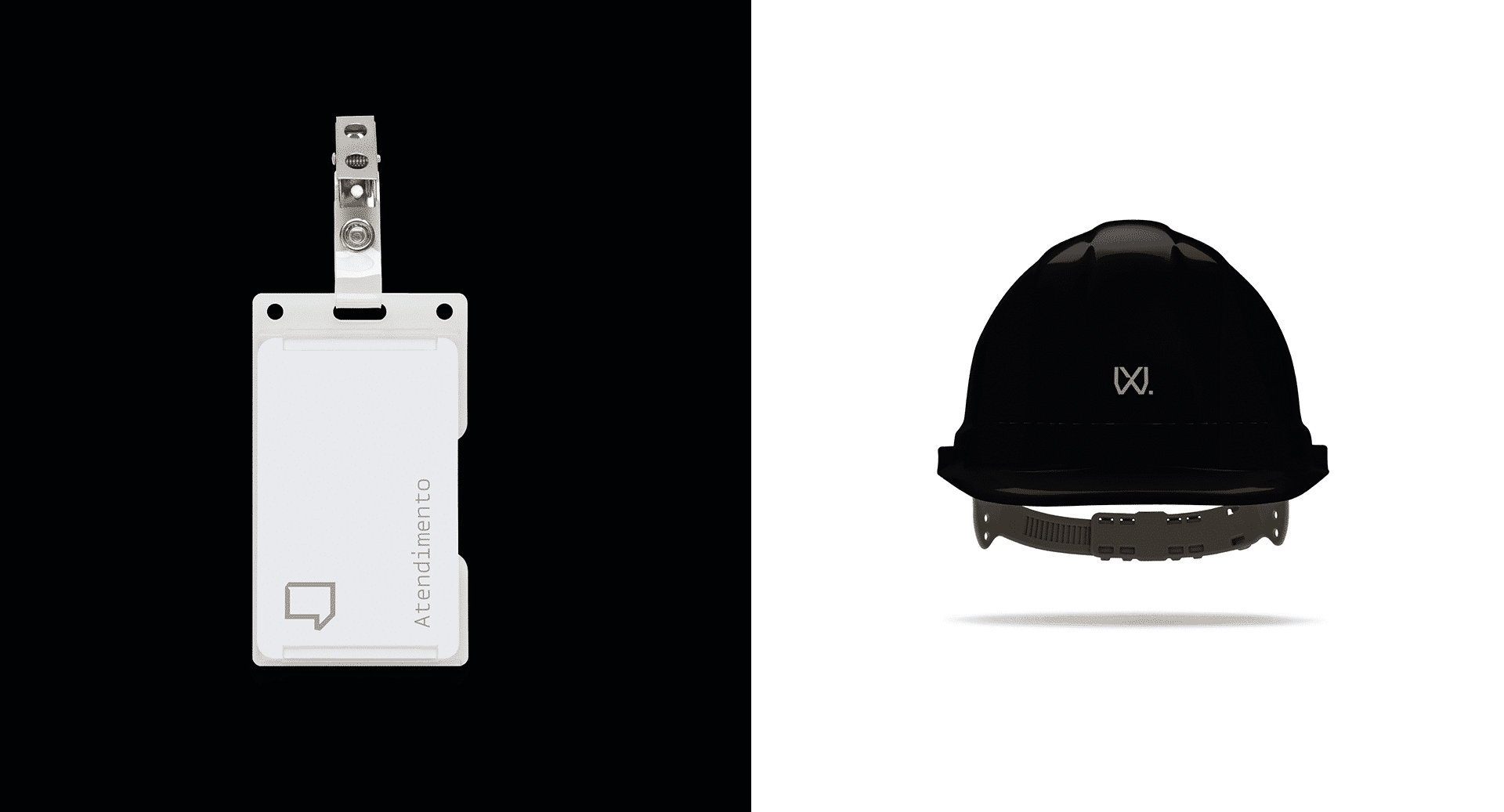
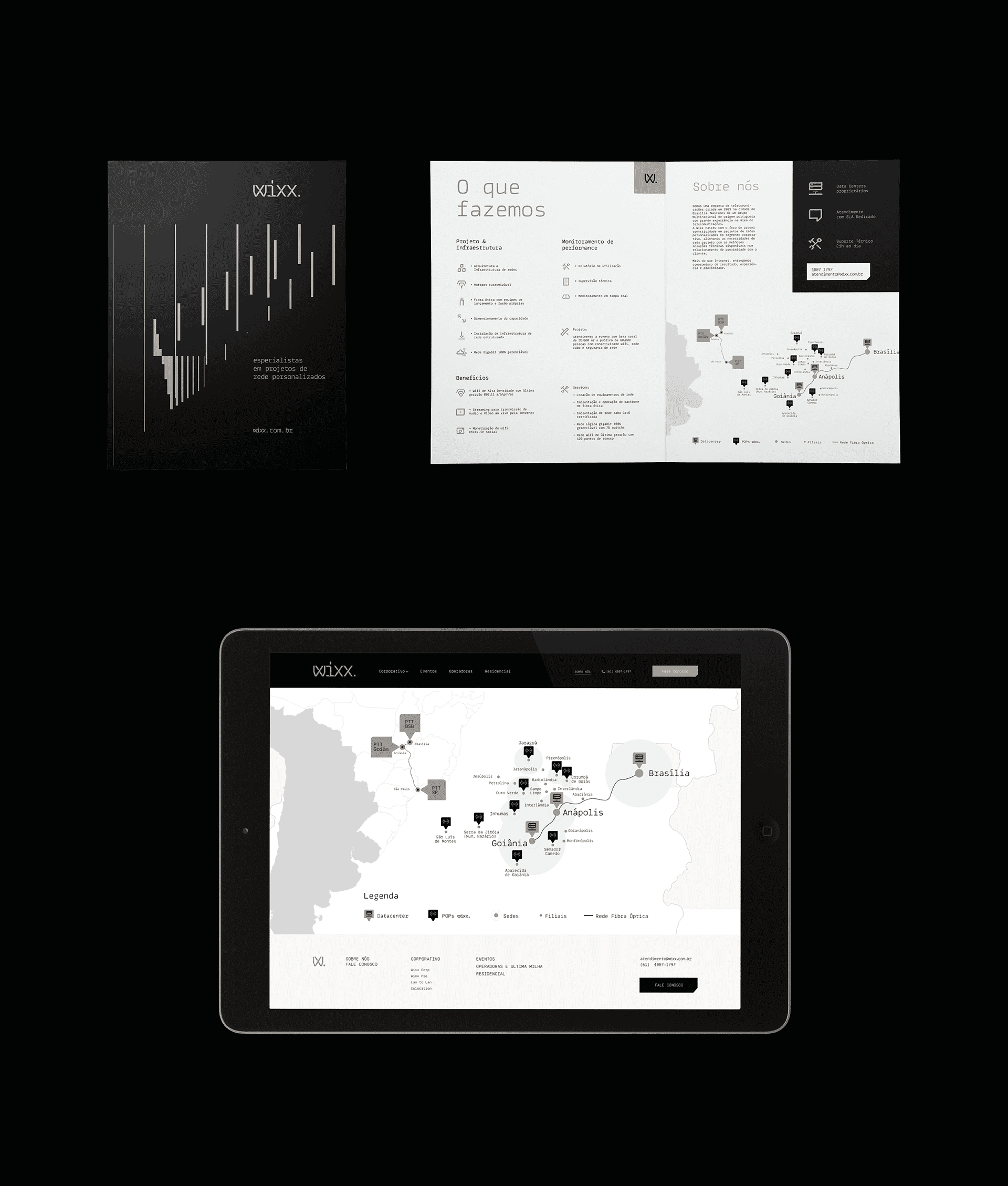
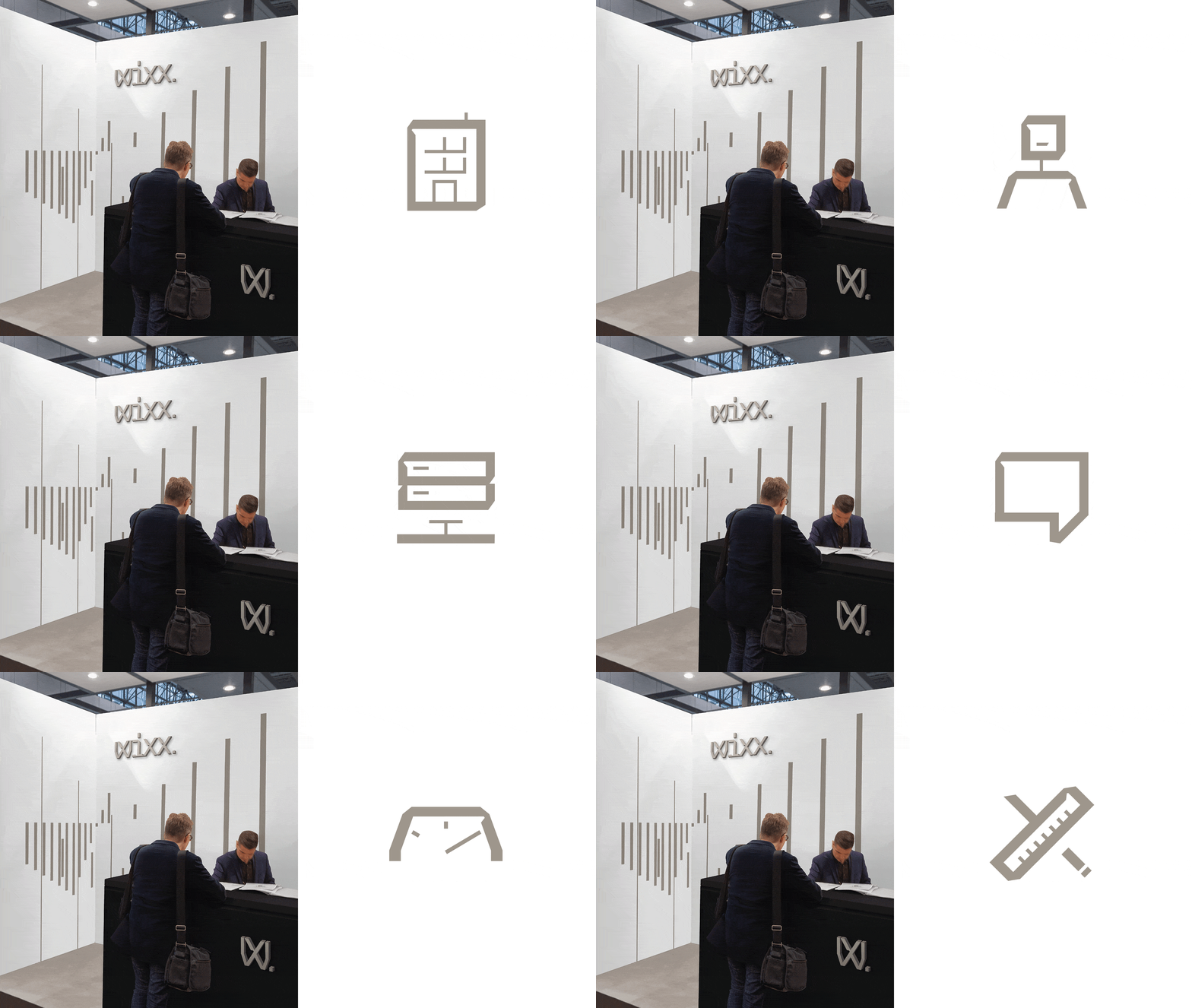
To support this narrative, we created the visual identity and its elements for maximum objectivity and recognition: the Wixx logotype and abbreviated signature "W.", a graphic composition language (inspired by transmission and responsiveness) extended across all printed materials. The colour palette was reduced to 3 colours, dominated by black and copper — with a voice-tuning tone that establishes the desired balance: Wixx is a specialist, "for today or forever," where 'today' = events and 'forever' = fixed networks, which became the brand's slogan.
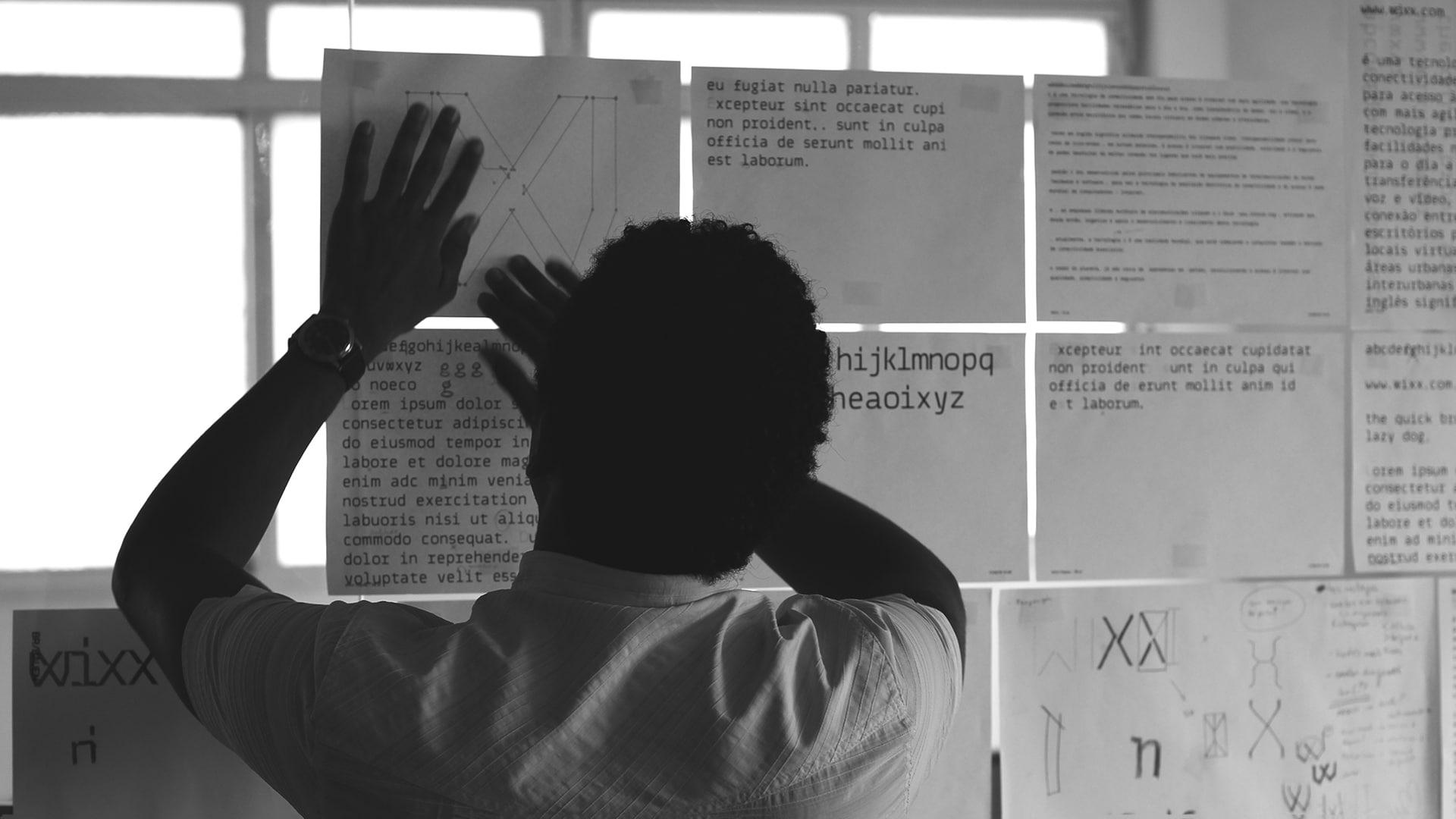
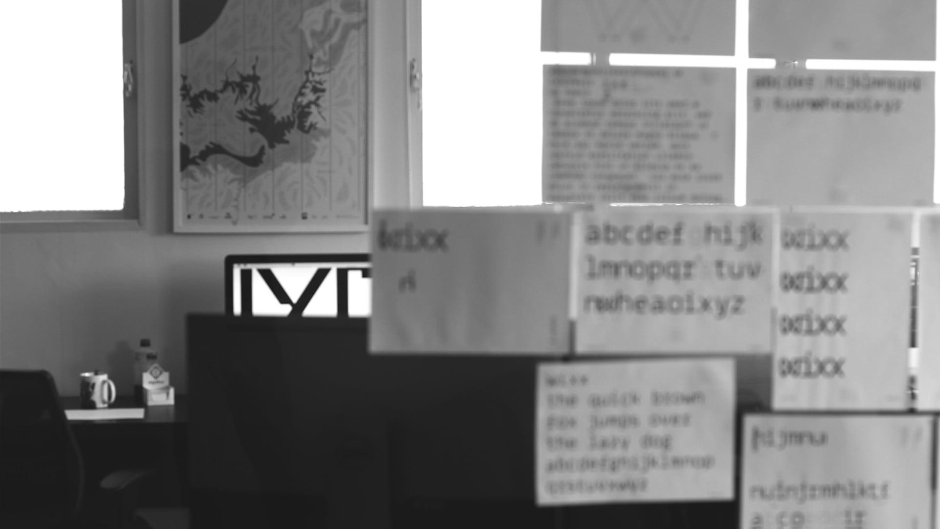
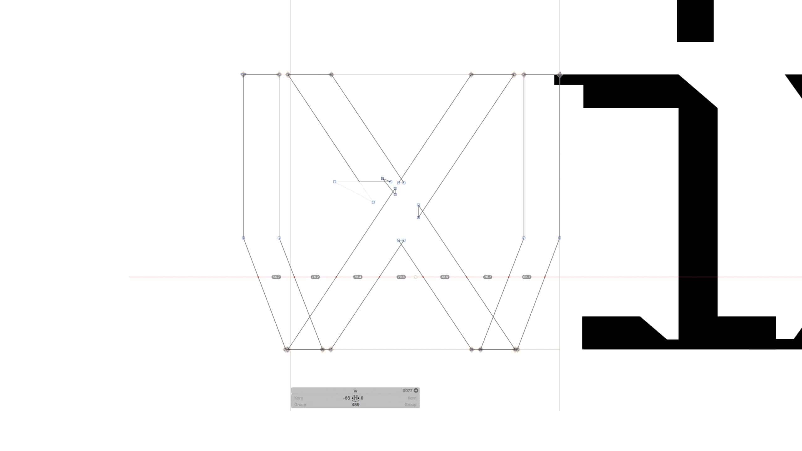
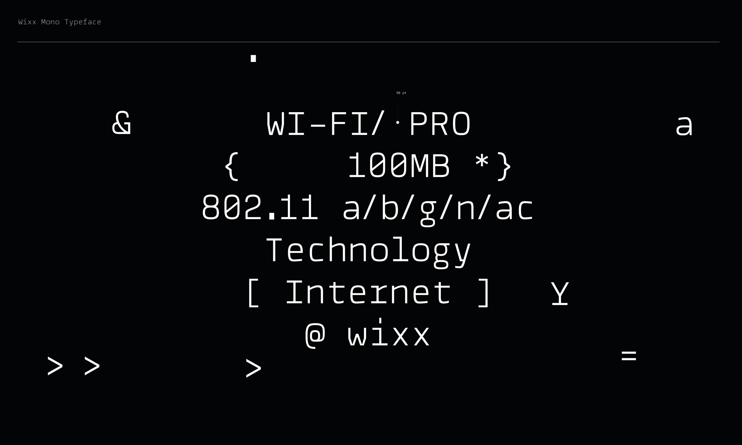
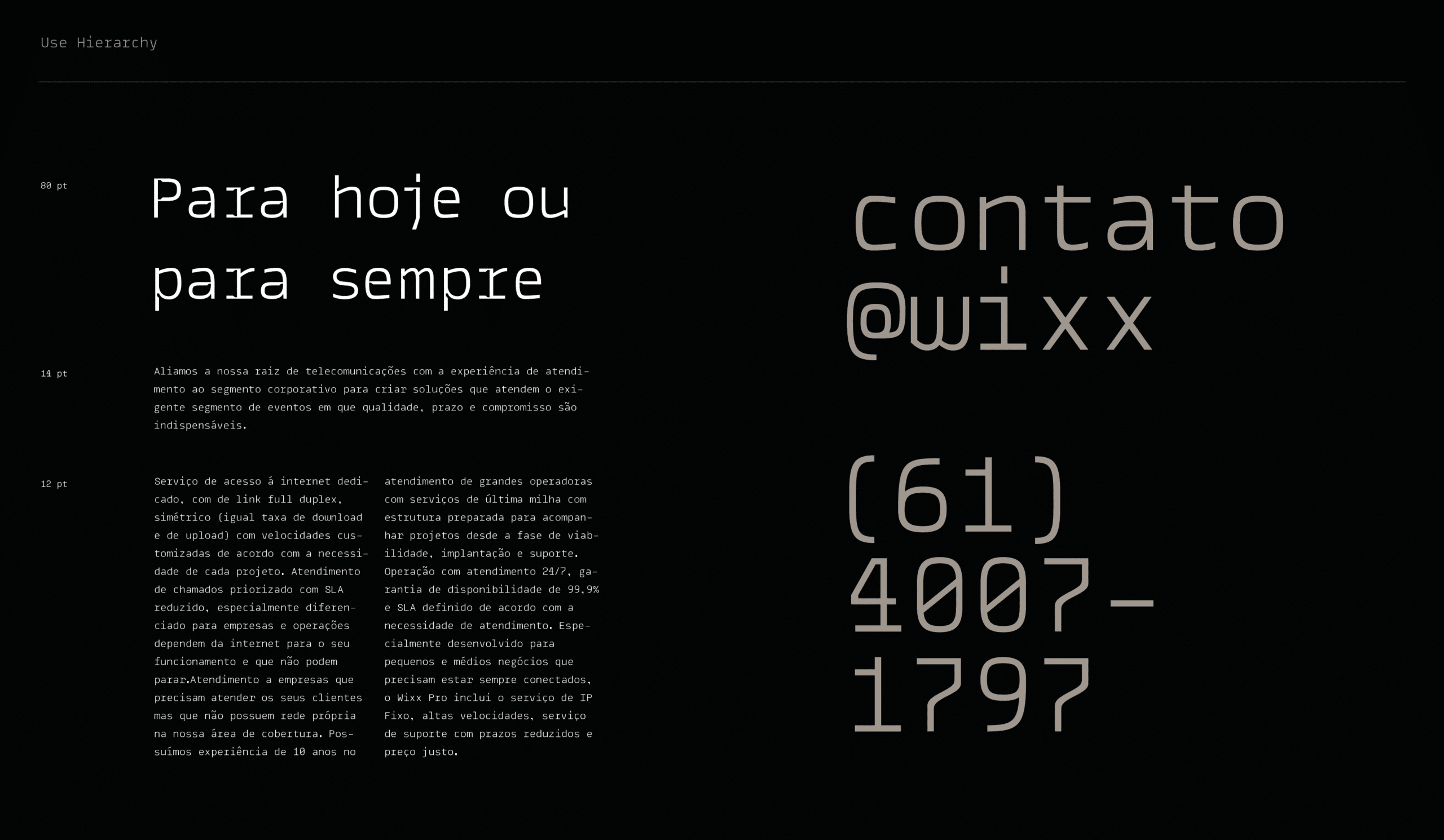
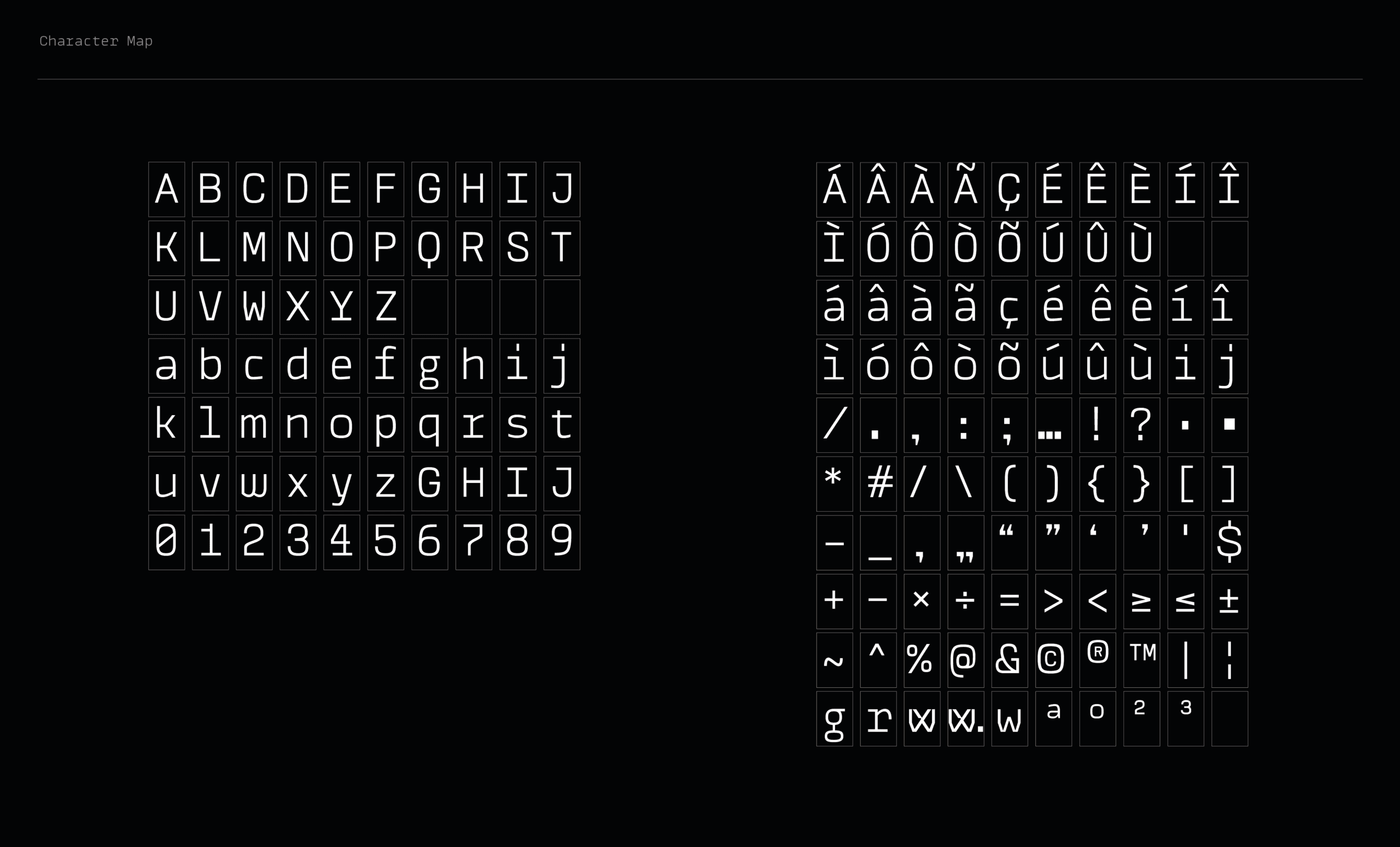
Recognising the importance of typographic voice for corporate communication, we created a custom typeface for the brand — an alphabet inspired by monospaced fonts widely used in contexts perceived as technological, like code typography — enabling us to develop all the brand touchpoints required for the repositioning.
The identity system was implemented and, since mid-2018, has demonstrated its strength: Wixx's perception has risen to the desired level of objectivity and authority in the telecommunications segment.
Impact
Recognition
 Alphabet Logo, Counter-Print · 2025
 Latin American Design Awards 2021
 13th Brazilian Graphic Design Biennial
- Behance, 2019
- Brand New, 2019
Select work
Telgo Telecom
A Central-West telecom, repositioned after hearing more than 100 of its employees
More Info →