Óbeli — Architecture beyond form
Óbeli
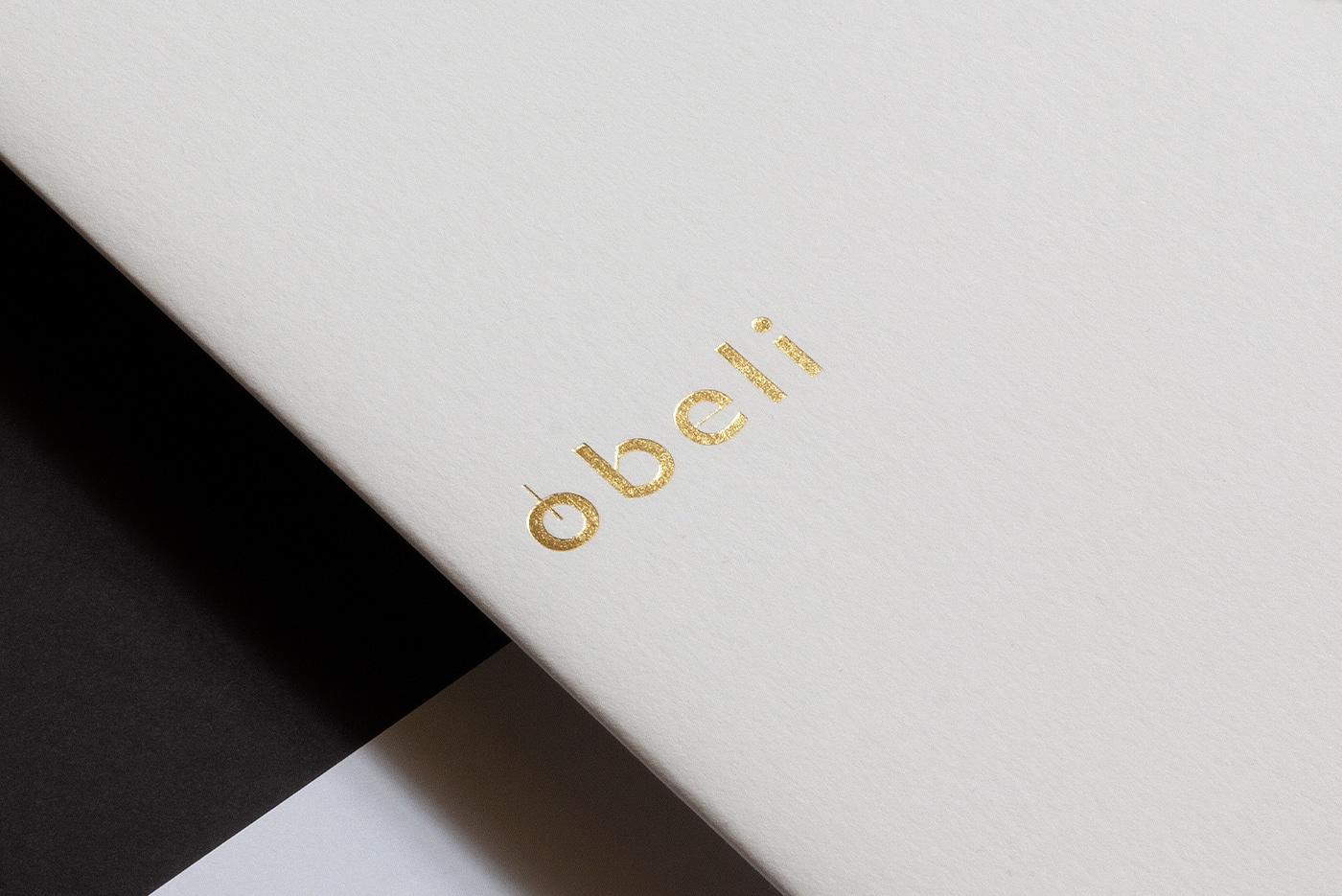
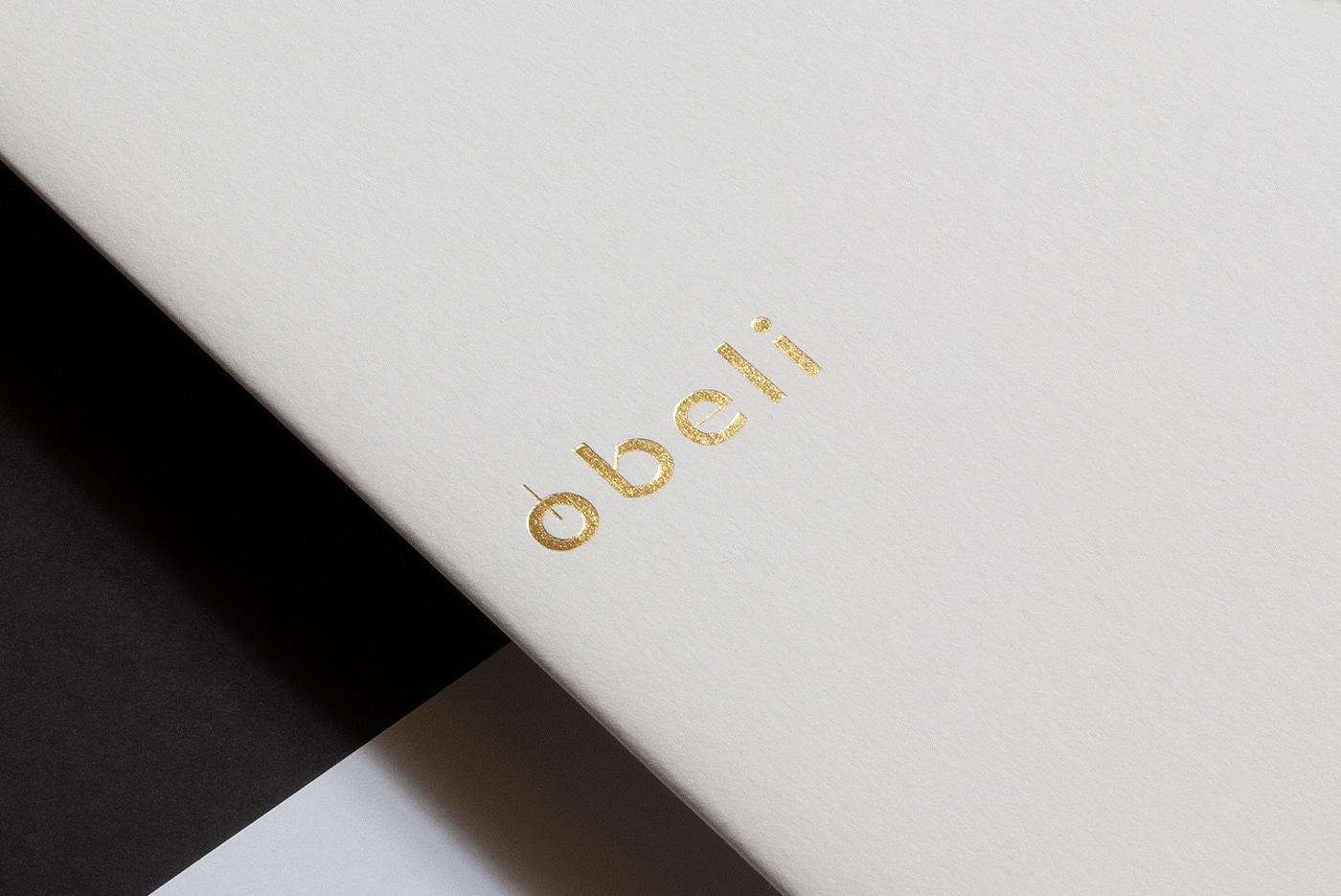
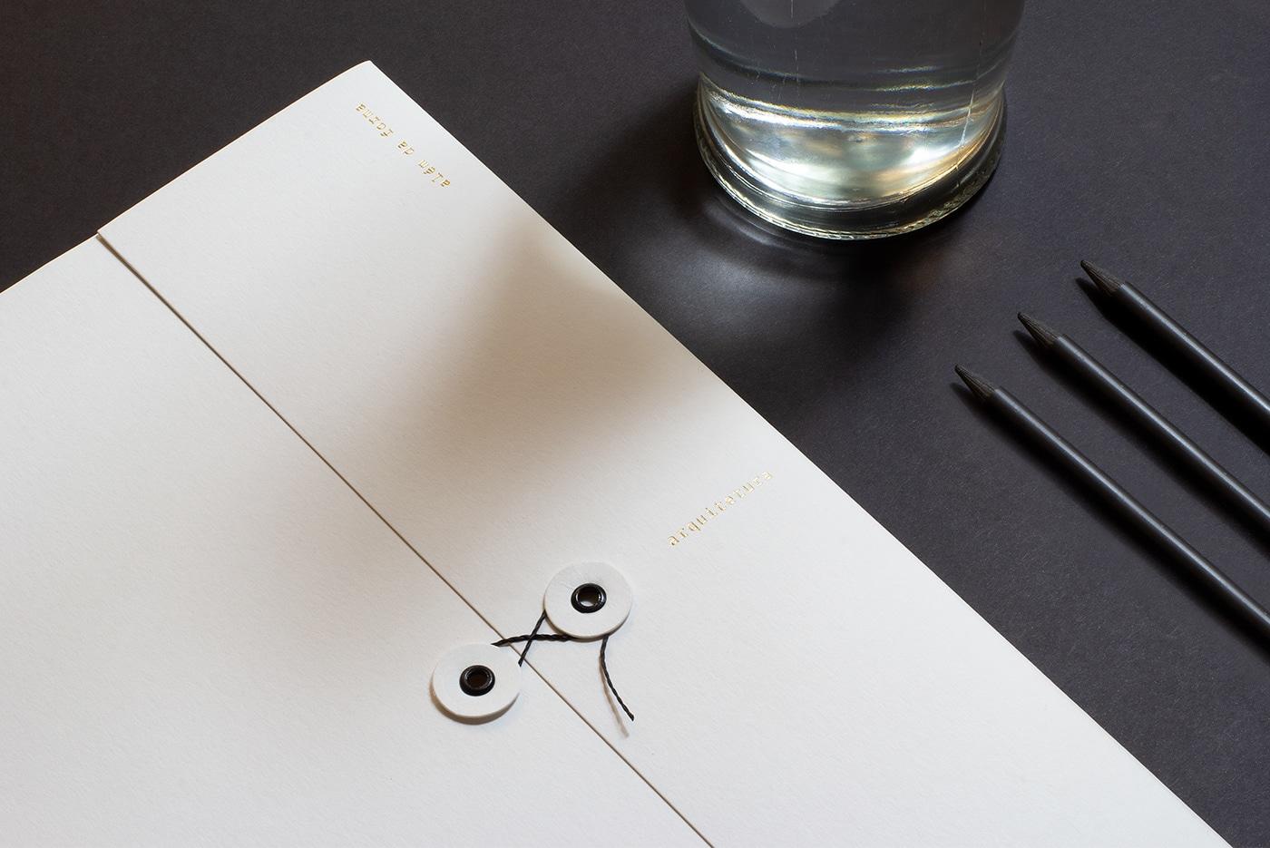
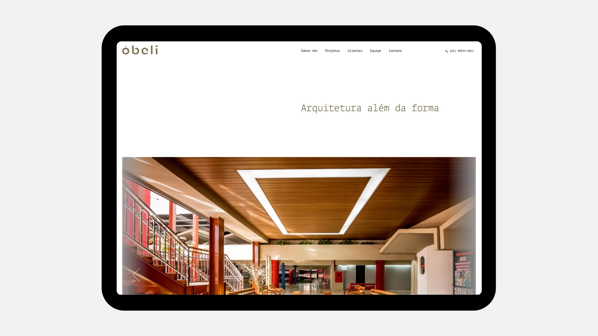
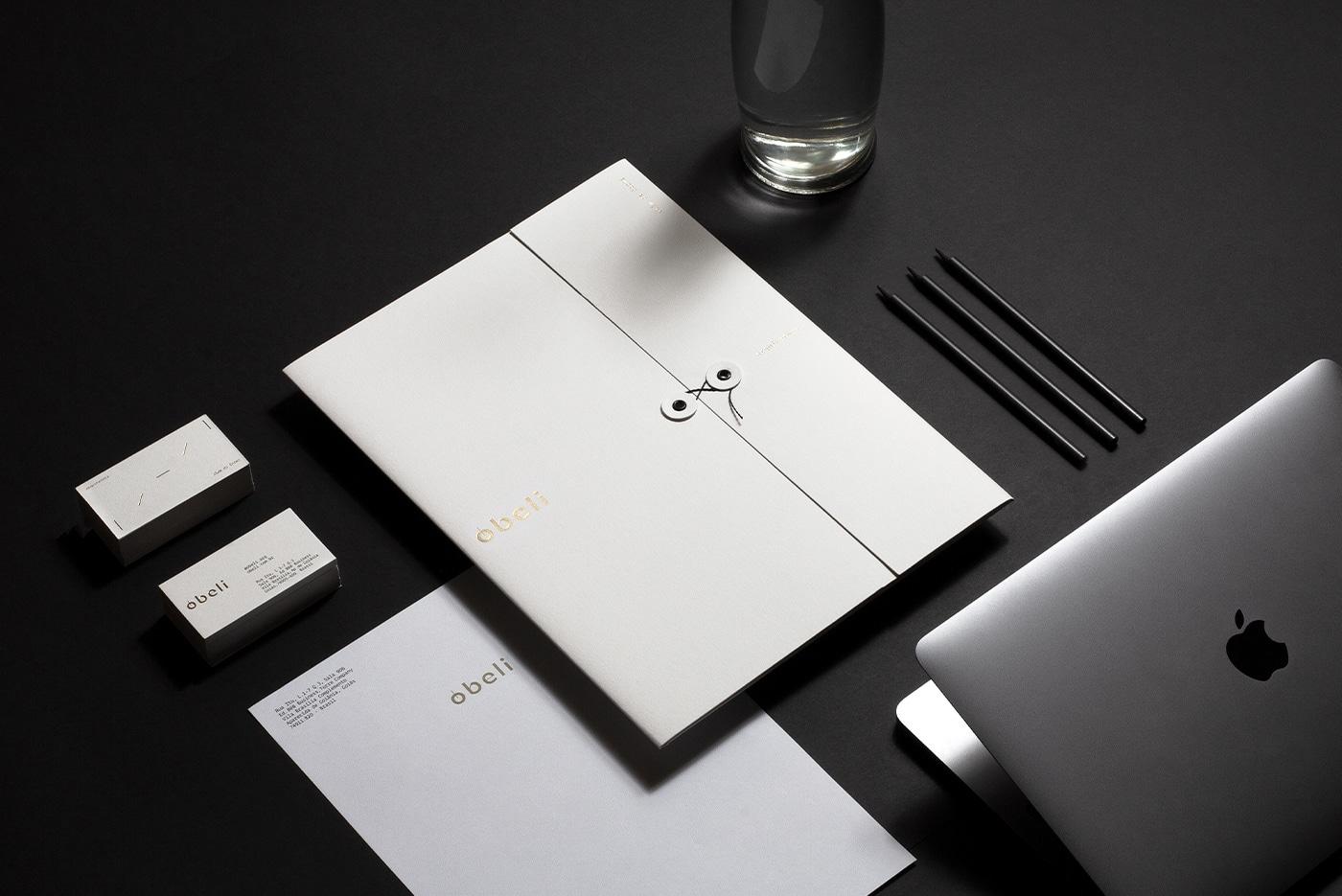
Óbeli is an architecture practice that had been growing under a personal name — 'Marina's Arquitetura' — limiting for the business's ambition. BRBAUEN led the positioning and naming, arriving at 'Óbeli' (from obelisk: monumental and timeless), and a visual identity that adopts architecture's structural angles (0, 45 and 90 degrees) as a living element of growth and movement.
Óbeli Architecture beyond form.
Architectural practices, like all other spaces related to creativity, allow for a wide variety of approaches, positioning, and brand names.
The naming possibilities are therefore vast — the challenge with Óbeli was understanding that, while being a recurrent solution, using a personal name can be a start, as it was for them, but it is a limiting choice for a growing business that understands the need for talent to grow.
The discovery phase also clarified the collaborative and cultural nature of the brand, reinforcing the need to build a more inclusive language, without compromising aesthetic, visual, and verbal characteristics relevant to the commercial practice of brand architecture.
- Client
- Óbeli Arquitetura
- Year
- 2022
- Sector
- Professional Services
- Services
- PosicionamentoNamingIdentidade Visual
Monumental
Monumental
Timeless Architecture+Art Modern+ Sophisticated Obelisk
A new name, to signal new times for the business
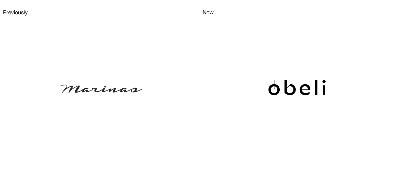
Previously named "Marina's Arquitetura" — a plural of the names of two founding partners — the business expansion goal led to the need for a new name and identity to encompass and shape the brand's vision for the future, for a more collective identity and an expansive environment for growth.
From a personal and characteristic name, to a broader and unique name that could express the nature of the brand: Plurality, Science and Freedom to develop an architecture that brings harmony as a central aesthetic value; efficiency as a central functional pillar; through deep understanding and knowledge of the people involved in the environments that would come to life.
Unidade
An element that brings unity to the language.
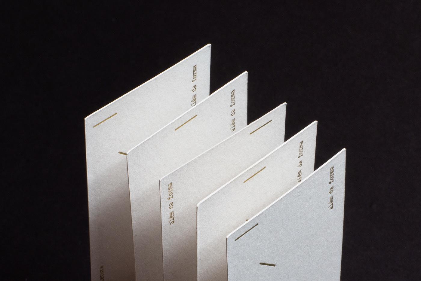
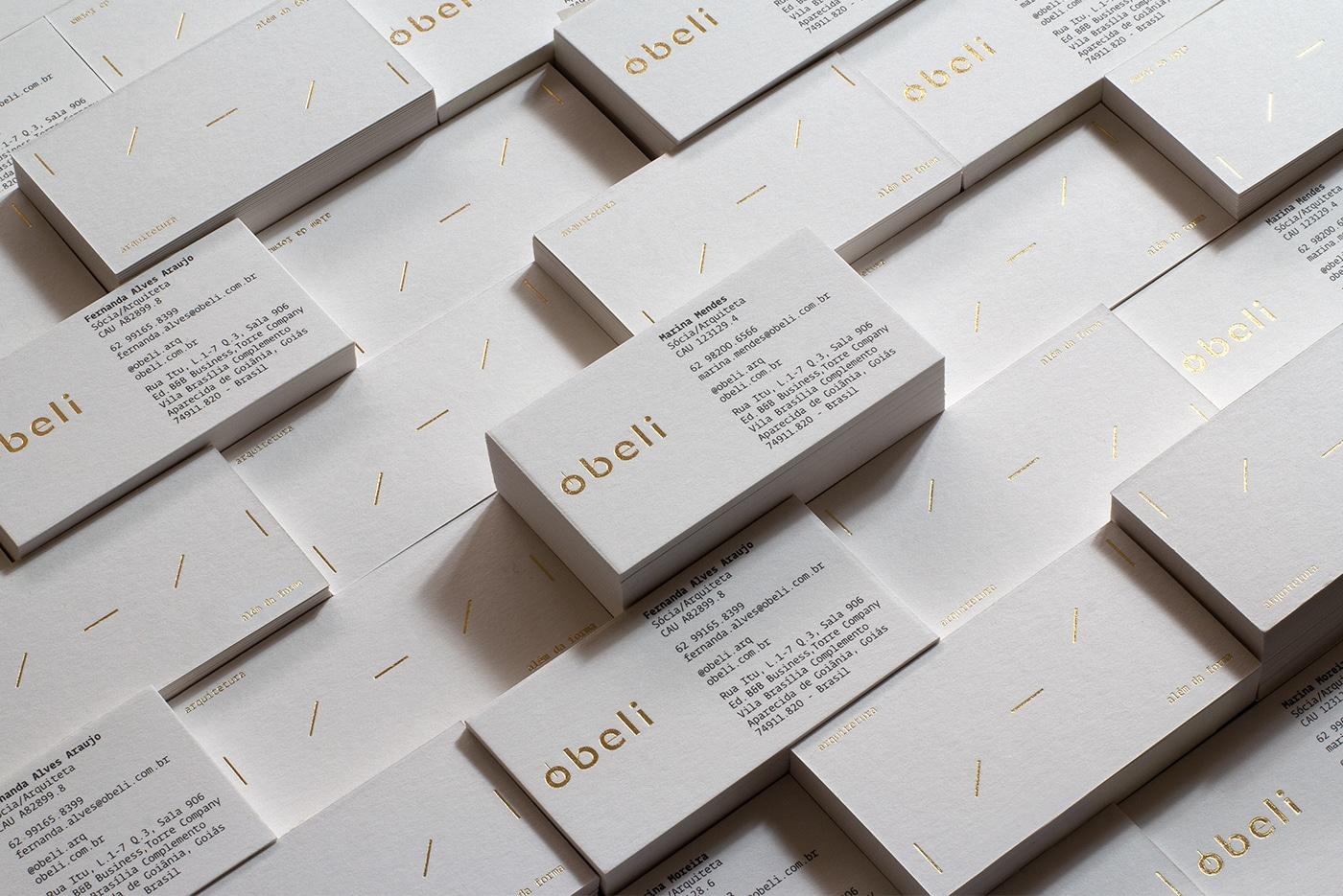
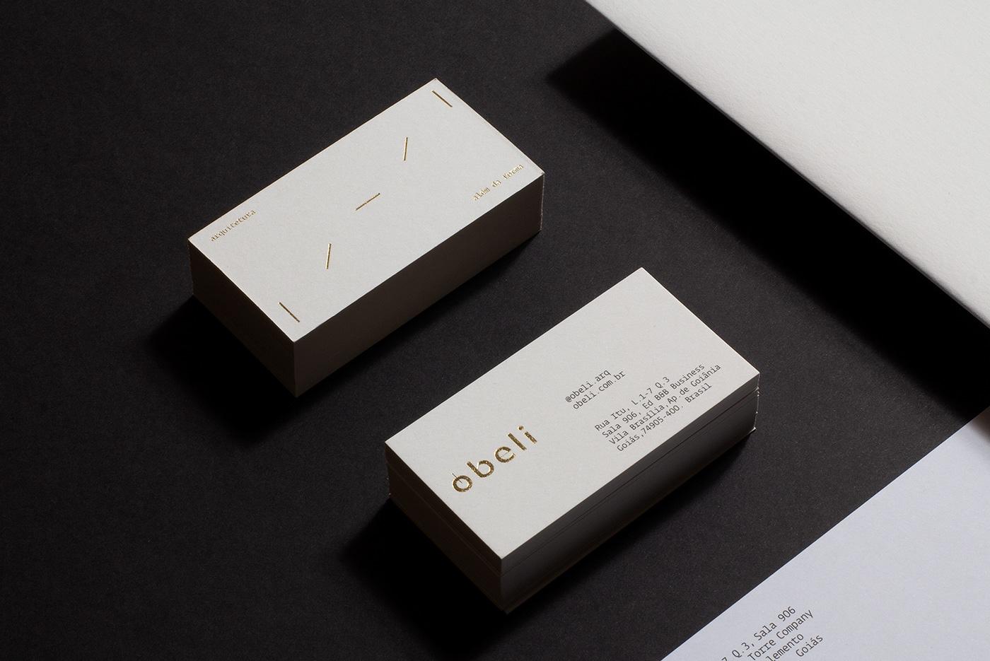
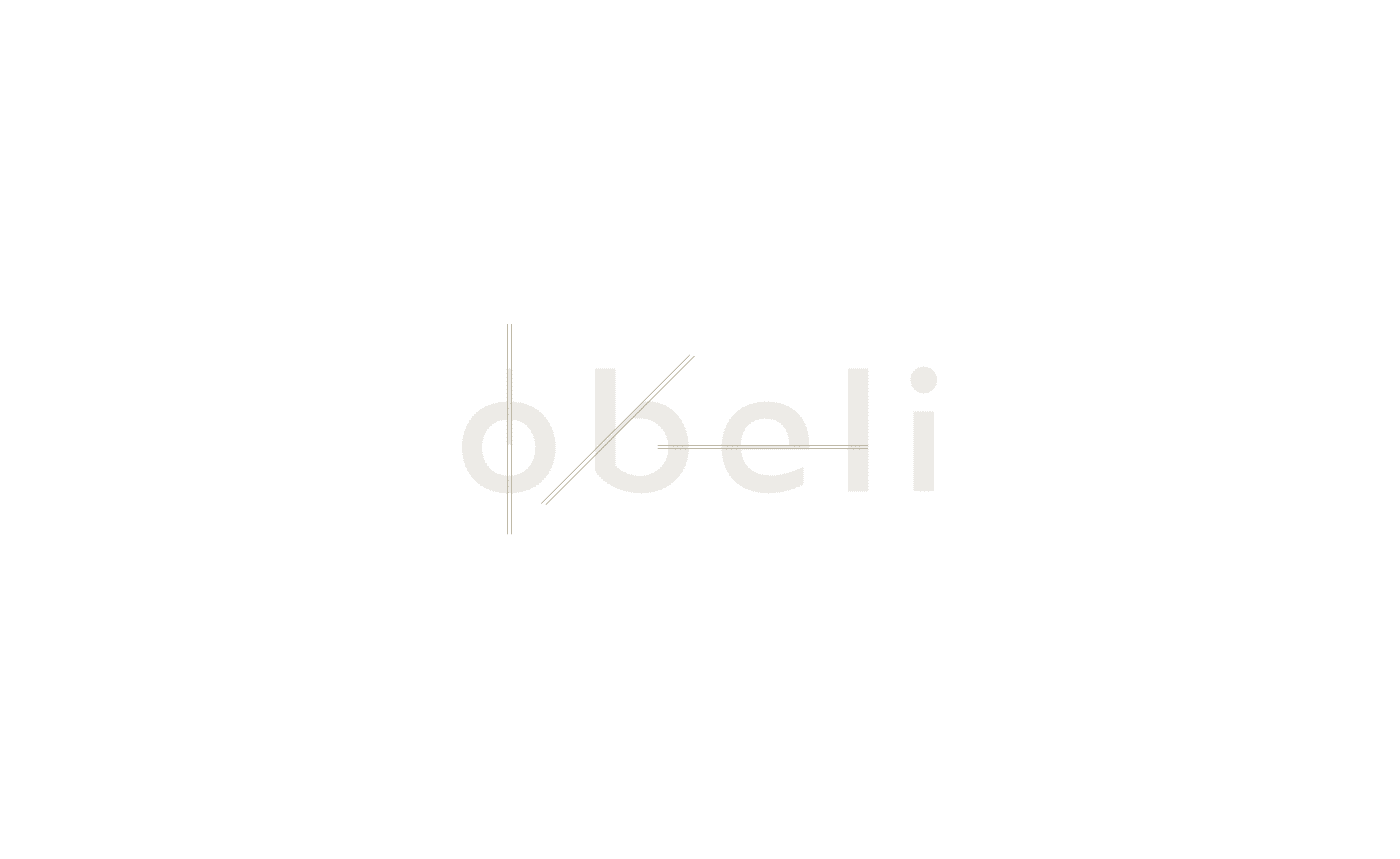
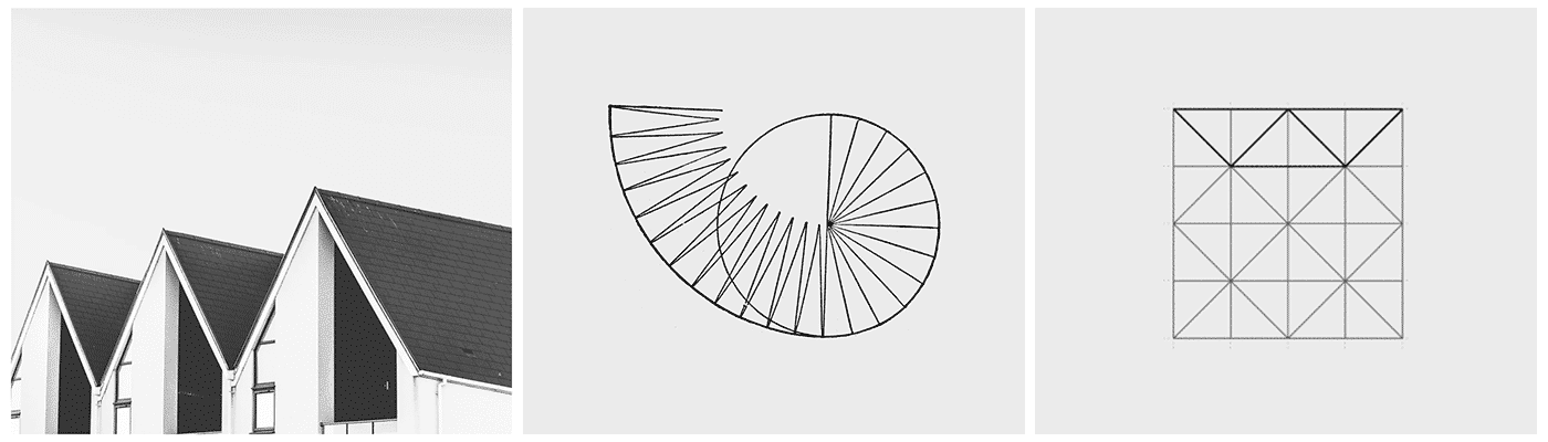
An authentic and strong name allows the visual language to 'carry less weight' — moving away from technically obvious solutions, the new logotype brings a subtle reference to the most common and necessary structural angles in architecture: 0.45 and 90 degrees.
Angles, shapes and three-dimensionality are common subjects in architecture – the design strategy was to assume this figuratively to become an element of living identity for dynamism, movement and growth.


Impact
Recognition
- Behance, 2022
Team
Select work
Allnorth
An engineering consultancy across Canada and the US, rebranded and united to lead international expansion
More Info →