Allnorth
Allnorth
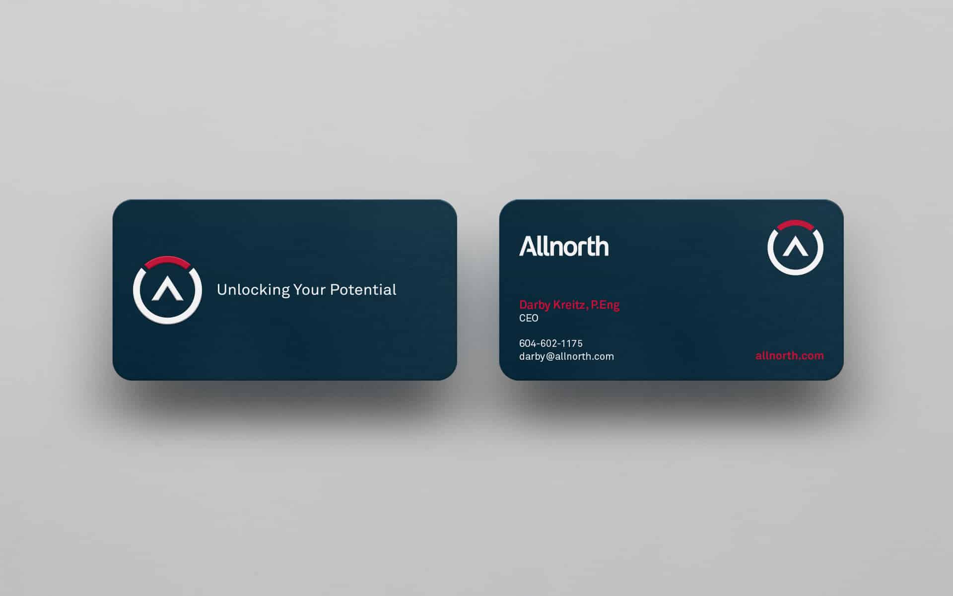
Allnorth is a multidisciplinary engineering and technical-services consultancy with offices across Canada and the US, serving mining, oil and gas, energy and other sectors. BRBAUEN developed the branding and creative direction around the idea of 'north' — a strikingly simple symbol inspired by the compass — plus an online Brand Central to standardise the identity across the company.
Allnorth is a multidisciplinary engineering consulting and technical services company, serving clients in the Mining, Oil and Gas, Infrastructure, Pulp and Paper, Energy, and Chemical sectors. With offices throughout Canada and the USA, they provide a single point of contact for clients seeking intelligent and practical solutions for their project needs.
- Client
- Allnorth
- Year
- 2012
- Sector
- Professional Services
- Services
- BrandingDireção Criativa
Abordagem
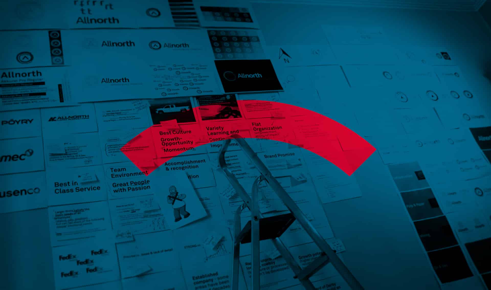
We had the great responsibility of dissecting and understanding Allnorth to make its essence tangible. Based on all the principles pre-established by Allnorth, we developed a precise and comprehensive project to accompany the company in its growth around the world with a strong identity to be recognized internationally. From functional principles to philosophical concepts, we organized in a graphic project a full experience of harmony with the brand.
Results
It was a complex project, based on all the principles pre-established by Allnorth.
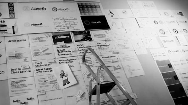
With such responsibility in hand, the work began by dissecting the brief and understanding it deeply, to the essence of the Brand.
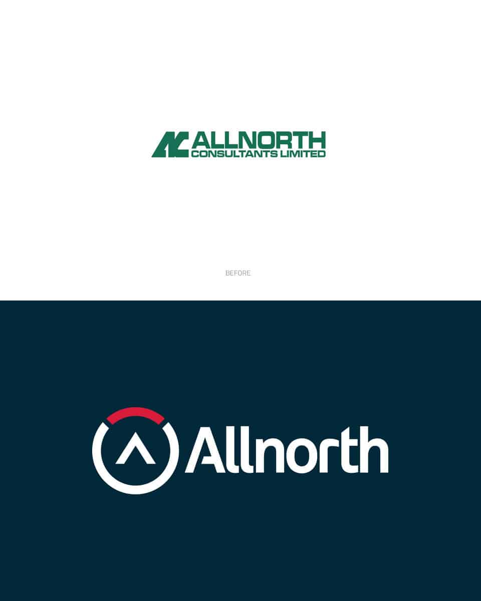
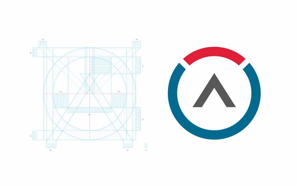
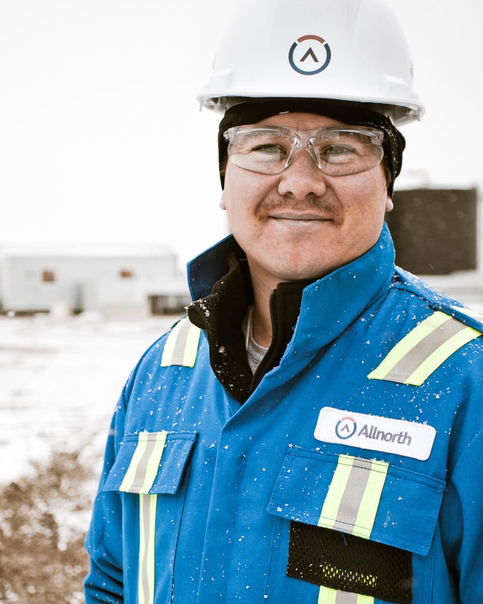
The initial concept of the symbol was a way to represent the company name directly, working with its philosophical meaning, where everyone seeks to find their north, in life or in navigation, North is a point of reference and Allnorth offers everything from the north. The thoughts for building the symbol are vast and, among them, are the following inspirations: everything comes from a compass; a sign that represents the union between the Client and Allnorth; an arrow that represents the initial of the name and indicates north. The result is a symbol with extreme simplicity.
Simbolo
The symbol
We based the symbol on a way to represent the company name directly, working with its philosophical meaning, where everyone seeks to find their north, time in life or in navigation, North is a point of reference, and Allnorth offers everything for this north.
The thoughts for building the symbol are vast and among them, are the following inspirations: Everything comes from a compass; a sign that represents the union between the client and Allnorth; an arrow that represents the initial of the name, and indicates "north". The result is a symbol with extreme simplicity, after all, we are "Clean & Uncomplicated VS Messy and Chaotic".
Marca Central
Brand Central
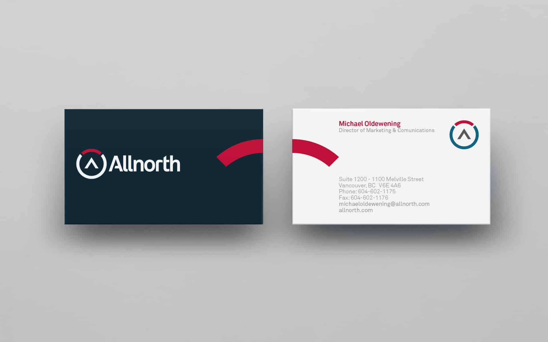
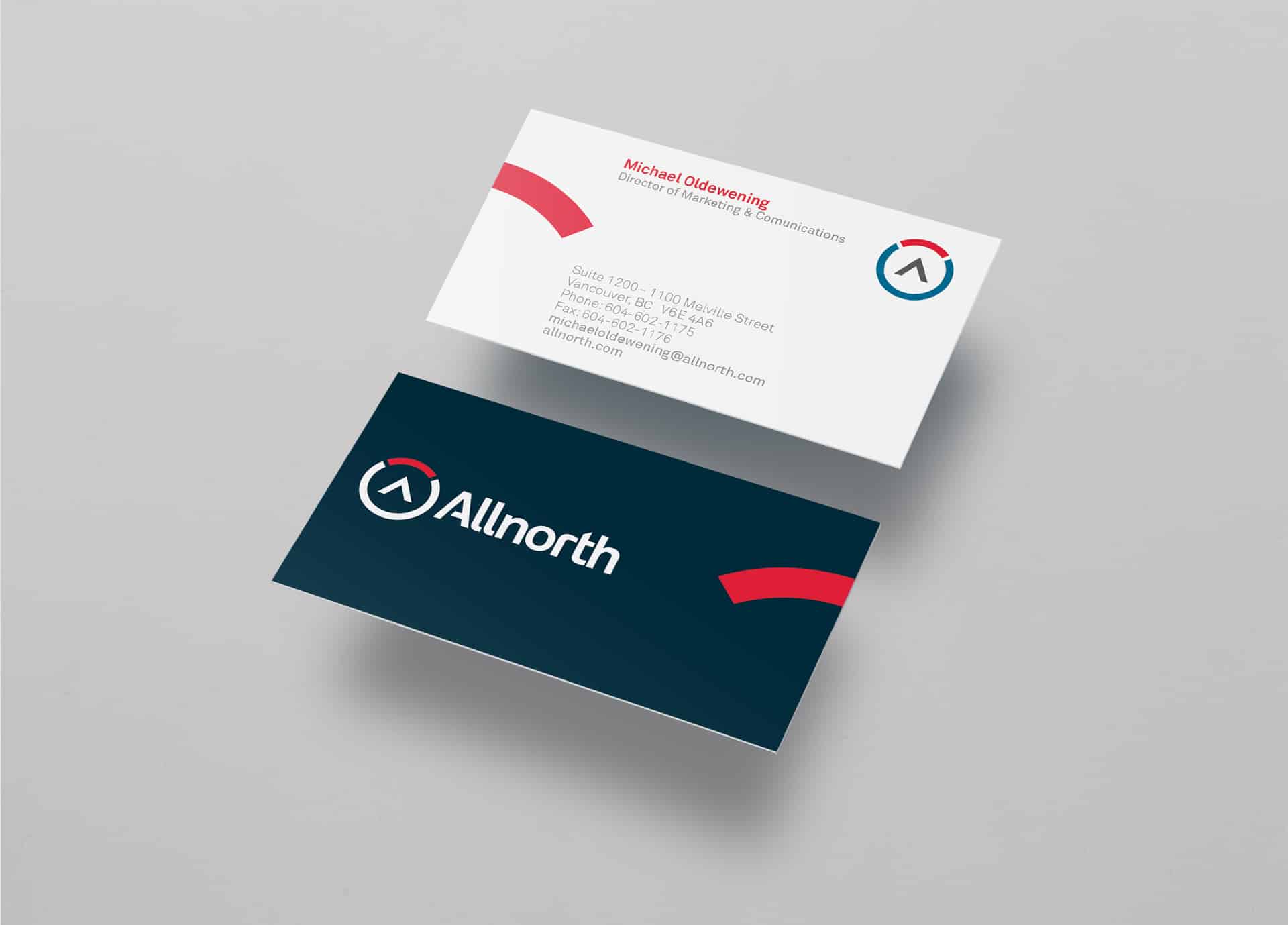
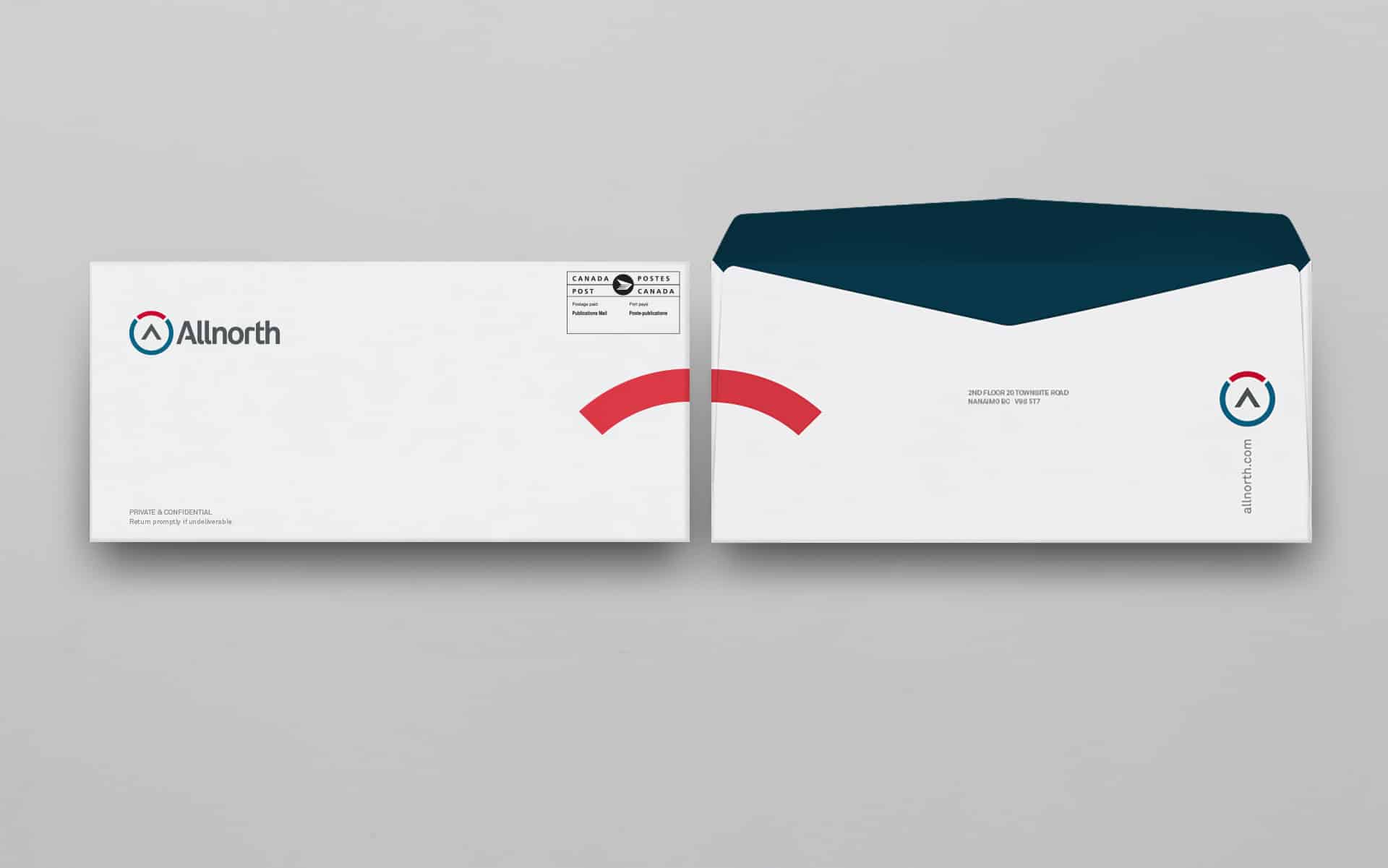
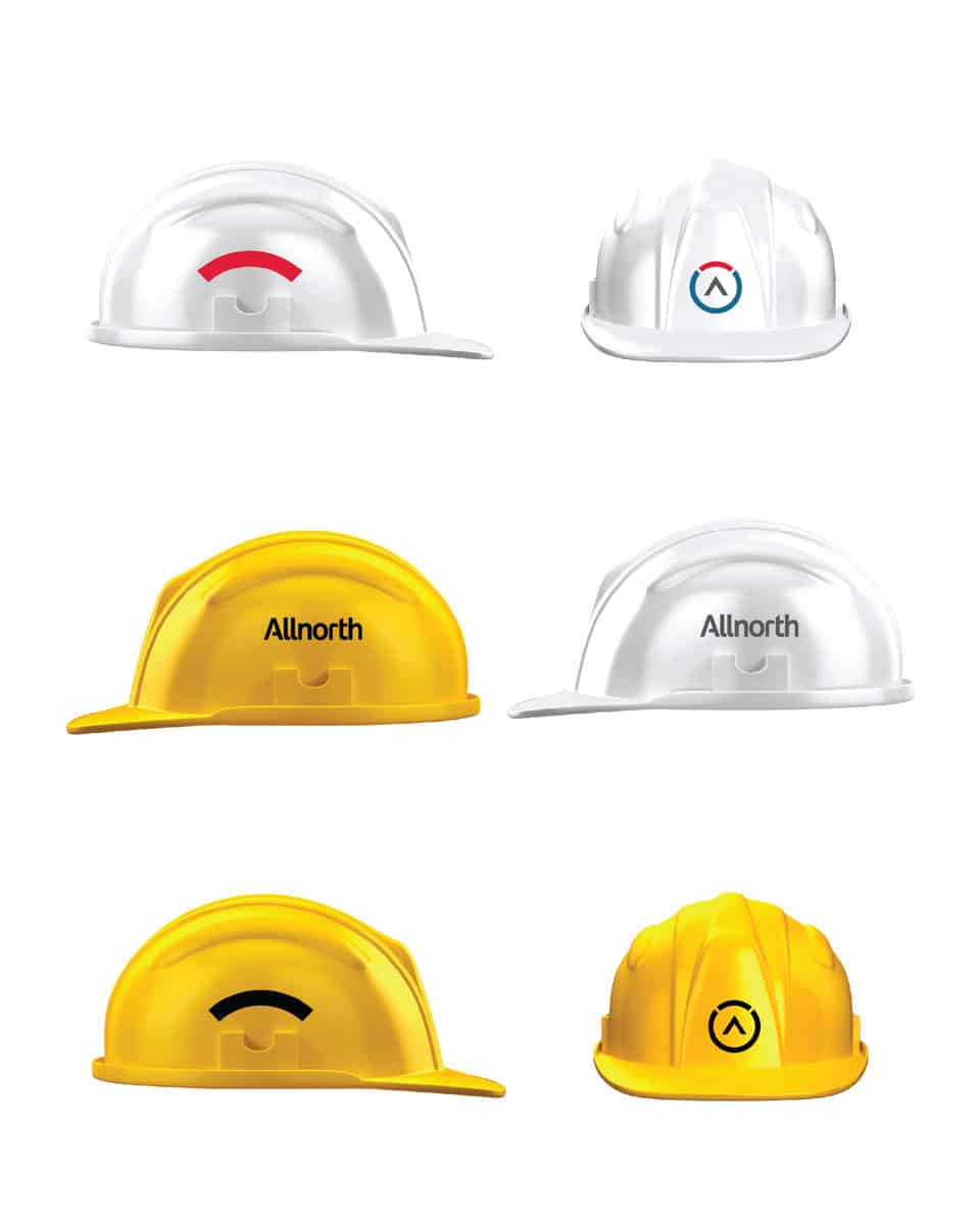
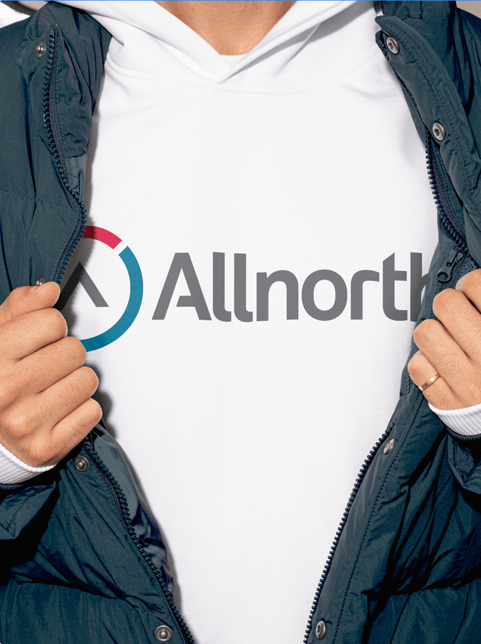
We developed a Brand Central to make it easier for Allnorth to understand and deal with identity across the company.
Having an online version of a company's brand identity guide is an option that has been widely used, and among this need, we developed one for the brand.
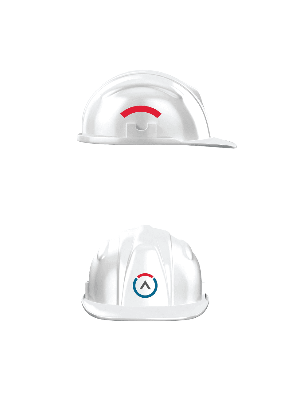
We made everything related to the new brand identity available for download, from corporate signatures with color instructions, stationery materials, digital presentation templates, internal document templates and corporate typographic instructions.

What the client says
“We were impressed with BRBAUEN's portfolio and their focus on results. Location didn't matter; project management did. They excelled at communication, process and understanding our goals. Their responsiveness, attention to detail and talent made them one of the best decisions we have made.”

Marketing Director, Allnorth
Impact
Recognition
 10th Brazilian Graphic Design Biennial, 2012
- Behance, 2012
Team
Select work
Bittar Arquitetura
A siblings' architecture practice, repositioned and given a monogram from their initials
More Info →