NewCastle Gold — A Functional Trustworthy Symbol
NewCastle Gold
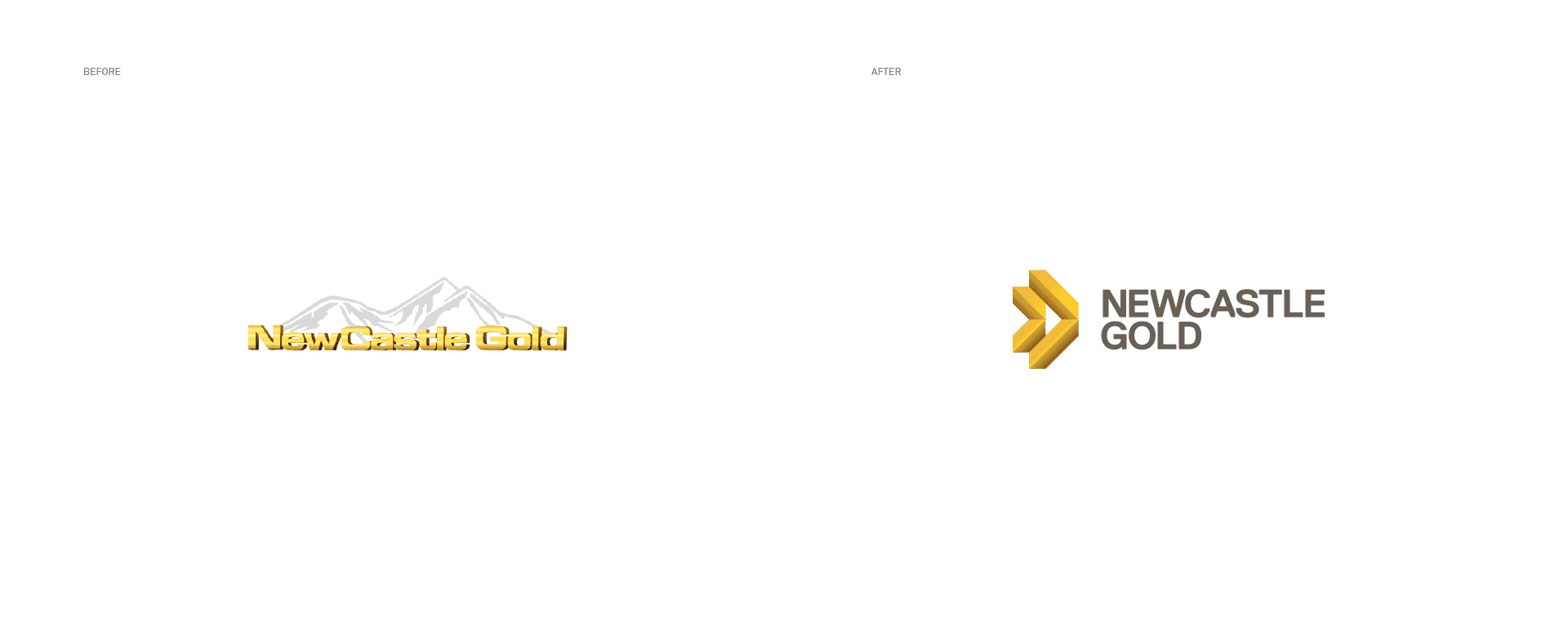
NewCastle Gold is a junior gold mining company listed on the stock exchange that needed a complete rebrand for its graduation to the Toronto Stock Exchange. BRBAUEN developed a functional, trustworthy identity — with an abstract symbol derived from gold ingots and an objective document system — to convey the company's fast-moving mindset to global investors. In less than 12 months after implementation, NCA announced a merger to form a mid-tier global mining operation.
About
NewCastle Gold is a gold mining exploration company that has a 100% interest in the Castle Mountain property in San Bernardino County, California. In late 2016 NewCastle Gold finished forming a powerhouse management team that include former executives from global gold mining companies, considered to be a major ingredient for a junior miner's success.
At this point, the Investor Relations department reached over to us for a complete brand makeover.
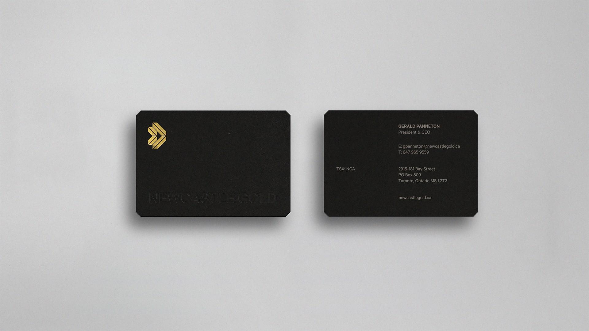
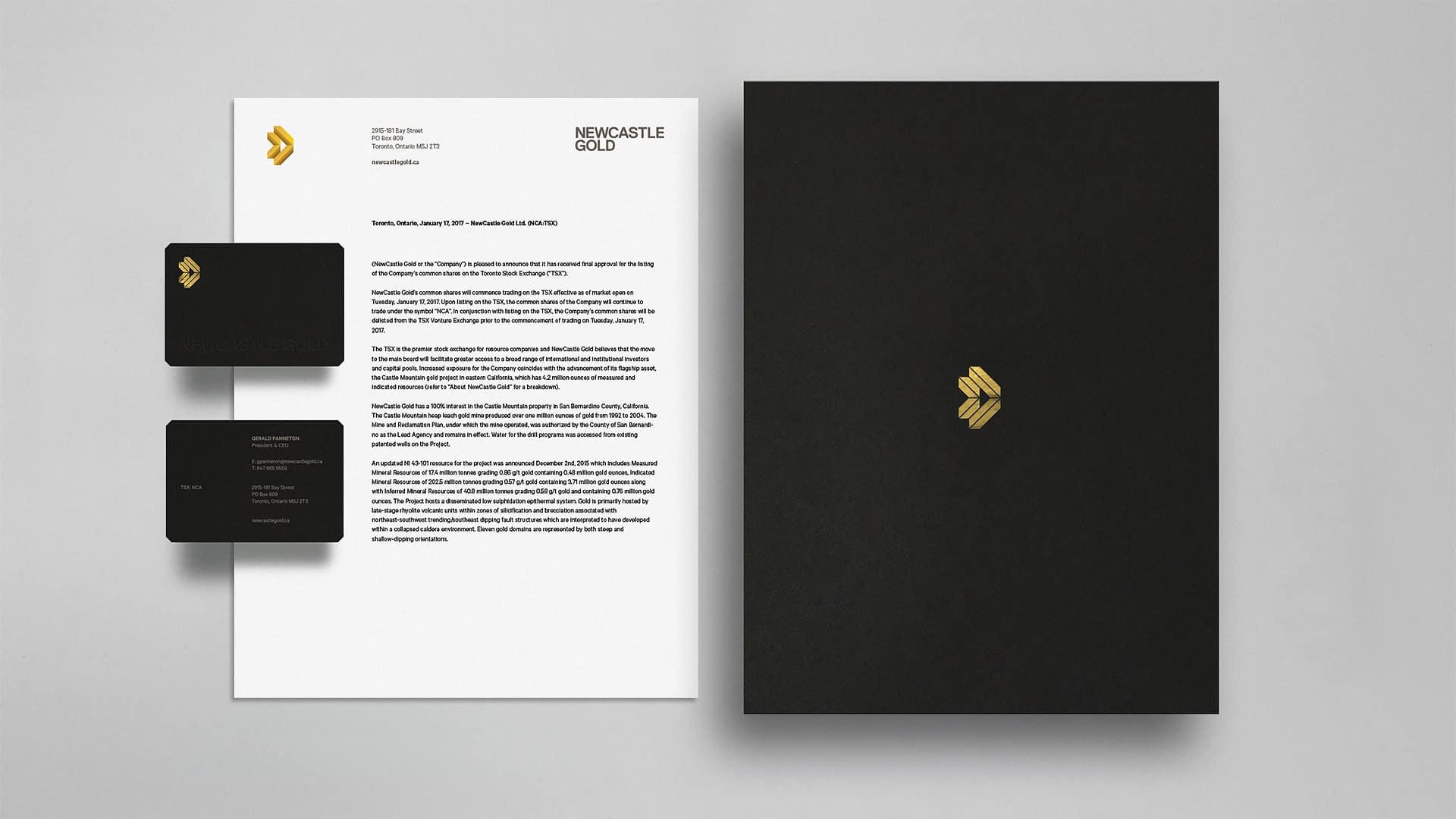
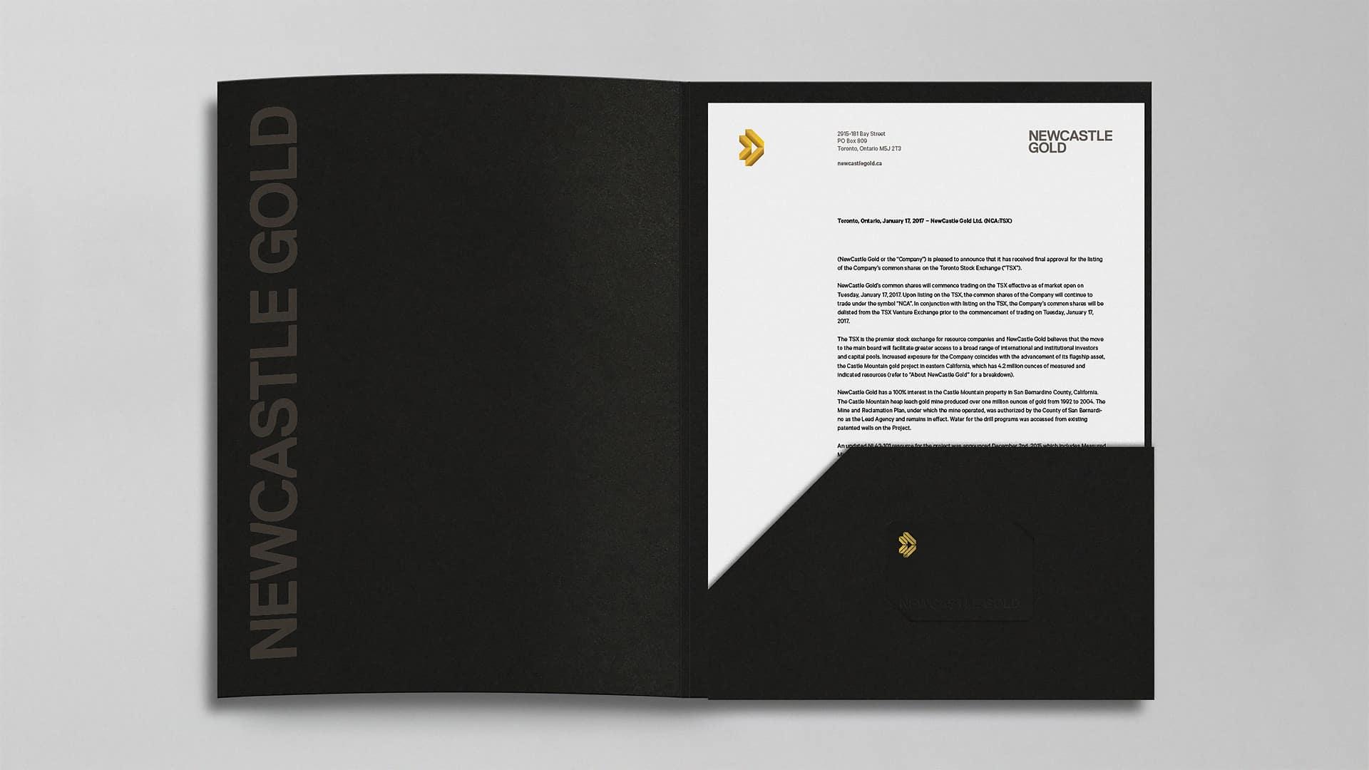
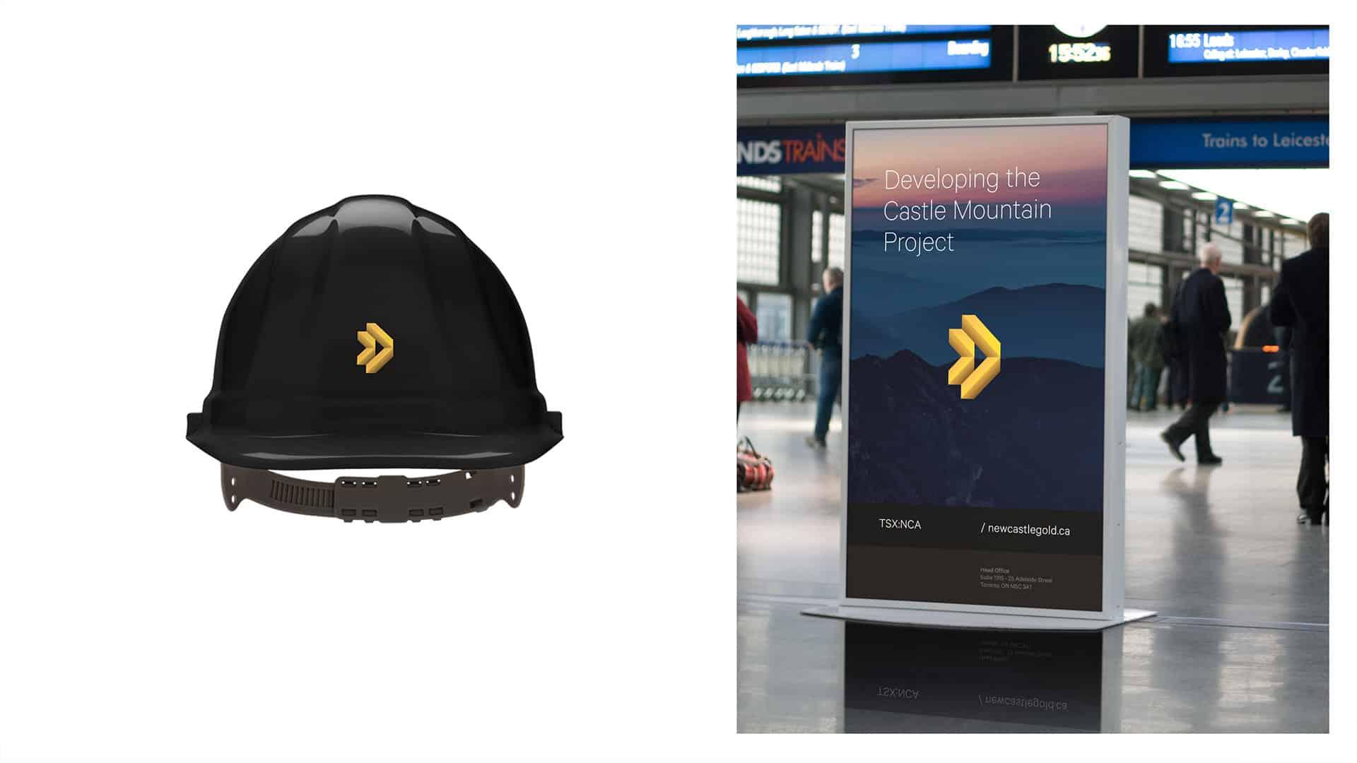
- Client
- NewCastle Gold
- Year
- 2017
- Sector
- Manufacturing & Industry
- Services
- BrandingIdentidade VisualDesign GráficoWeb Design
Abordagem
Approach
Preparing NewCastle for Toronto Stock Exchange graduation was the main goal set out at the beginning of the process. Aside from the inherent aesthetic impact of our work on the brand as a whole, making sure that both current and future investors understood NCA's forward-thinking mindset was a must.
Resultados
Results
In less than 12 months after implementing, as a result of the company's mining advancements and IR efforts through a cohesive brand presence, they recently announced a merger to form a mid-tier global mining operation.

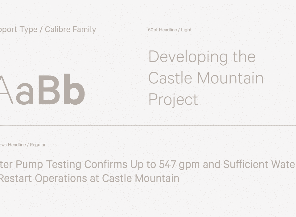
Simbolo
A Functional Trustworthy Symbol
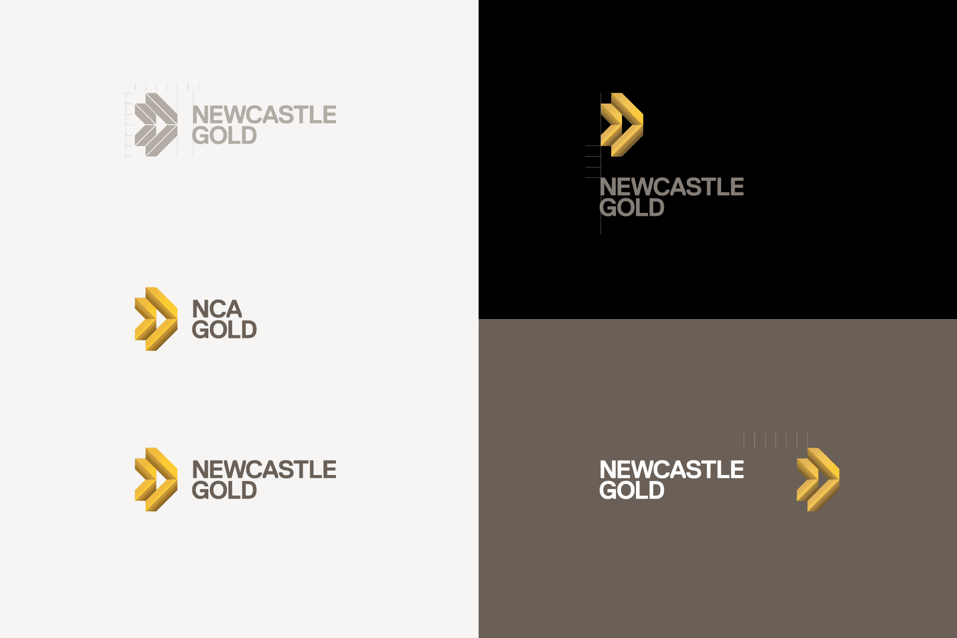
Through immersive conversations with the NCA team, the company's technical and fast-moving posture stood out as they provided plenty of knowledge and data as to where the mining operation was currently standing and where the company wanted to get in the next 10 to 12 months.
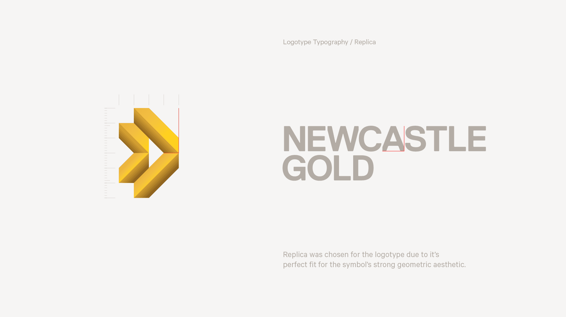
Their posture made us believe that although aesthetically referencing gold, an abstract symbol was the way to represent their objectiveness towards the future through simple geometry and 3-dimensional reference to gold ingots, pointing arrows in negative space, which conveys a strong and representative symbol for an imposing brand identity.
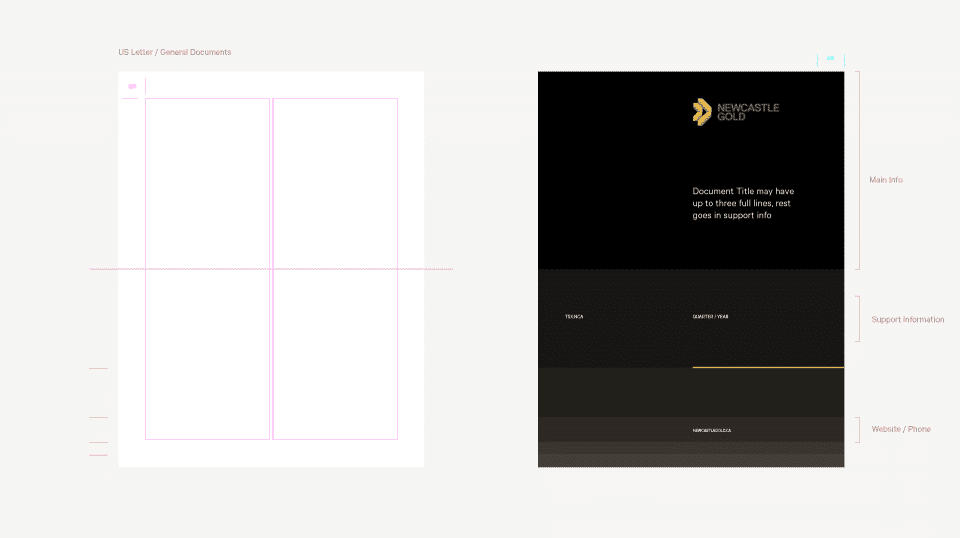
Sistema
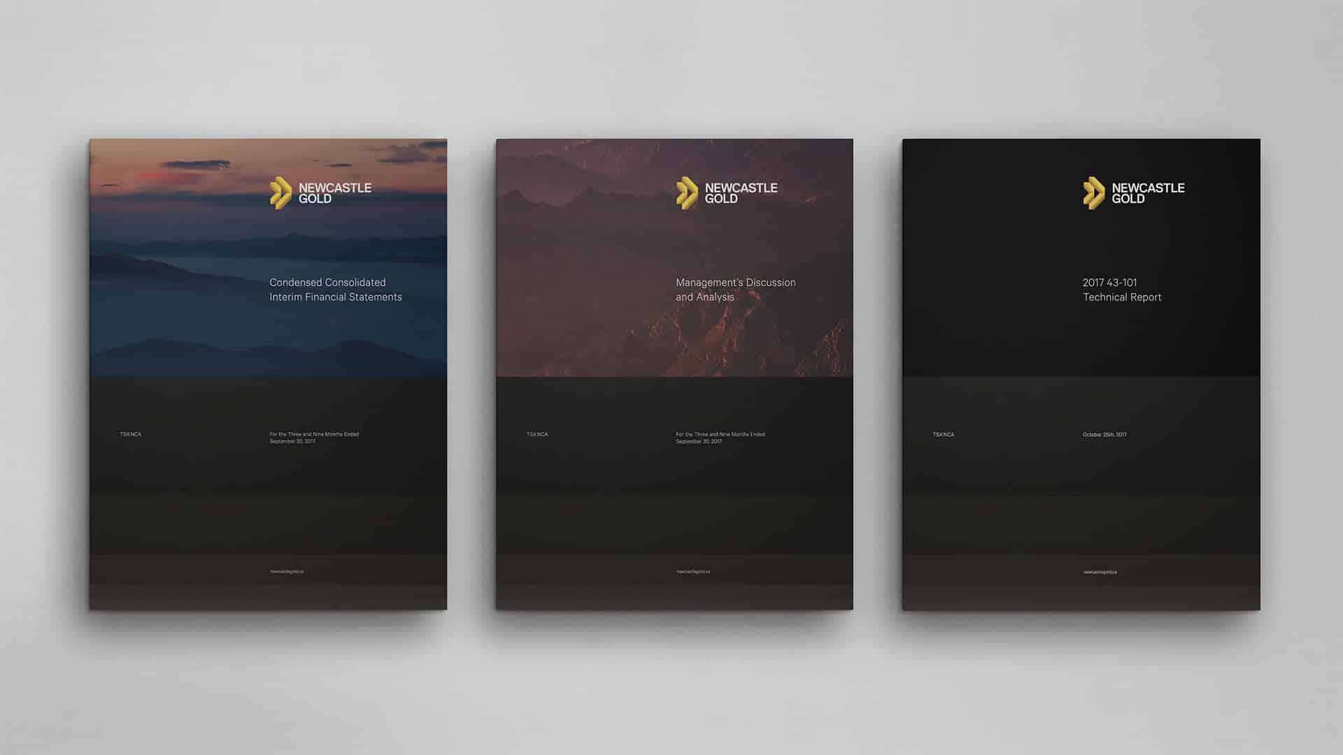
Surface mining layers was the main reference to develop NCA's advertising and document identification system which derives from proportional division of the formats to guide the use of smaller or larger photography depending on the document's purpose.
Site
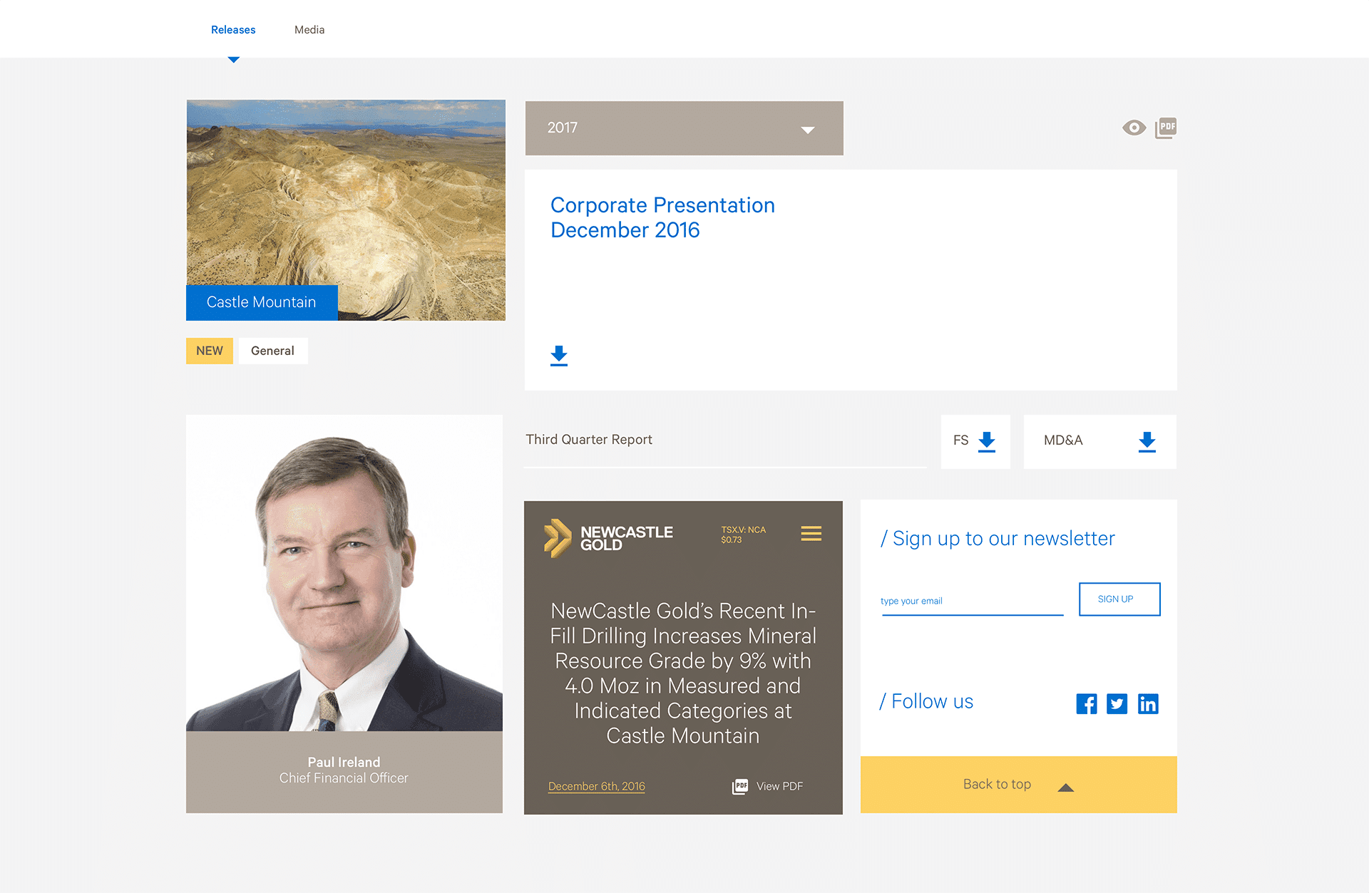
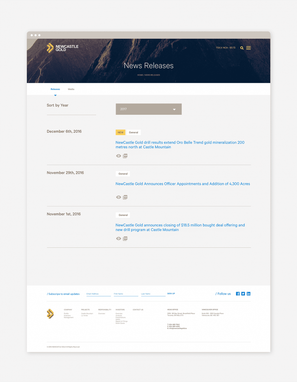
Website / Focus on PR and Documentation
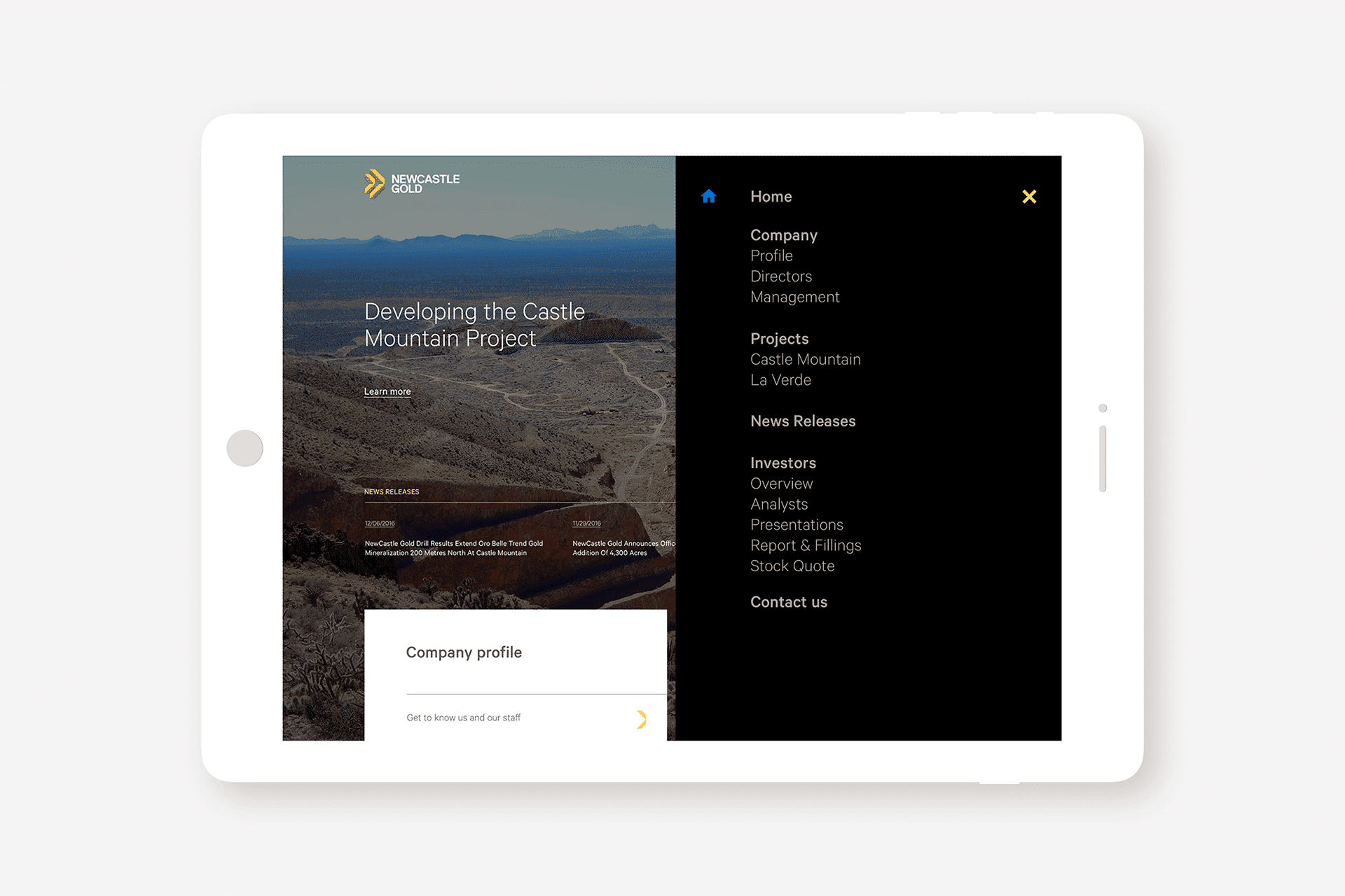
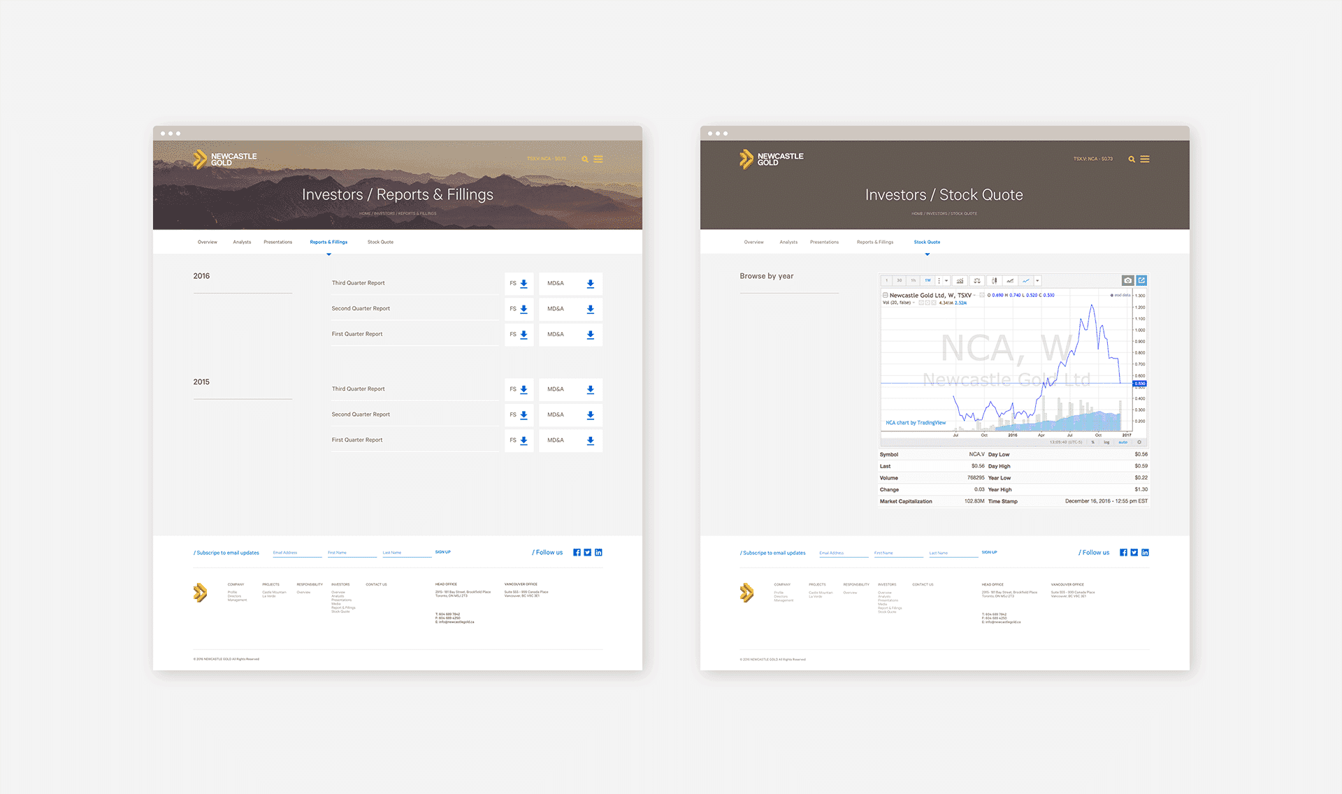
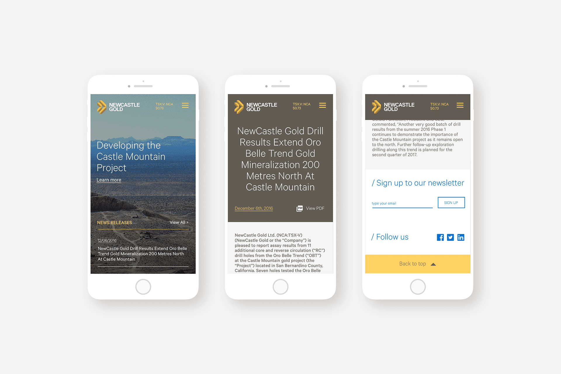
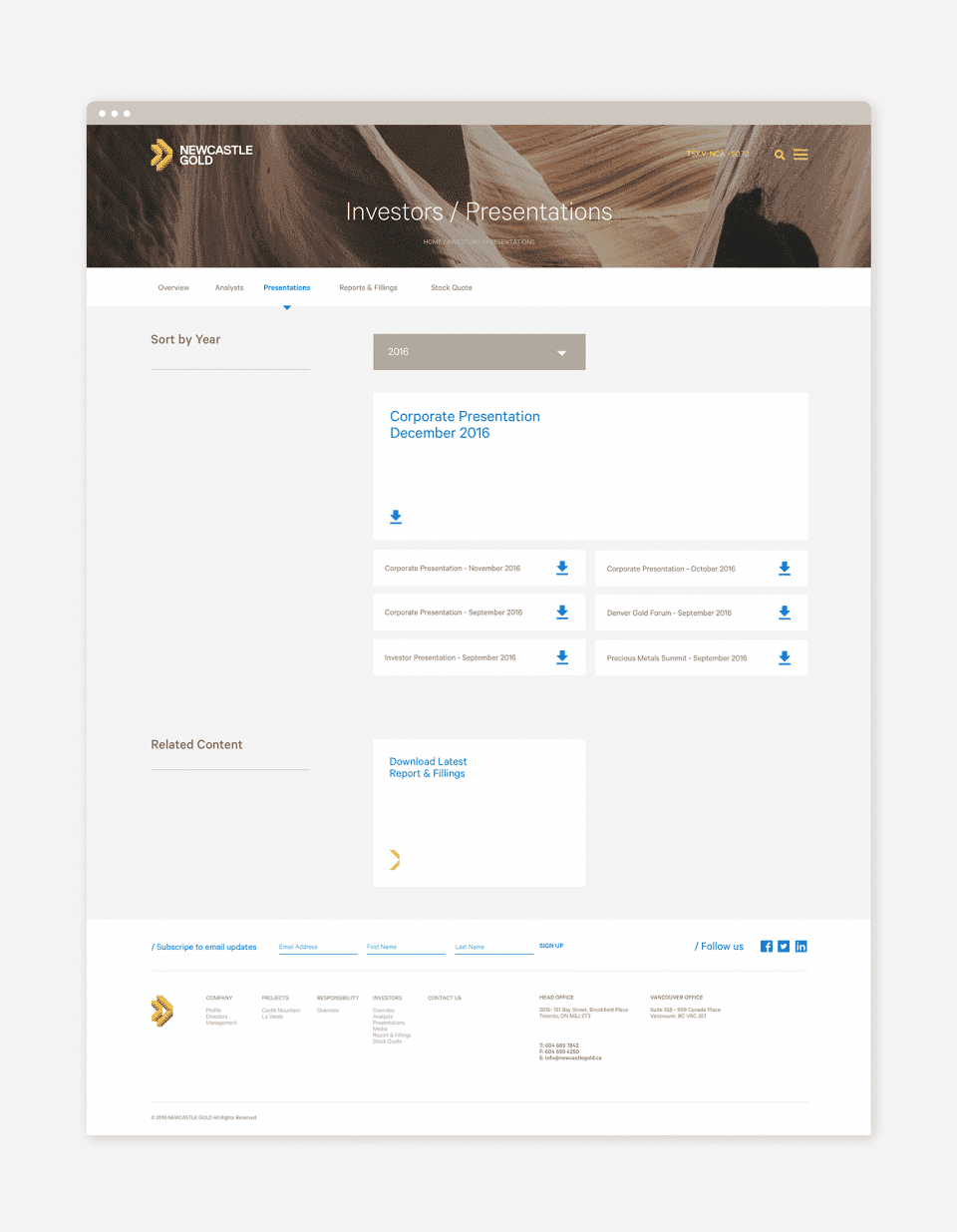
NCA handles and publishes a significant amount of Press Release and Mining exploration documents on a regular basis so the website needed to not only be easily manageable for the IR team but also easily accessible for the Investors willing to get updates on the company's overall status.
Those basic needs led to an equally basic direct visual language, with straightforward calls to action for seamless navigation throughout the whole content, whether it's a PR or a financial report, dates and updates are easily distinguishable, making the website a living status report of NCA's progress.
Impact
Recognition
 Brand New, 2017
- Behance, 2017
- Behance, 2018
What the client says
“After an excellent experience with Rodrigo and the BR/BAUEN team at a previous company, I couldn't think of any other team I wanted to collaborate with to build out the NewCastle brand. Their work illustrated that NewCastle Gold was a serious market contender for investors and companies looking to acquire or merge with a junior asset.”

Director, Communities & Social Performance, Rio Tinto · formerly Director of IR & Corporate Communications, NewCastle Gold
Select work
CMC
The first Guinean-owned bauxite miner, branded around cycles instead of excavation
More Info →