LOUD — Follow the noise
LOUD
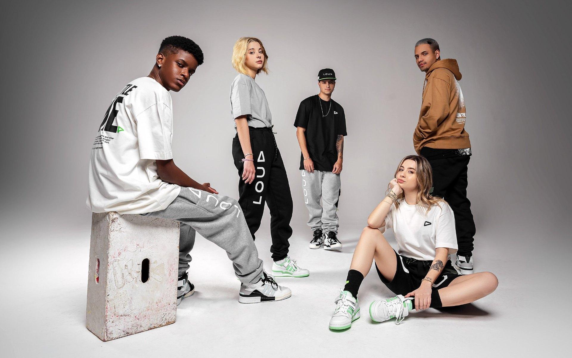
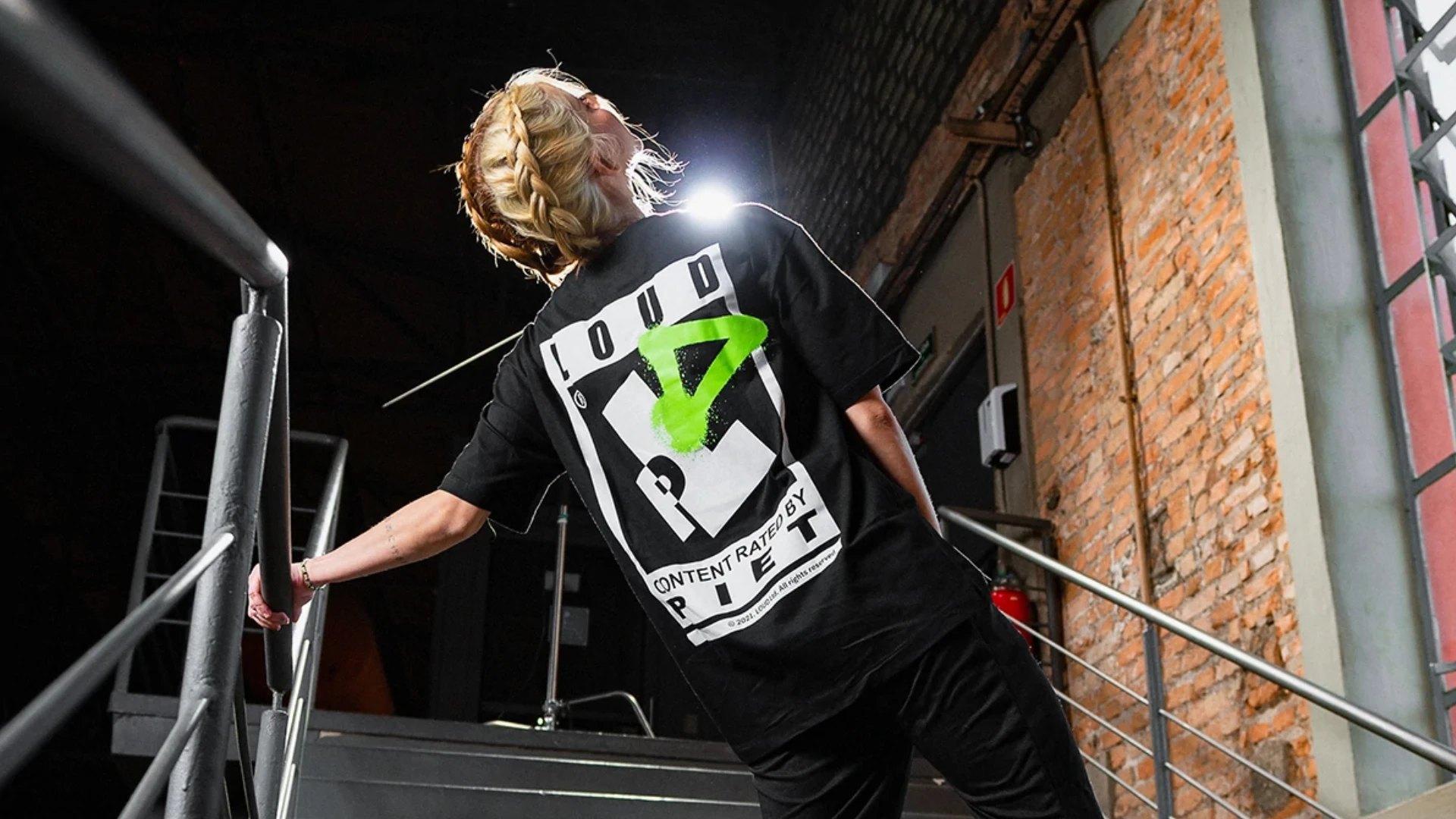
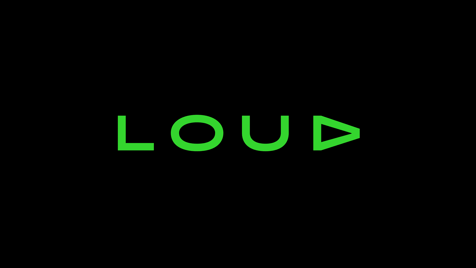
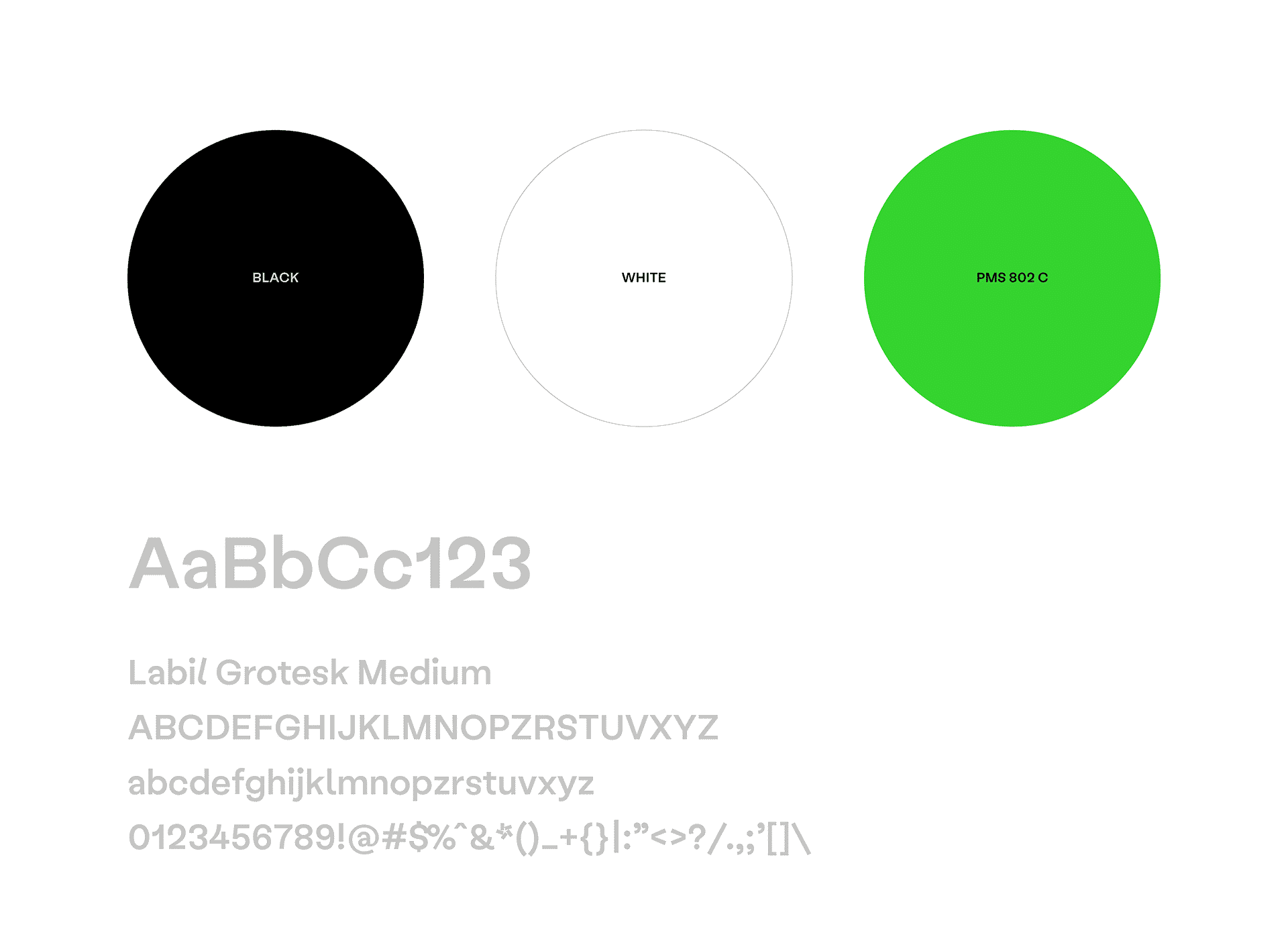
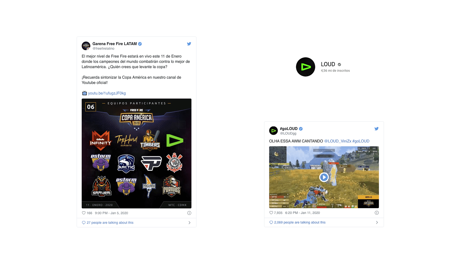
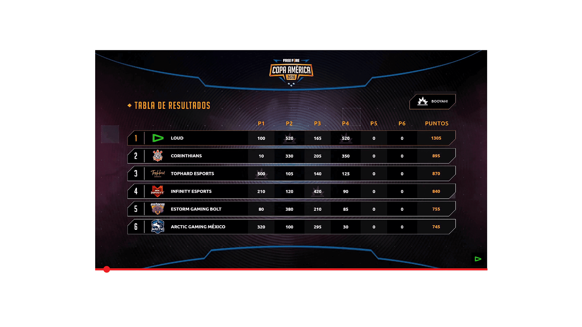
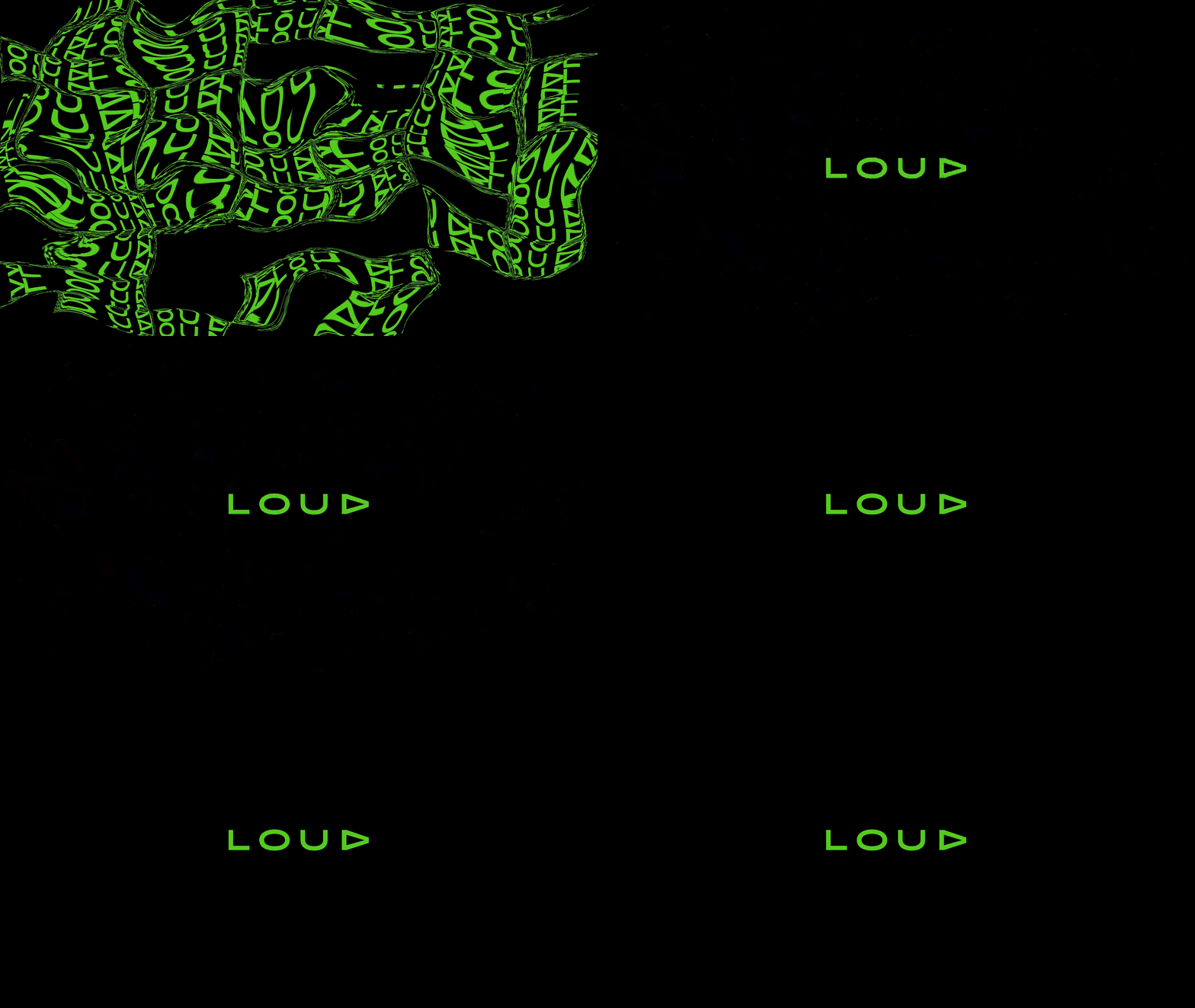
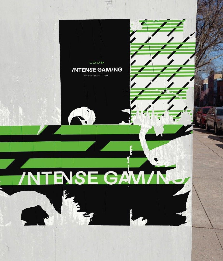
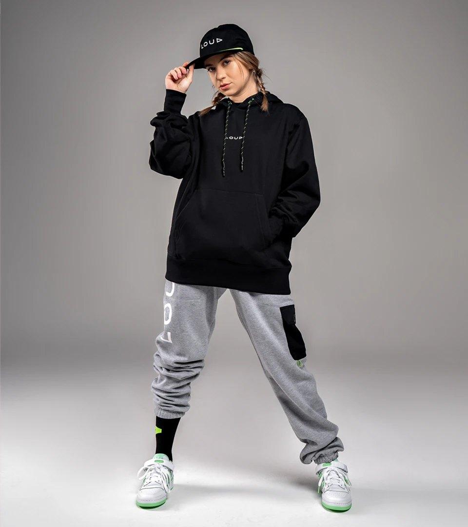
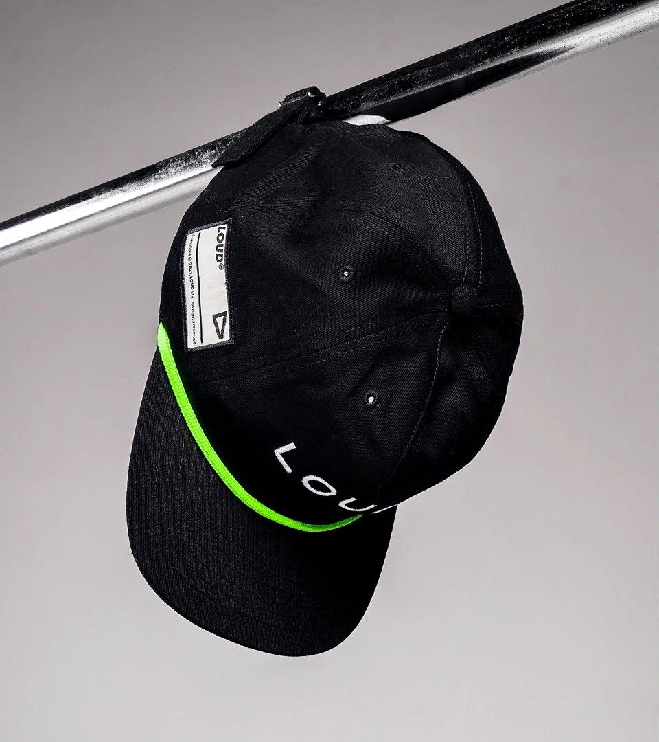
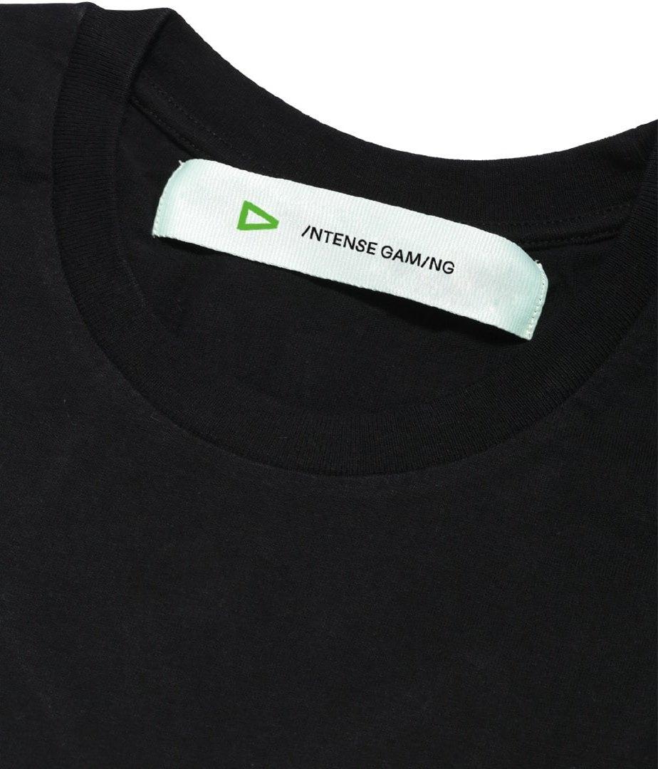
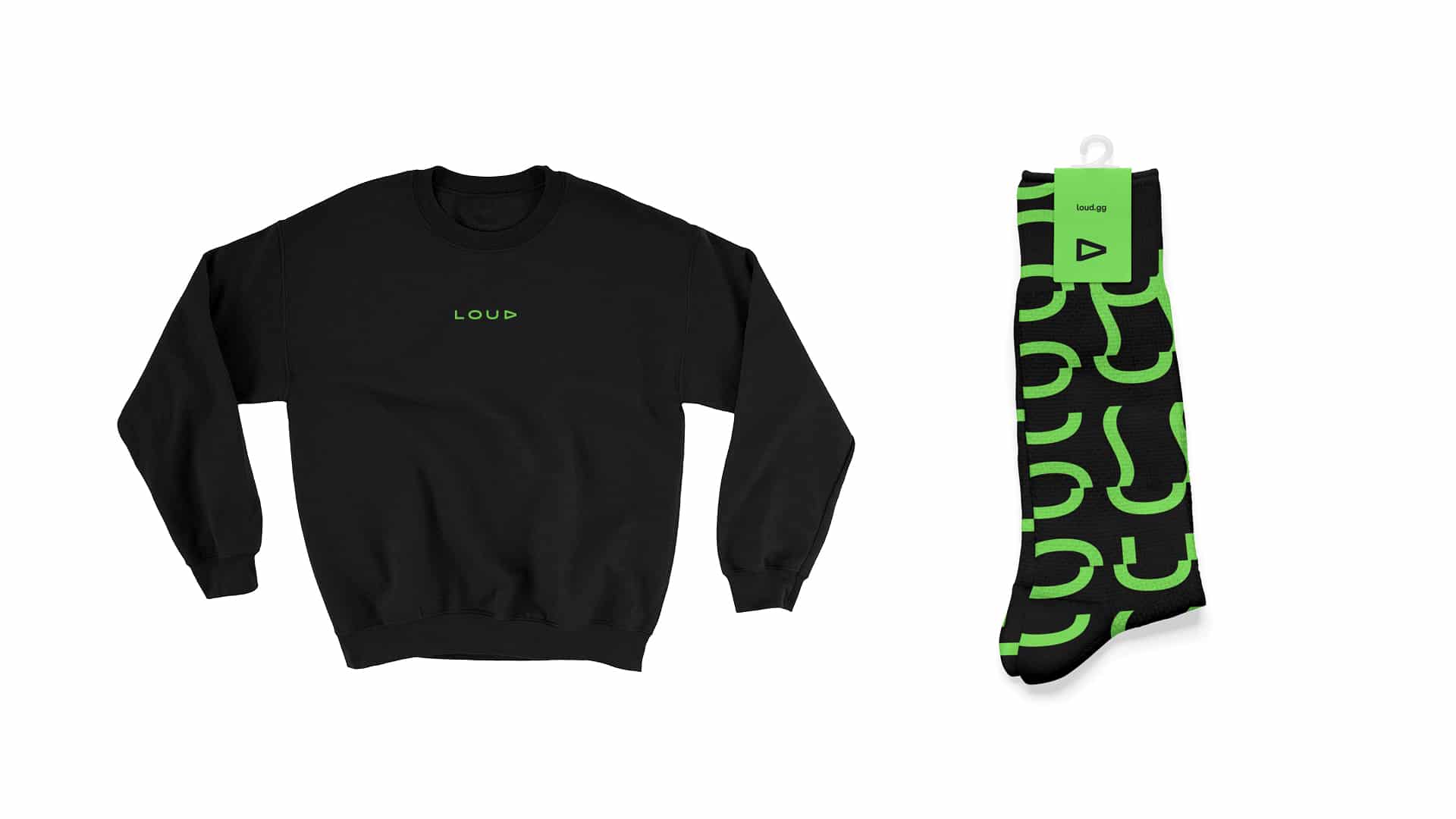
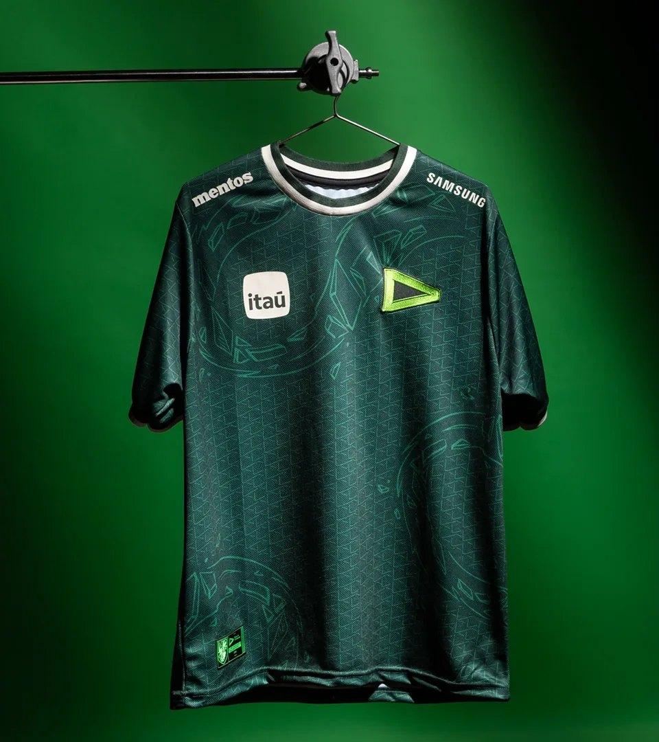
LOUD is an esports and digital-entertainment brand that needed to speak to a young, passionate audience. BRBAUEN developed the branding and a bold visual language — a vibrant palette and impactful typography — coherent across every touchpoint, from digital environments to physical materials, reinforcing the brand's positioning in the market.
Approach
The branding strategy for LOUD focused on capturing the dynamic and irreverent essence of the brand. We analyzed its positioning in the esports and entertainment market, understanding the need for a visual identity that was memorable, energetic, and capable of resonating with a young and passionate audience. Every design decision reflected the brand's strong and fearless personality.


- Client
- LOUD
- Year
- 2020
- Sector
- Entertainment & SportTechnology
- Services
- BrandingIdentidade VisualDireção CriativaDesign Gráfico
Linguagem
Language
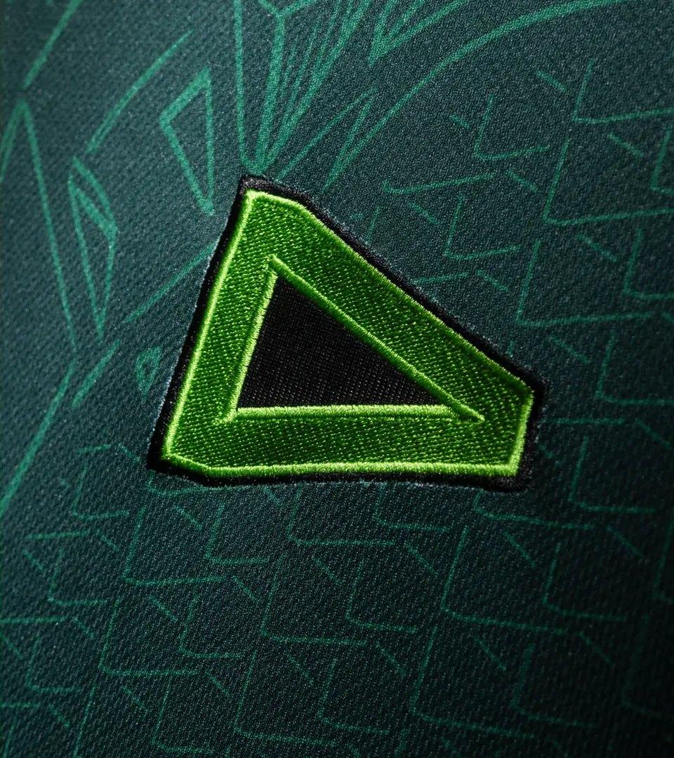
LOUD's visual language is strong, bold, and contemporary. We used a vibrant color palette and impactful typography to create an identity that stands out in the crowded digital entertainment space. The visual language works consistently across all touchpoints, from digital interfaces to physical materials, maintaining brand cohesion.
Resultados
Results
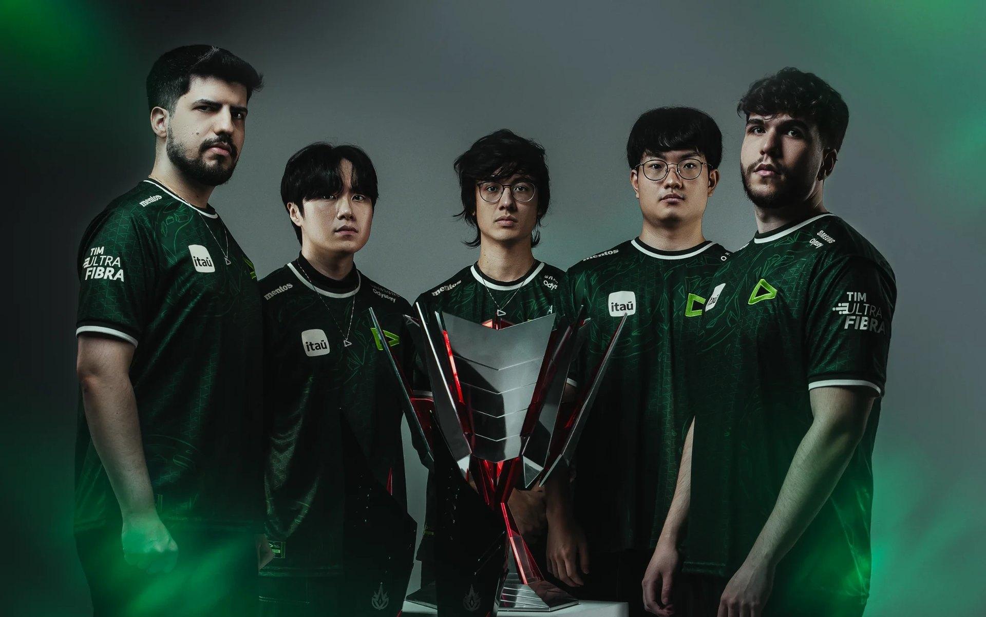
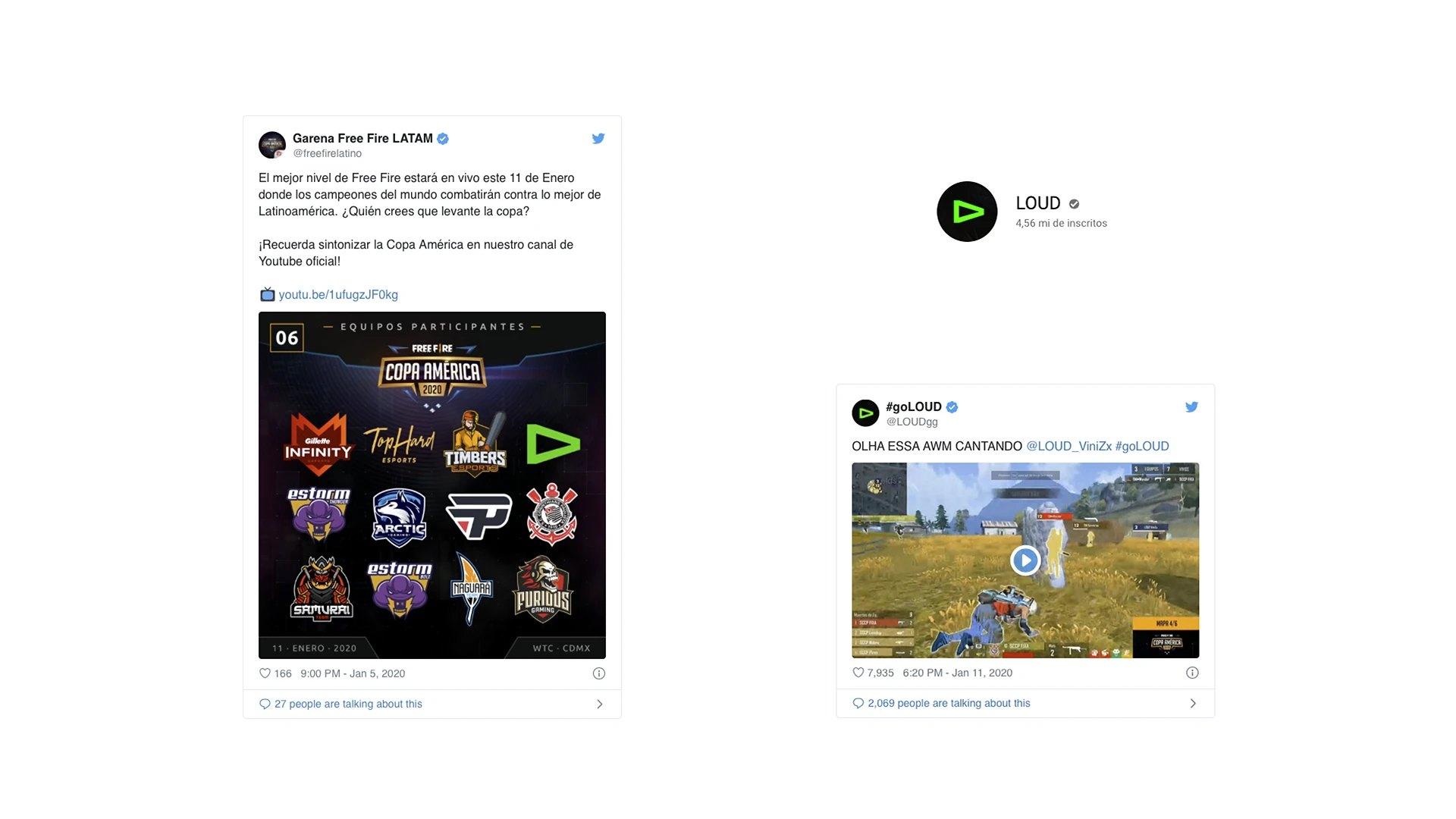
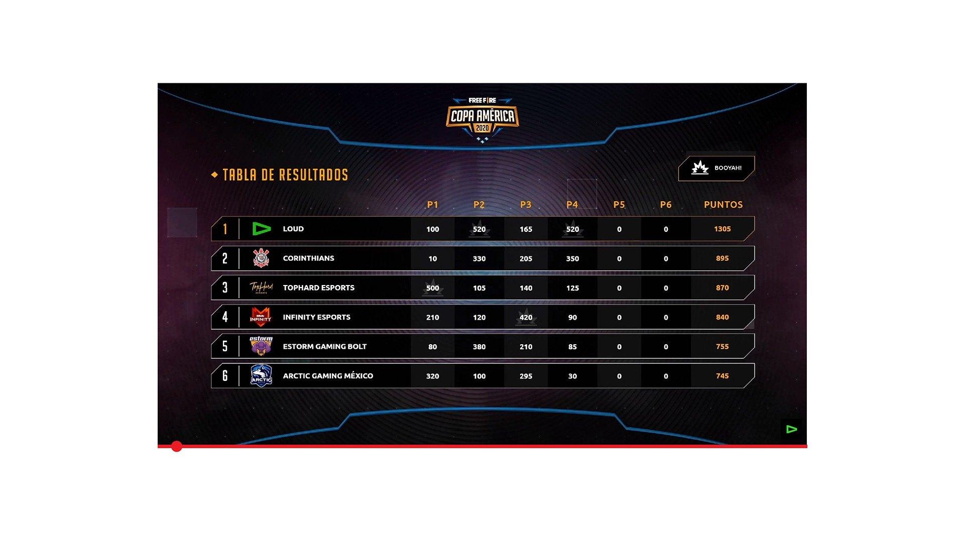
The results of implementing LOUD's new identity were significant. The brand gained a striking visual presence in the esports market, establishing immediate recognition among its target audience. The developed identity system provides flexibility for diverse applications while maintaining the visual consistency that reinforces the brand's market positioning.

Impact
Recognition
 14th Brazilian Design Biennial, 2024
- Behance, 2021
Team
Select work
BlueBenx
A crypto fintech in a country short on financial literacy, branded to make the complex clear
More Info →