BlueBenx
BlueBenx
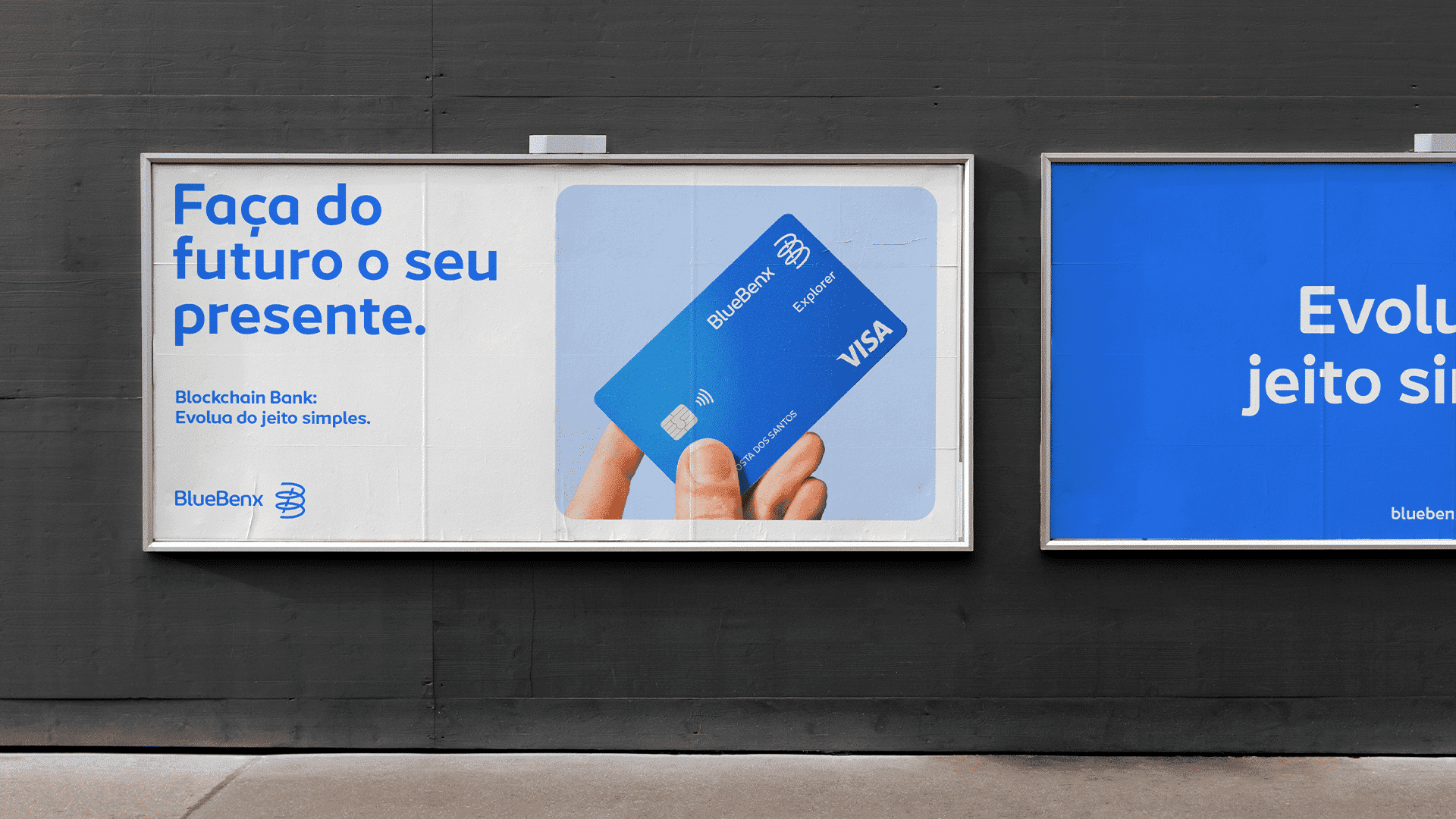
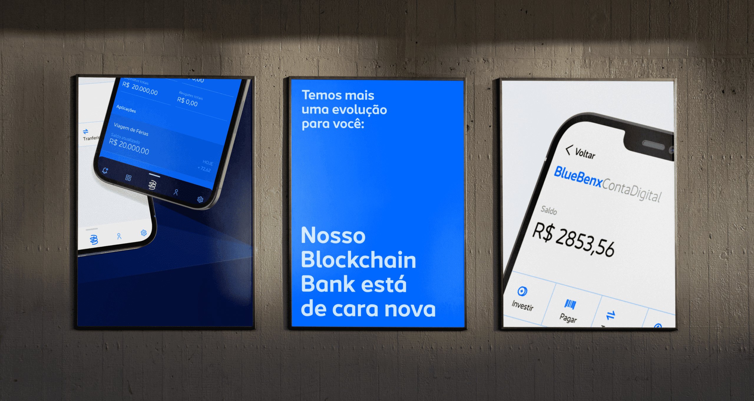
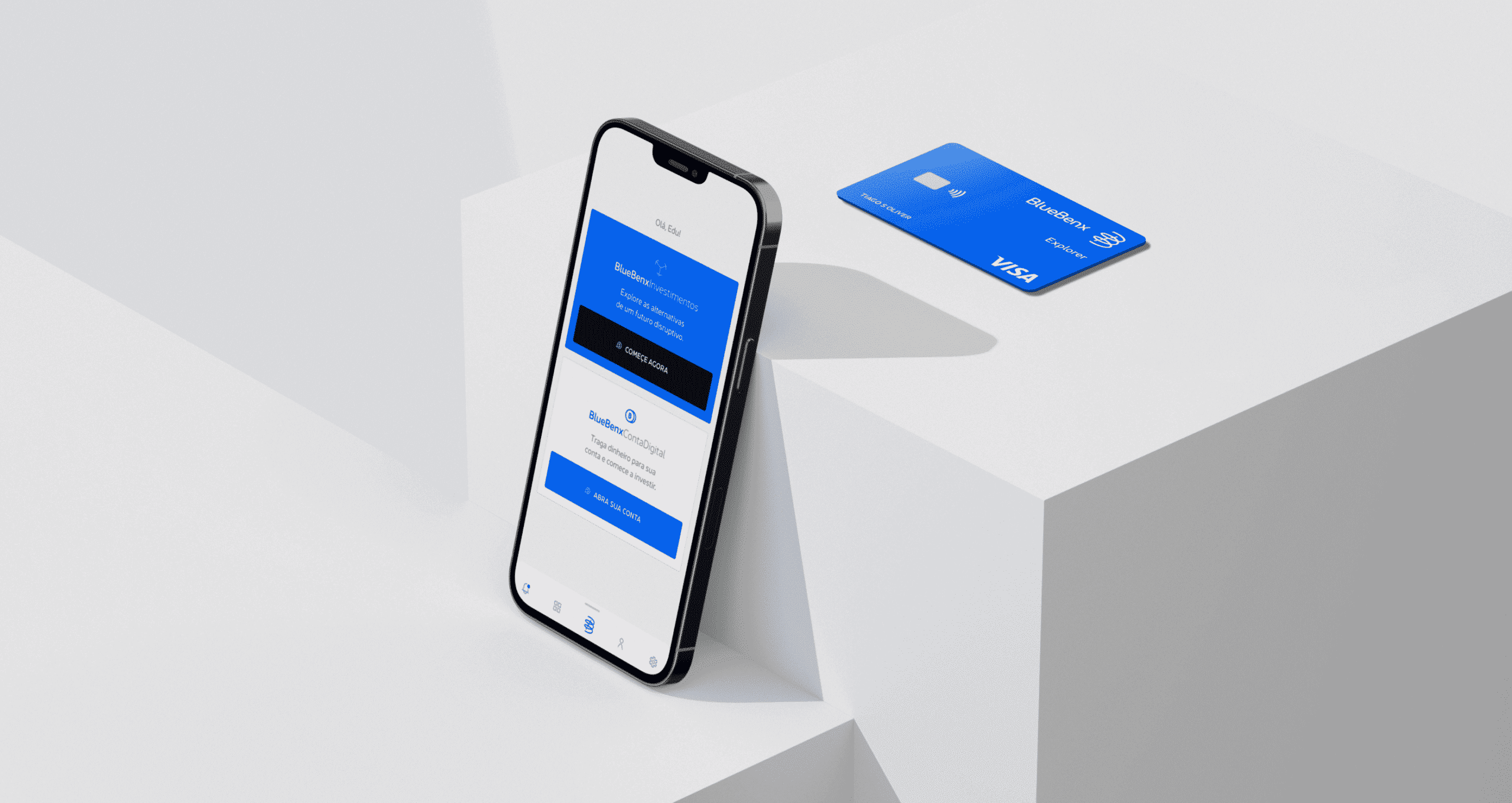
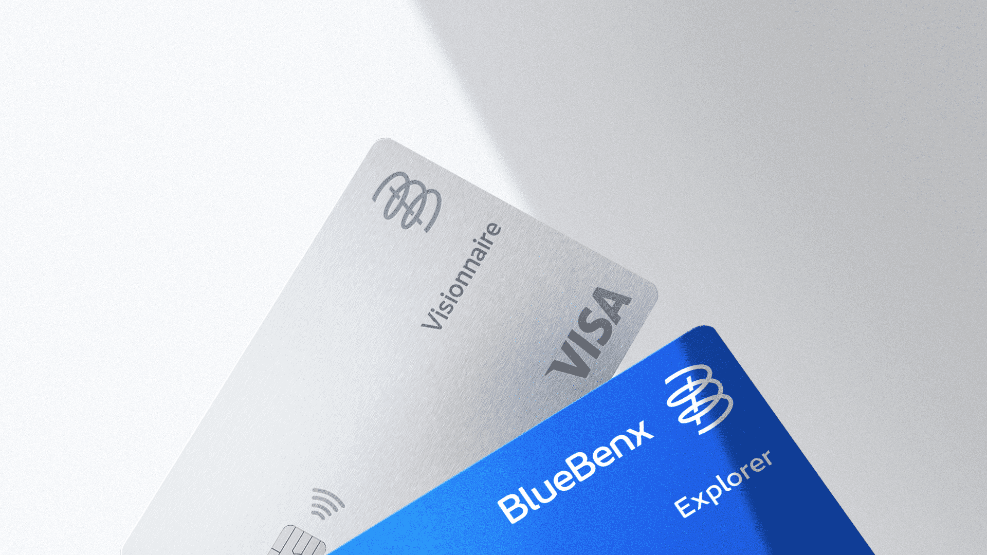
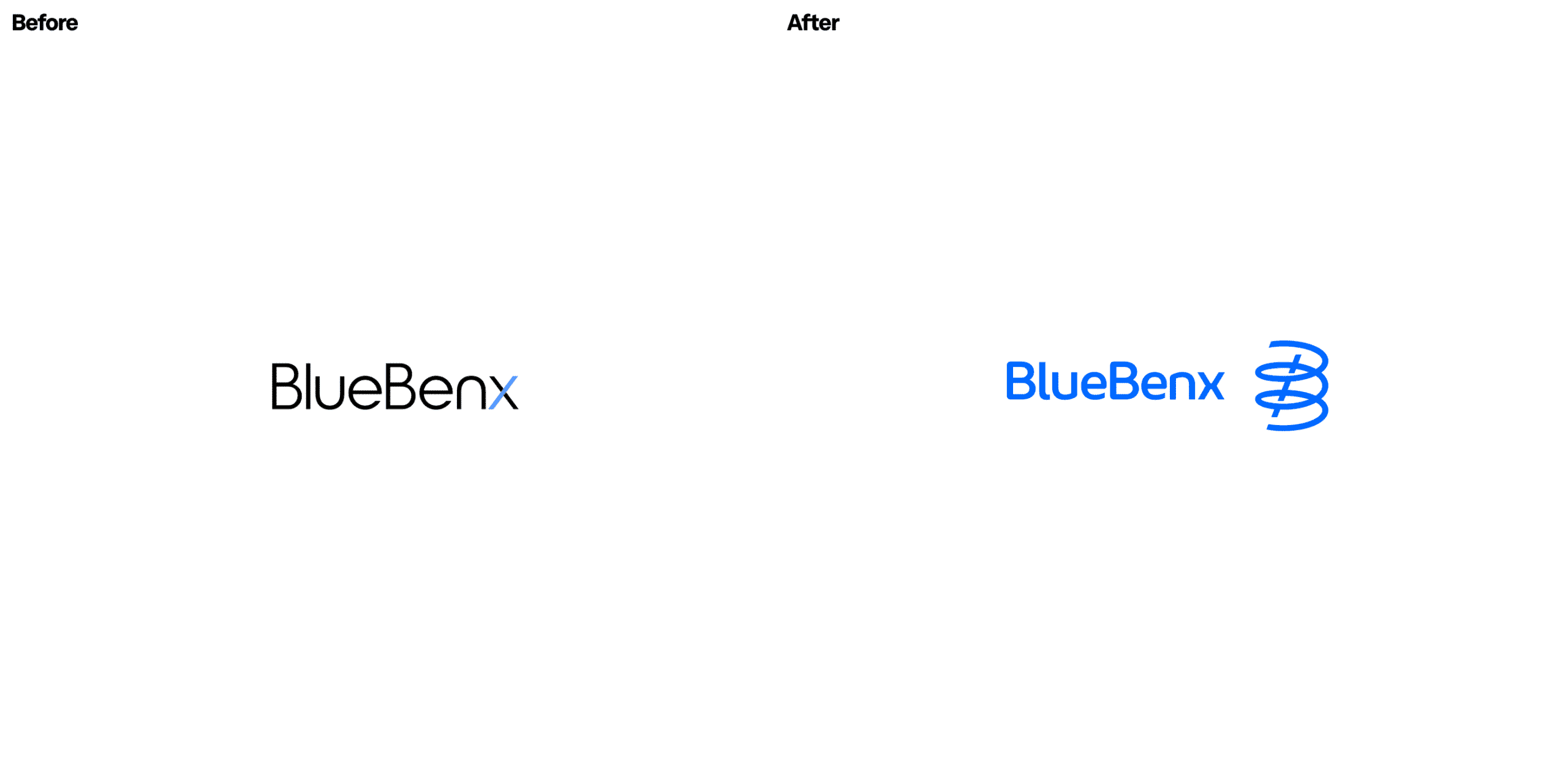
BlueBenx is a fintech specialising in cryptocurrencies that needed to explain a complex subject clearly in a country with low financial literacy. BRBAUEN created the positioning and brand identity, with a double-'B' symbol drawn from the concept of leverage and a visual system that conveys security and stays coherent from the digital account to the rewards programme.
About
Brand Identity Project for a fintech specialist in cryptocurrencies.
The great stimulus of this project was to design a brand identity that presents the subject clearly and simply in a country where financial education is neither developed nor popularised. To better understand the identity to be developed, we created a portrait of the Bluebenx investor profile through research, so that the brand image connects with the brand's main public personas — from knowledge to relationship with Bluebenx. The central idea was based on building an explanatory, didactic communication that conveys the necessary security and is easily assimilated.

- Client
- BlueBenx
- Year
- 2022
- Sector
- Technology
- Services
- Posicionamento de MarcaIdentidade de MarcaDigital Design SystemApp DesignIconografia
Abordagem
Approach
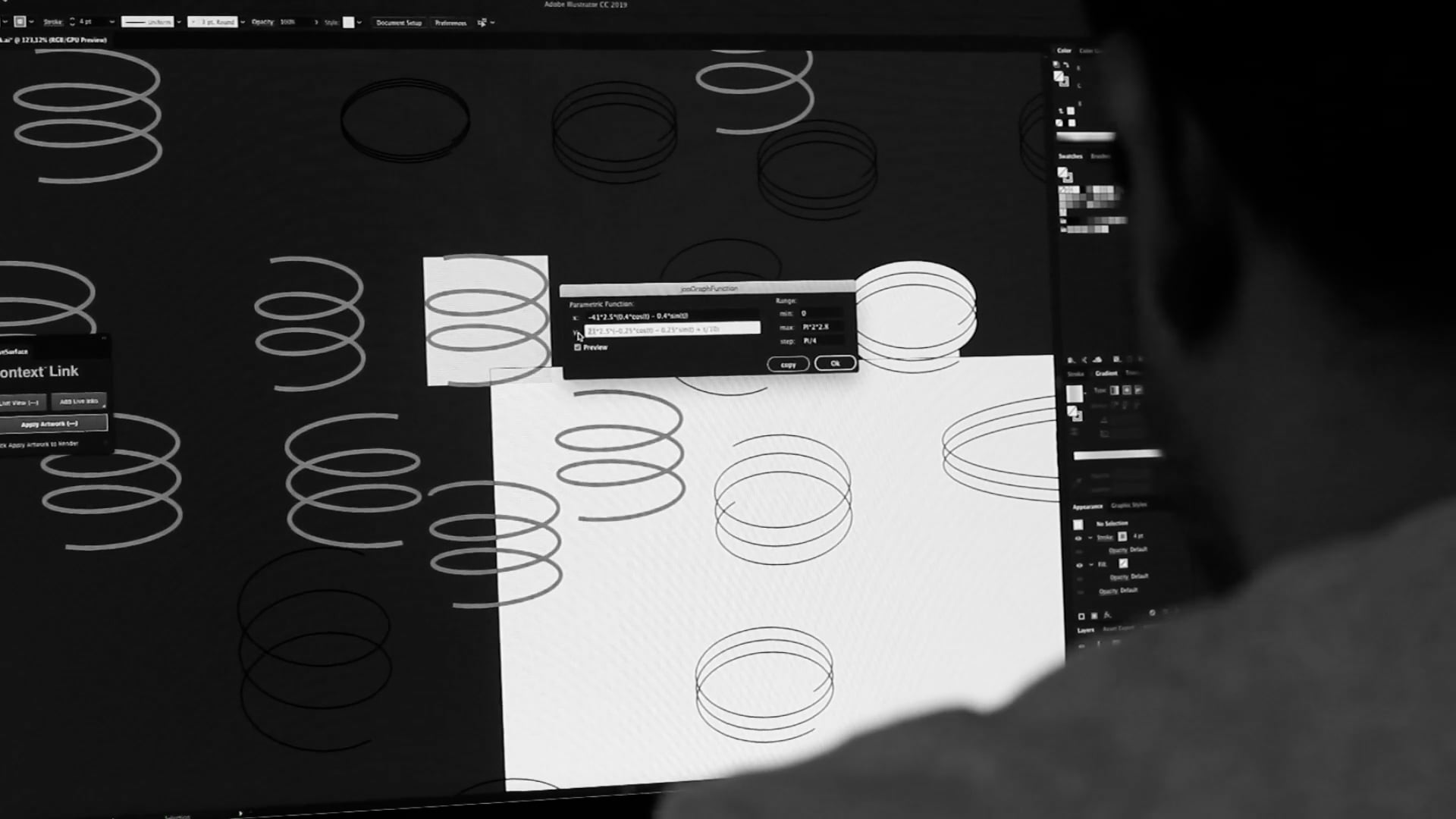
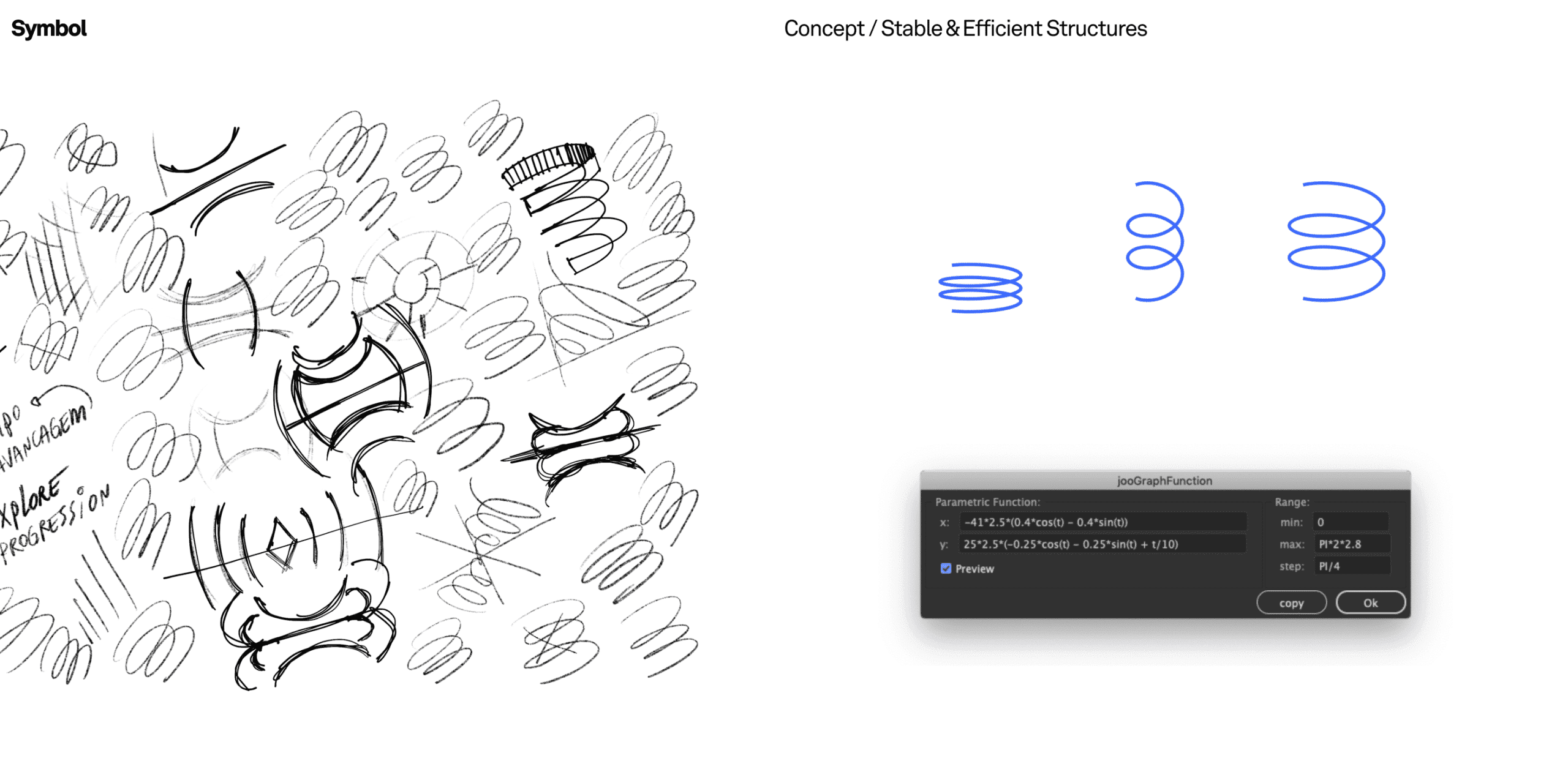
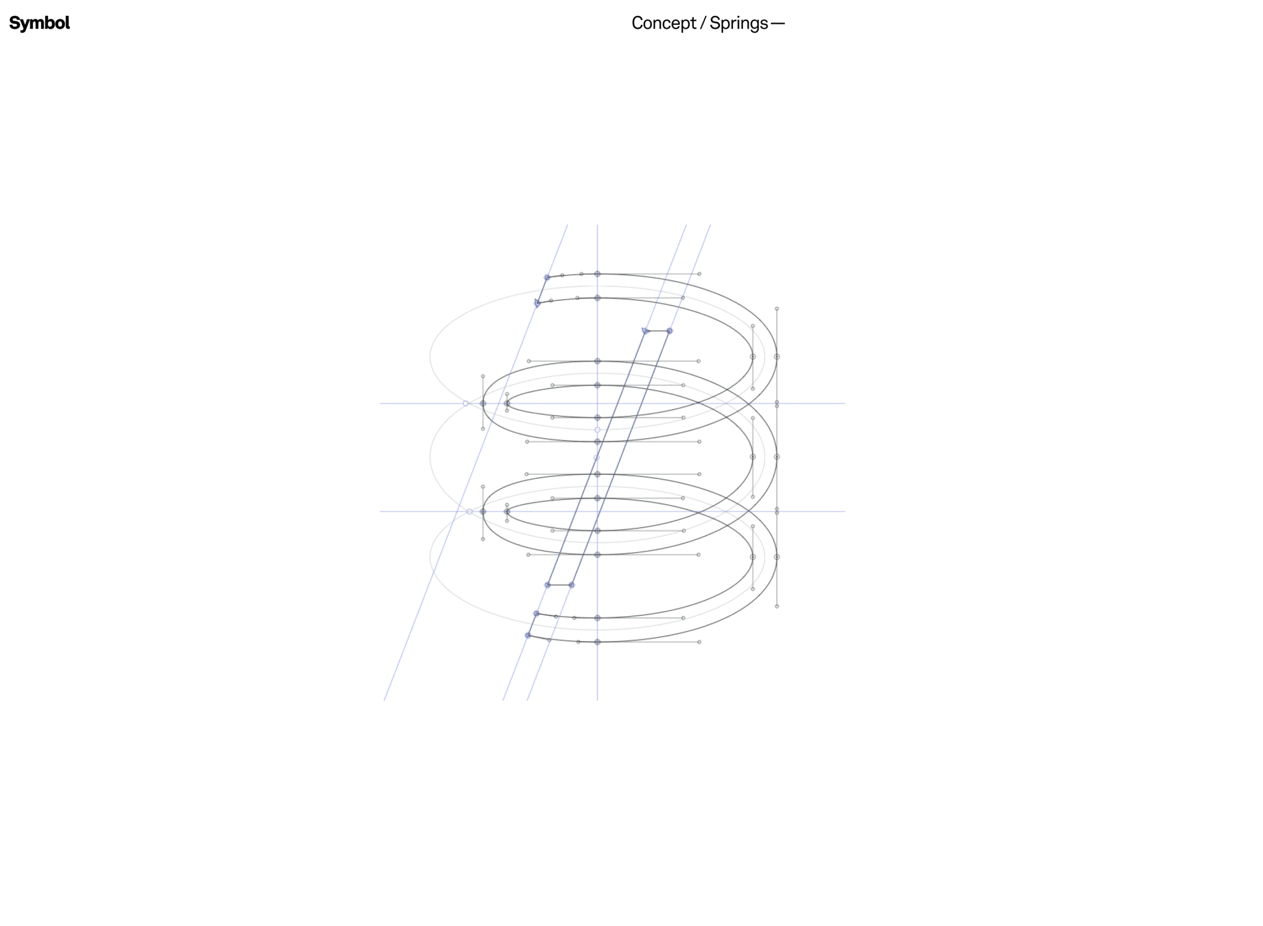
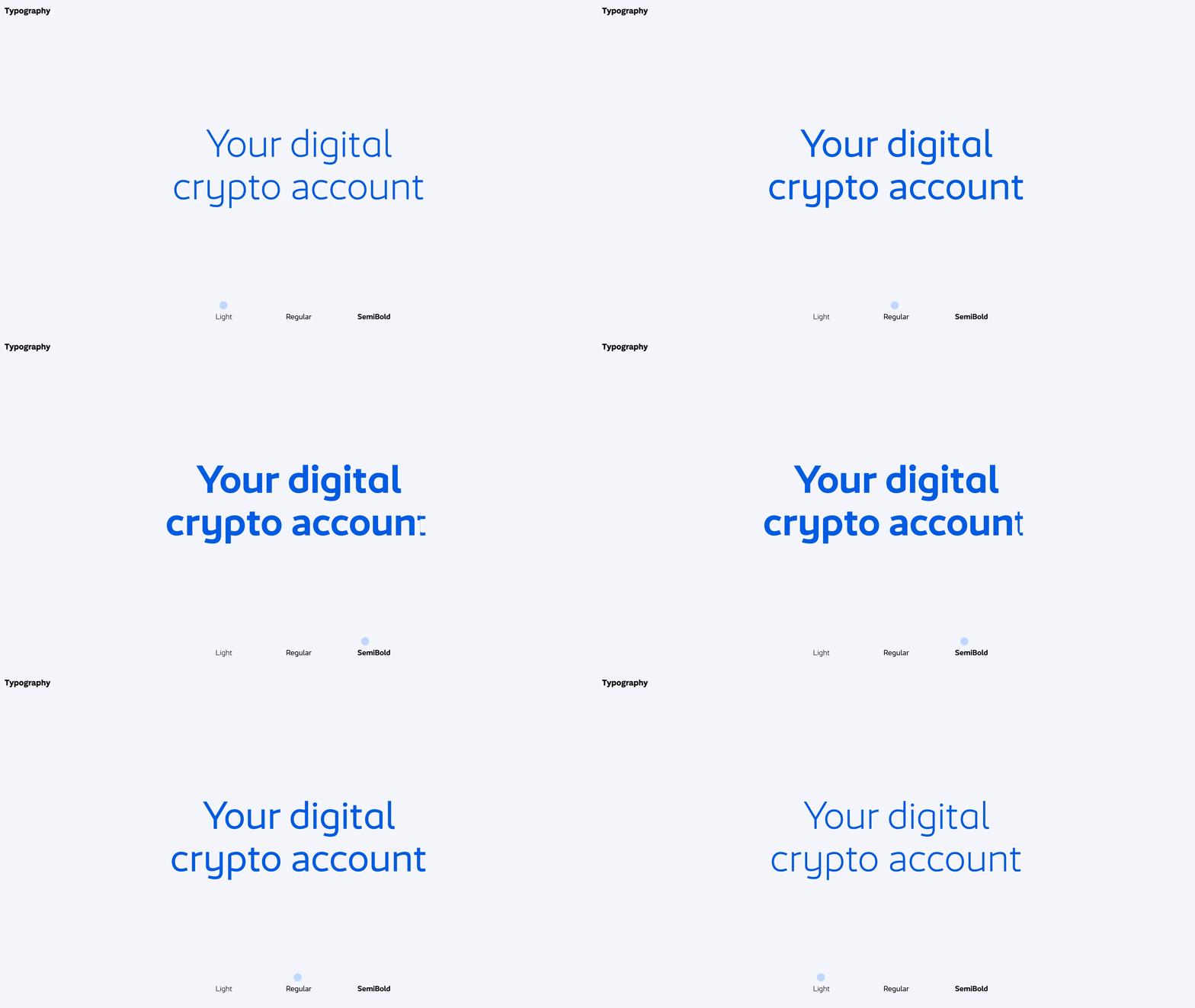
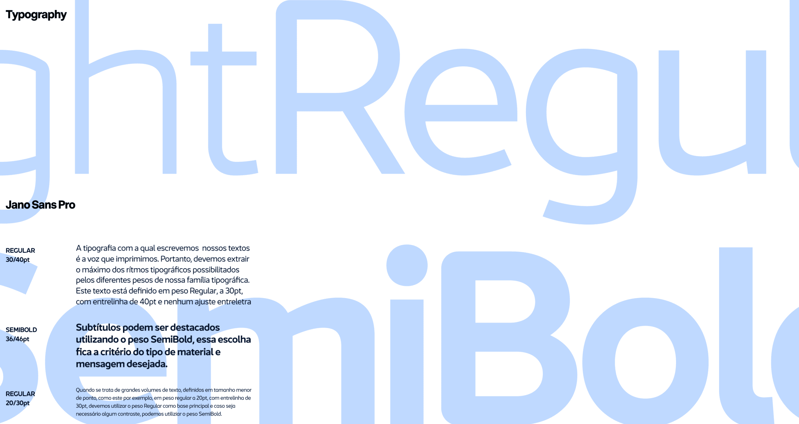
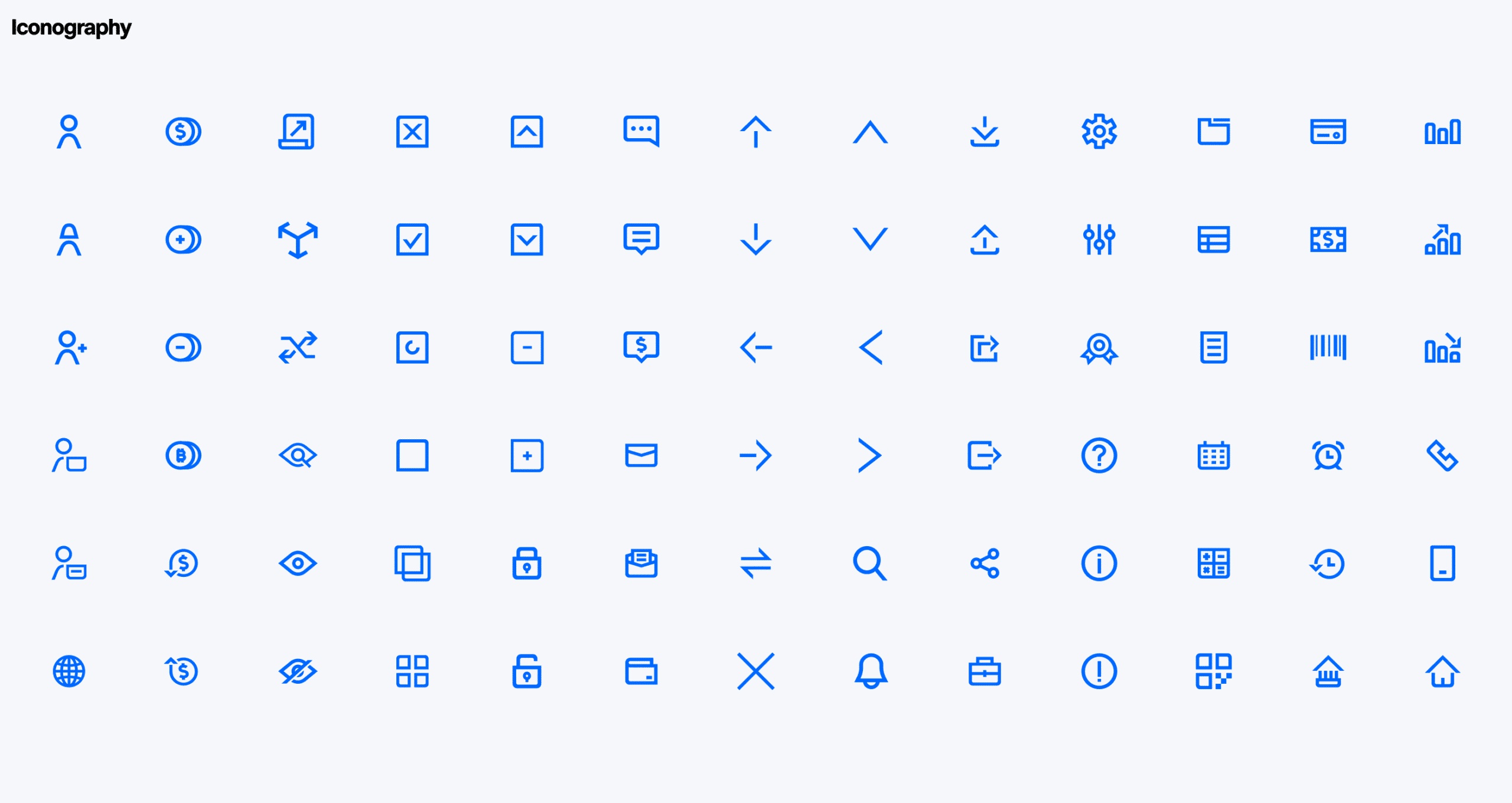
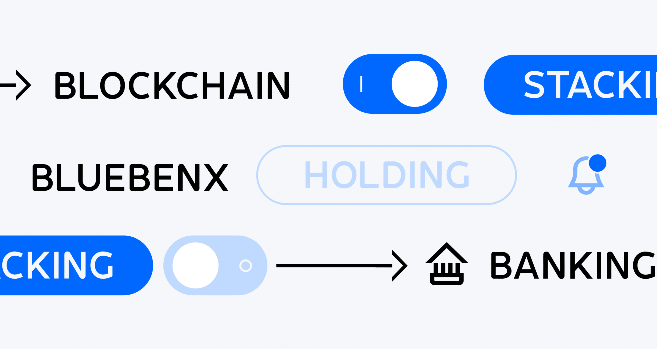
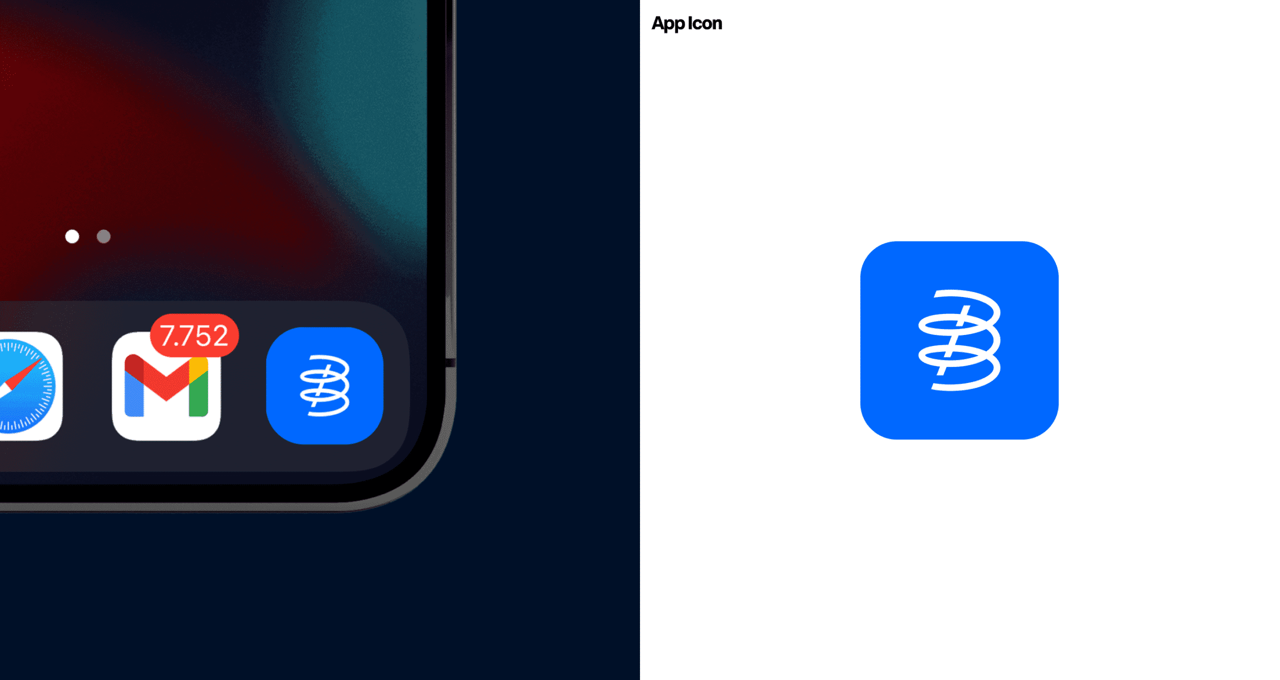
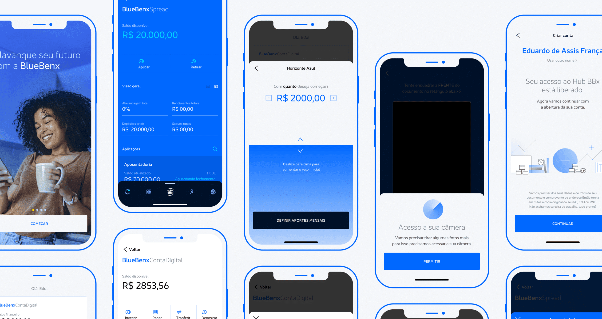
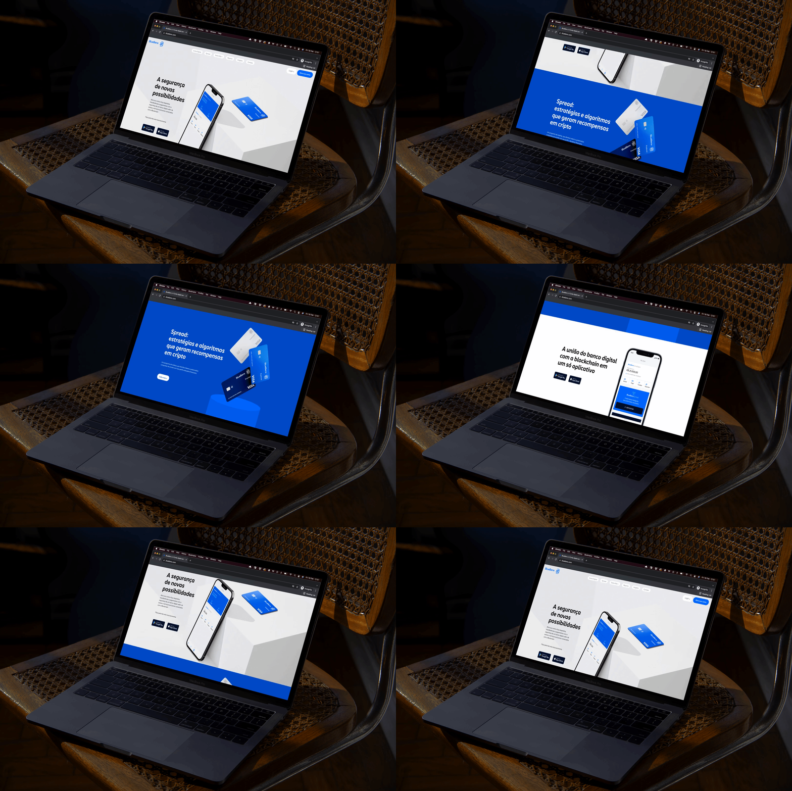
We took the concept of leverage into the brand's narrative, using a physics approach to draw its symbol: from arithmetic spiral to elastic force concepts, the Bluebenx symbol was mathematically designed to resemble a double "B", referencing the company name and — above all — representing the leverage cycle made by the brand's investment services. For the logotype and institutional typography, we considered a modern, intuitive and simple language. We were guided especially by the brand's greatest asset: its presence in digital media (apps, mobile phones, screens). The identity had to behave consistently across the company's different fronts: its digital account, investment products, rewards programme, Exchange, and more.

Titulo
A Visual Metaphor



Impact
Recognition
 Monogram Logo, Counter-Print · 2024
- Behance, 2022
Team
Select work
Wixx
A generic telecom, repositioned as a corporate specialist with its own typeface
More Info →