Giulietta — Embers, fire and subversive nature
Giulietta
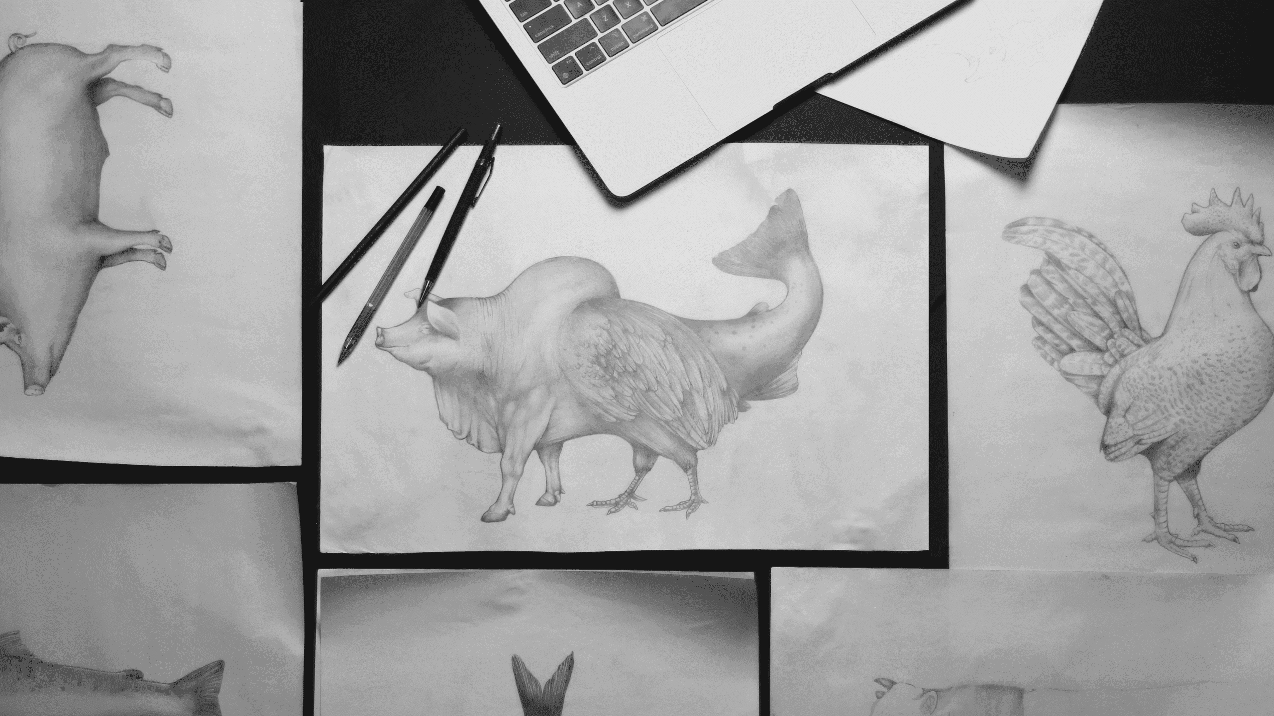
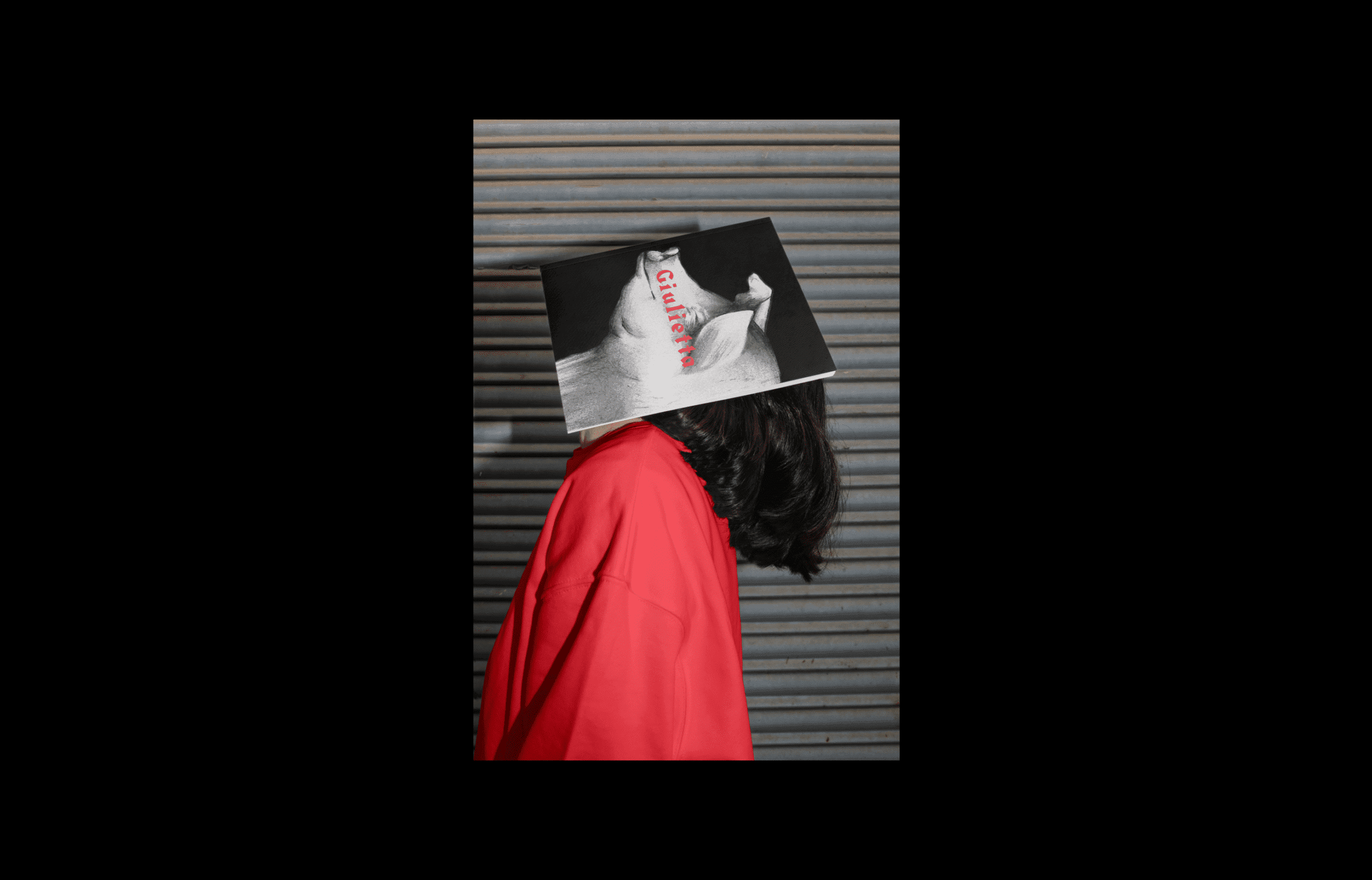
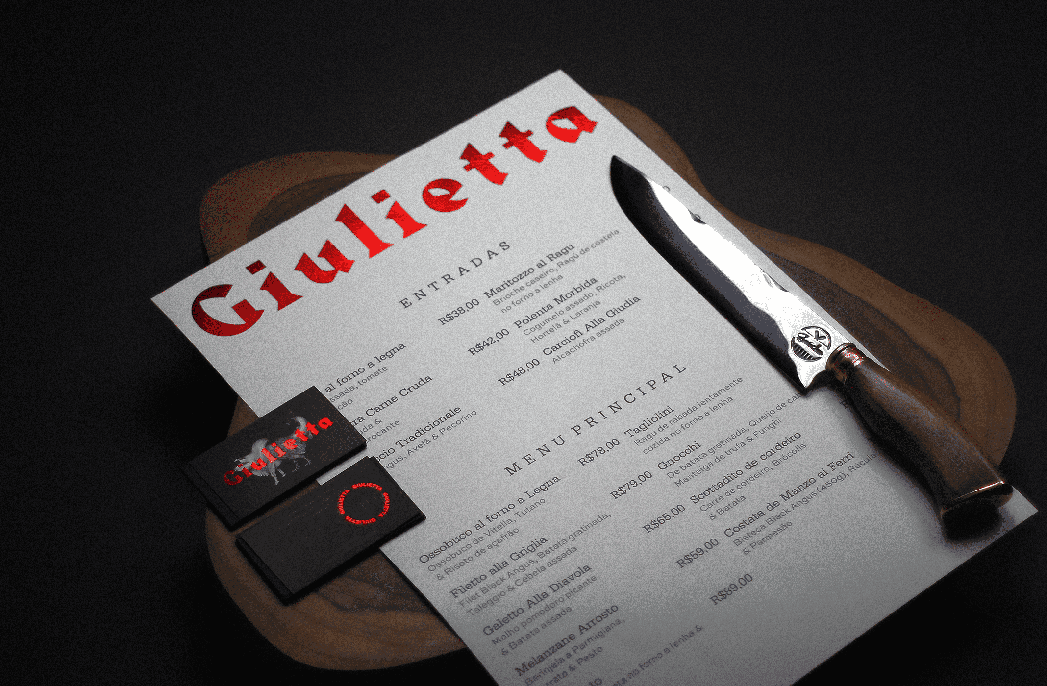
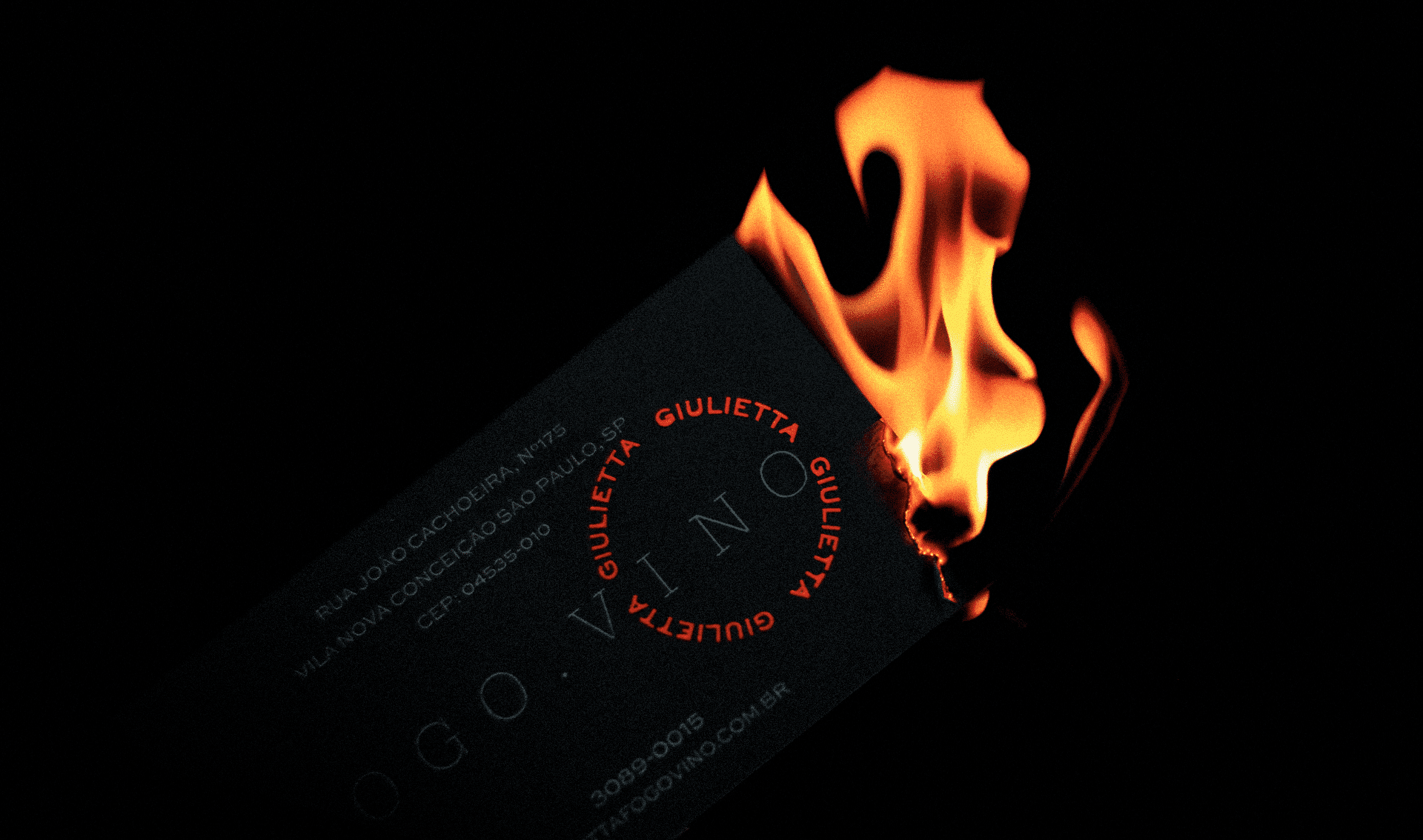
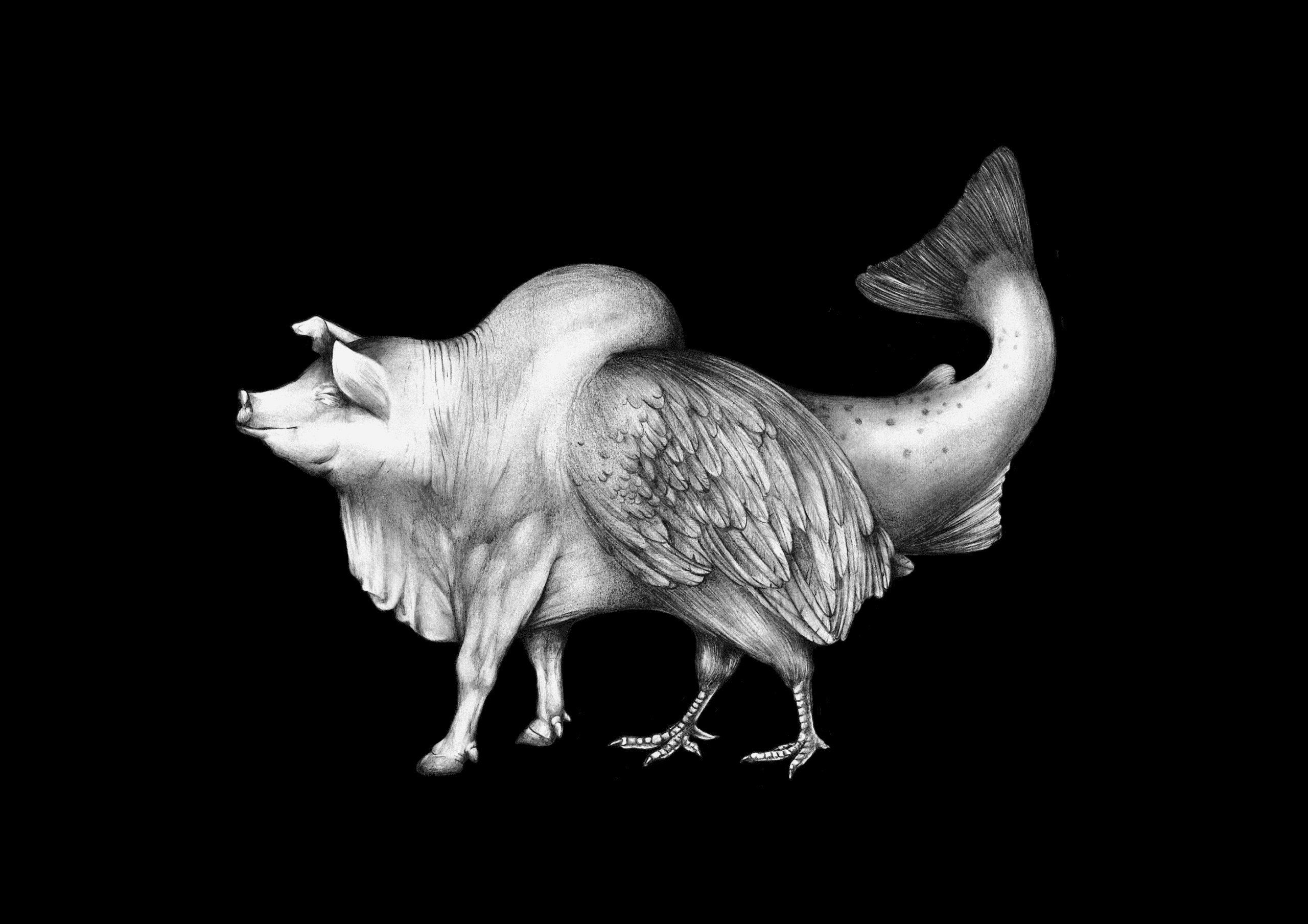
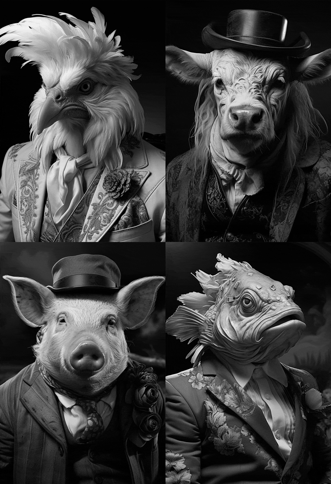
Giulietta is chef Rodolfo de Santis's house, an original ember kitchen inspired by Italian cuts and driven by an 'Outlaw' DNA. BRBAUEN translated that break from convention into visual language and illustration: a chimera drawn in pencil — pig, ox, chicken and fish — strong enough to identify the house even without a logo.
About
Based in São Paulo and created by Chef Rodolfo de Santis, Giulietta is born from the chef's desire to go beyond the barbecue approach already widespread in Brazil. The intention was to reproduce and build upon typical Italian cuts — an unprecedented focus in São Paulo — without restricting to beef, and to propose an authorial approach whose DNA was fundamentally nonconformist and mutant.
Following this line of thinking, we understood that the identity and all its elements should reflect this break with convention proposed by the chef.
- Client
- Giulietta Fogo & Vino
- Year
- 2023
- Sector
- Food & BeverageHospitality
- Services
- Brand Visual LanguageIllustration Style
Process
Process
During the process, the archetypal "Outlaw" positioning became clear within the brand. We understood that we could not create a visual identity with what is expected of one: logotype, symbol, and ordinary accessory elements.
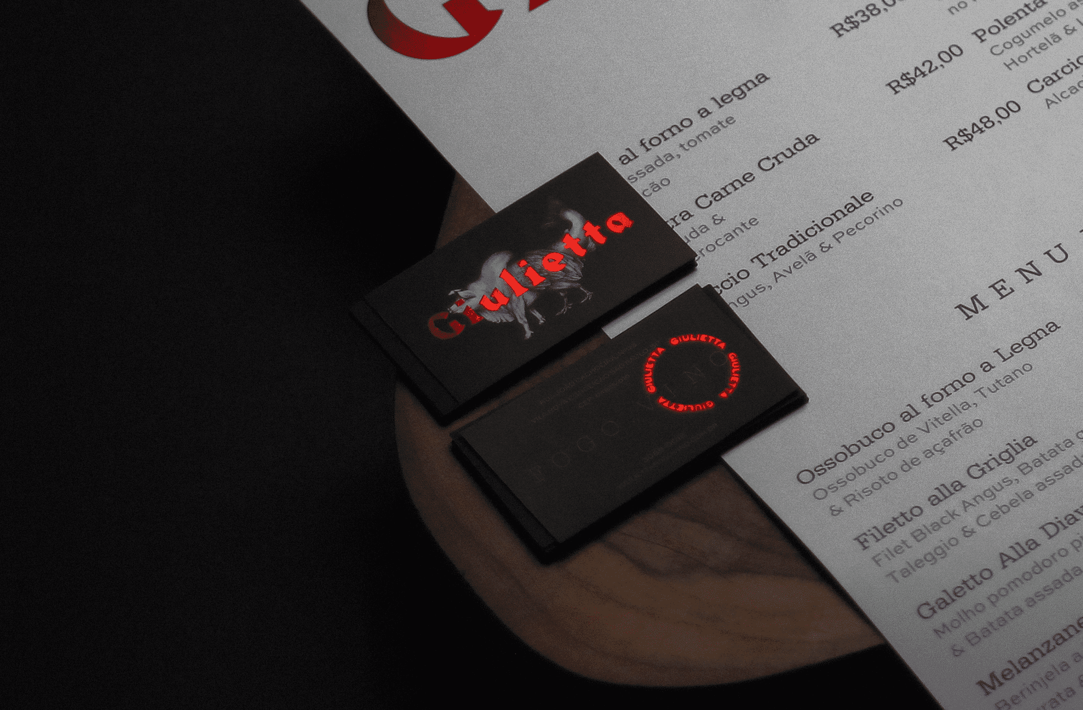
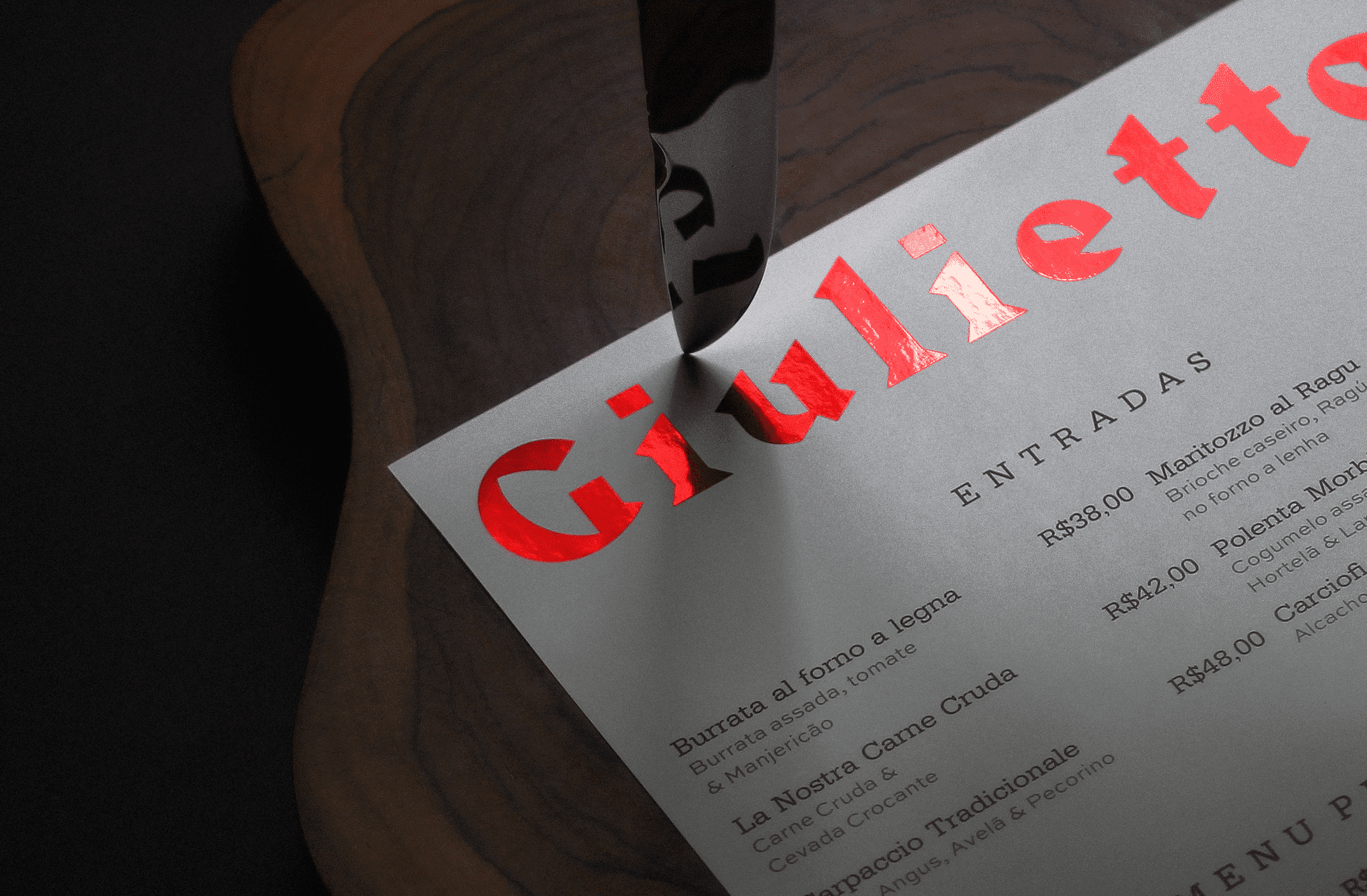
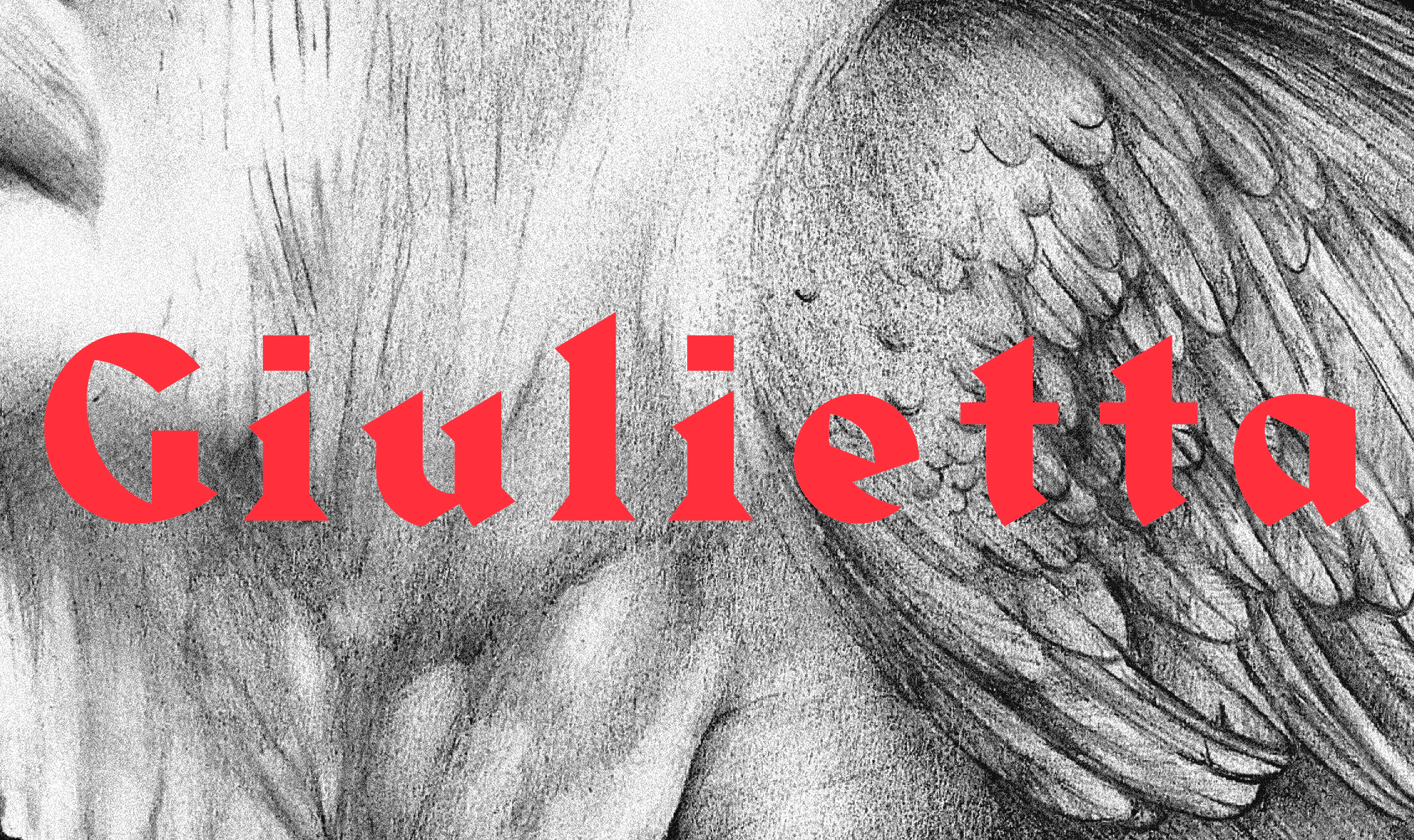
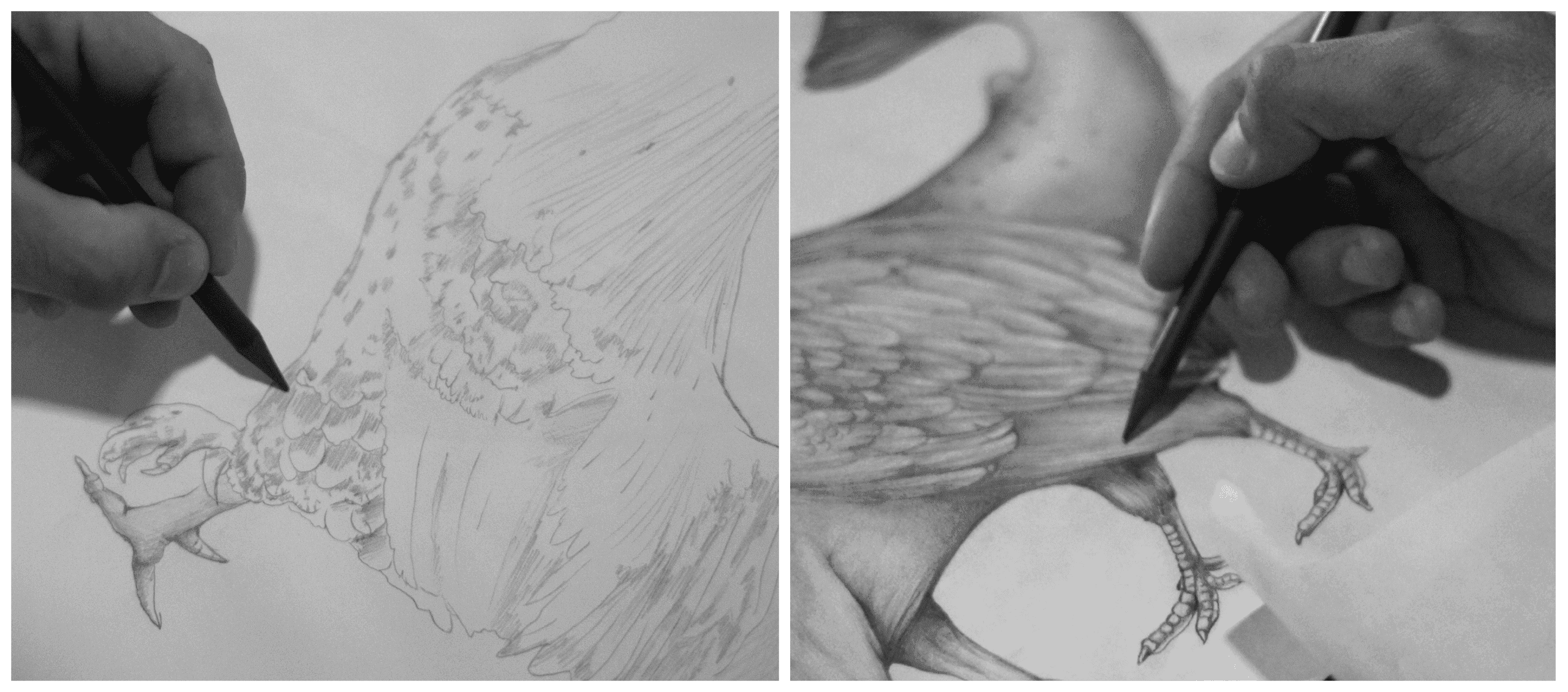
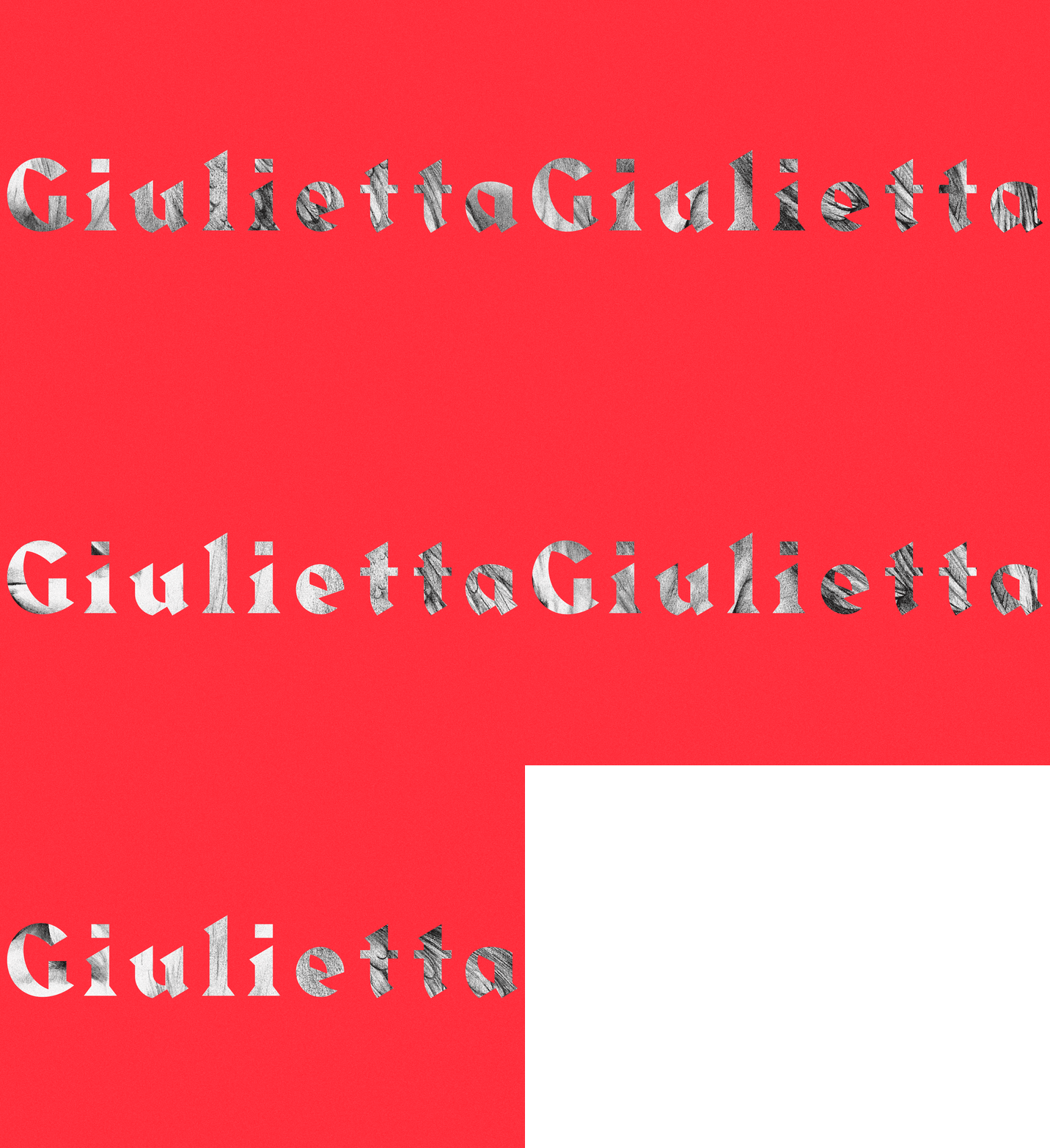
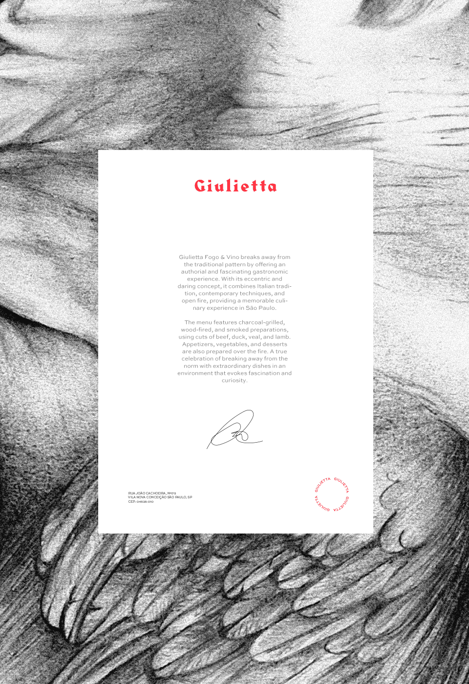
The chosen path was to create a work that encapsulated the chef's restlessness in creating the new house — an artistic element that, even without a logotype, could have enough force to identify it. With this goal, we created a pencil illustration of a chimera composed of 4 animals: Pig, Ox, Chicken and Fish. Carefully illustrated with a dark and mysterious finish, the illustration is sometimes accompanied by a logotype set in the Harbour typeface, chosen for characteristics that also break with the conventions expected from the contrast produced by the quill in blackletter typefaces.
Impact
Recognition
 13th Brazilian Graphic Design Biennial
- Behance, 2023
Team
Select work
Factorio
An all-day restaurant, named and branded between industrial and Scandinavian aesthetics
More Info →