Escola Aldeia
Escola Aldeia
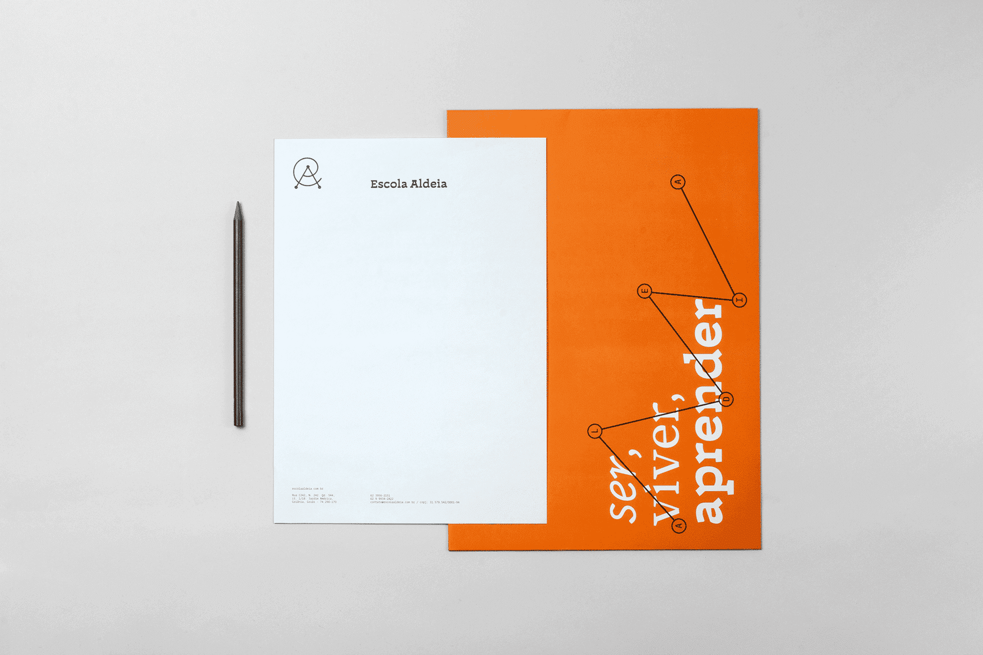
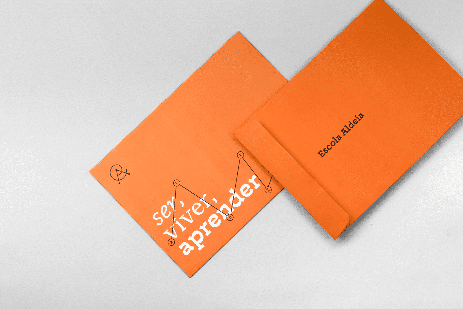
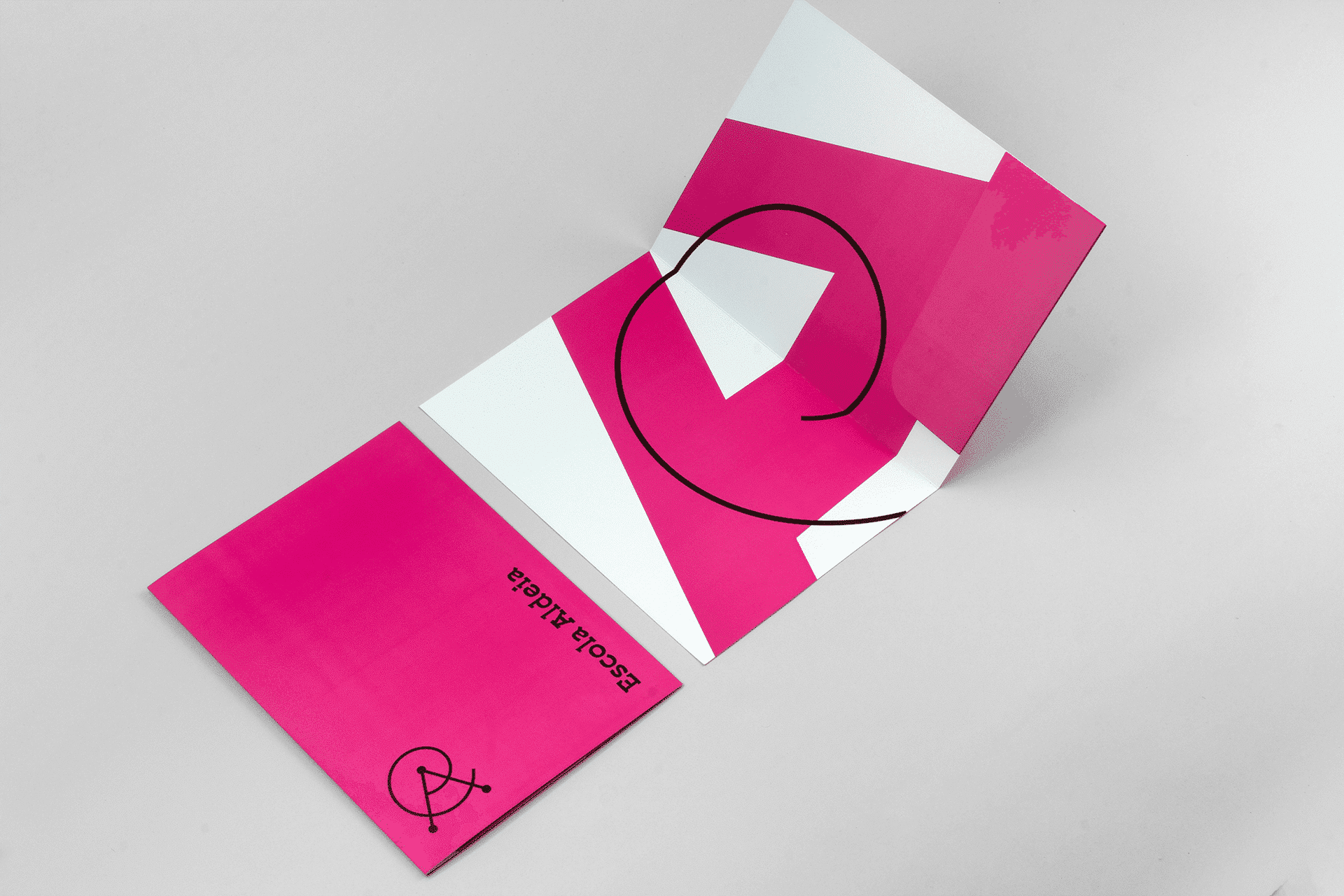
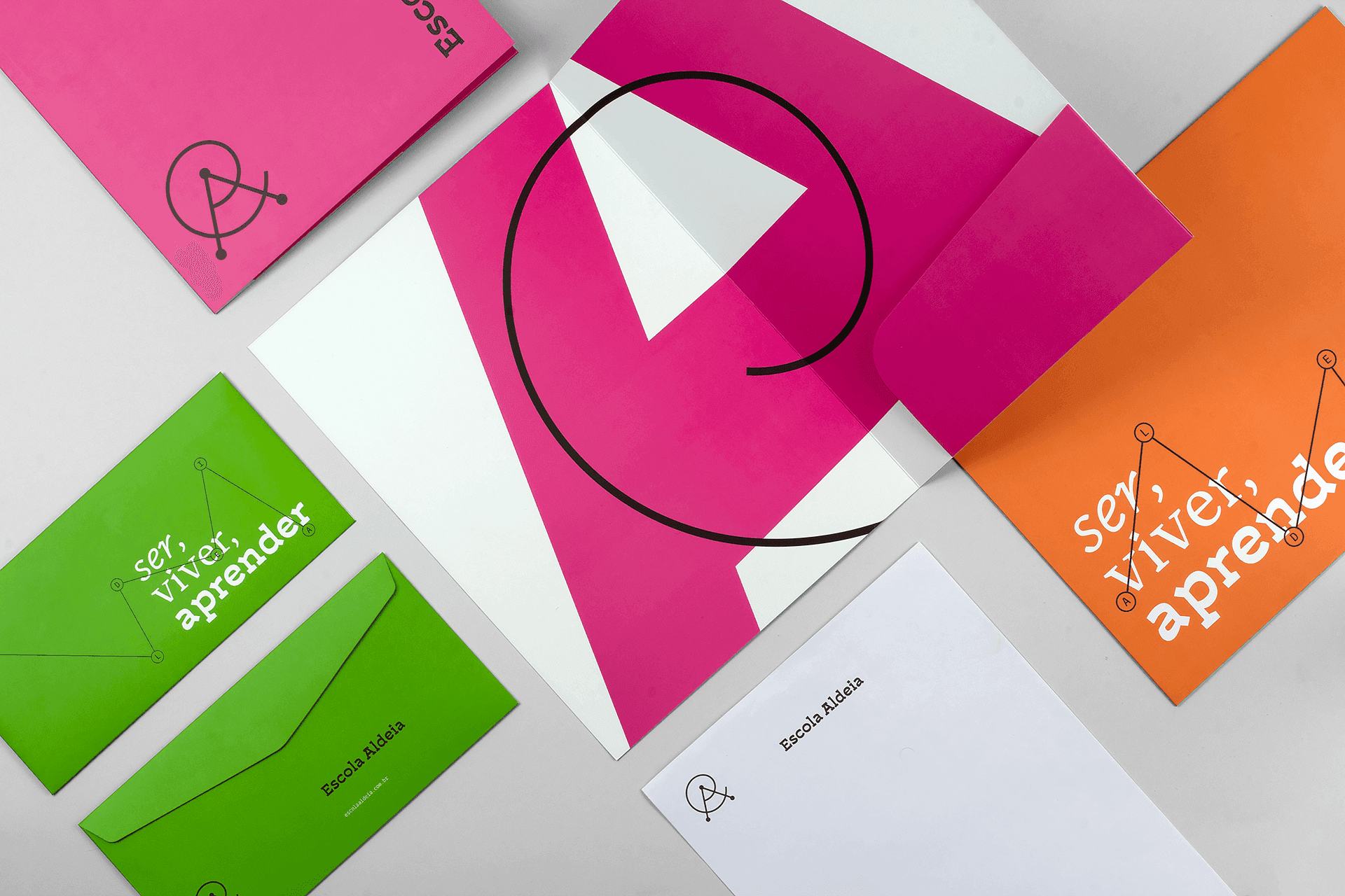
Escola Aldeia was founded as an alternative to traditional schooling, offering community, creativity and contemporary teaching methods. BRBAUEN created the branding and visual identity from the Explorer and Sage archetypes, with a free typographic voice and a palette applied across different materials, to speak to parents looking for new ways to learn.
About
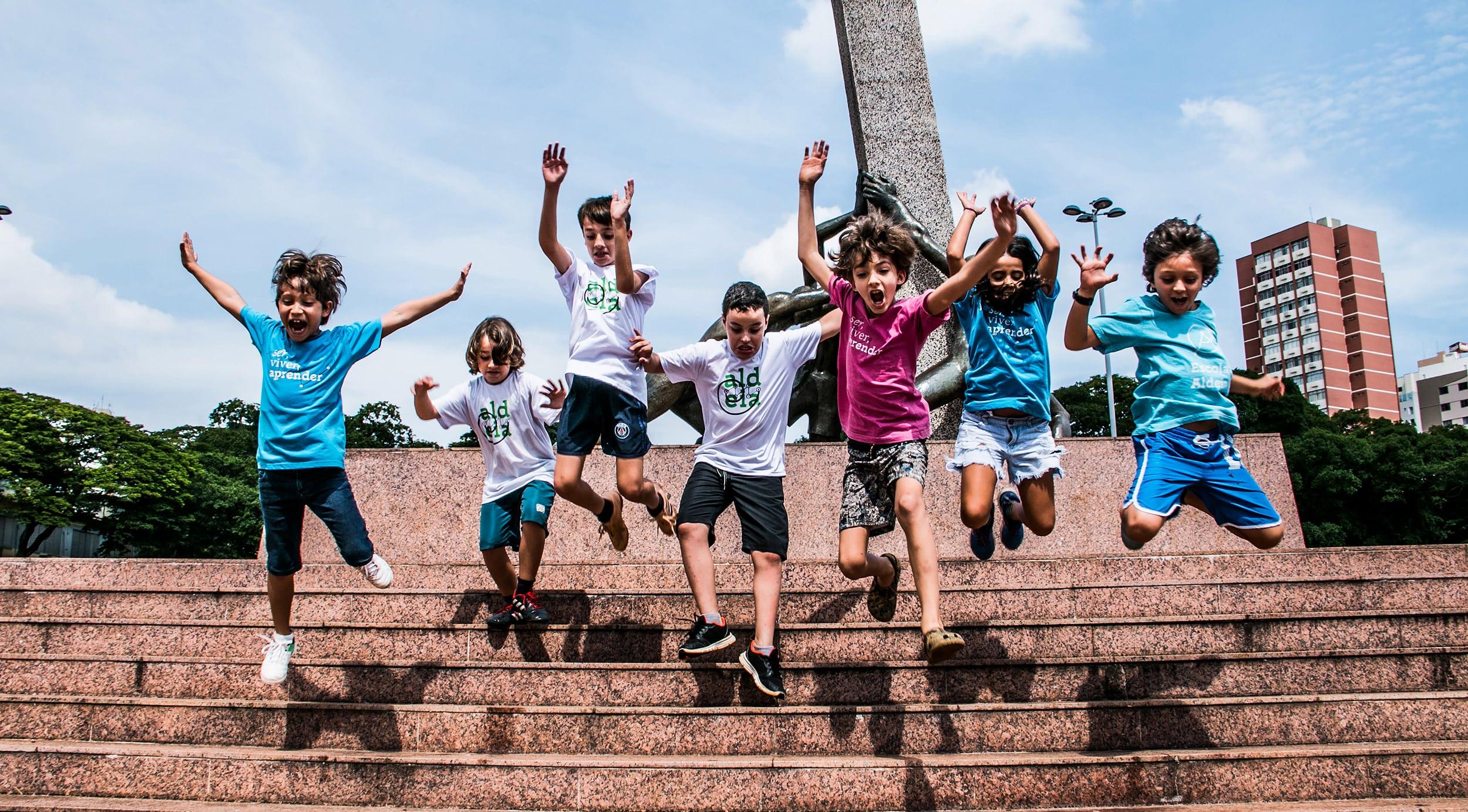
Brand identity development for a primary school and early childhood education institution. Escola Aldeia emerged as a response to the need for change in teaching methods. In a context where we see "school" as hierarchy, linear learning model that nullifies the individual and the exercise of creativity, the school project was born to present an alternative to this education model, offering the new generation a path of community, creativity and more contemporary teaching methodologies.
- Client
- Escola Aldeia
- Year
- 2019
- Sector
- Culture & Education
- Services
- BrandingIdentidade Visual
Abordagem
Approach
The project concept was based on guiding the perception of parents seeking new learning choices, demonstrating through its communication and identity construction a school that has love for knowledge, for others, and for life. Based on research and market diagnosis conducted by the project, we looked at innovative schools and their models to understand how to emphasize all the school's values, in order to build an identity with a strong concept.
Resultados
Results
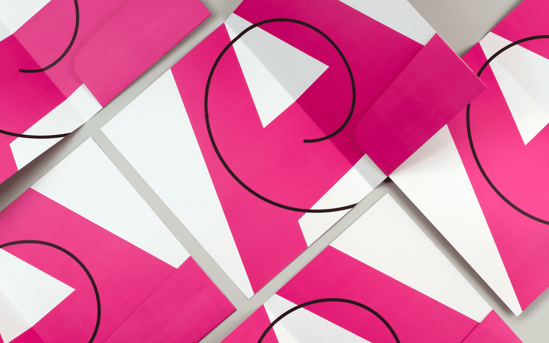
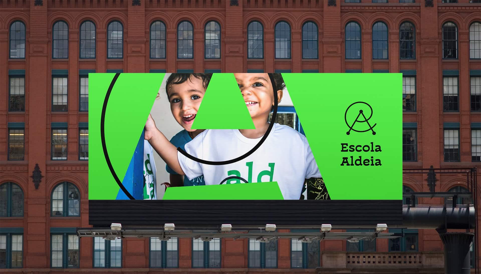
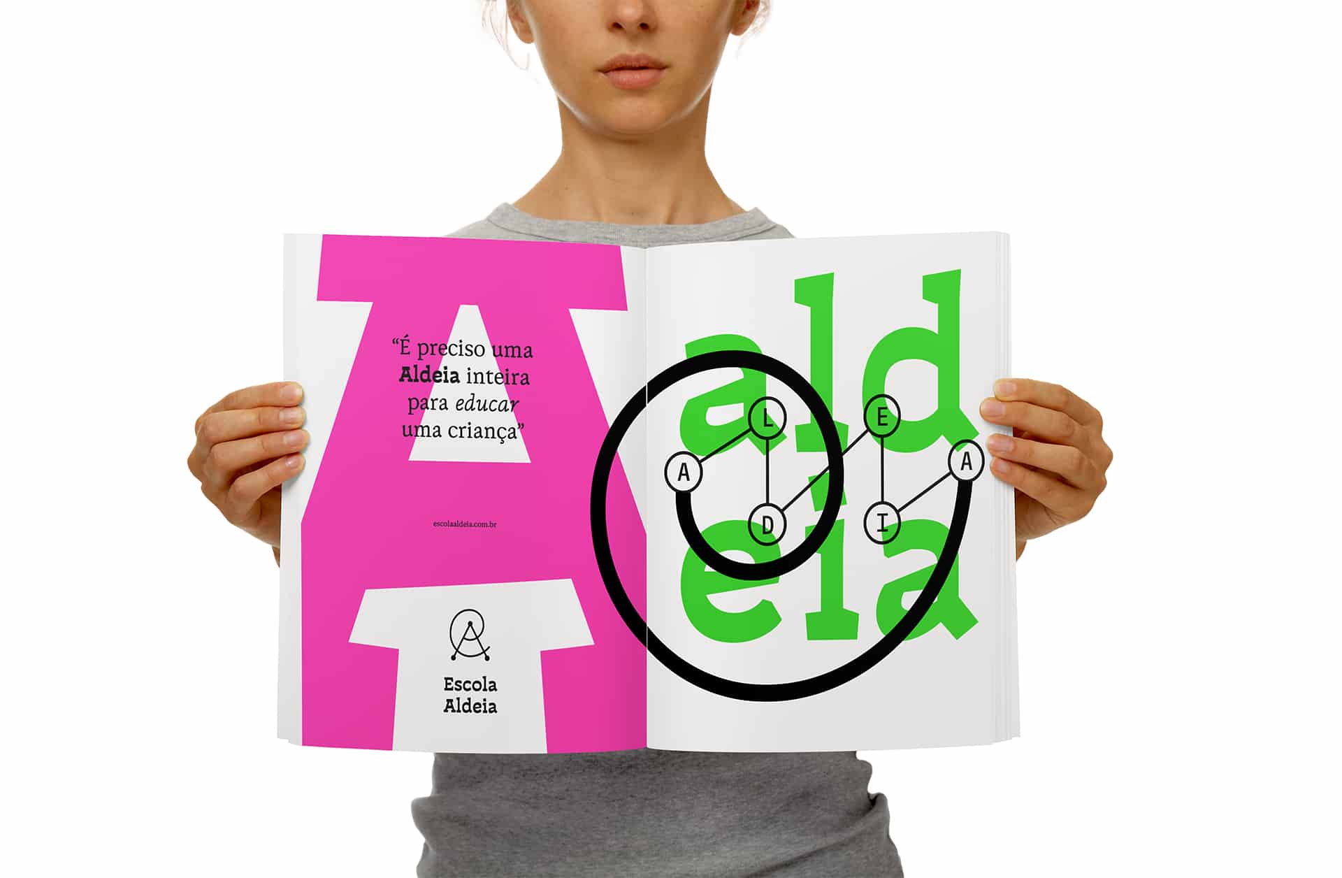
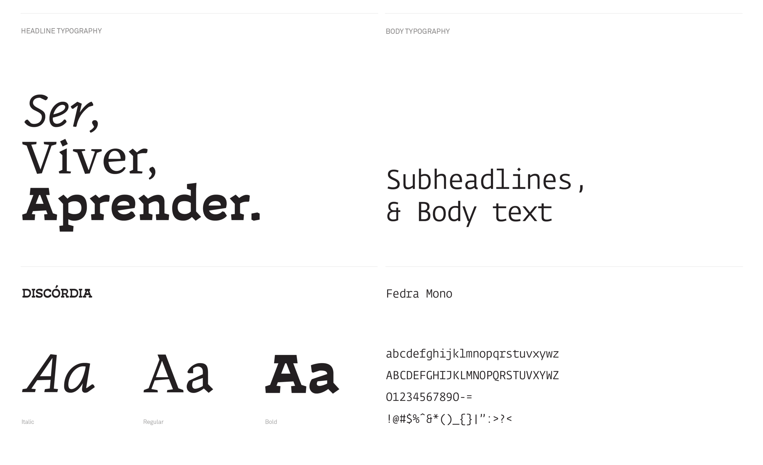
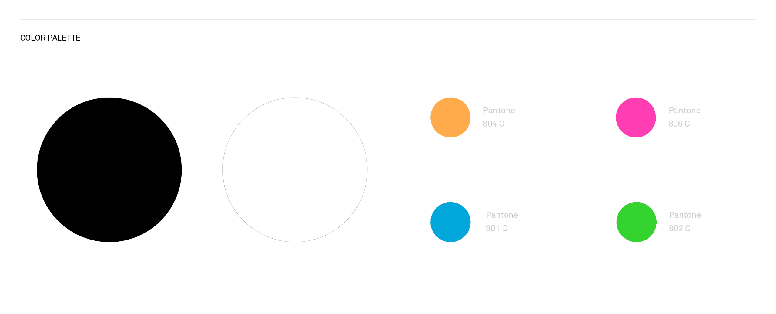
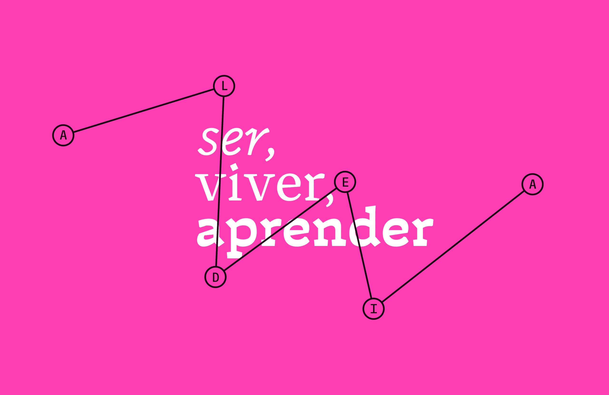
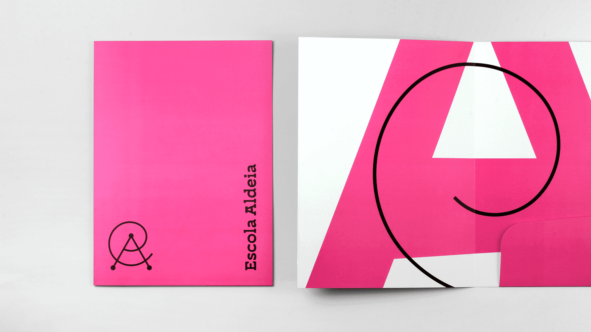
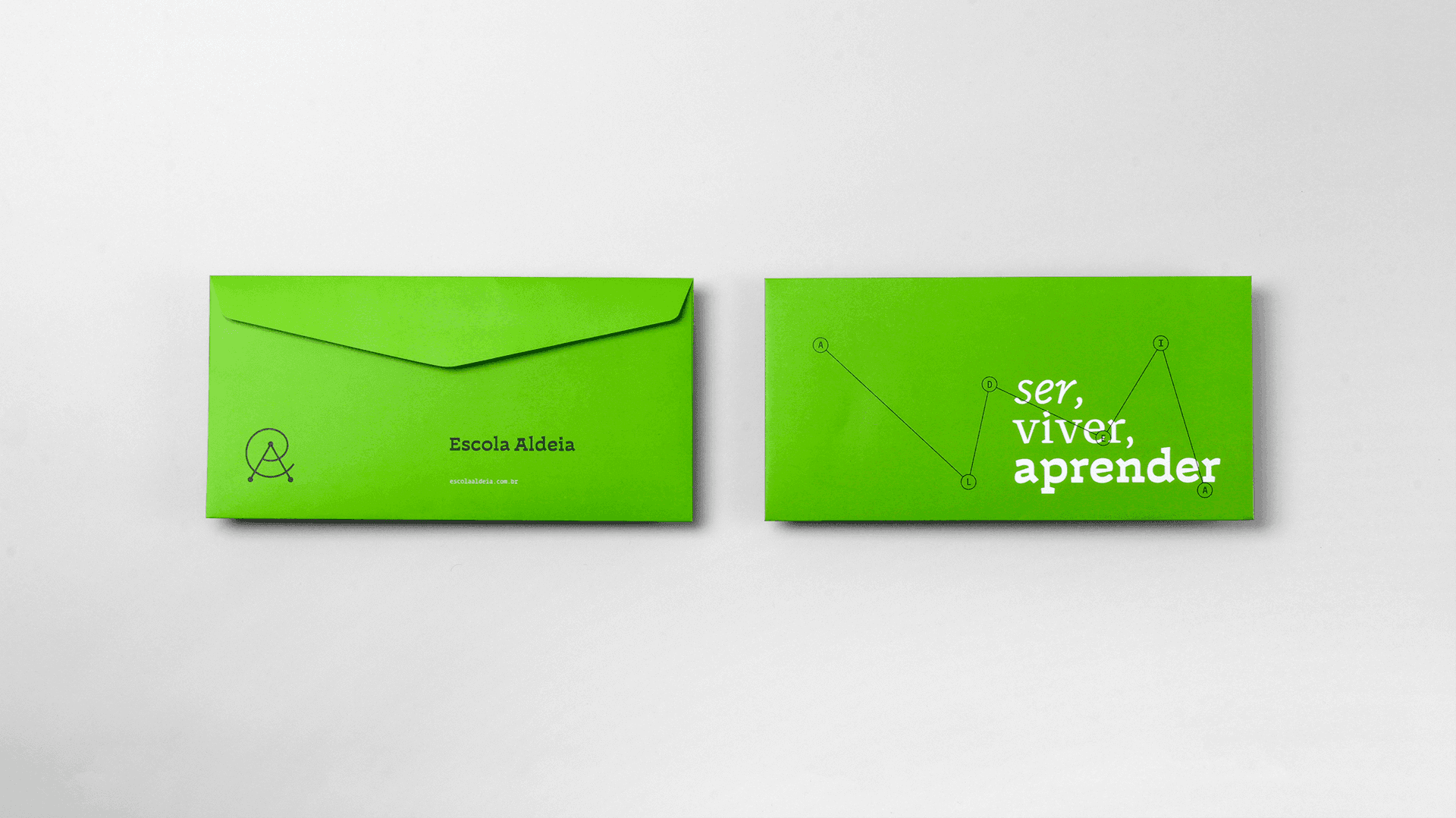
We brought through the Explorer+Sage archetypes in the brand design an intriguing and intelligent visual narrative that evokes and reminds us of various symbols and signs that represent creativity, knowledge, intelligence, freedom, connections. The symbol explored the cultural knowledge of each one, bringing different memories and recognition. With a typographic voice based on intentionally uncommitted letters, inspired by letters that emphasized important writings, creating emphasis through contrast and weight variation. Of course, when dealing with an elementary school and especially to ensure freedom with cohesion to the visual system, it was necessary to bring a range of colors that presented this concept. We did this by bringing colors in different materials and supports, rather than creating color clusters in the same piece (commonly practiced in this segment).



Impact
Recognition
 Monogram Logo, Counter-Print · 2024
- Fonts In Use, 2022
- Behance, 2020
What the client says
“We are grateful that you captured the soul of what we do in such a singular way! A sharp, intelligent and thought-provoking result. Every time we look at the identity you developed, we reaffirm that, in truth, it could not have been any other way!”
Select work
FAAP
An icon of Brazilian culture and education, revitalized for the next 75 years with its heritage intact
More Info →