FAAP — Revitalizing an Icon of Brazilian Culture and Education
FAAP
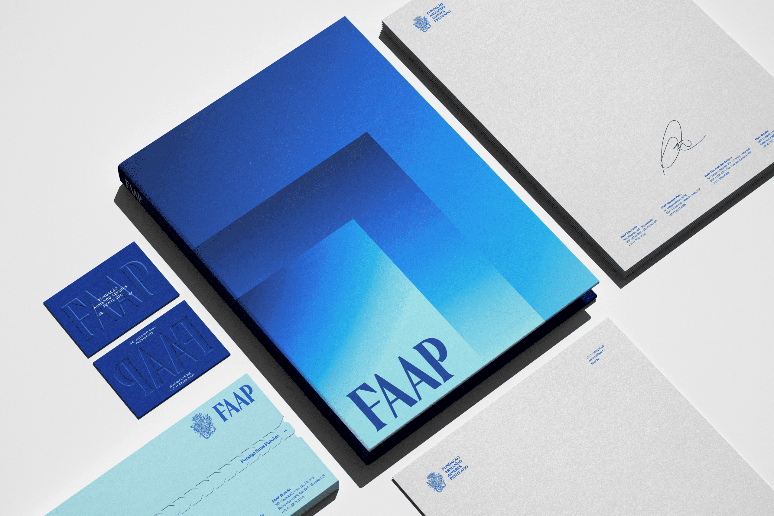
FAAP — one of Brazil's most iconic culture and education institutions — needed to revitalise its brand without losing its heritage. BRBAUEN led historical identity research, brand diagnosis and a full visual identity redesign, with a digital design system and a motion language. The project won the iF Design Award 2025.
About
Over 8 months we dived deep into FAAP's past, present and future to develop the Brand Visual Language.
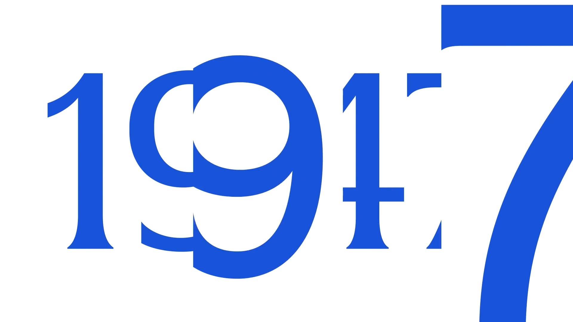
Founded in 1947, FAAP completed 75 years in 2022. The during/post-pandemic moment is symptomatic for traditional institutions like FAAP, whose physical spaces are the materialization of the experiences they provide, as the additional challenge of attracting younger generations becomes ever greater.
As part of the institution's pioneering and restless attitude, a strategic branding project was developed by Unbranded.today + BRBAUEN to rediscover and evolve the brand.


- Client
- FAAP
- Year
- 2022
- Sector
- Culture & Education
- Services
- Pesquisa de Identidade HistóricaDiagnóstico da Identidade da MarcaRedesenho da Identidade VisualSistema de Design DigitalLinguagem de MotionBrand Guidelines
Desafio
Challenge
The project's challenge was to shape the present and future of the brand language and prepare it for the next 75 years of a hybrid and constantly evolving educational reality. Thinking about FAAP's core value proposition; allowing each student to see and pursue their passions, thus shaping their own lenses to the world. This motivation was the inspiration to build the new language.
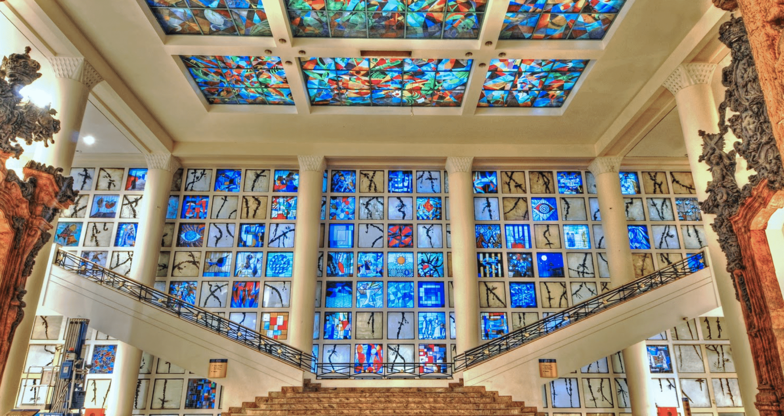
FAAP creates unique hybrid connections. Whether through the singular architectural choices of buildings that blend styles that would not work in any other institution, or through the institution's pioneering role in creating Brazil's first and most prestigious fine arts degree programs. Later, in the 80s and 90s, the fusion of creativity and business.
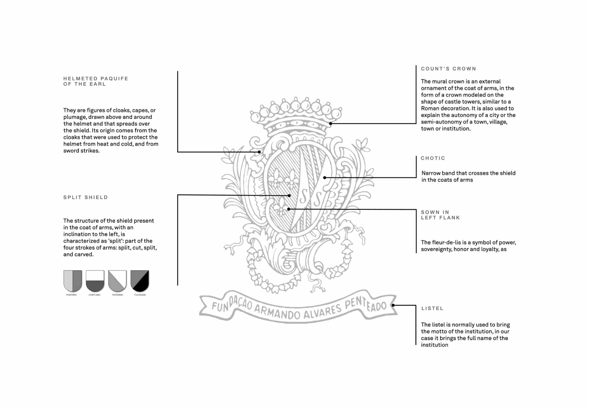
The coat of arms underwent a respectful reformulation, after deep heraldic research to understand the history of each element, reinforcing its unique characteristics, such as the radical asymmetry of the elements — which was uncommon in coats of arms of the time, but made perfect sense with the institution's bold posture over the years.
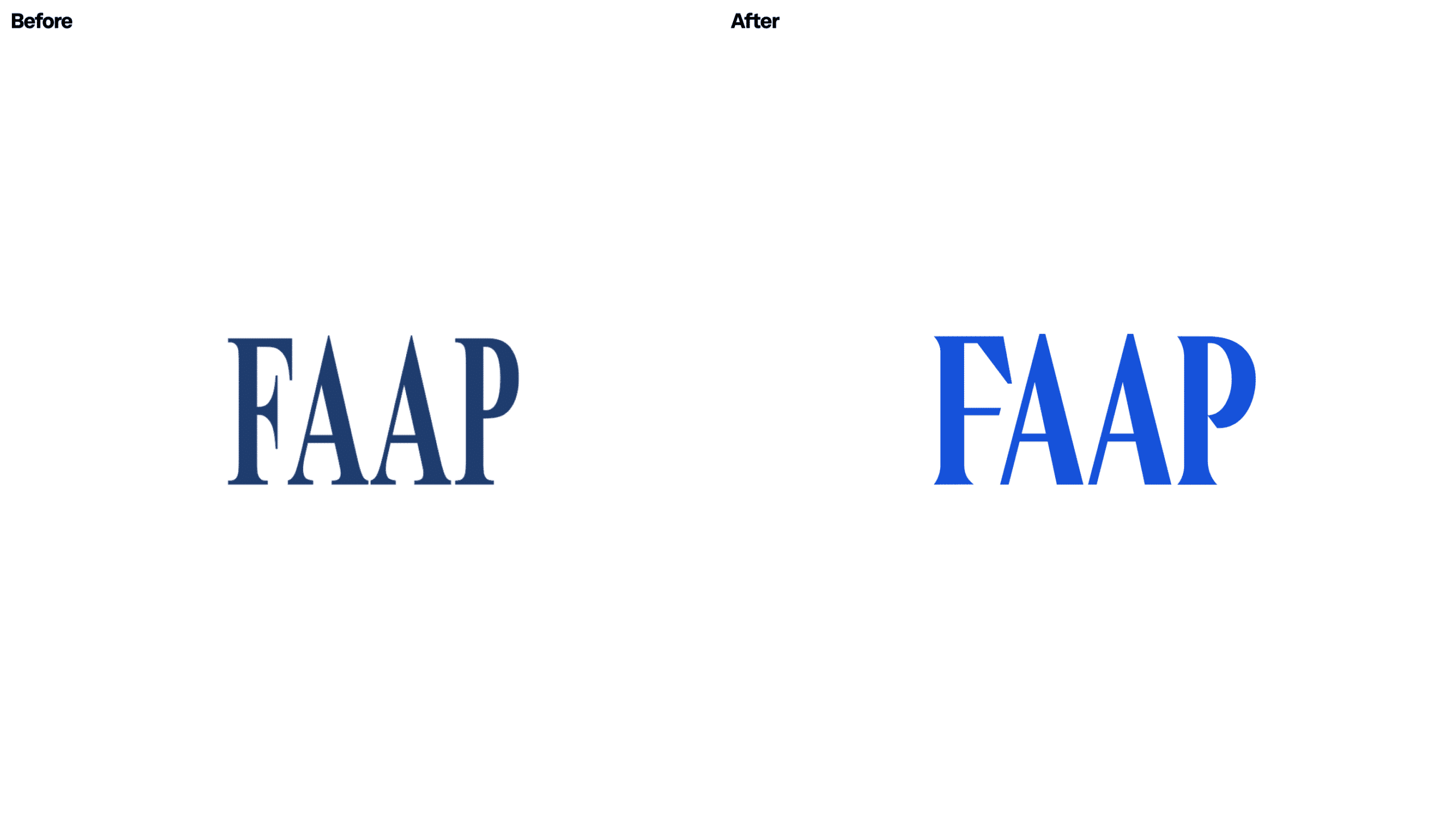
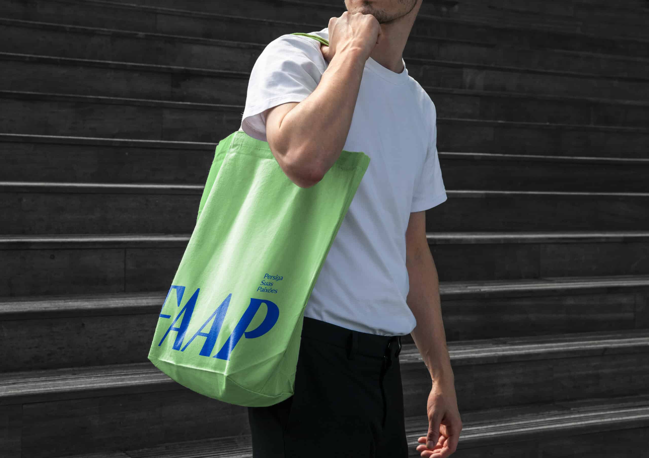
The inspiration for the logotype comes from this same movement of creating unique connections, after understanding that historically the condensed proportions of the letters were a reminder of the university's architecture, with its elongated and imposing façade. We revived the logotype by uniting characteristics of serif and sans-serif typography; with different types of serif finishing (straight and rounded) — literally exploring knowledge of the rule, to break it and ultimately create a harmonious and unique composition.
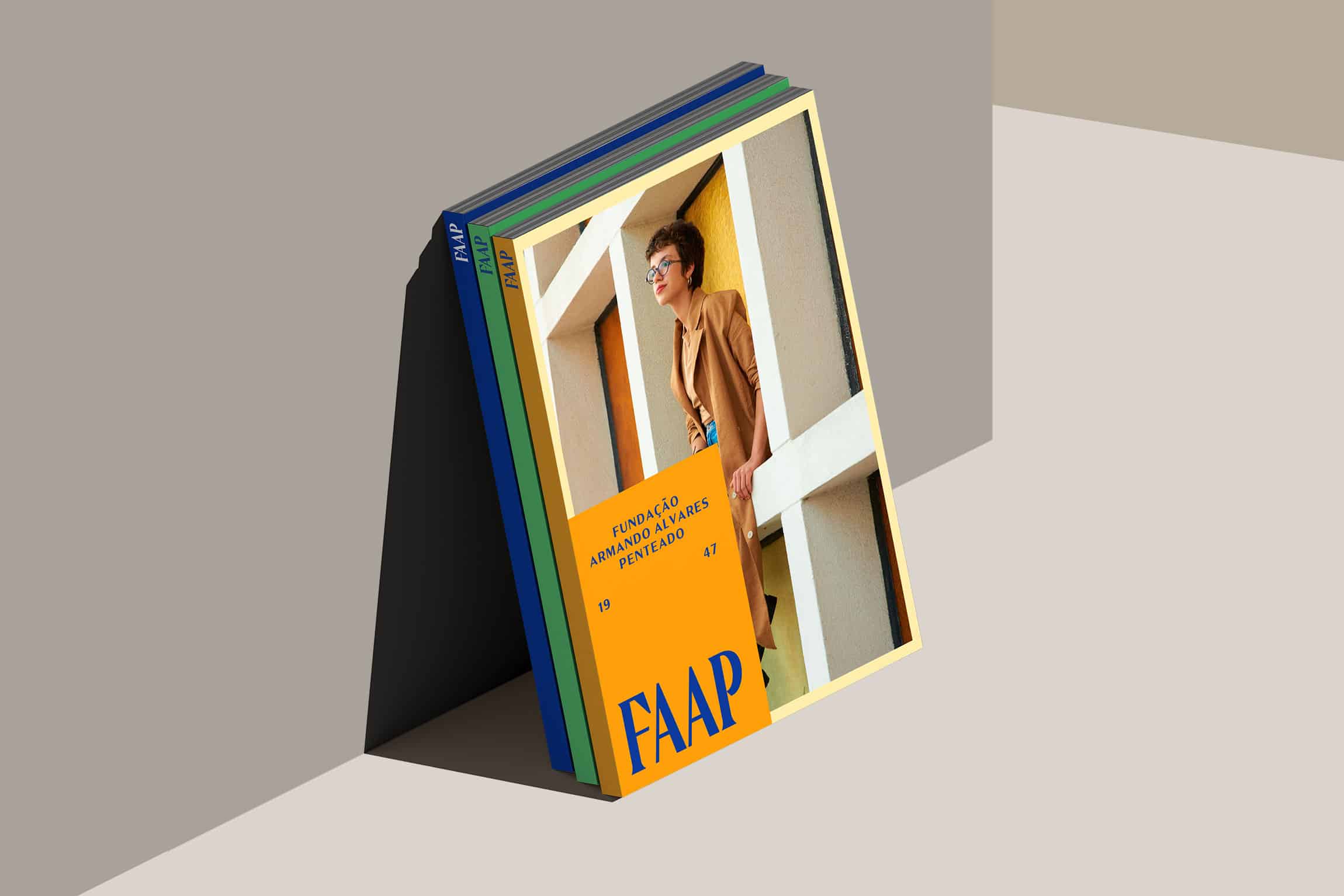
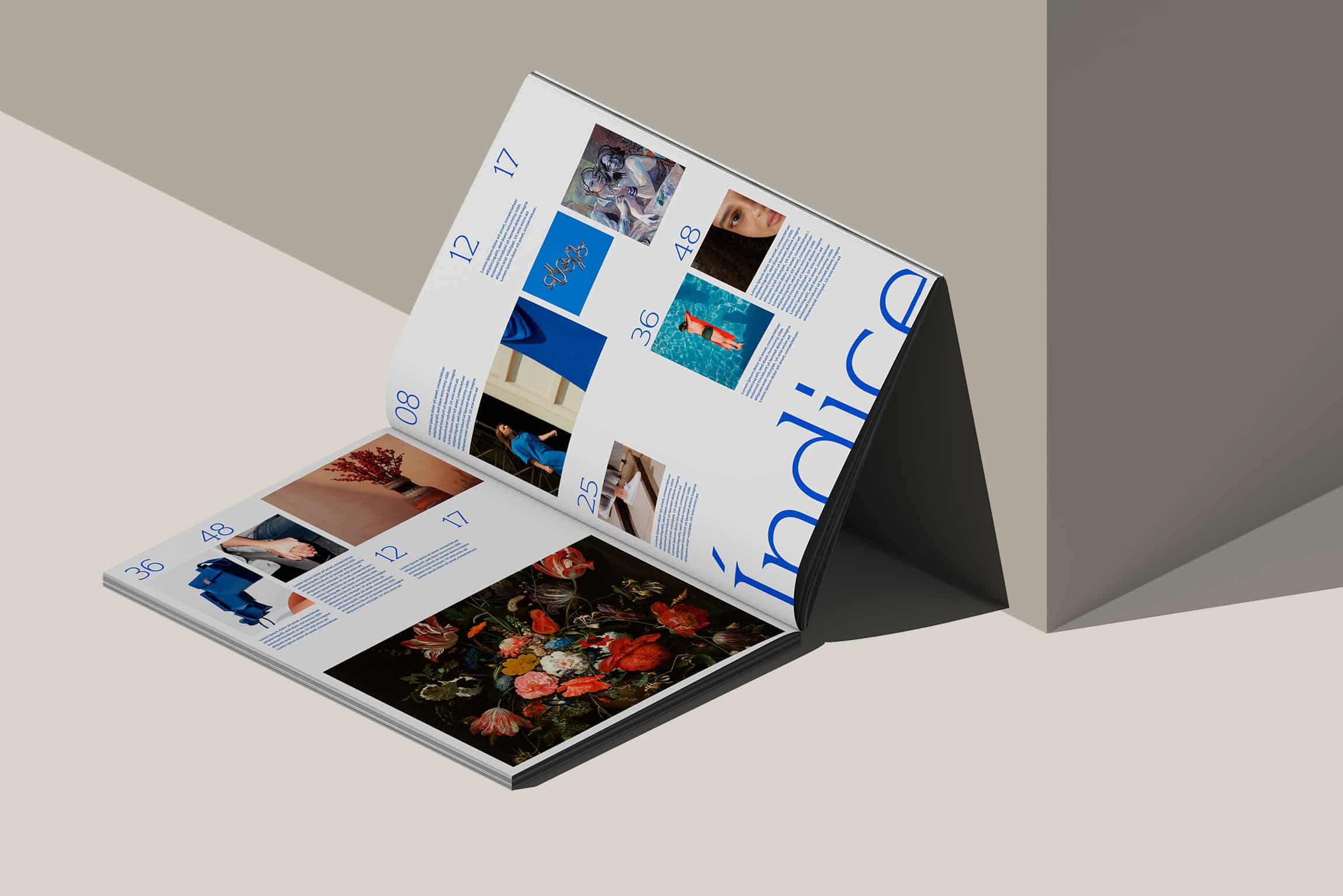
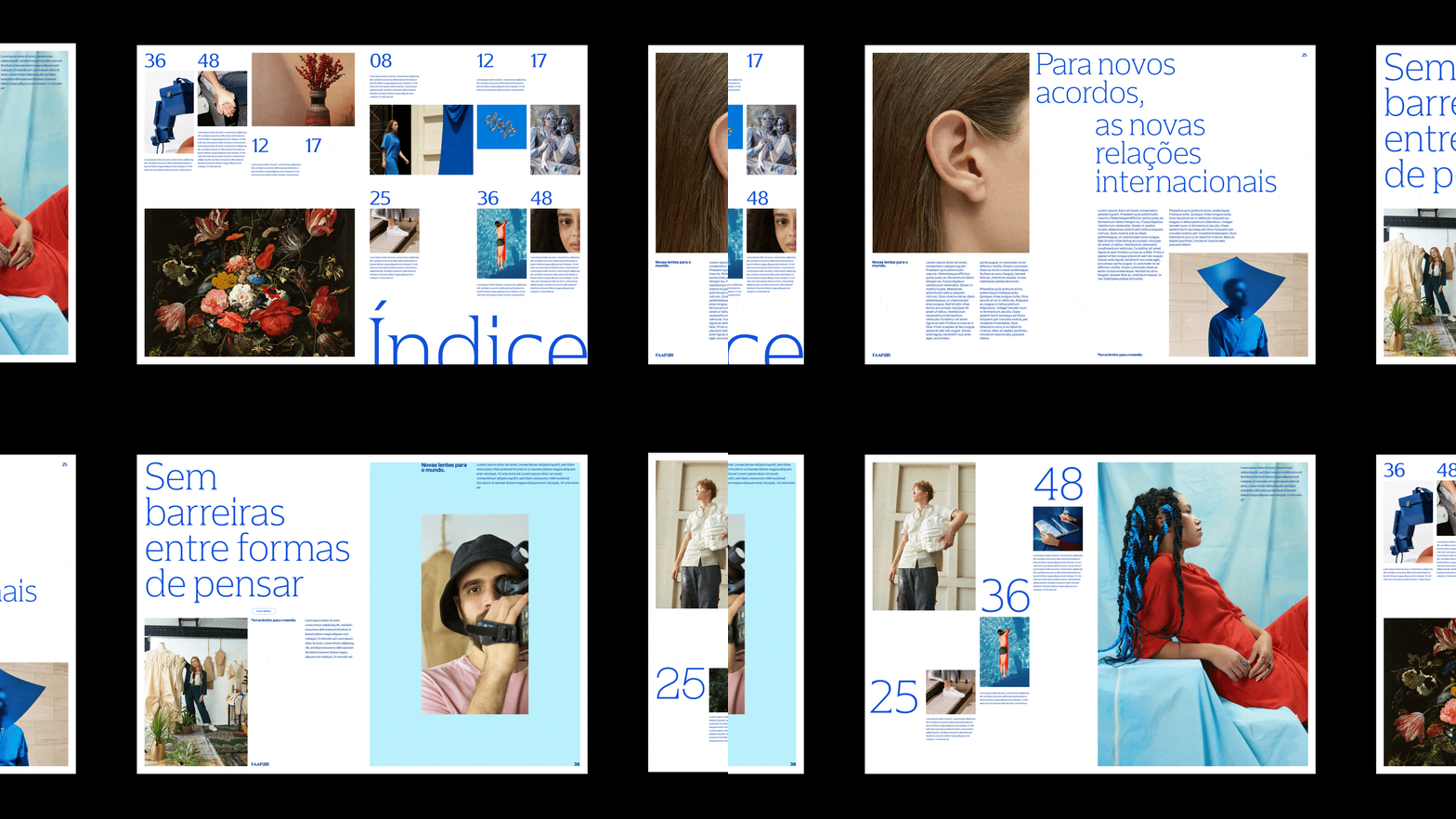
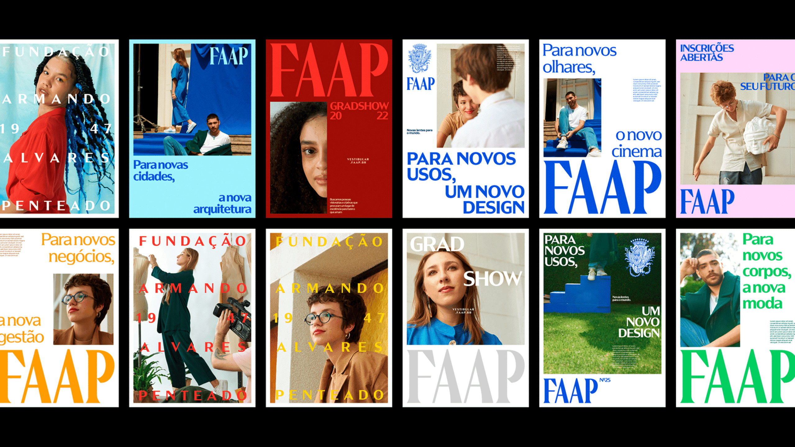
The visual identity as a whole breathes movement and visual deconstruction; maintaining organization, but allowing the identity to breathe dynamically, altering its chromatic palette combination to suit the contexts of School, College and Postgraduate; always bringing students and their personalities to the scene, plus a custom typeface designed exclusively for the project, incorporating the concept of hybridism into the typography as well.
Presidentes
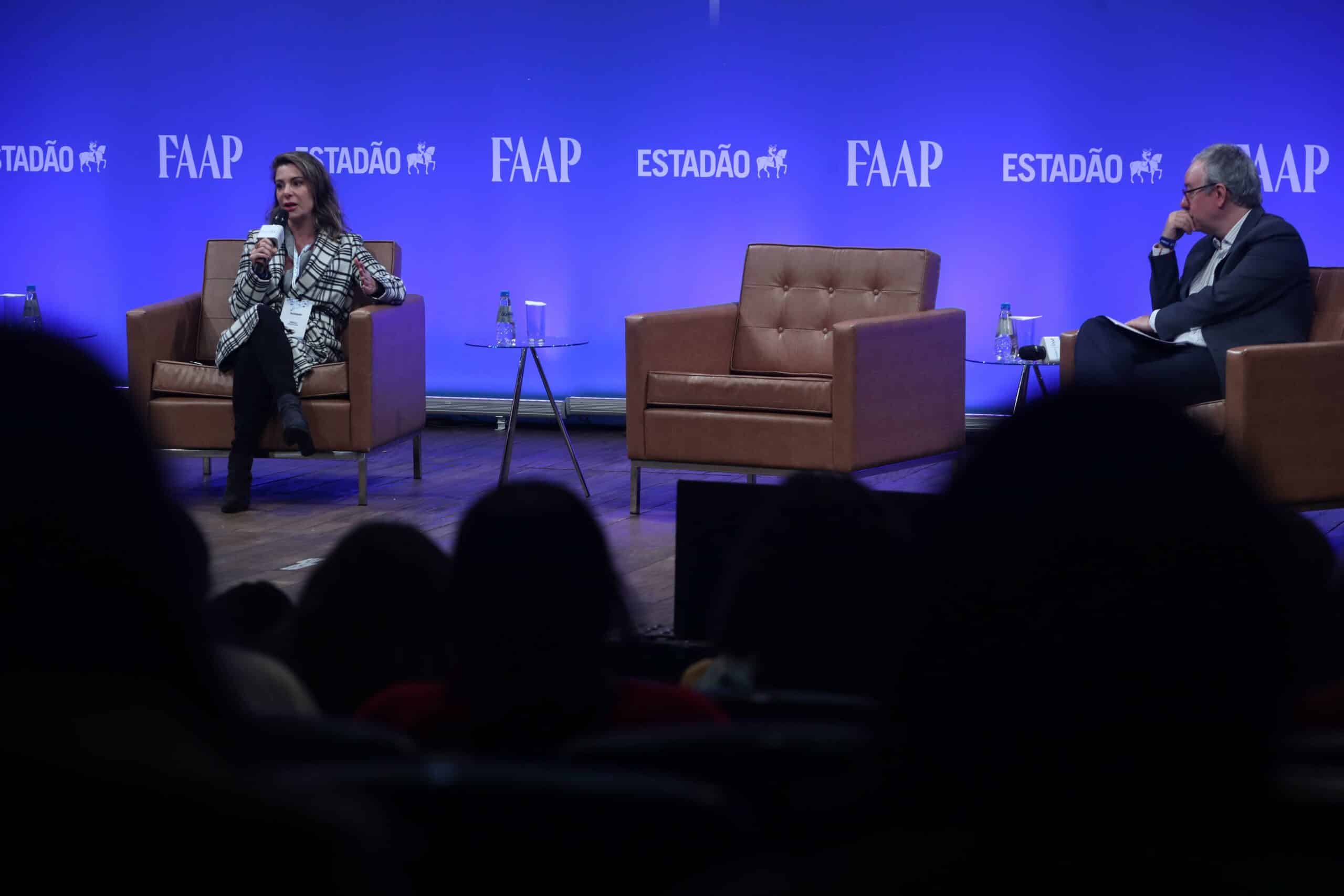
From presidents to industry giants;
FAAP's reputation precedes itself, but the institution knows that looking backwards is not enough.
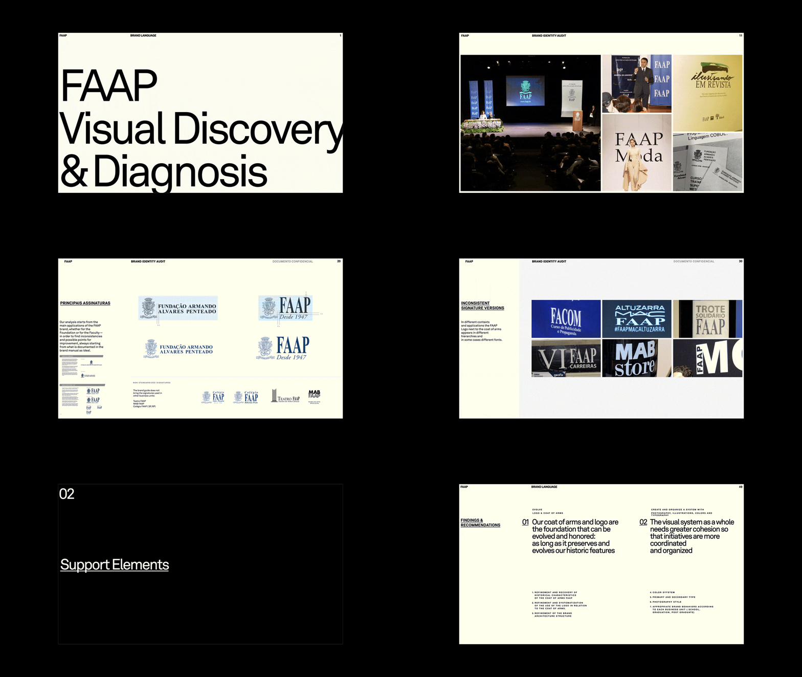
For a brand with such history it is natural that inconsistencies occur in the way it is graphically applied; especially due to so many technological advances over the years.
The creative process first aimed to respectfully understand each element, its meanings and the current scenario to point directions and evolve the brand language; preserving the value built so far and ensuring it is ready for the coming decades.
Auditoria
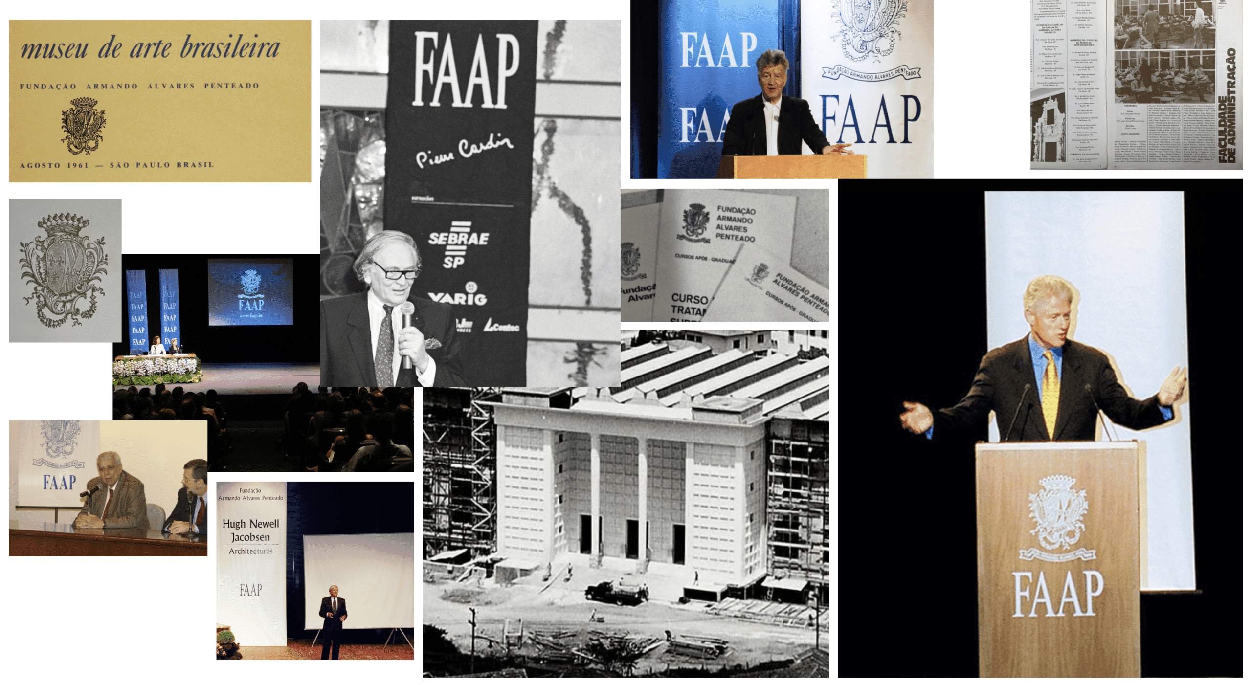
A deep historical audit process to discover and clarify all visual meaning and uncover the potential for evolution.
From the logotype to the way FAAP's architecture influences it, down to the smallest details of heraldic meaning.
Brasao
The anatomy of a bold and asymmetric heraldic element
The heraldic structure of FAAP's coat of arms is unique — symmetry is intentionally set aside. We sought to understand its structure to highlight its particular characteristics.
RULES OF HERALDRY. Luís Belard da Fonseca, 1997
MHN/IPHAN — Principles of Heraldry
Construcao
The construction of the FAAP logo
Comparing both forms, and rescaling the original 'A' of Times New Roman to the 'A' of the FAAP logotype, it was possible to confirm that to draw the current FAAP logotype the letters were distorted without optical and stylistic compensations.
This analysis confirms that the thickness difference was an unplanned occurrence, so we can consider the logotype refinement as a point of improvement.
Tipografia
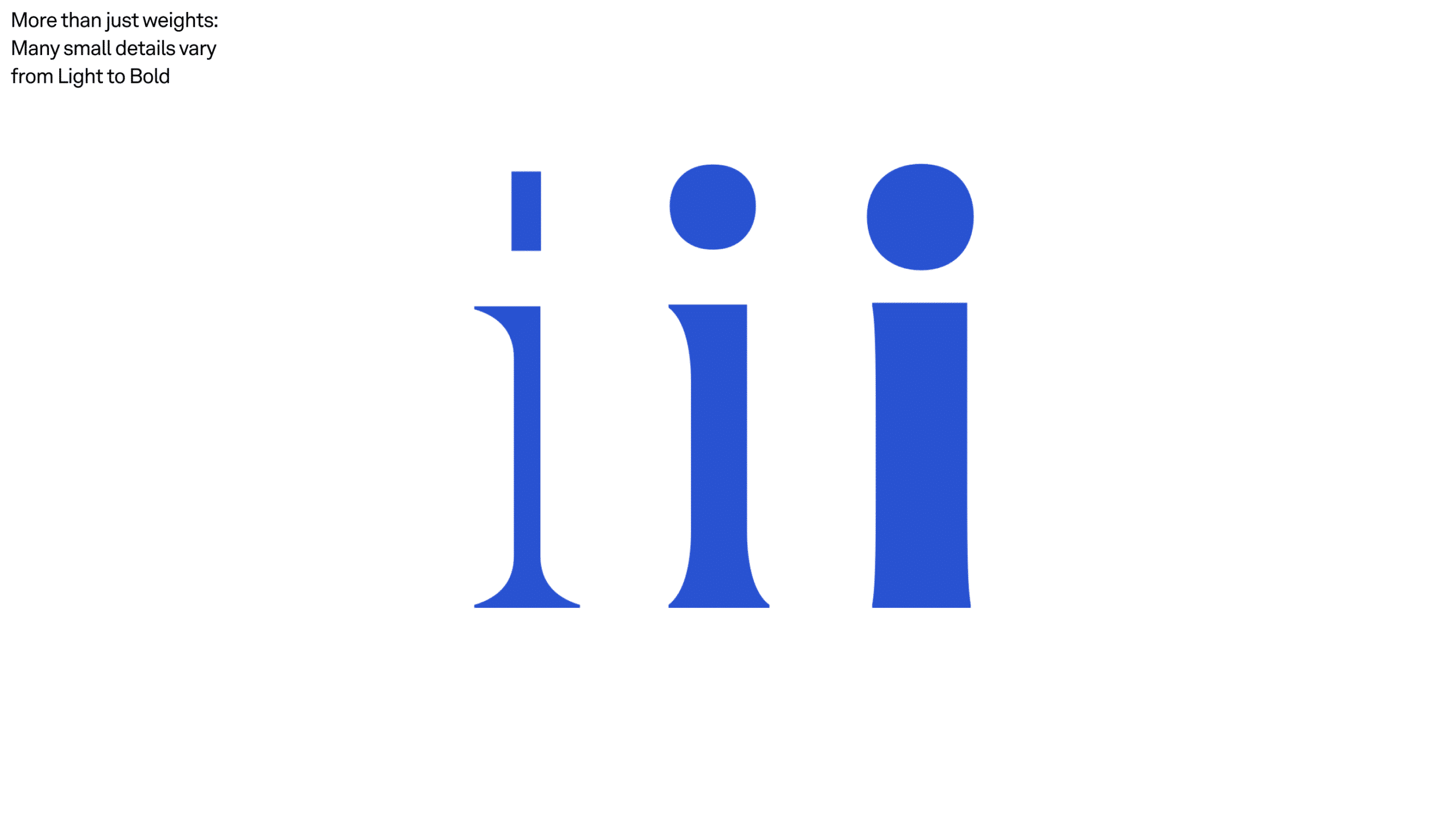
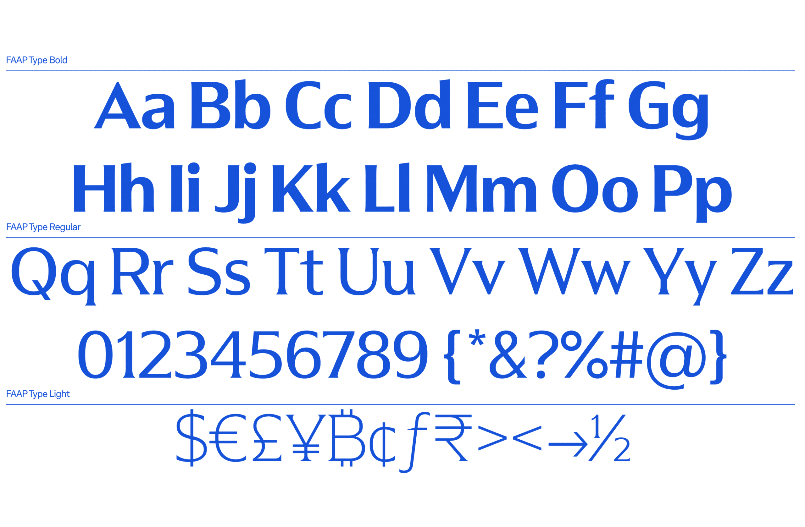
A custom type family inspired by the logotype's hybridism to shape the message
Design by Blackletra — FAAP typography carries a subtle memory of the logotype and expands its meaning by portraying the typographic hybridism between Sans Serif and Serif, as a relationship with the duality between Creativity and Business.

What the client says
“We're very proud of how far we've come! This is the result of work that recovered FAAP's historic importance and brought the brand into a current, digital context. Thank you for the partnership!”
Impact
Recognition
 iF Design Award 2025One of 85 Brazilian projects selected from more than 11,000 entries from over 100 countries. See it on iF Design → · Read the news →
 Latin American Design Awards 2023
- Latin American Design Awards 2023
 14th Brazilian Design Biennial, 2024
 Brasil Design Award 2022
- Behance, 2023
Team
Select work
Sui Generis
A benefit livestream for culture workers, given a pro bono visual language of broken glass
More Info →