EichenGlobal
EichenGlobal
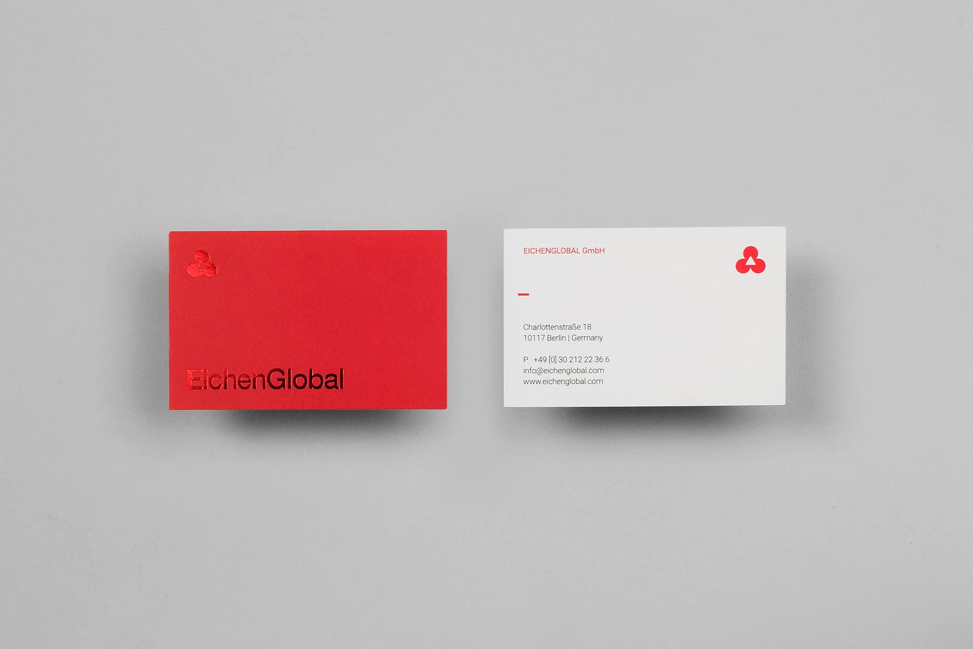
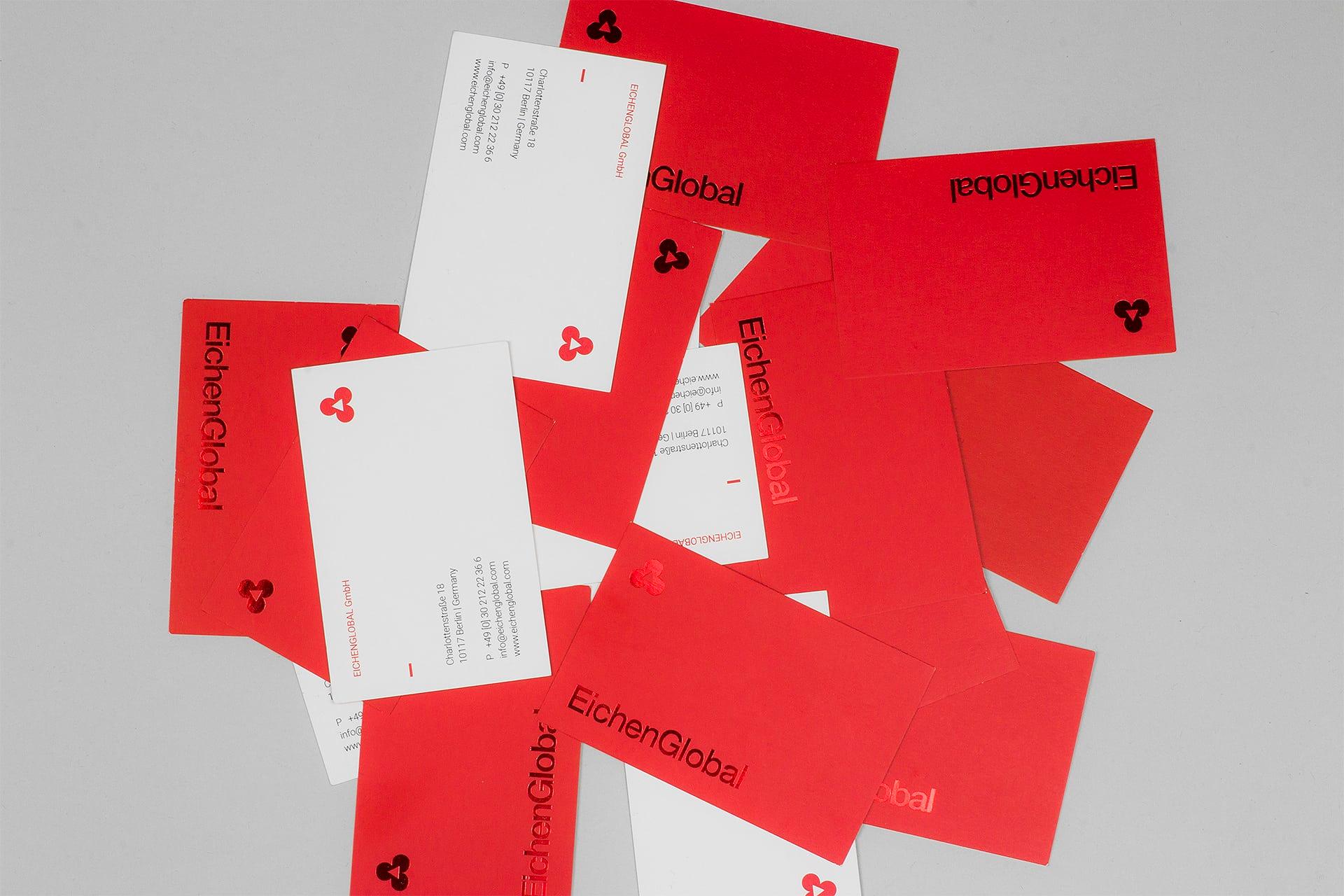
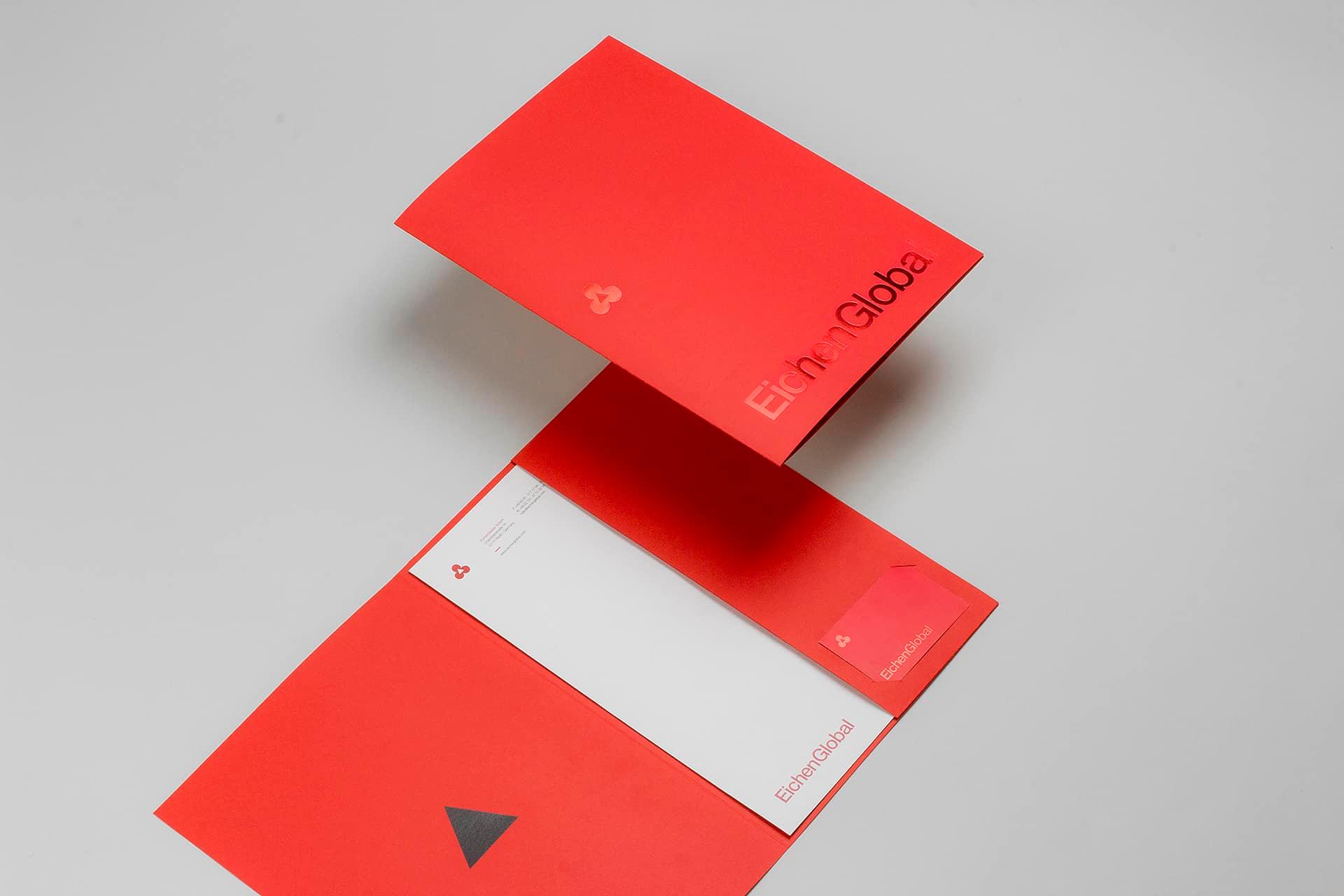
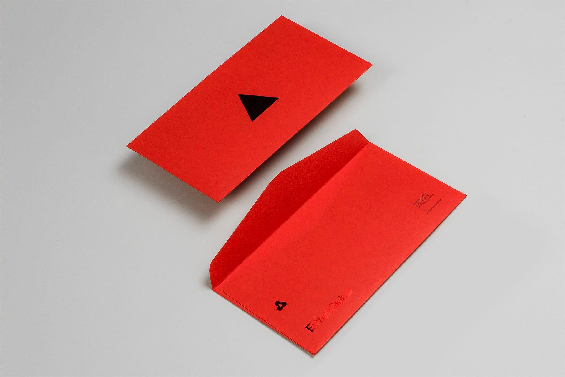
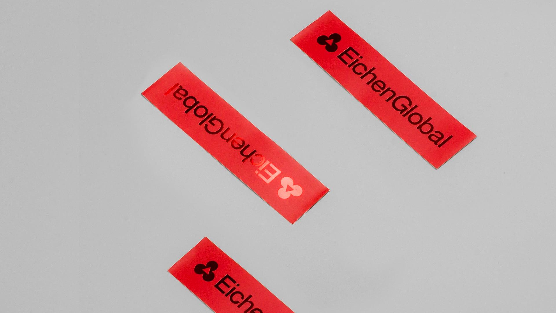
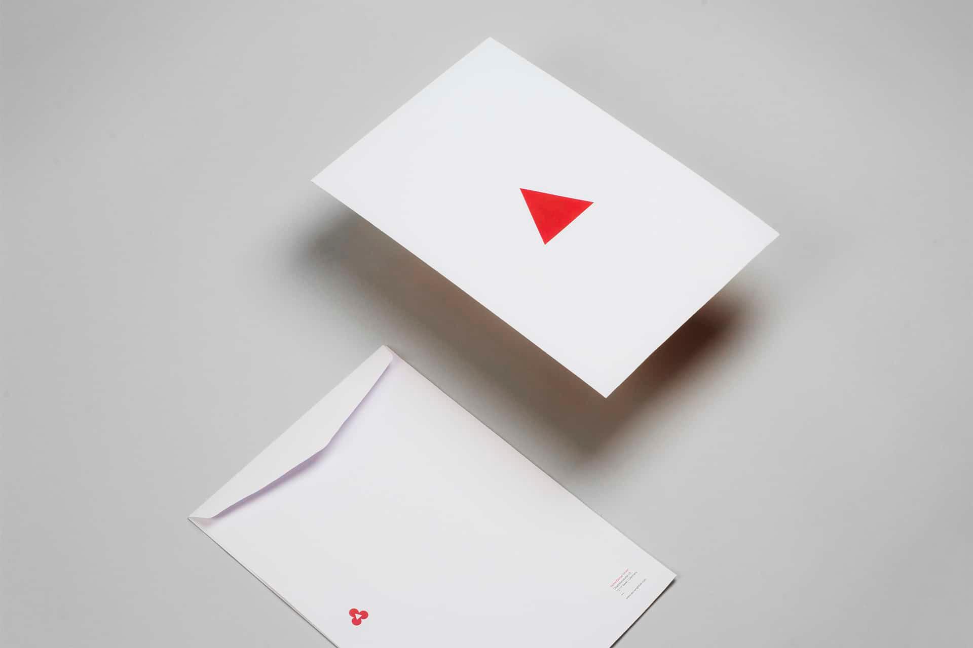
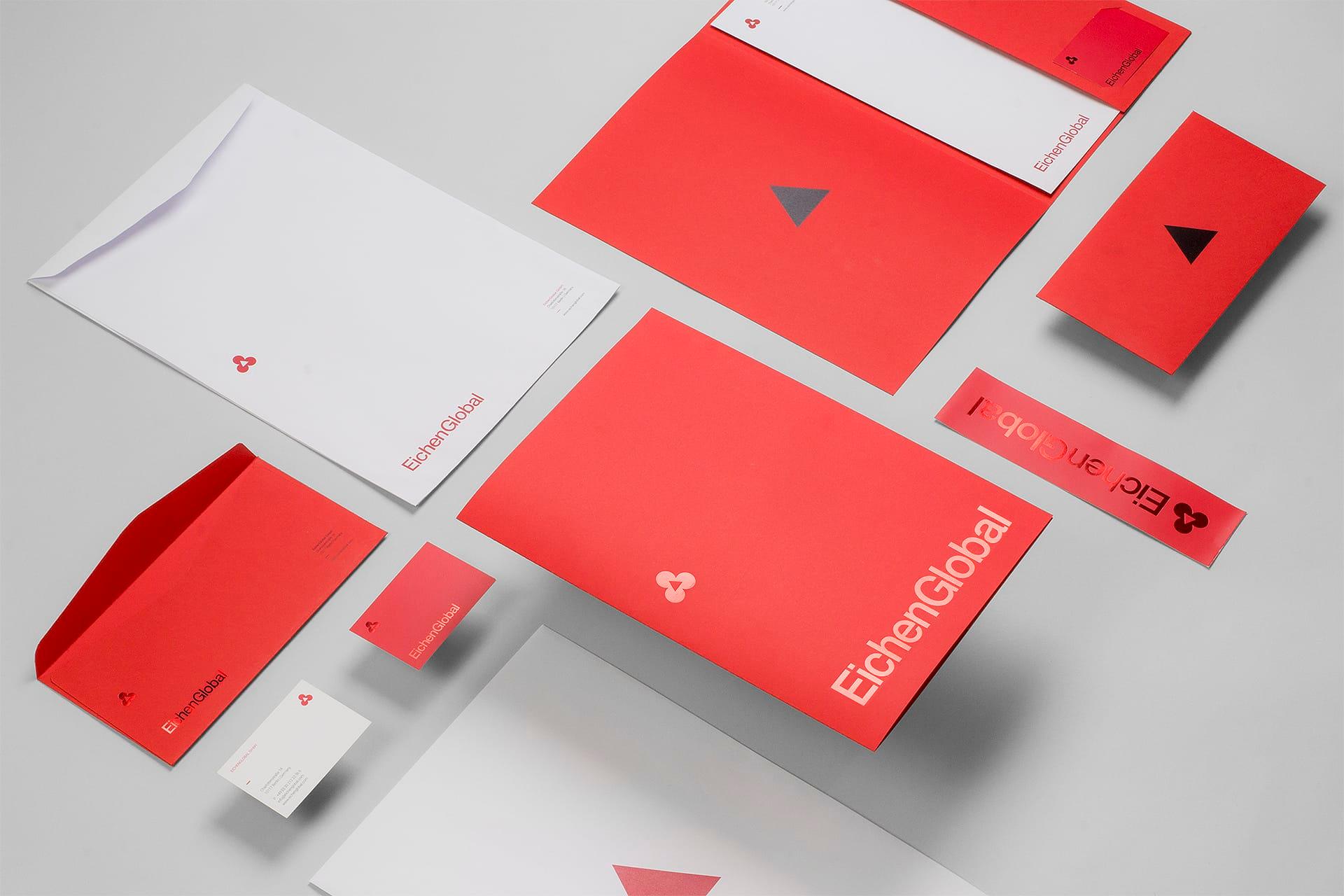
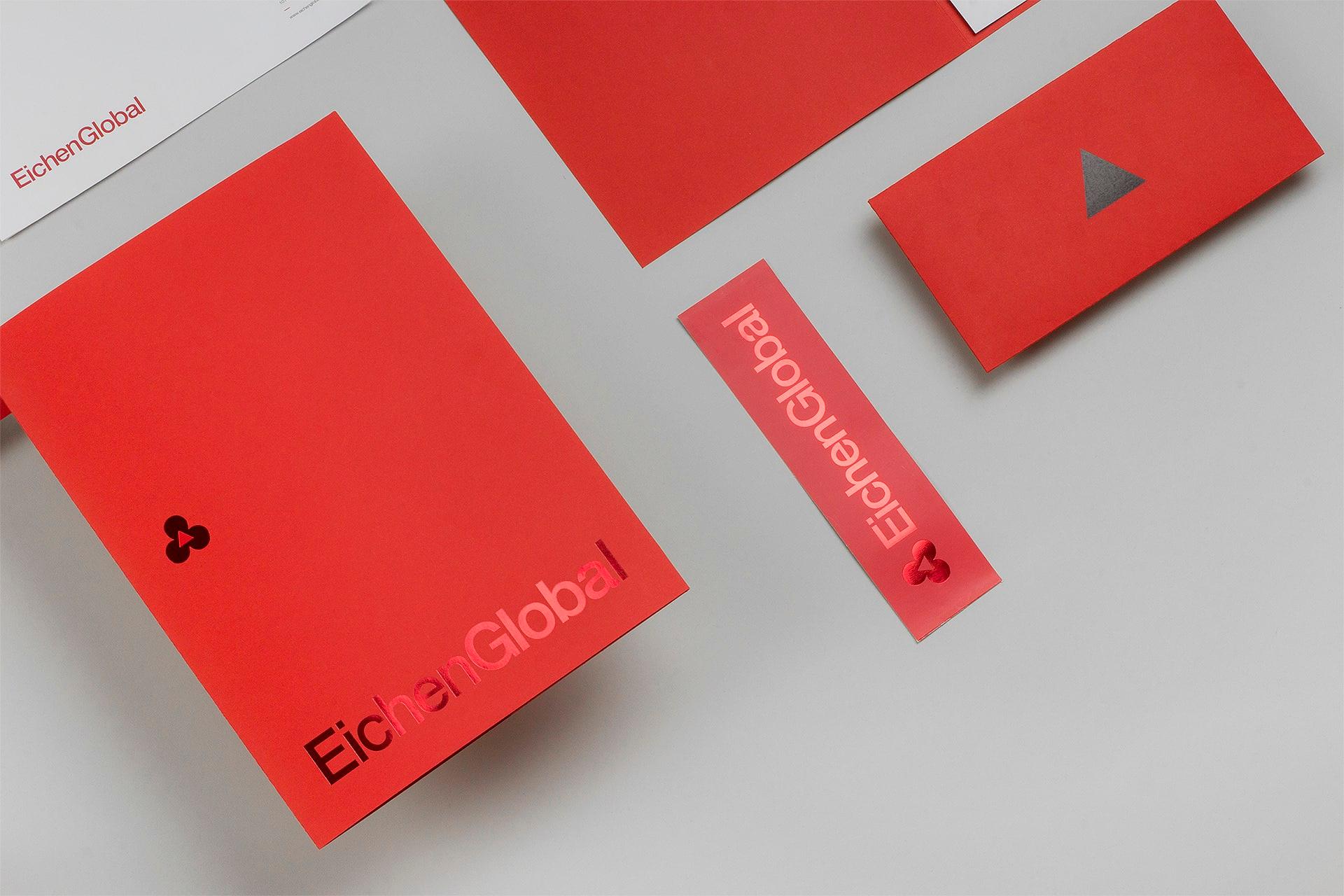
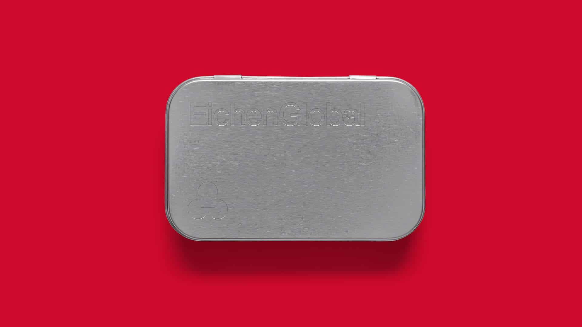
EichenGlobal brings together, under one management, the services an international real-estate investor needs in Germany — from finance to law. As a new brand backed by more than 110 years of inherited experience, BRBAUEN created the naming (Eichen, 'oak', a German symbol of trust), the positioning and a rationalist, Bauhaus-rooted identity to build instant familiarity and recognition.
About
EichenGlobal is a services company focused on the international real estate investor who is interested in, has just acquired, or already owns property in German lands. Its mission is to serve as the bridge between clients and all types of advisory services through the curation of a network of finance, legal, auditing, property management, and insurance companies.
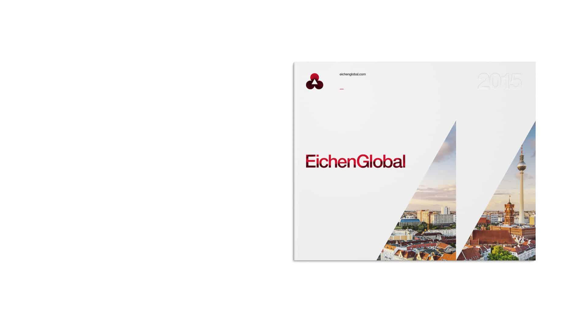
- Client
- EichenGlobal
- Year
- 2015
- Sector
- Real Estate
- Services
- NamingPosicionamentoIdentidade VerbalIdentidade VisualBrand Guidelines
Abordagem
Approach
With over 110 years of combined experience in the Berlin real estate market, inherited from its parent company, its competitive advantage is being a pioneer in the German real estate market in offering all services under the same management. Being a new brand in the market could potentially be its perception disadvantage.
The objective was to balance advantages and disadvantages through a graphic and conceptual solution that generated recognition and familiarity. A German company, expert in grouping and managing administrative, financial, and legal tools for the investor in the German real estate market.
Resultados
Results
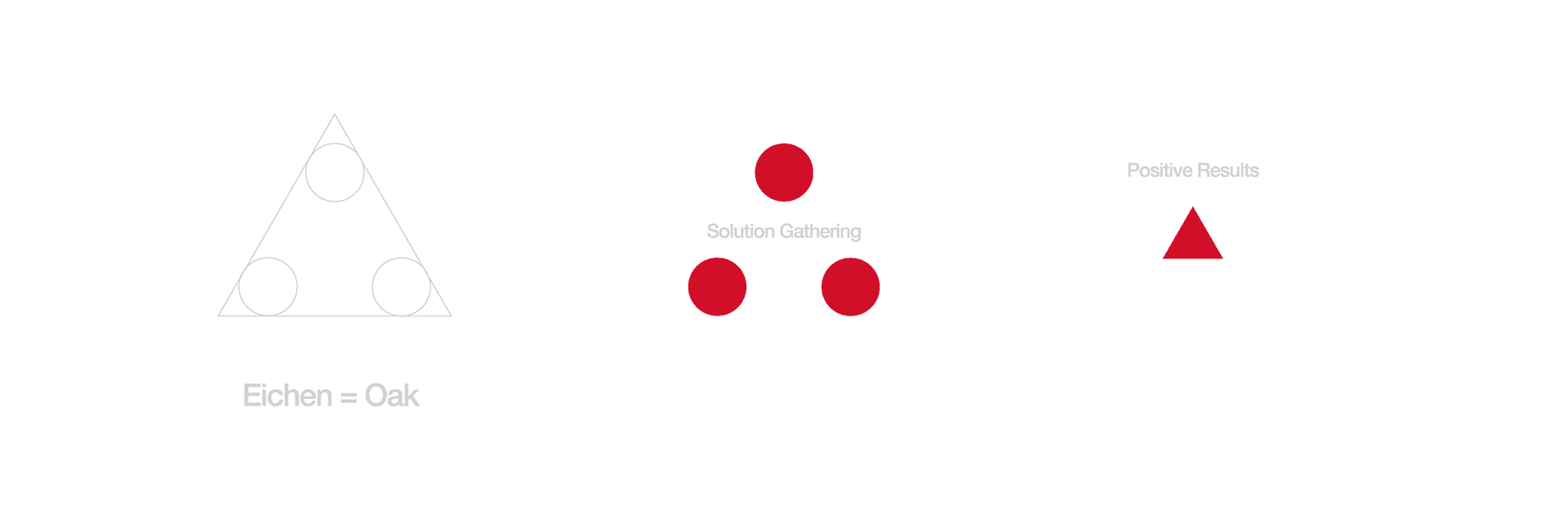
The name was strategically directed so it could evoke conceptual characteristics of the oak tree — a symbol of German culture since the early 19th century, having been a key element even in German coins, representing the national values of trust and stability.
Eichen = Oak
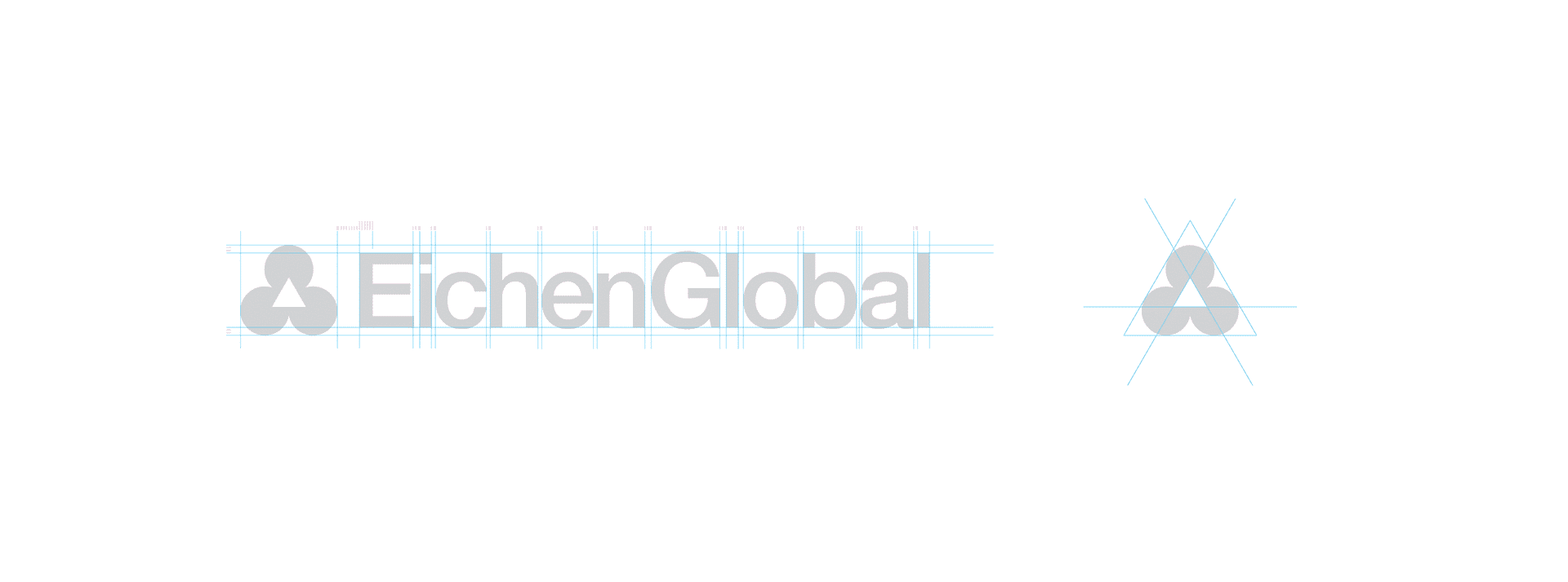
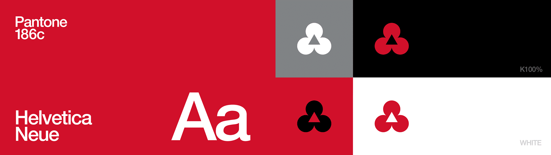
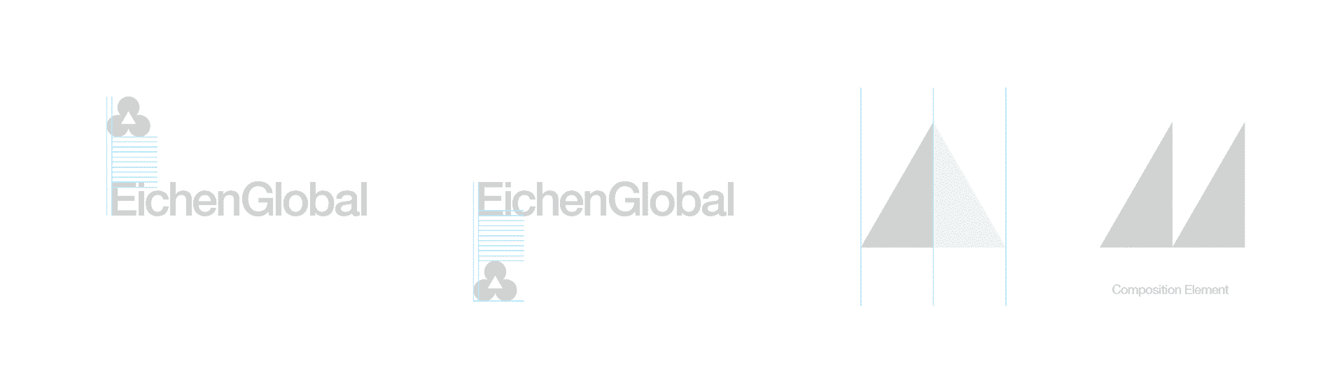
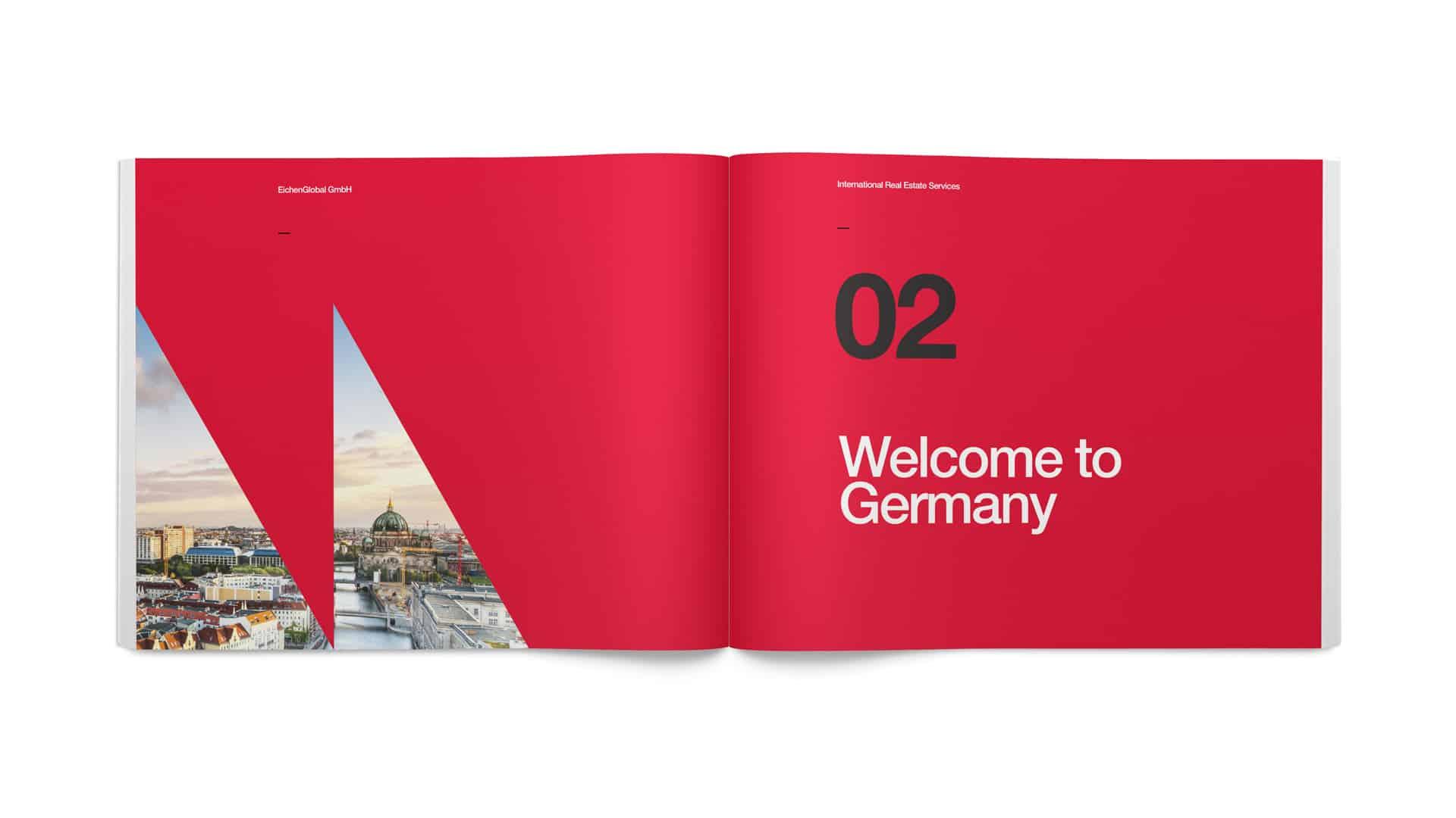
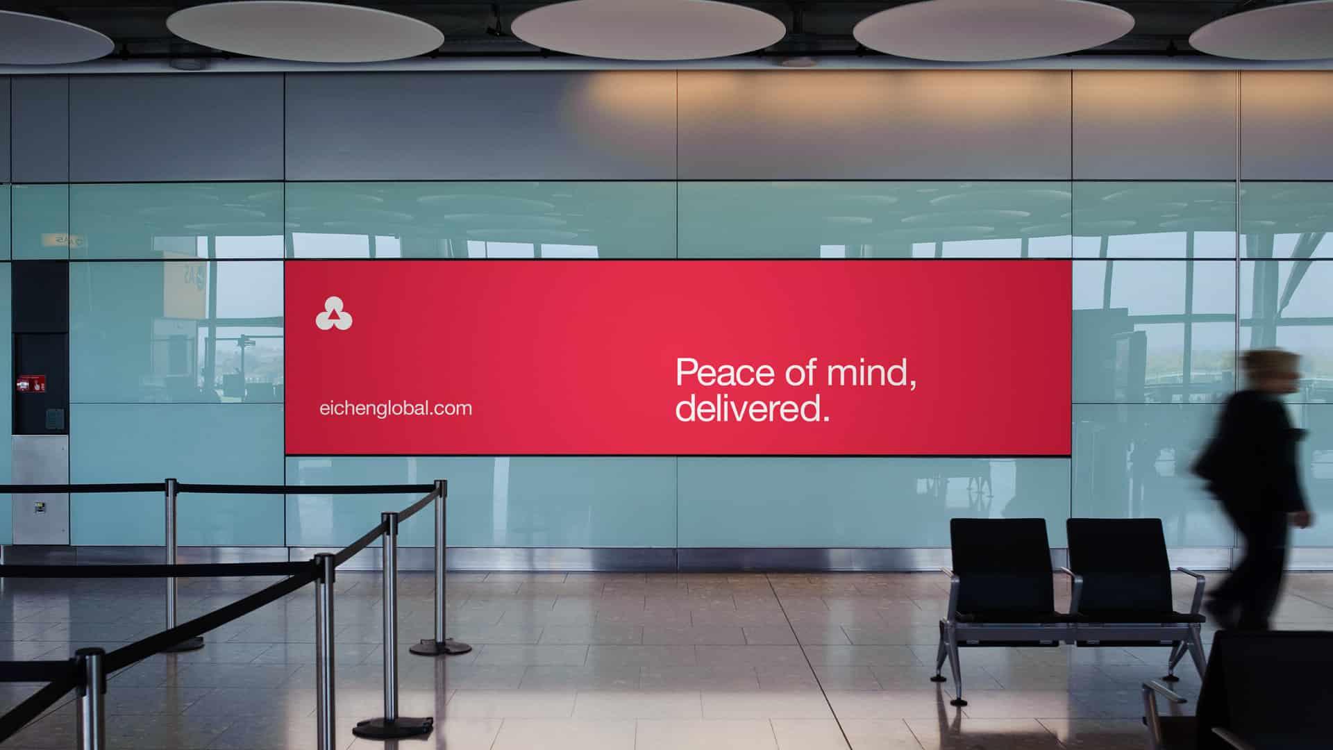
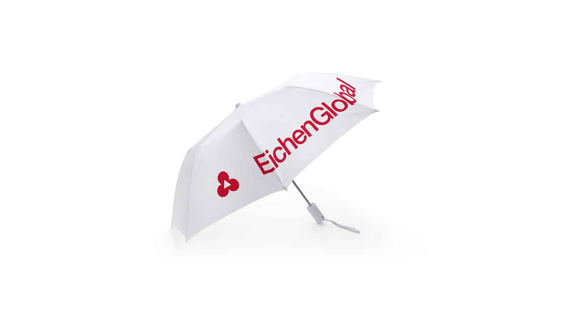
The need to balance advantage/disadvantage led to the development of a design language that takes into account the need to be familiar and recognizable. A simple and clear visual approach to represent the core of the company with evident references to the so-called international style derived from the Bauhaus, which is grounded in rationalism using clear geometry and the sophistication that results from it.
Operating since 2015, EichenGlobal has solidified itself as a benchmark in its industry, proposing innovation and leading the market as the practical guide for investors in the German real estate market.

Impact
Recognition
 Abstract Logo, Counter-Print · 2024
 12th Brazilian Graphic Design Biennial, 2017
- Behance, 2016
Select work
Séren Inc
A high-end property developer, renamed and repositioned around serendipity as a skill
More Info →