BAHPORTO — Made, wholly, of our own revolutions
BAHPORTO
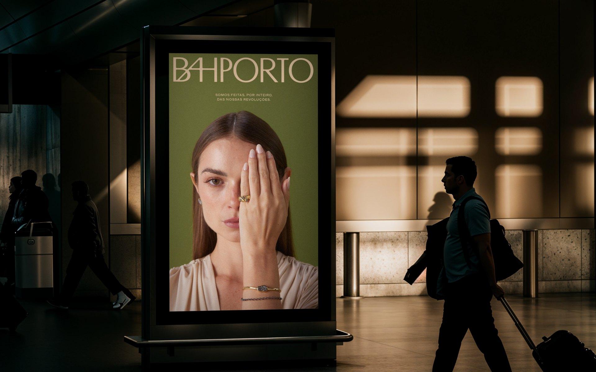
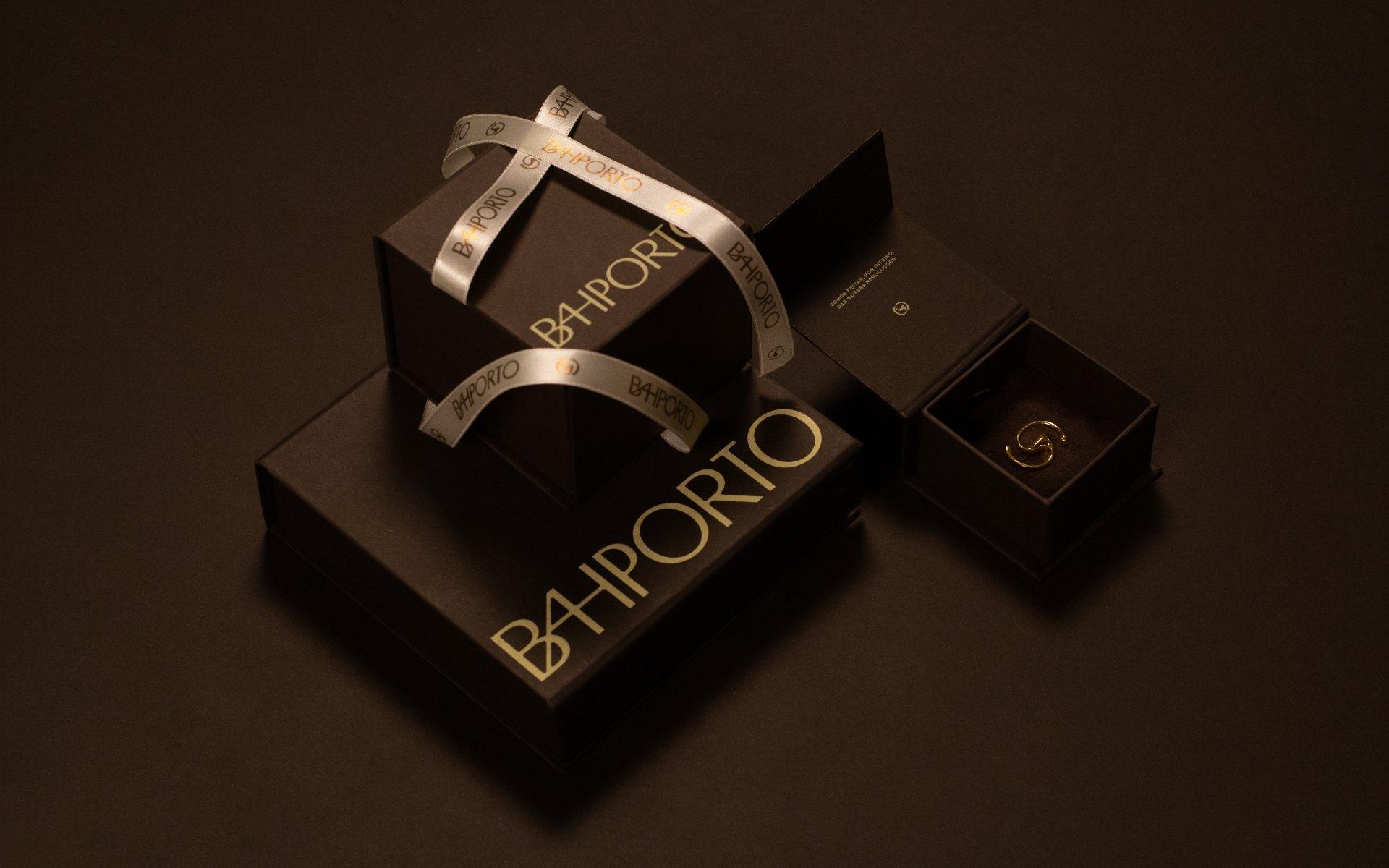
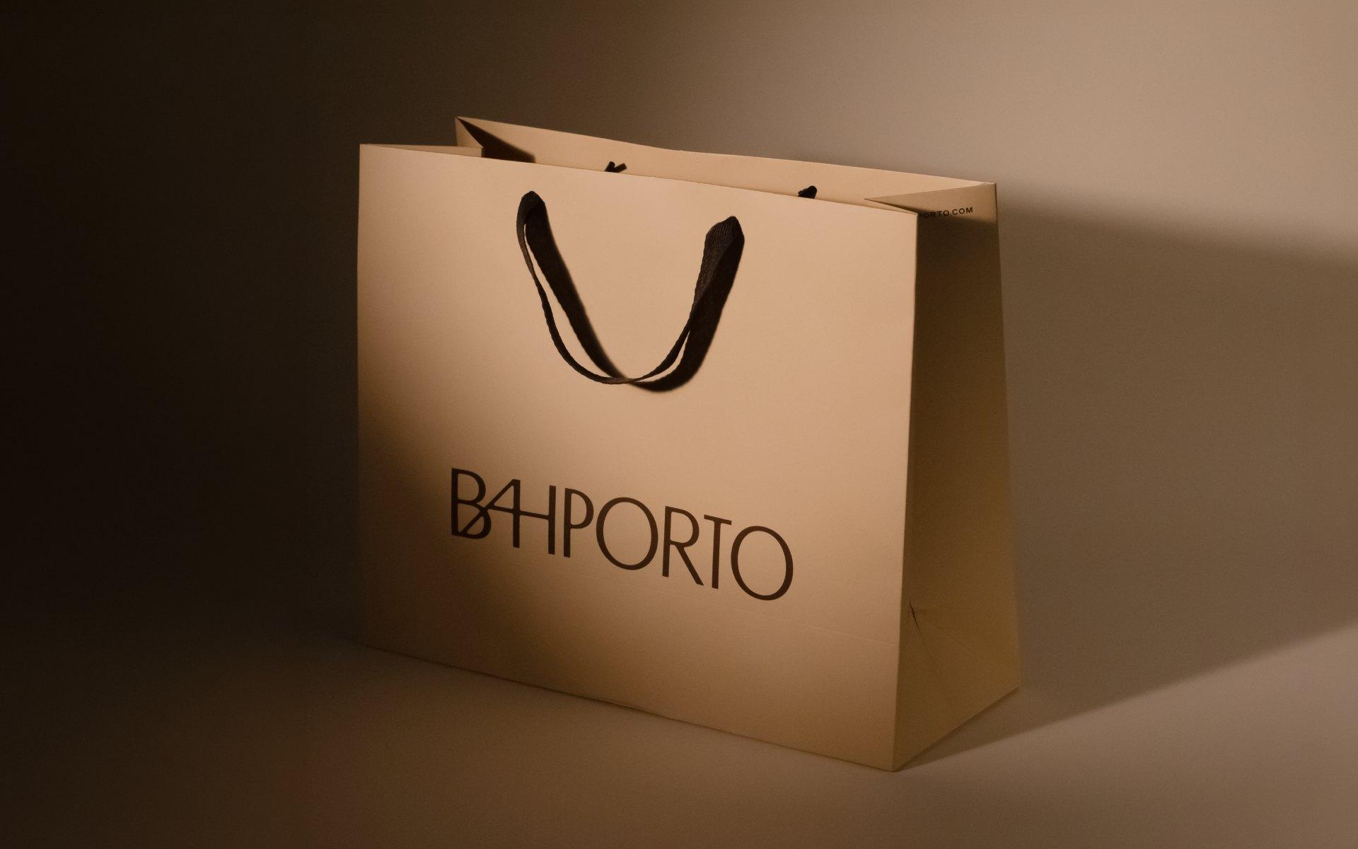
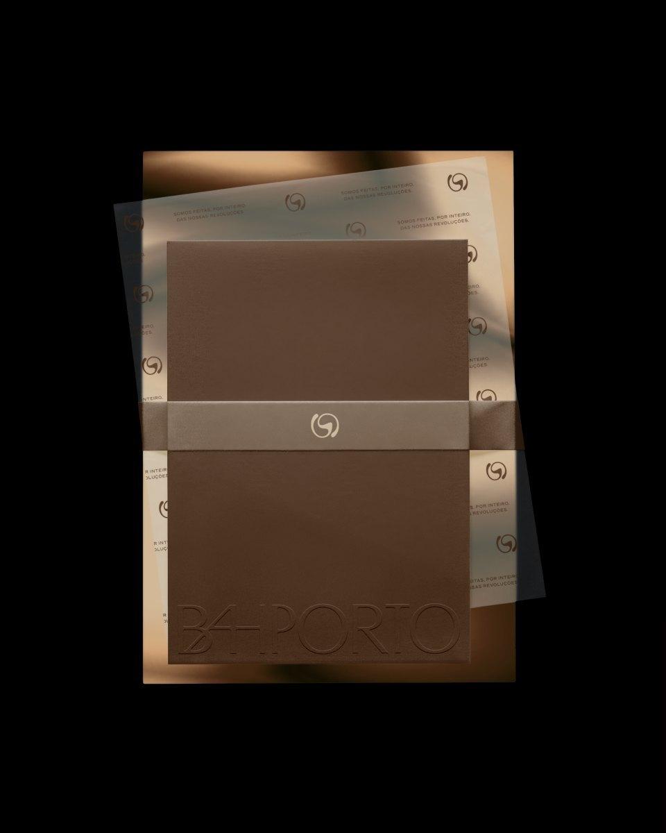
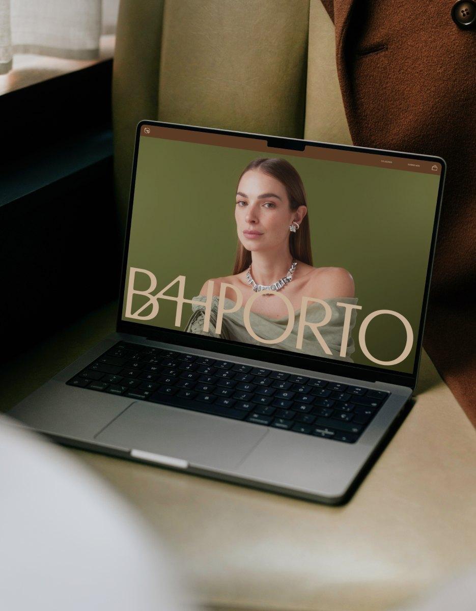
The jewellery house founded by Bárbara Porto in 2013 was repositioned around one conviction: a jewel is defined by its process. BRBAUEN led the strategy, the naming (from Bárbara Porto to BAHPORTO) and the verbal and visual languages, with a packaging system, collection architecture and brandbook.
- Client
- BAHPORTO
- Year
- 2025
- Sector
- Health & Beauty
- Services
- Quantitative ResearchQualitative ResearchBrand DiagnosisRepositioningStrategyVerbal IdentityVisual IdentityArt DirectionNamingBrandbook
About
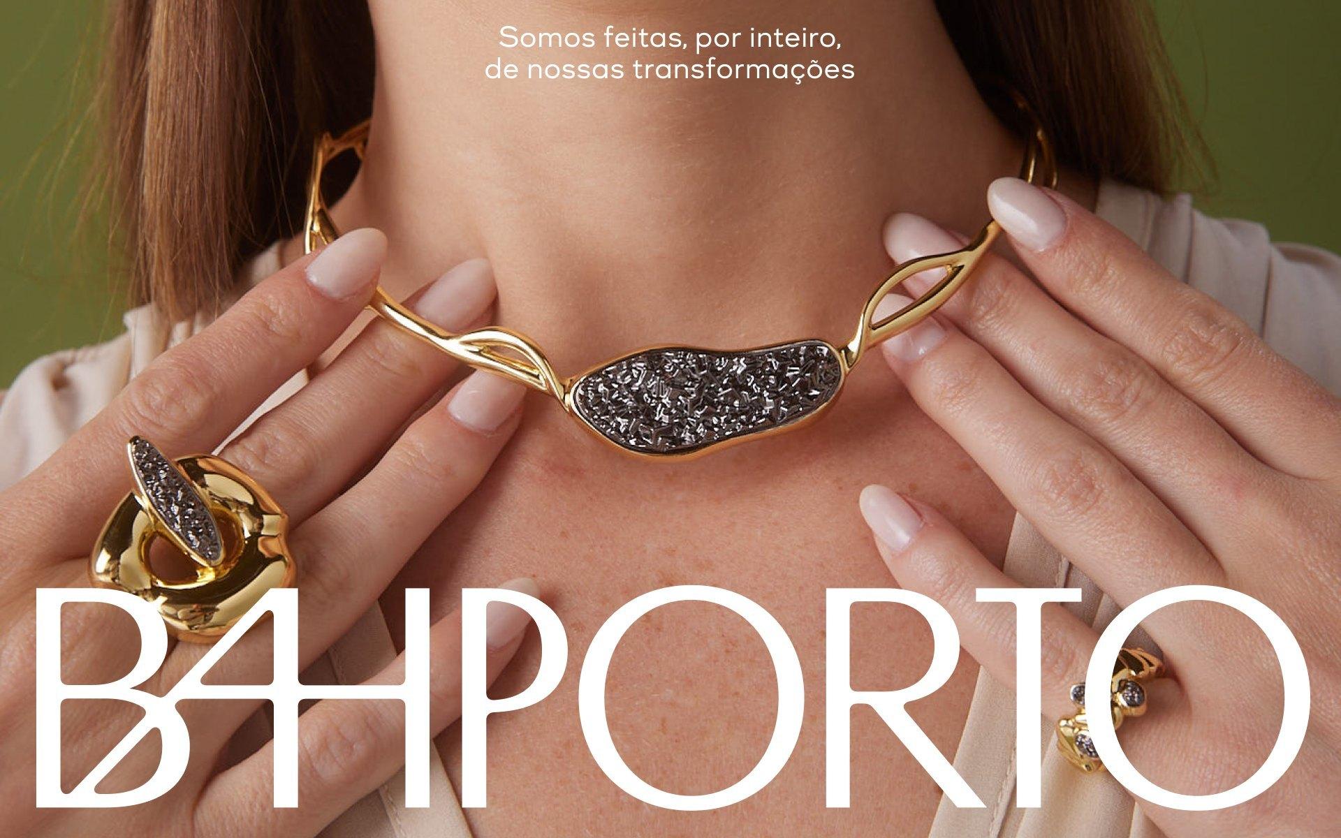
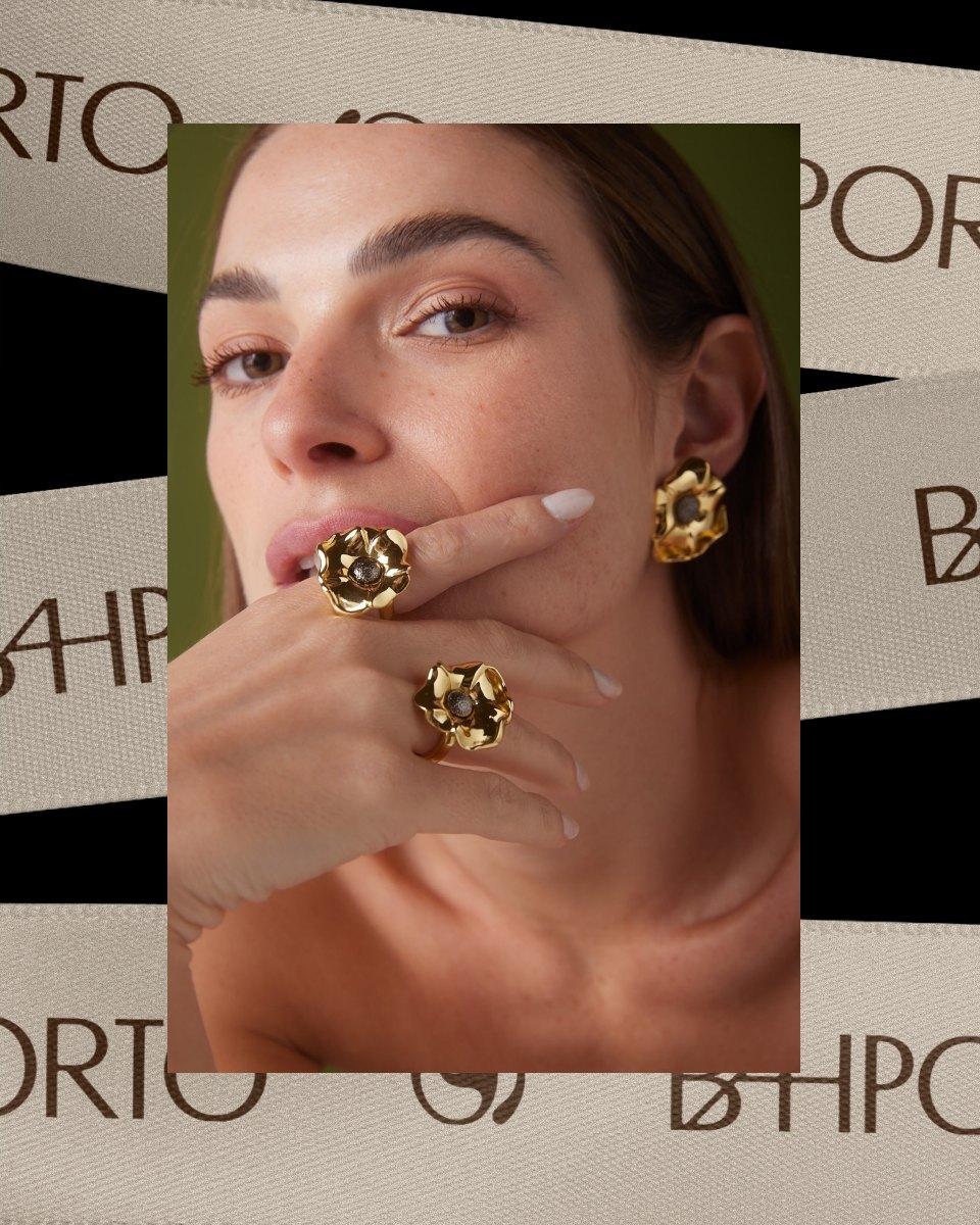
BAHPORTO was born as Bárbara Porto in 2013 and grew on a way of creating all its own: authorial pieces, made by Brazilian artisans, for women who recognise themselves in every detail. By claiming the word jewel, the brand stopped defining itself by the material. It came to be defined by the process: the hand that creates, the woman who wears.
Twelve years on, that same growth brought an impasse: a positioning that no longer represented the brand, and a clientele ever more demanding about what it wore. That was the moment, with a devoted following, resellers across the country and an e-commerce in constant expansion, that Bárbara Porto came to us.
Challenge
The brand conveyed presence through its jewels, yet carried an identity that still spoke of a delicacy that no longer fit. That mismatch opened a gap between what the brand did and what it said about itself. On one side, a founder and creative director who no longer recognised herself in her own brand. On the other, a devoted following taking ever more authorship of its own image.
Our role was to close that gap. To trade delicacy for creativity, femininity for authenticity, empowerment for protagonism, without losing what already held the public's attachment.
Positioning
Facing a public that already owned the authorship of its own image, the answer came in the platform "We are made, wholly, of our own revolutions". Under it, BAHPORTO came to be guided by its own authenticity: a creative, authentic brand with a leading role, able to sustain plural collections, free of constraints.
Language
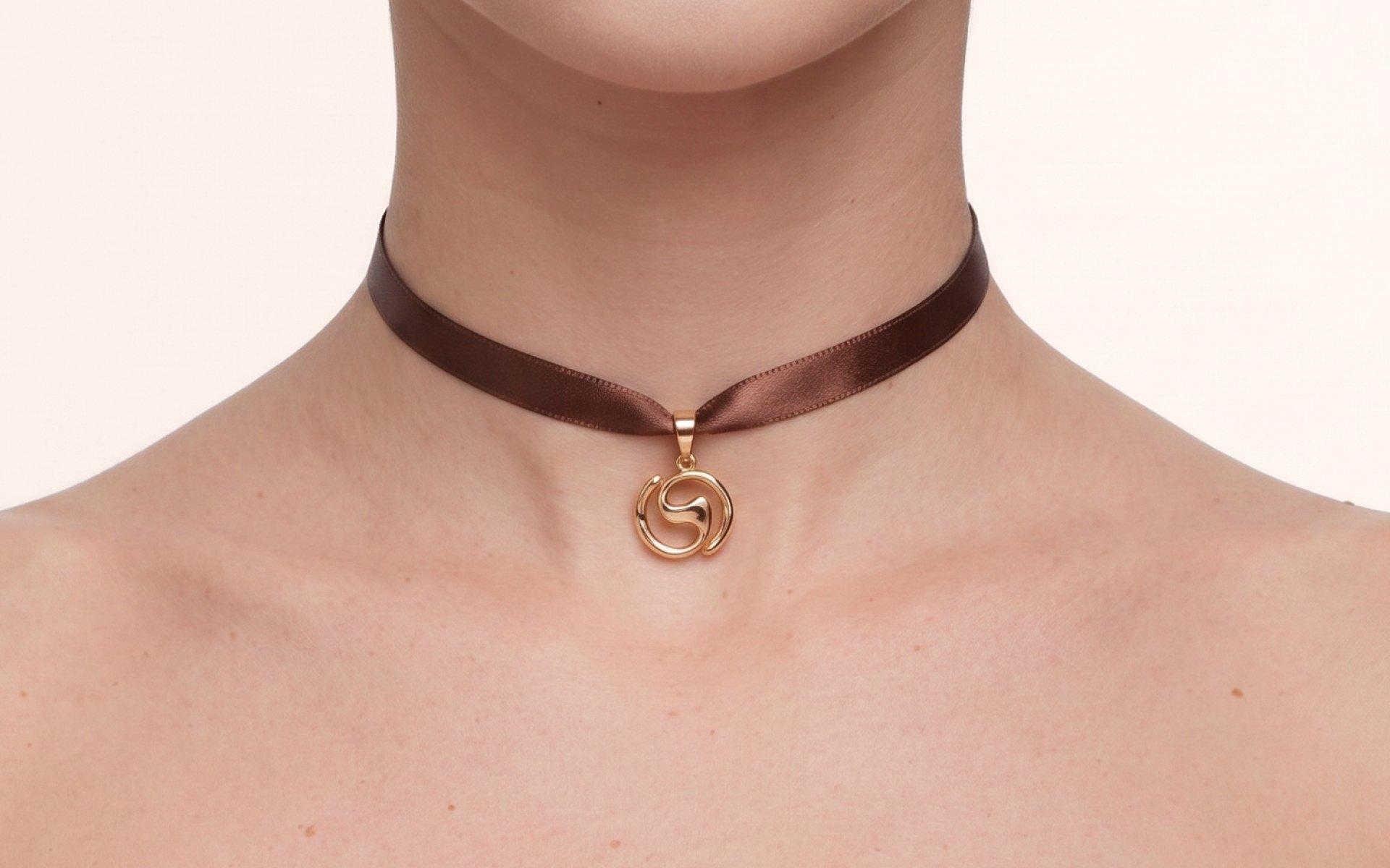
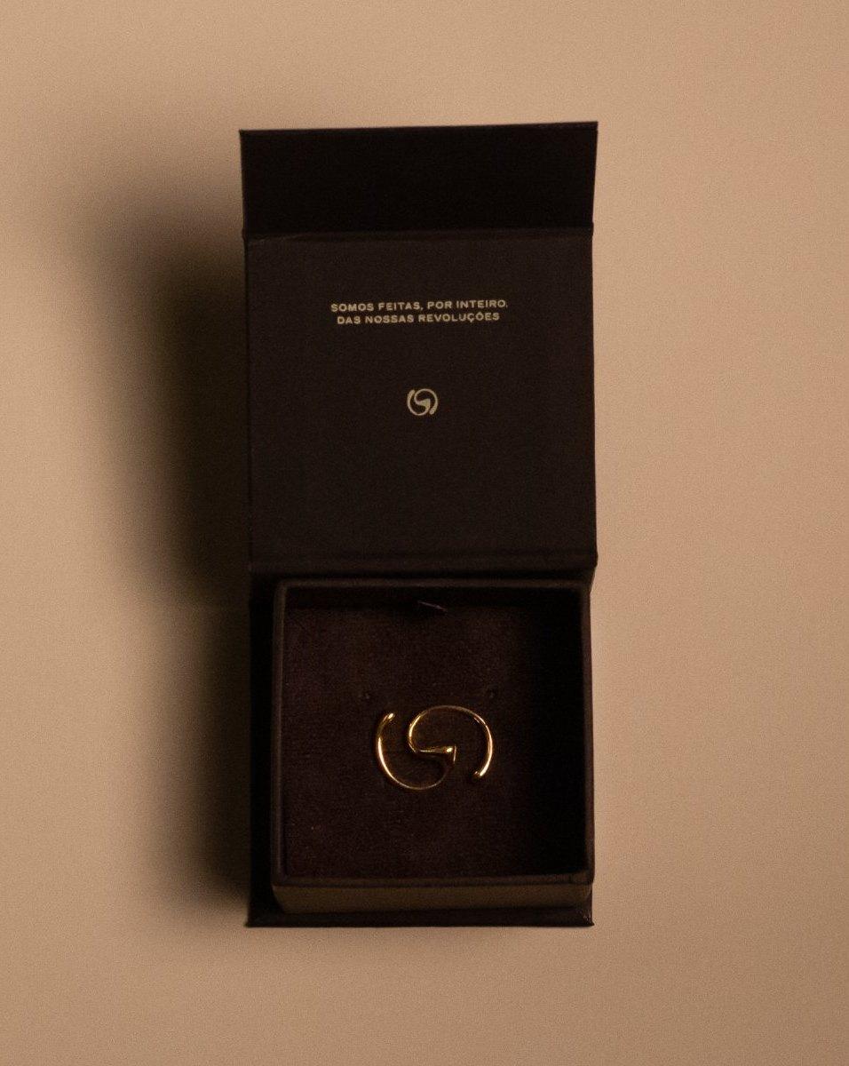
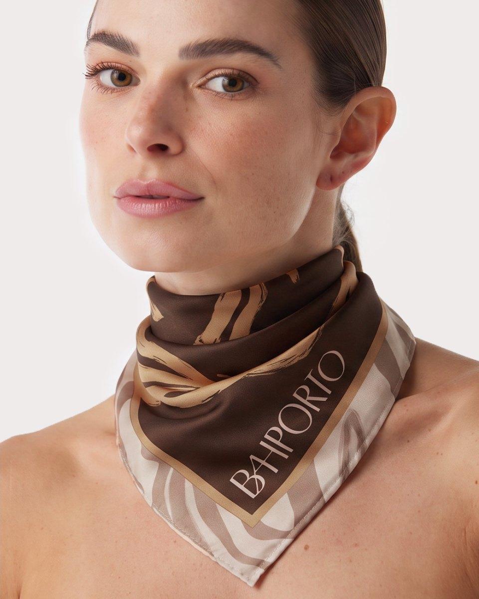
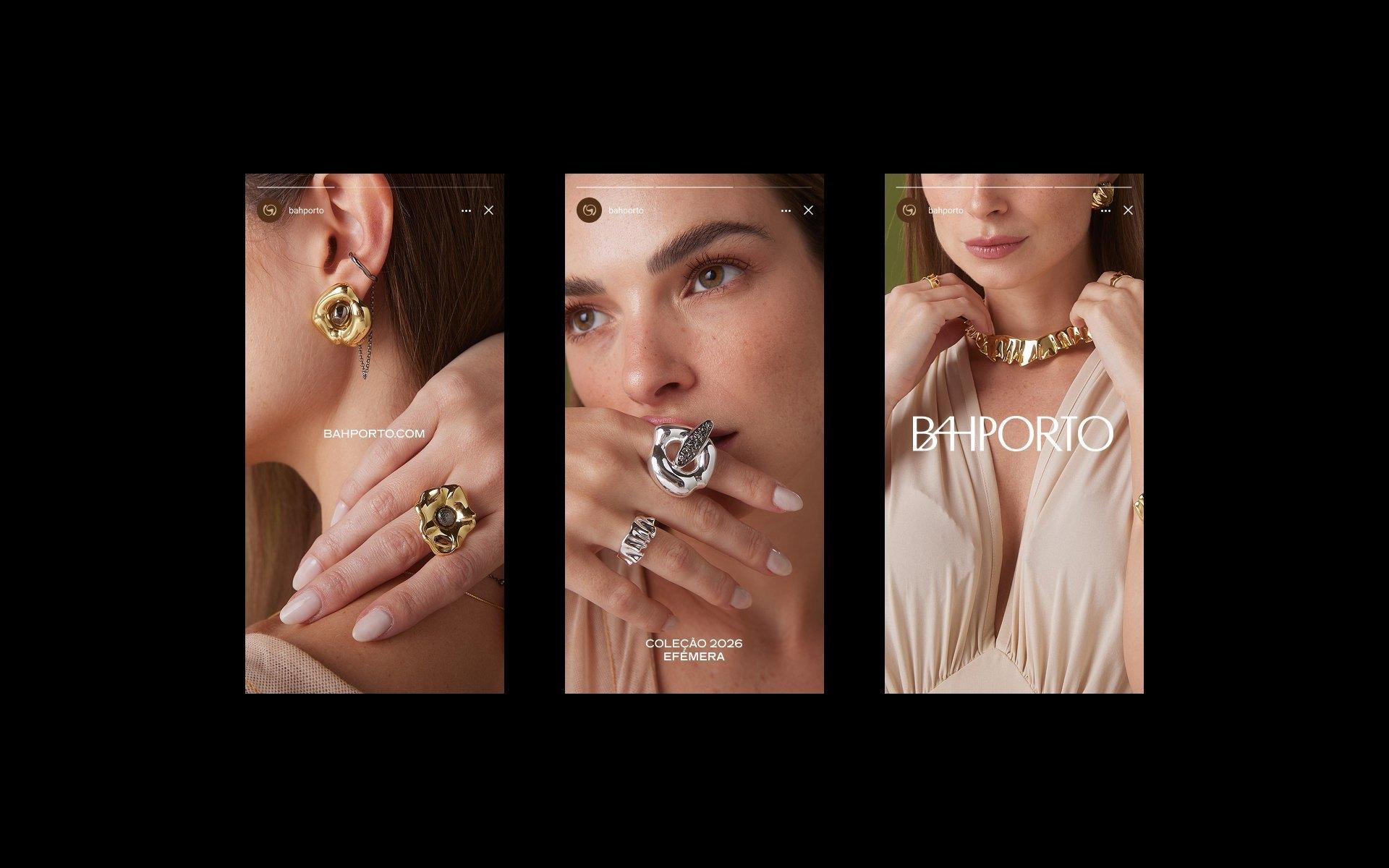
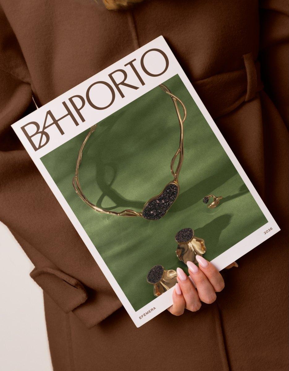
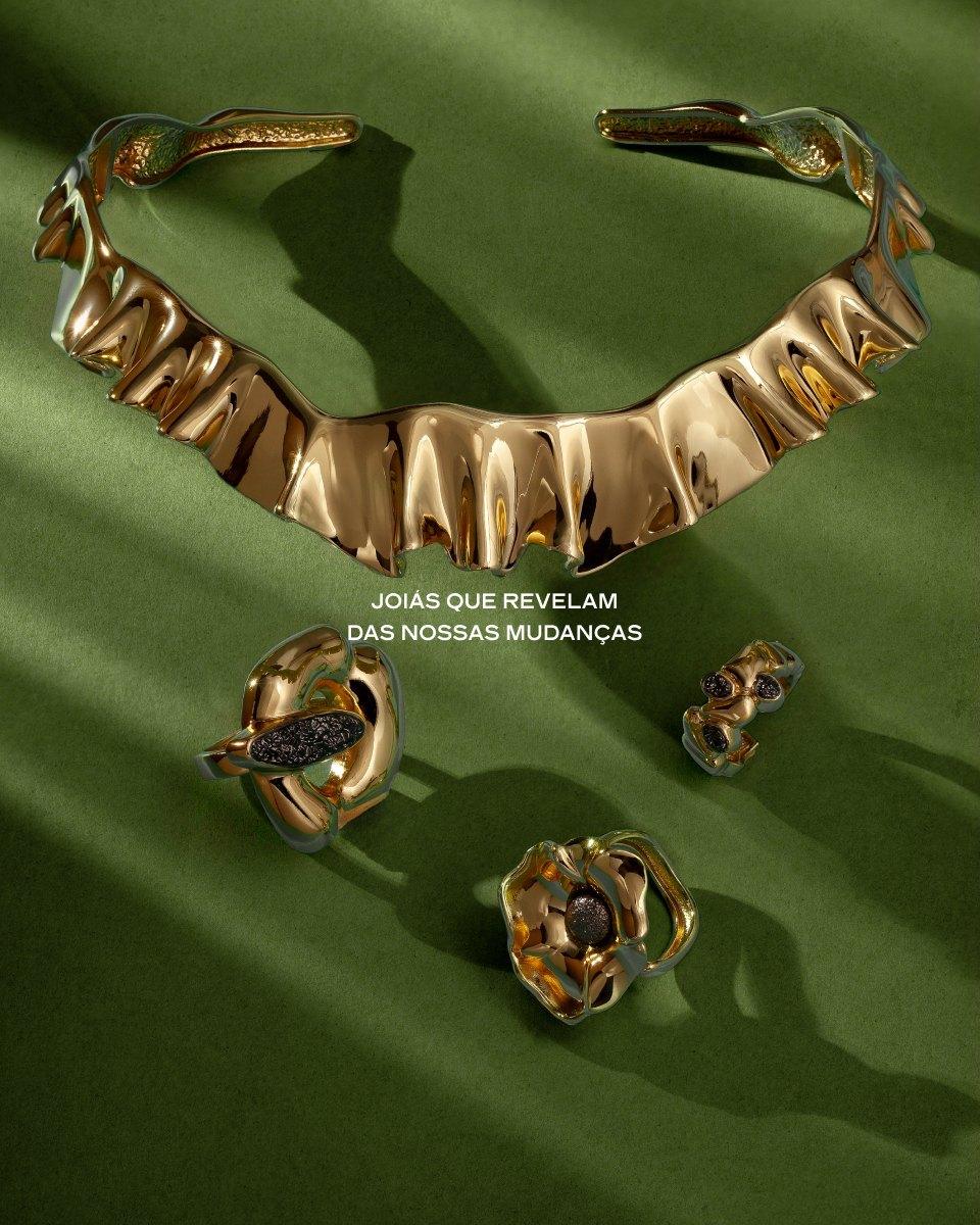
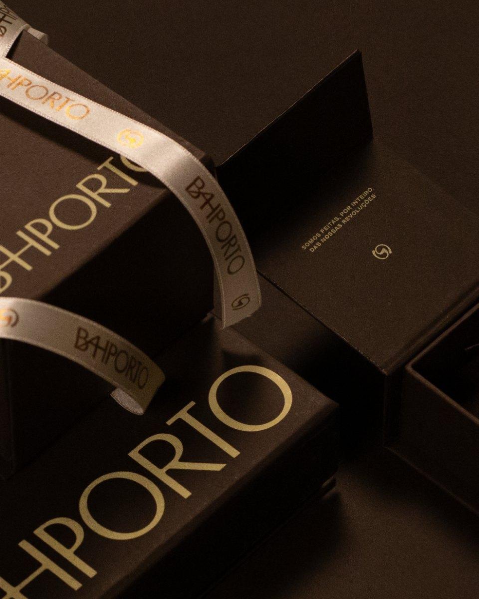
In the visual identity, every choice comes from the same research: the symbol is born of the spiral (a universal representation of evolution) and of the fluidity of raw gold before it becomes a jewel. It is the same organic form found in the asymmetric gesture of the pieces, repeated as the brand's signature.
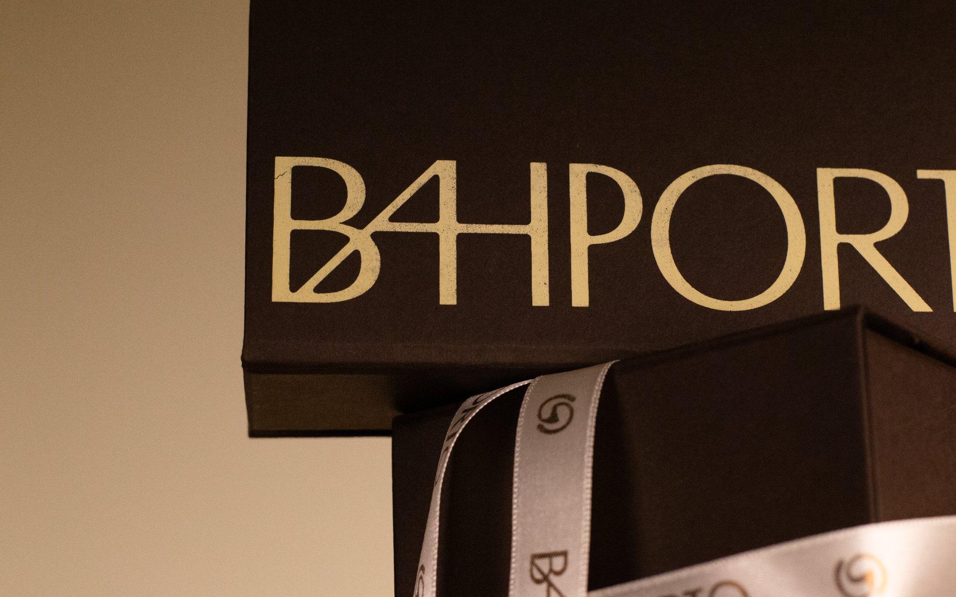
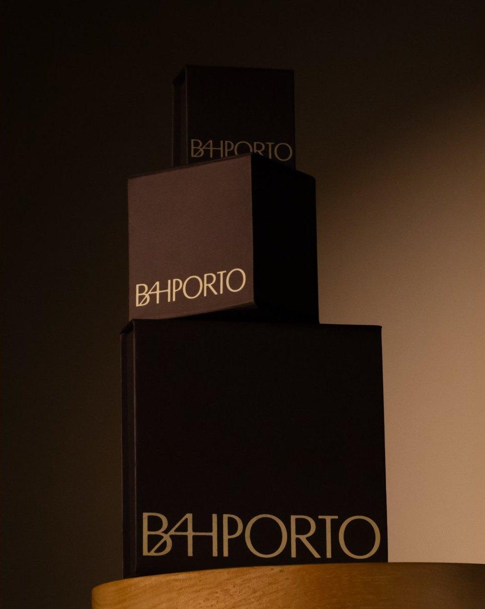
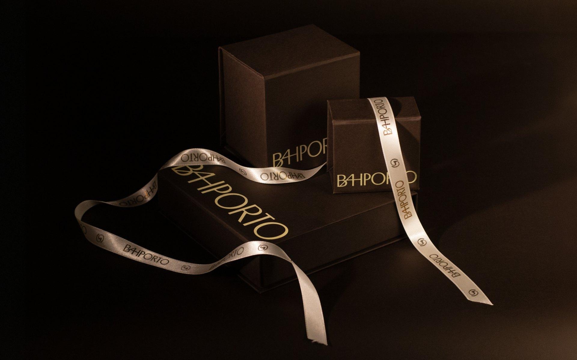
That signature doesn't stop at the piece. It carries into the delivery: the act of enchanting begins before the jewel leaves the box, in the weight of the paper, the gesture of the ribbon, the care taken in wrapping each piece. That is the detail BAHPORTO believes in.


Team
Select work
Zavi
An aesthetic-medicine clinic, named and positioned to treat beauty as health
More Info →