Zavi — Take care of yourself entirely
Zavi
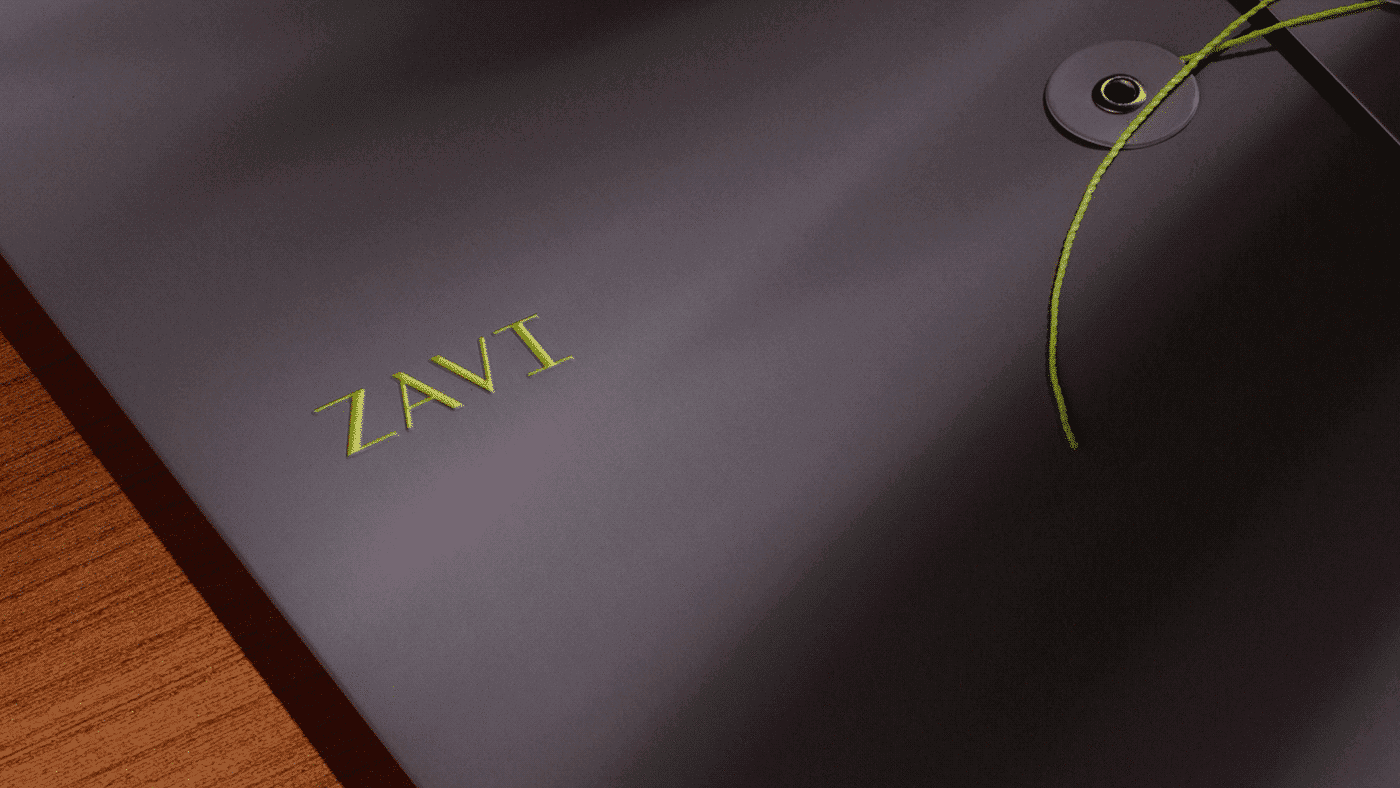
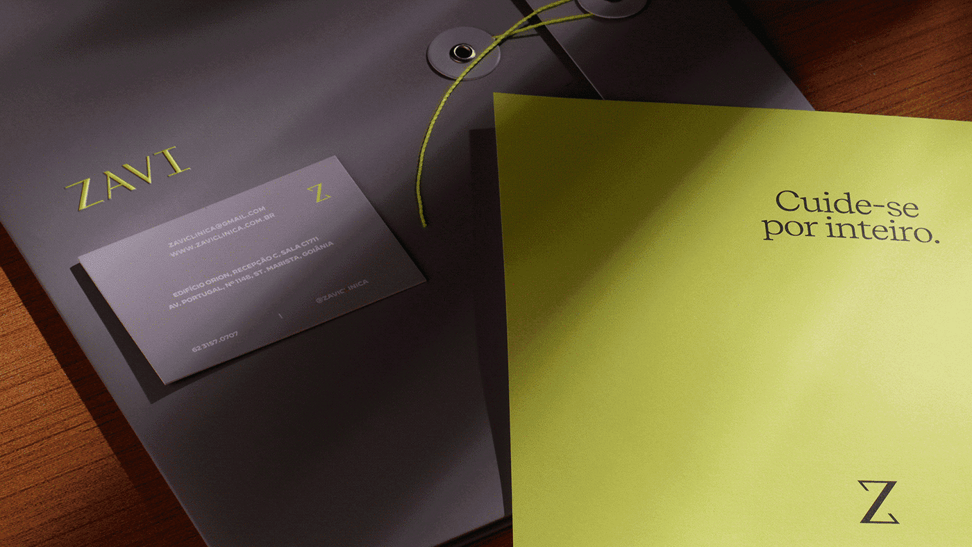
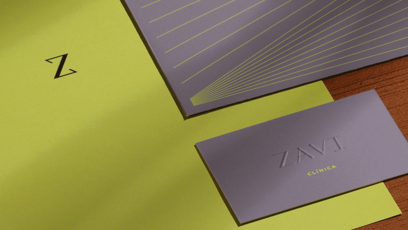
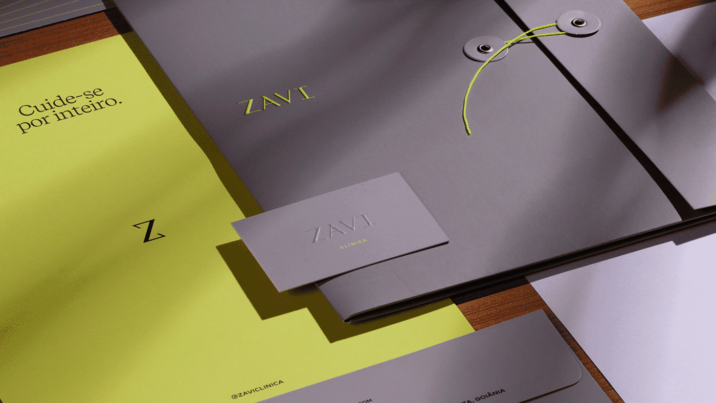
Zavi is an aesthetic-medicine brand created by a group of young doctors, on the conviction that aesthetics is health, not vanity. BRBAUEN created the positioning, the naming — 'Zavi', a synthesis of saúde, santé and savvy — and the verbal and visual identity, avoiding the sector's 'luxury' clichés: a 'Z' symbol that evokes DNA and neon yellow as a colour connecting different audiences.
Zavi — Take care of yourself entirely
Zavi is born from the dream of a group of young doctors. The motivation is simple: the doctor is not an unreachable figure, and the client experience is fundamental to building connections. Medical aesthetics can and must be delivered with the highest technical qualification; it is a matter of health, not vanity. Far beyond stereotypes; far beyond exaggerated facial harmonizations, but with the awareness that one's own image is fundamental to the balance of health and well-being.
The key question raised in the diagnosis was: how do you belong to the segment while still standing out? The visual clichés of the segment treat high technical standards as "luxury" — a practice that results in a visual universe of gold, grand chandeliers, and neoclassical architecture as the norm. It became clear this was not the brand perception they wanted.

- Client
- Zavi
- Year
- 2023
- Sector
- Health & Beauty
- Services
- PosicionamentoNamingIdentidade VerbalIdentidade Visual
Naming
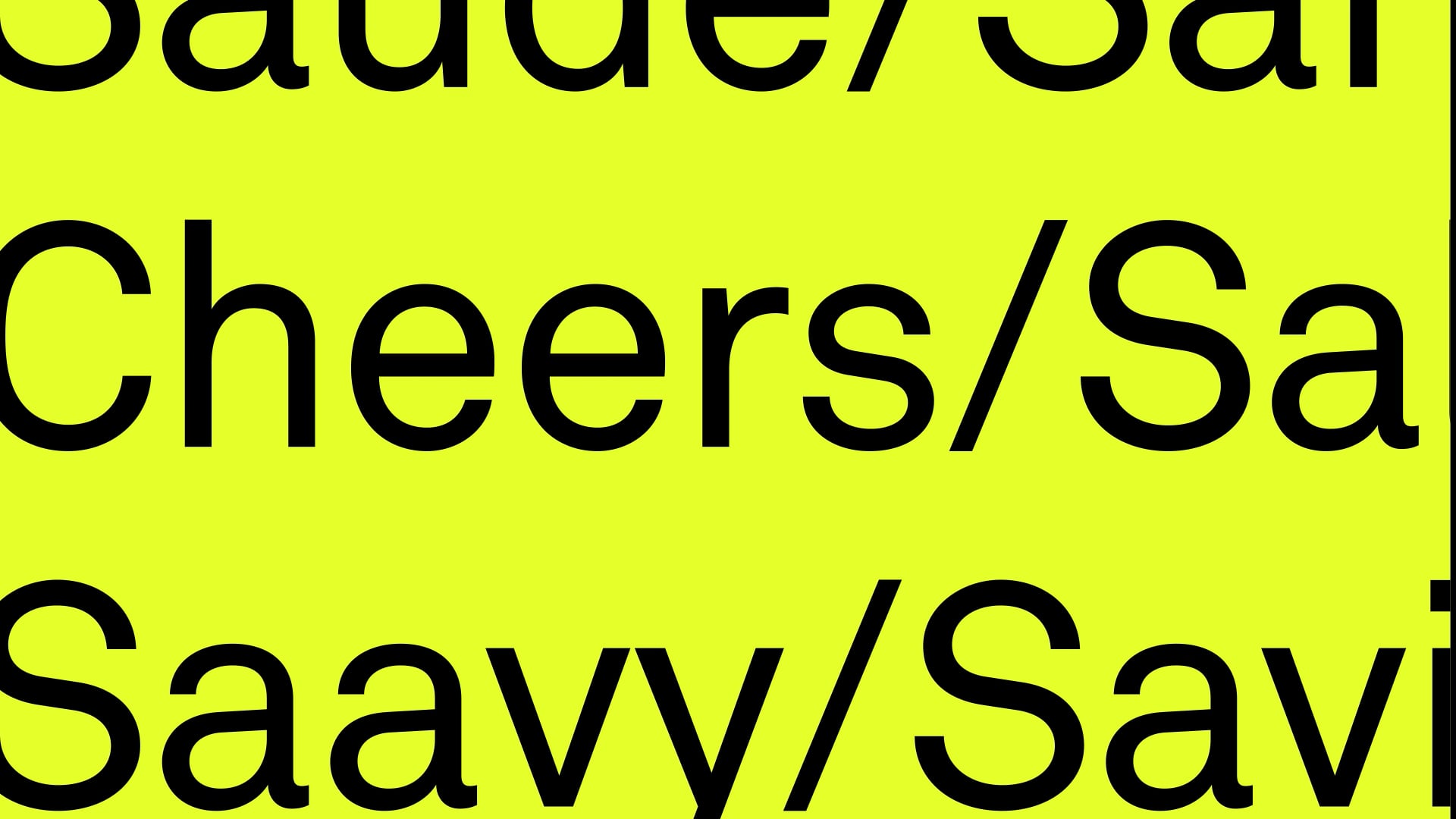
Sophistication / Timeless / Health / Science + Sensitivity / Santé / Cheers / Salute / Savvy / Zavi
An ode to health made with science and sensitivity — starting with the name.
We can be fully present in our own lives: "Take care of yourself entirely" is the synthesis of the brand vision. Uniting science and sensitivity for medical aesthetics led to the construction of an invented name that says everything about the brand: Saúde, Santé, Savvy = Zavi.
A short name, with a strong and memorable sound — far from the more obvious forms, with surnames or words that reference sophistication literally (e.g. Sofisticato, Eleganza).
The intention is to bring the subject to a broader audience. From teenagers with hormonal disorders and acne, men with baldness, women who take care of themselves during pregnancy, elderly women dealing with varicose veins. We defined a brand essence that would allow it to go beyond stereotypes — perceived as something of added value without reproducing the segment's common ground.
Visual
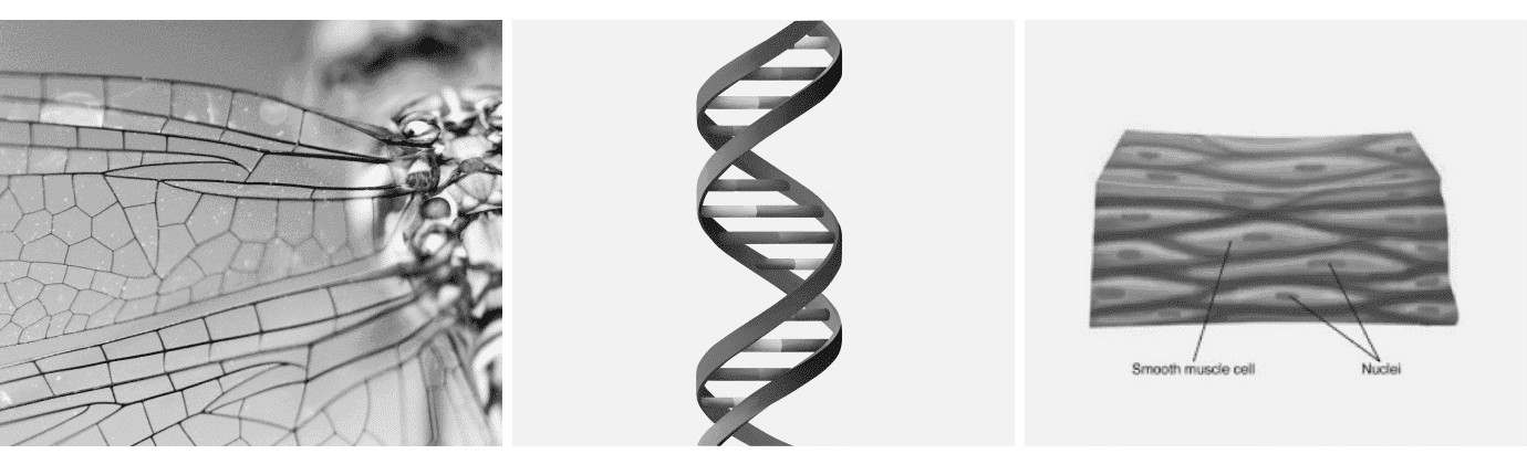
Skin / Science / DNA / Biomimetics / Movement / Longevity
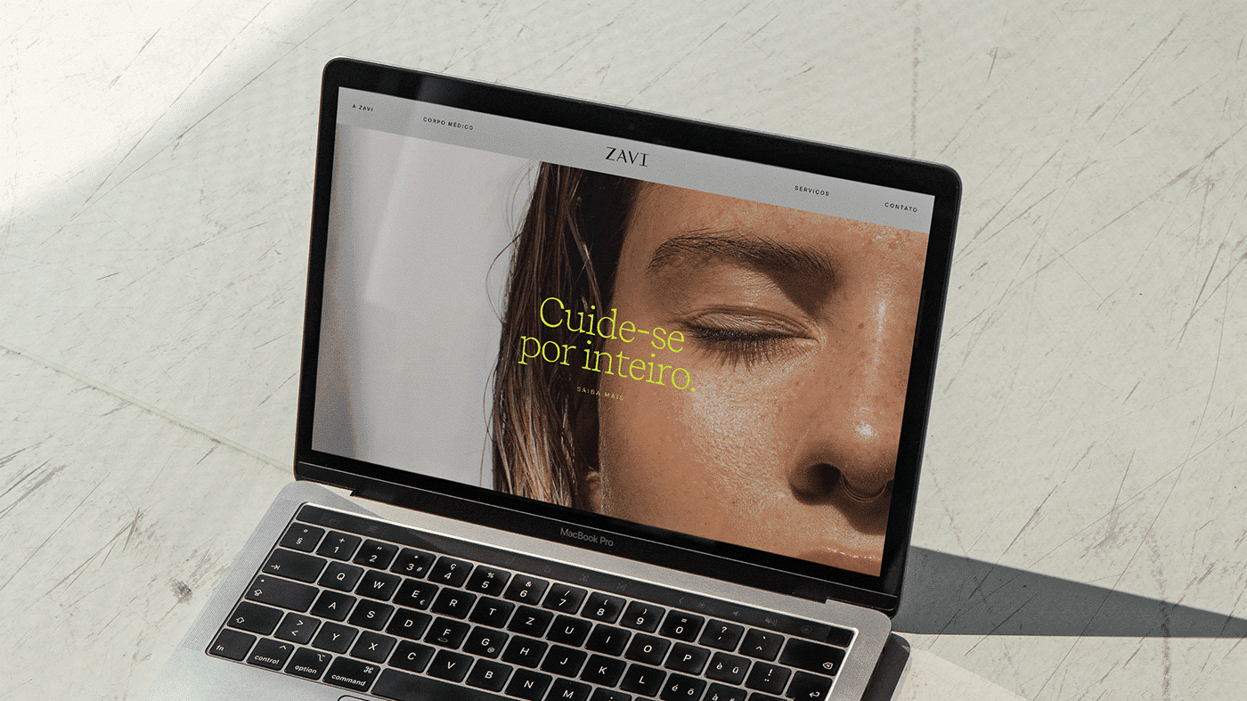
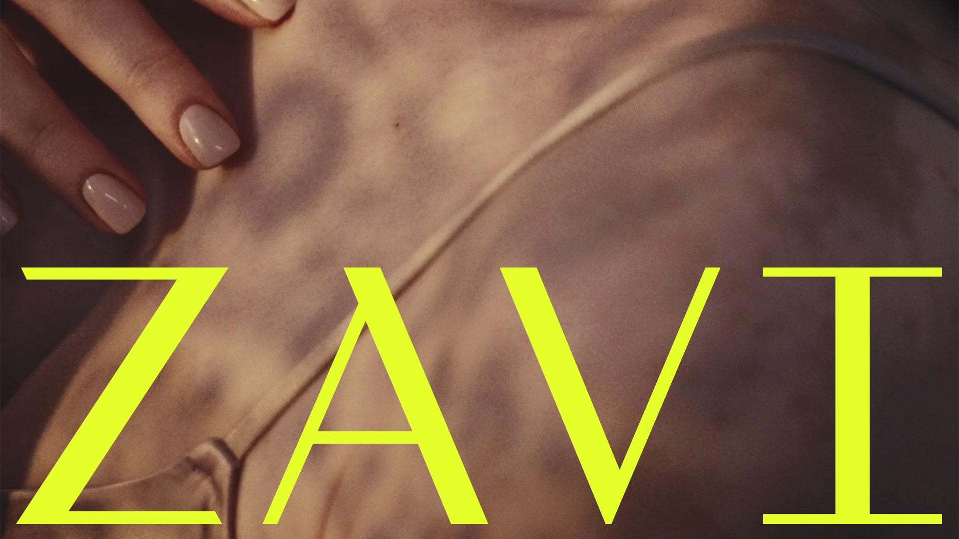
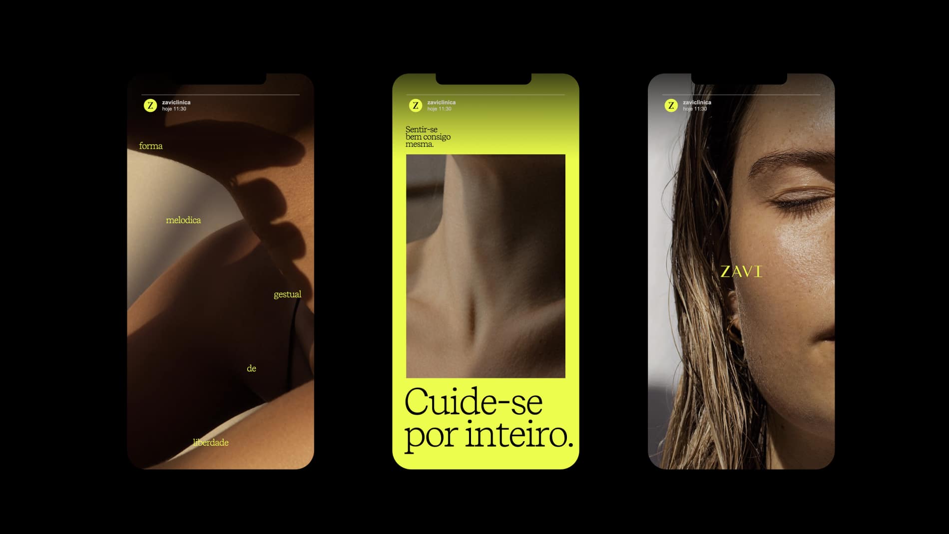
The brand's visual language has a photographic style designed for real people, with different skin tones and without excessive retouching. It's fine to have freckles and wrinkles; the lightly saturated photography suggests spaces with natural light and life outside the office.
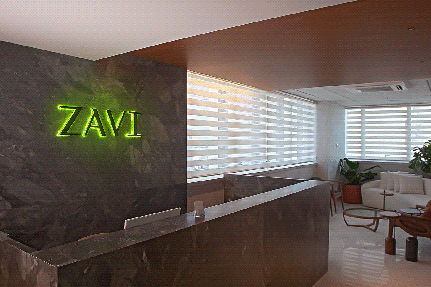
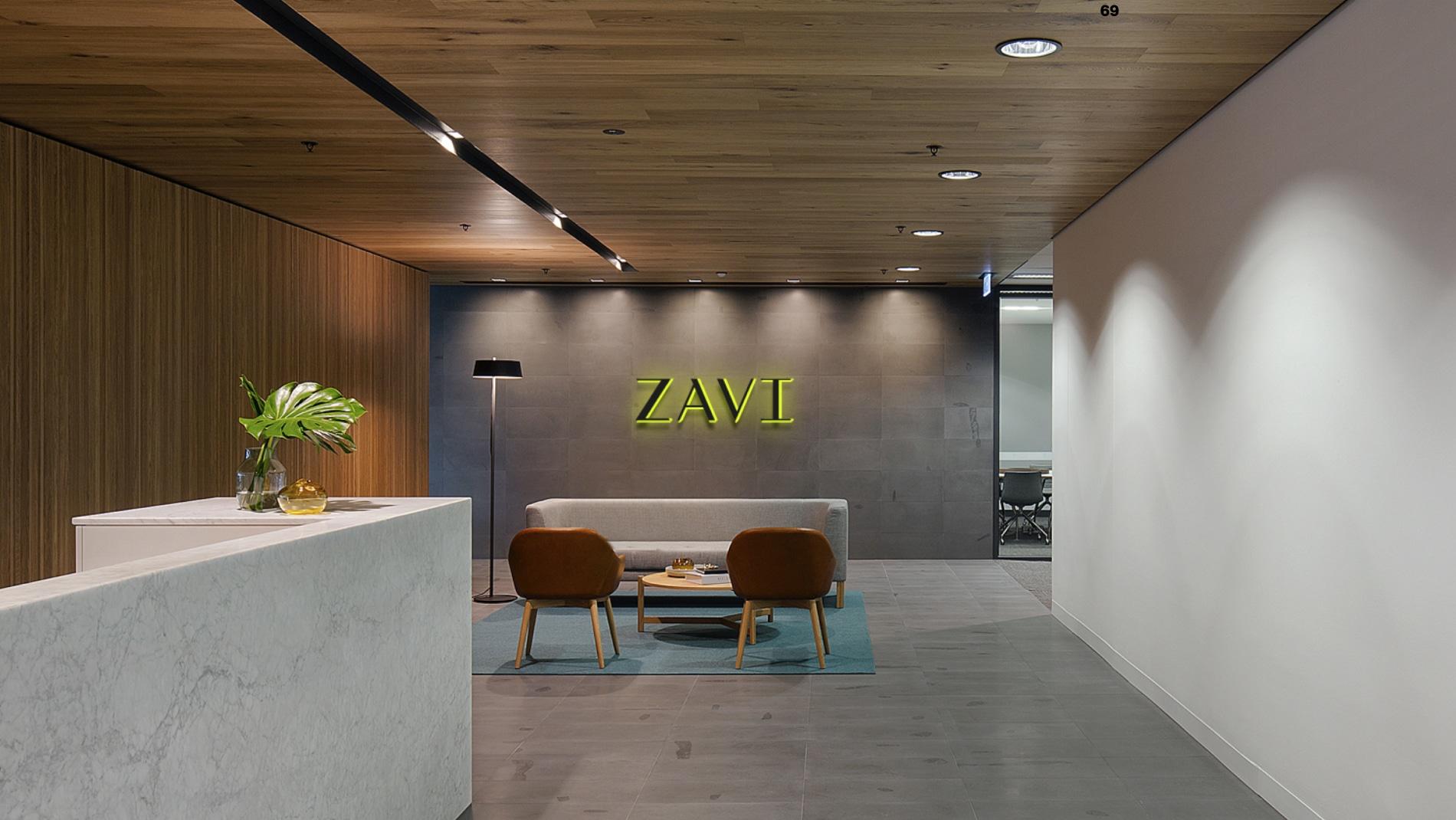
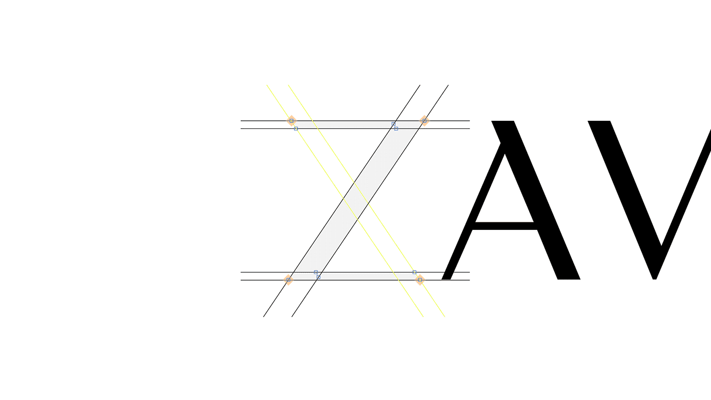
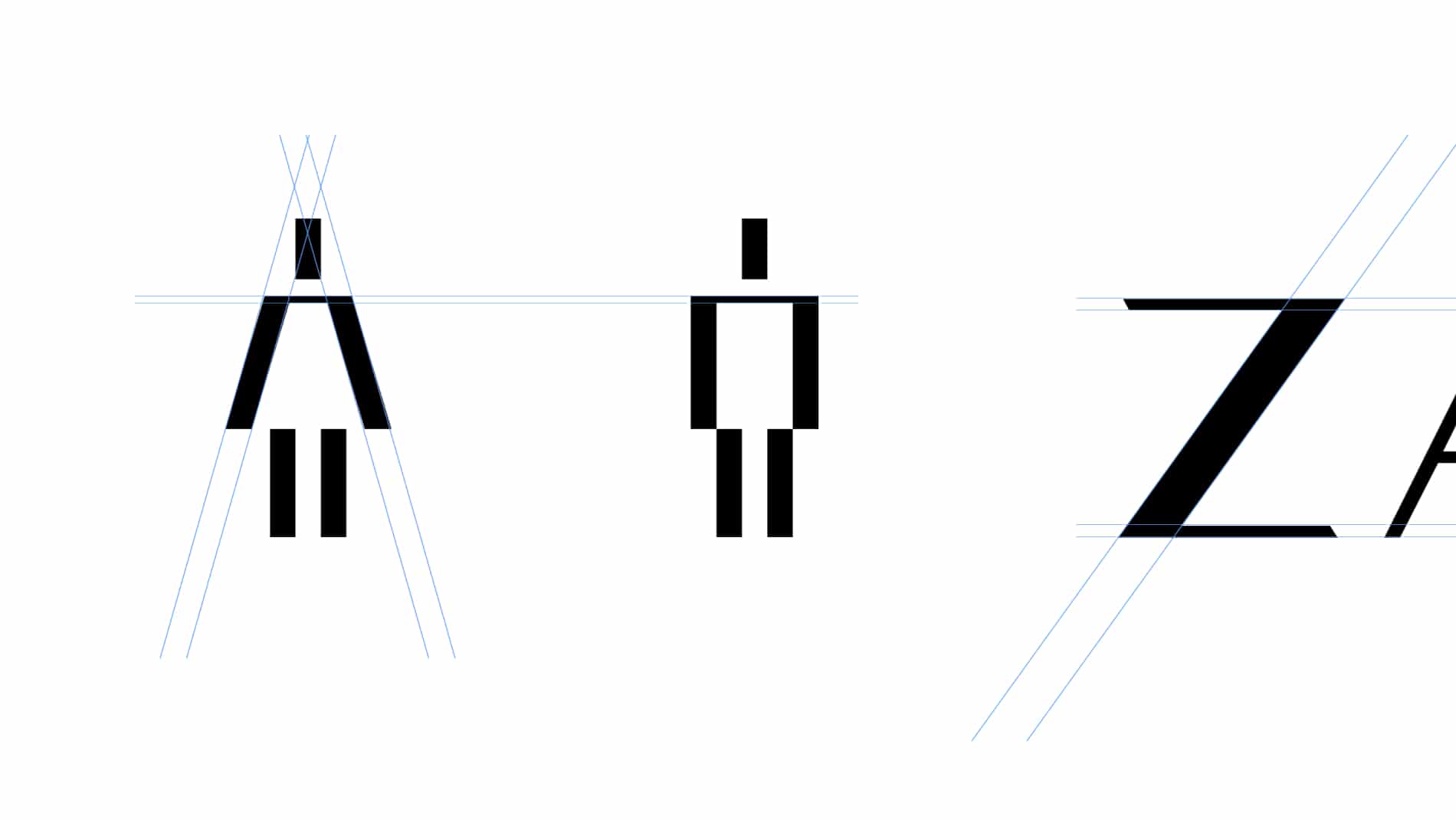
The logotype is the most conservative (albeit isolated) element of the language and was custom-designed to translate something that could convey 'trust' for the group's young doctors. As a symbol, the "Z" receives layers of abstraction that unite the Z with the graphic synthesis of DNA, functioning as a living element in motion.
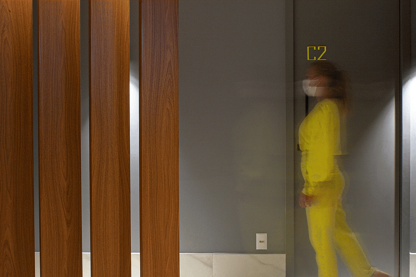
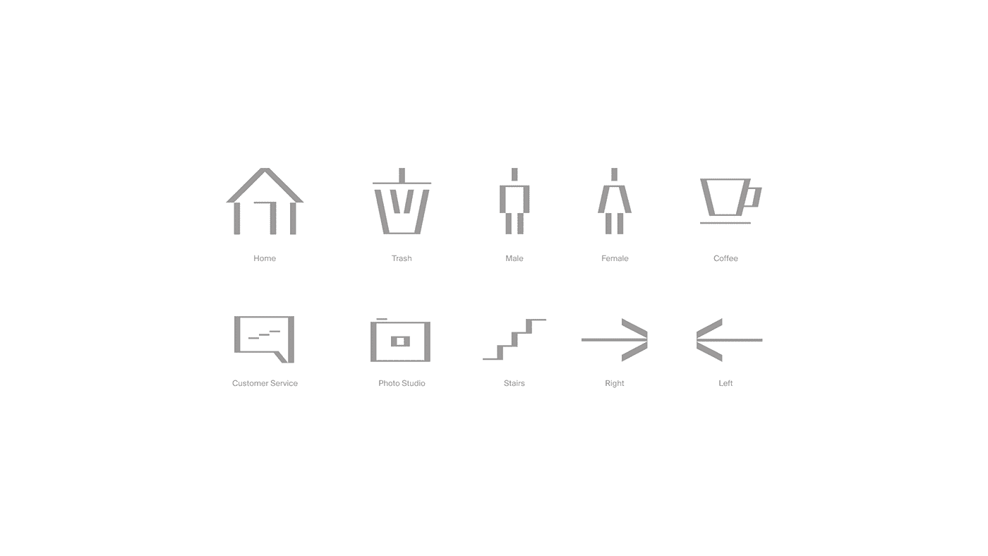
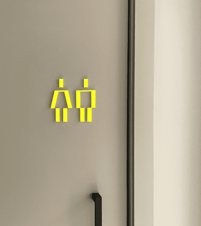
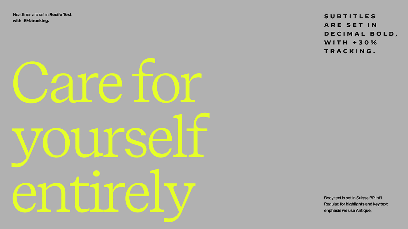
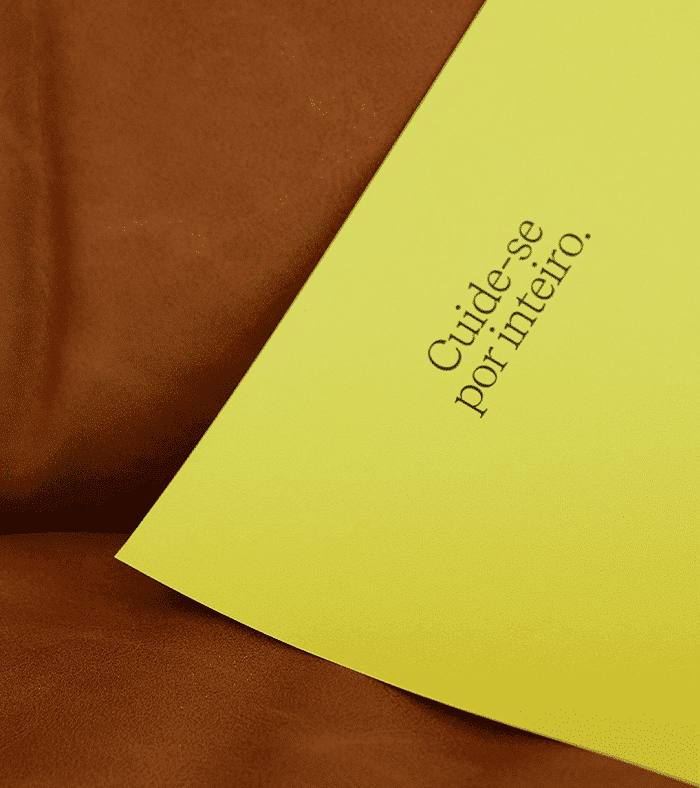
Present in everything — from fitness t-shirts a 70-year-old man might wear for a walk, to Off-White sneaker collections, to one of Billie Eilish's hair looks: neon yellow is the brand's color. The intention is to use it as a connection element across different audiences and as a high-visibility marker for the brand — whether in a cord that seals a package or in the details of the signage system.




Impact
Recognition
- Behance, 2023
- Behance, 2023
Team
Select work
Layla Monteiro
A personal brand in health and beauty, given its own visual identity
More Info →