Peppino
Peppino
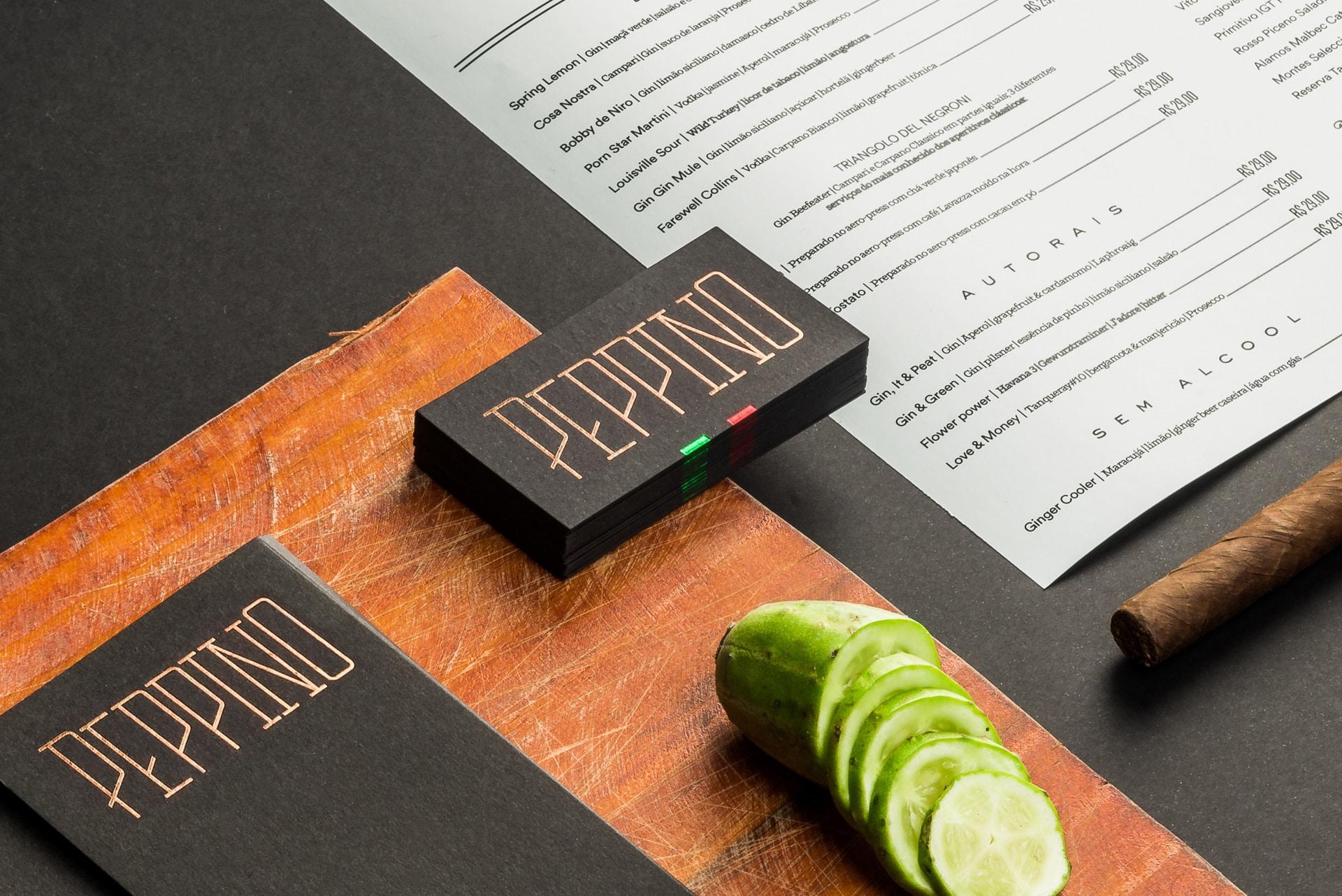
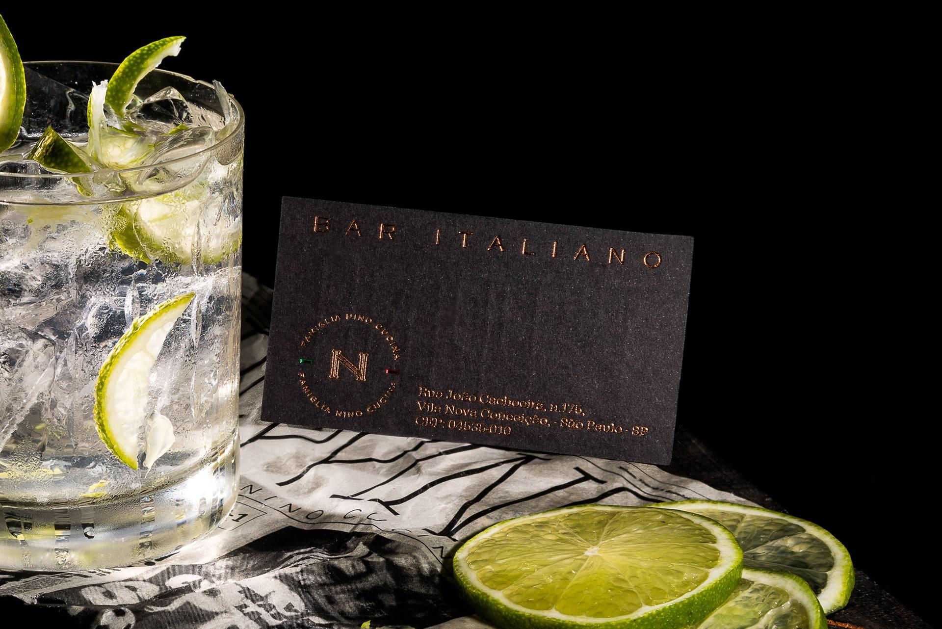
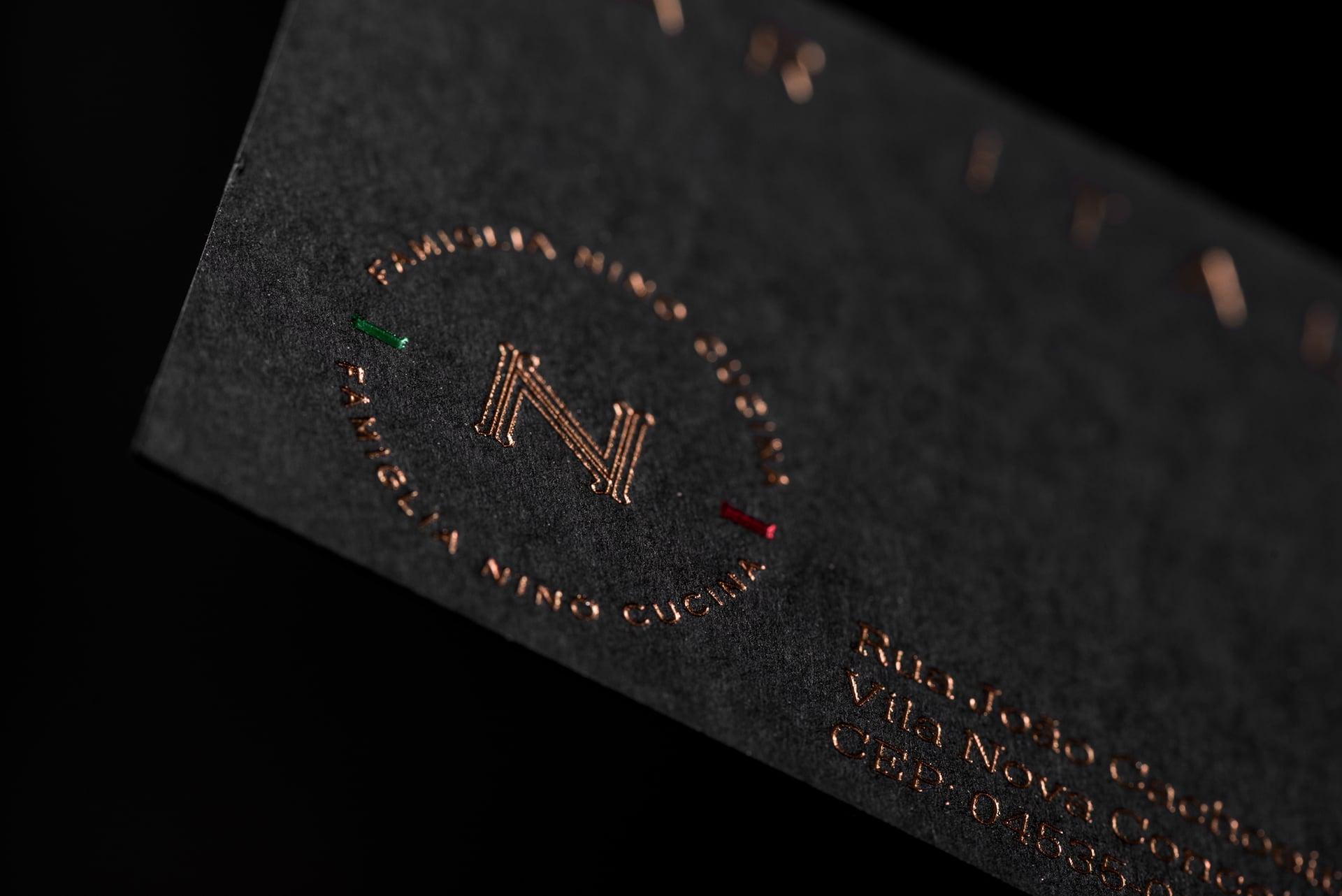
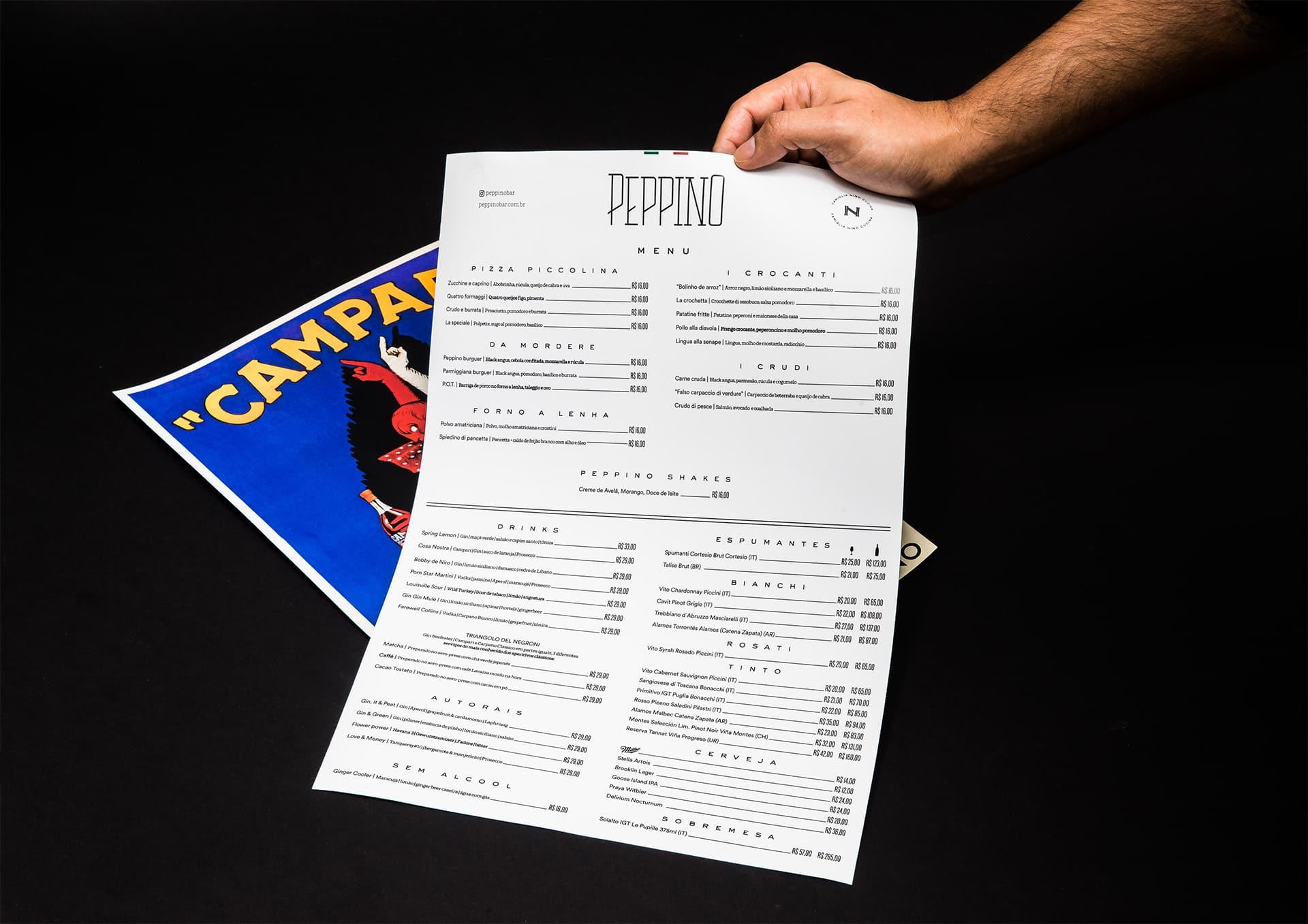
Peppino brings the experience of an authentic Italian bar, created in 2016 by partners Rodolfo di Santis and Renato Calixto. BRBAUEN developed the branding and an identity inspired by the typography of Italian bar façades, treating the stationery itself as a façade. The bar was voted the 2017 revelation and its logo became a neon landmark on Rua João Cachoeira.
About
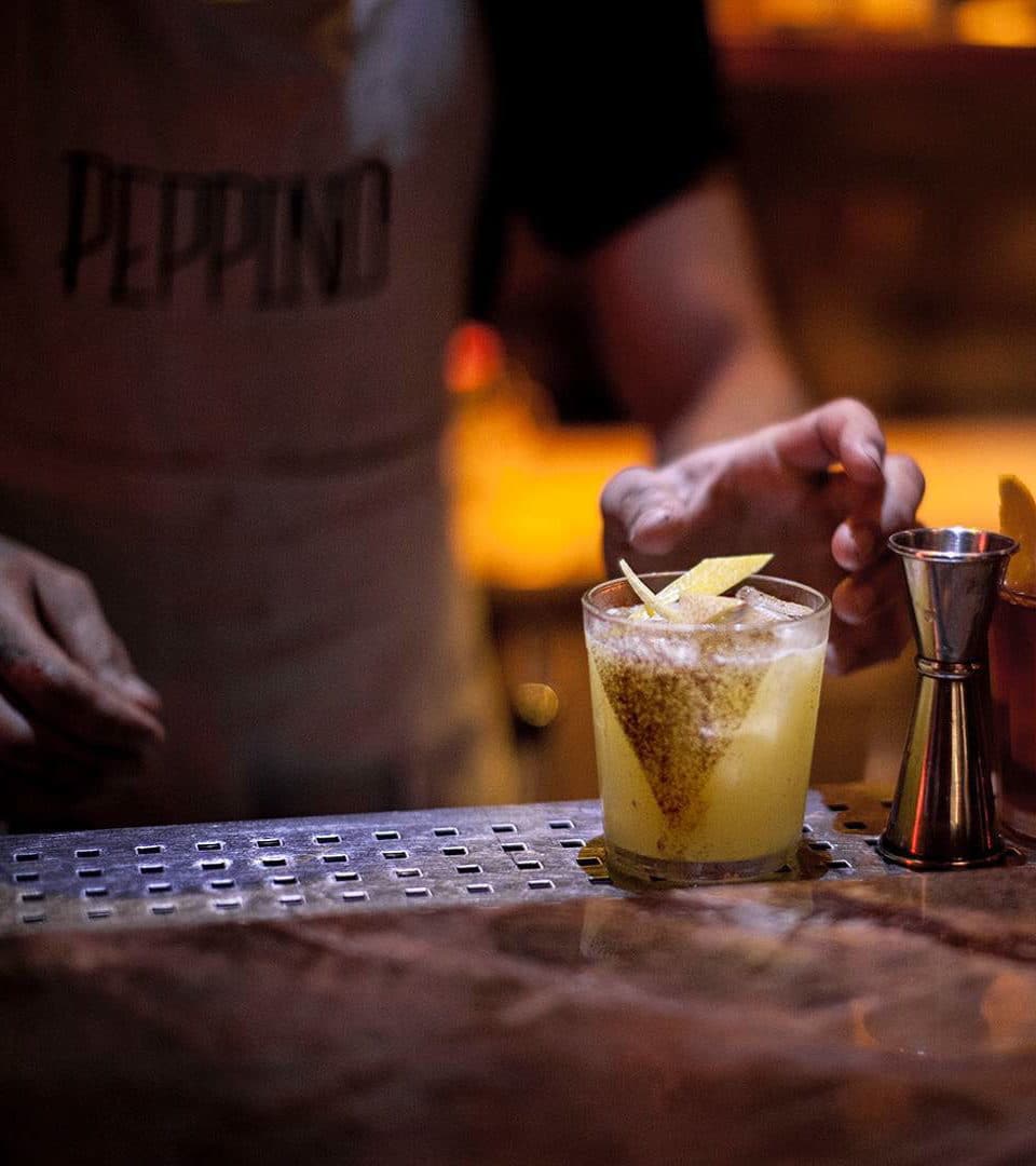
Peppino Bar was created to bring the authentic experience of an Italian bar to São Paulo. Founded in December 2016 by partners Rodolfo di Santis and Renato Calixto, the bar won over the São Paulo public right at its opening. Rodolfo was voted Chef of the Year at VEJA COMER & BEBER in 2016, and at that time announced that a sibling of his already-established house Nino Cucina would have a "younger, rebellious brother."
- Client
- Peppino
- Year
- 2016
- Sector
- Food & BeverageHospitality
- Services
- BrandingIdentidade Visual
Abordagem
Approach
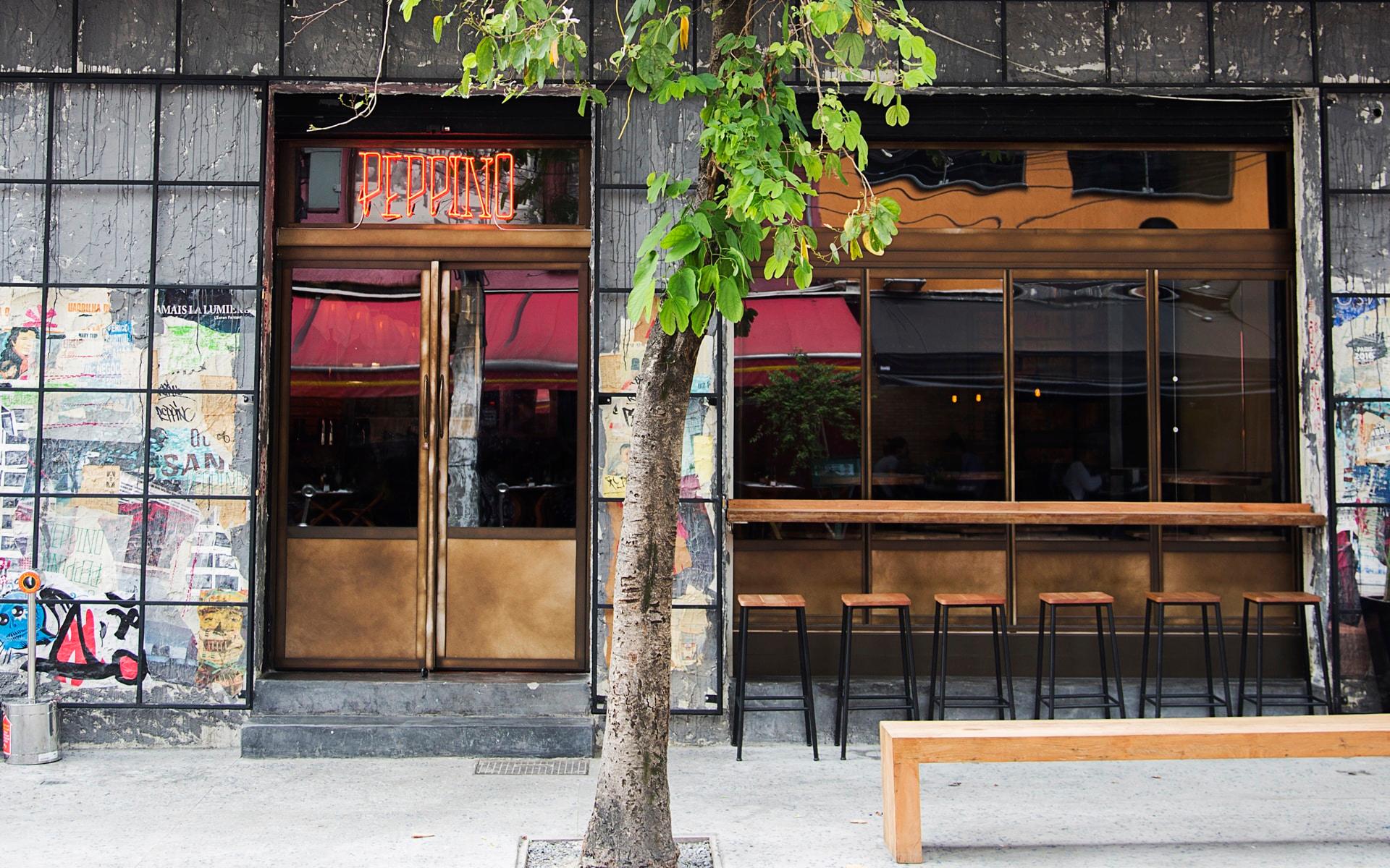
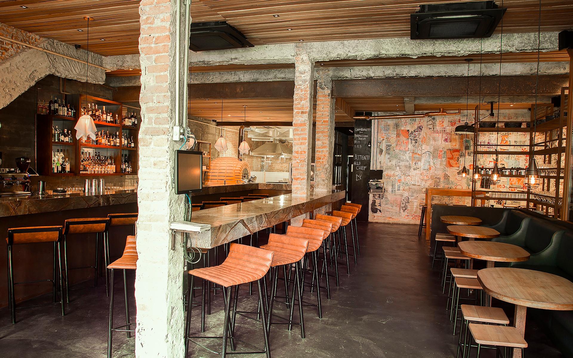
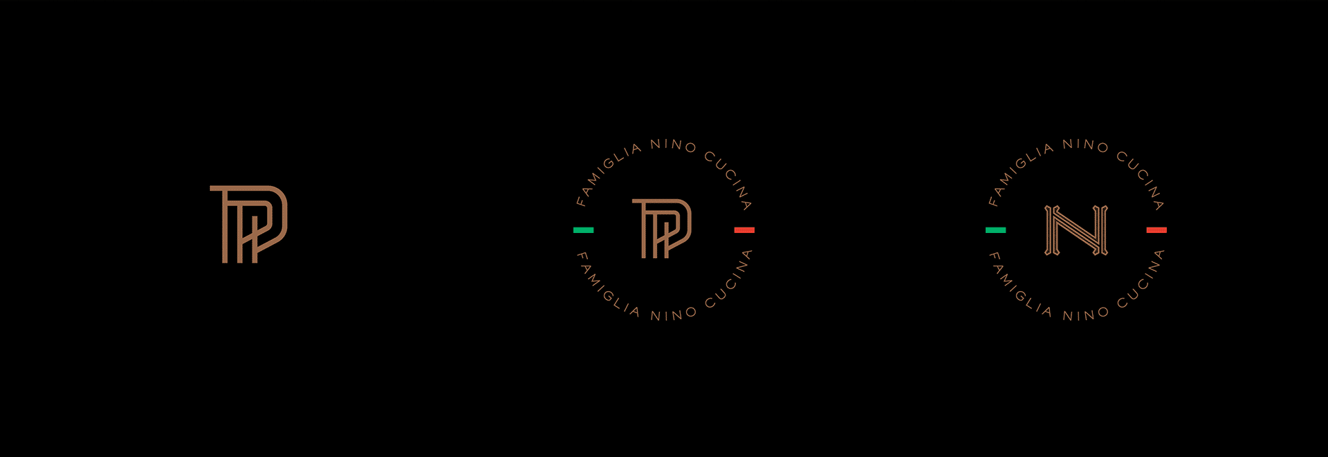
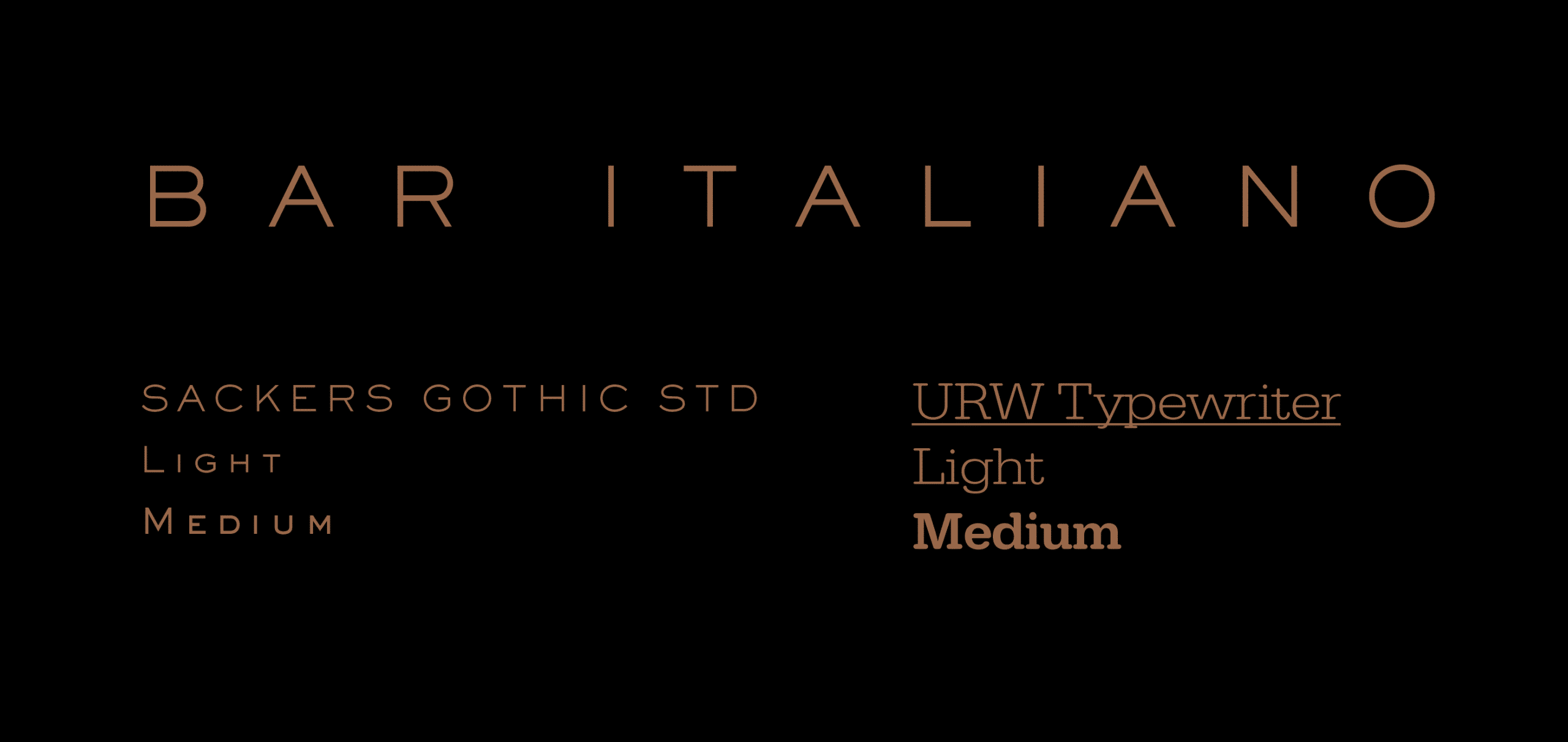
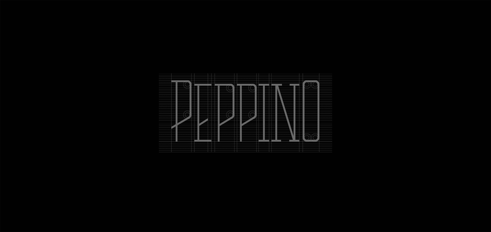
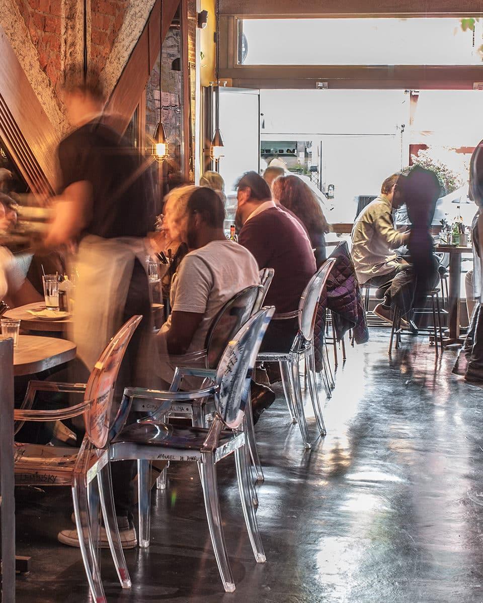
The bar is cozy and intimate, with numerous stools at the counter and shared tables that foster closeness among its patrons. The décor, signed by Elisete Borim, brought nocturnal European references to the bar, creating an atmosphere full of cinematic memories and precise Italian cultural cues. For this sense of origin to feel authentic, we developed an identity based on classic typographies found on Italian bar and commercial facades — with the exclusive typography dominating at scale, treating the stationery itself as a storefront.
Resultados
Results
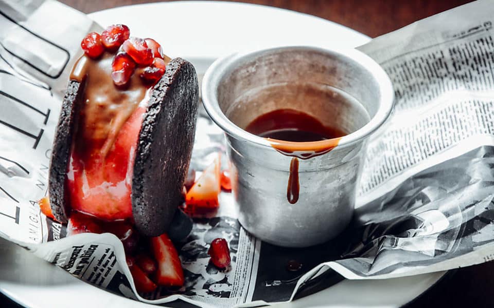
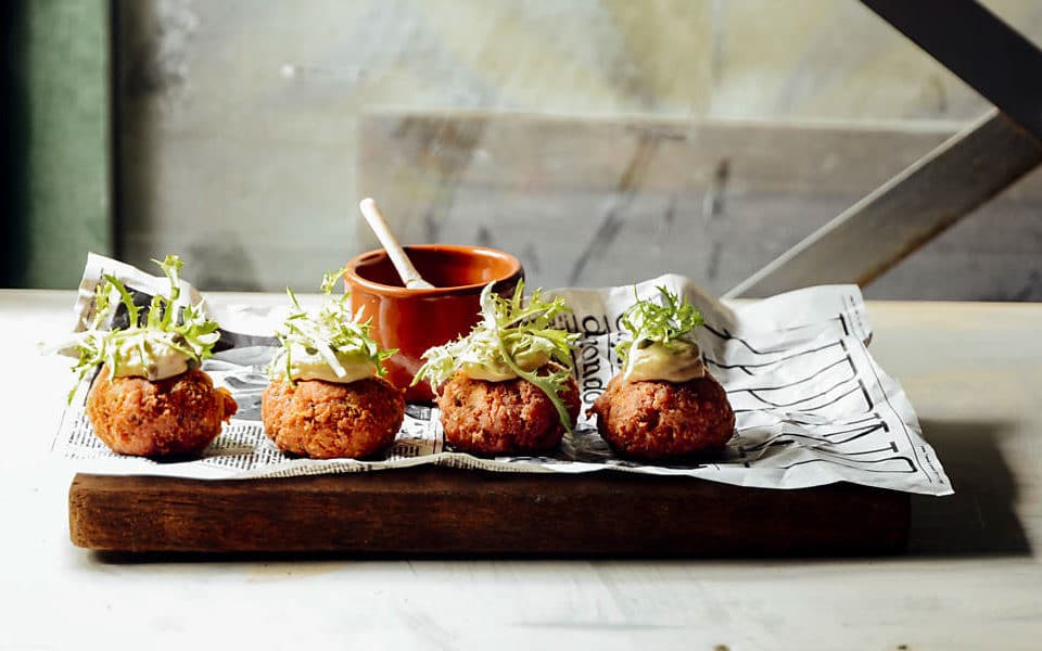
The bar, already featured in press reviews as one of the best bars in São Paulo and named revelation of 2017, is the union of a cool industrial atmosphere with the already-famous menu created by Rodolfo di Santis.
The perception of rebelliousness and youth is clear through the public's identification with the space, and the way the logo has become an identifier on the famous Rua João Cachoeira, where it is applied as a neon sign — which became the defining feature of a facade that is periodically redefined by local artists.
Impact
Recognition
 Brasil Design Award 2018
- Press, 2017In the press reviews as one of the best bars in São Paulo, voted the revelation of 2017.
- Behance, 2017
- Behance, 2017
Team
Select work
Abaceria
An artisanal food store and restaurant, given an identity and packaging
More Info →