Nomo — To change is to point new directions
Nomo
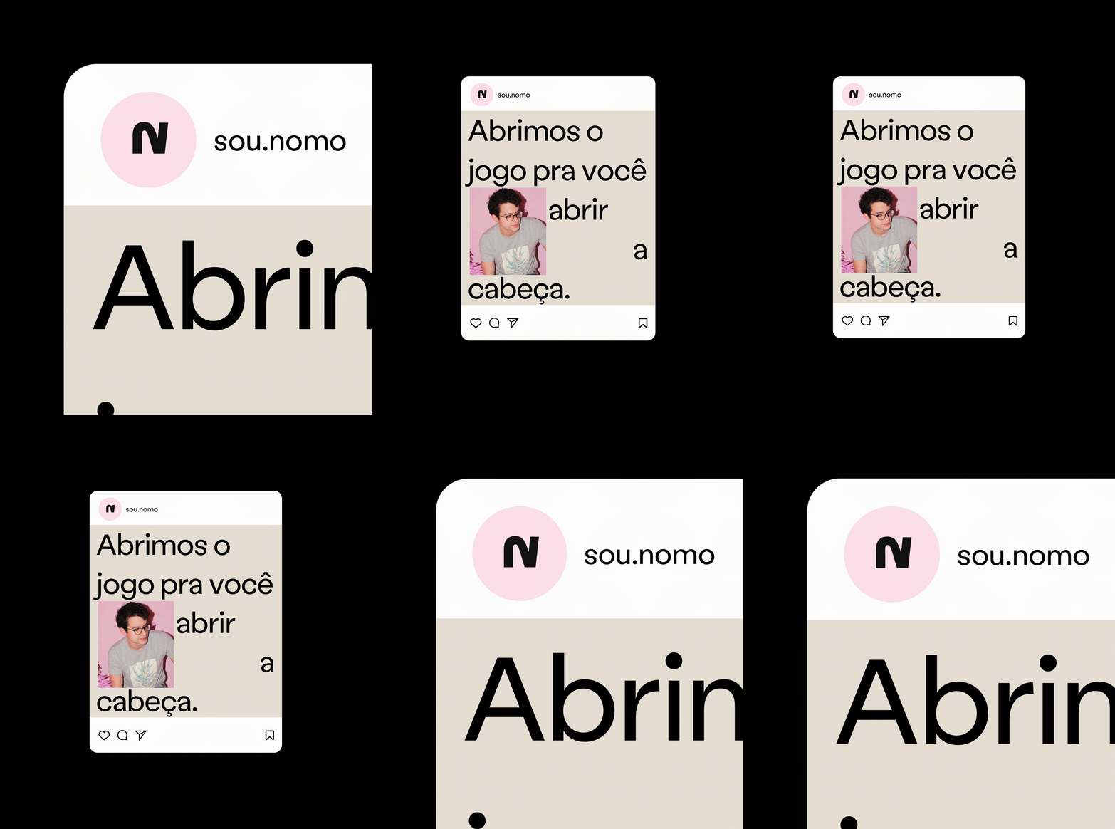
Nomo, a technology brand, needed a visual expression that conveyed change and new directions. BRBAUEN built the brand's visual language, motion behaviours and illustration style. The project received the TDC NYC (Type Directors Club) Judge's Choice.
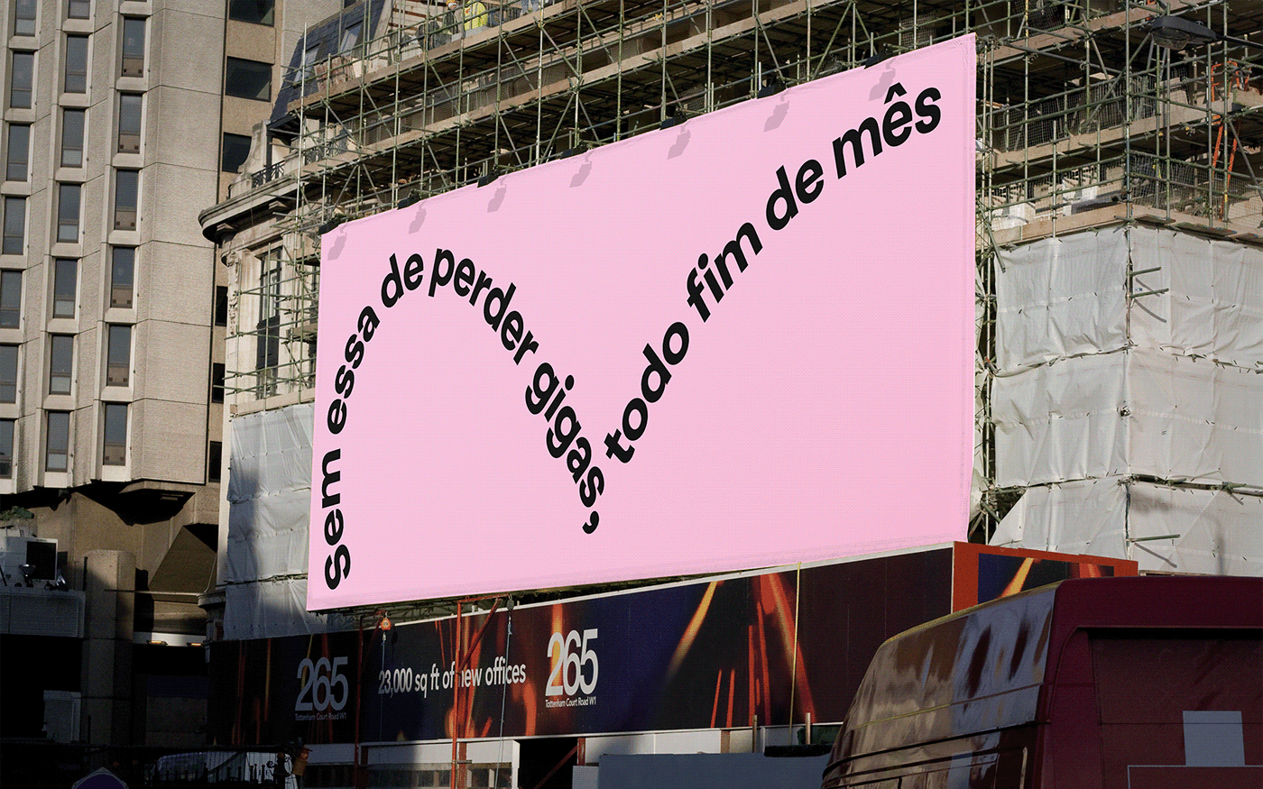
Nomo is a telecommunications startup born to change the way things are done in the telecom industry. This desire gave rise to the name NOMO — NO MORE. The brand's proposition is not just to do things differently, but better. This means generating opposition and proposing new paths.
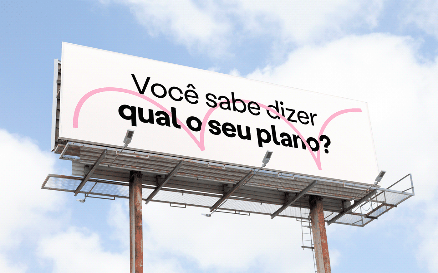
In the telecom segment, the visual language clichés revolve around "neon lights" evoking speed (optical fiber) and three-dimensional effects in communication. The natural approach for Nomo is to propose something different. The entire visual translation stems from a simple proposition: to change, there must be an inevitable movement of opposition — not destroying what already exists, but learning from what doesn't work in order to do better.
- Client
- Nomo
- Year
- 2023
- Sector
- Technology
- Services
- Linguagem Visual da MarcaComportamentos de MotionEstilo das Ilustrações
Processo
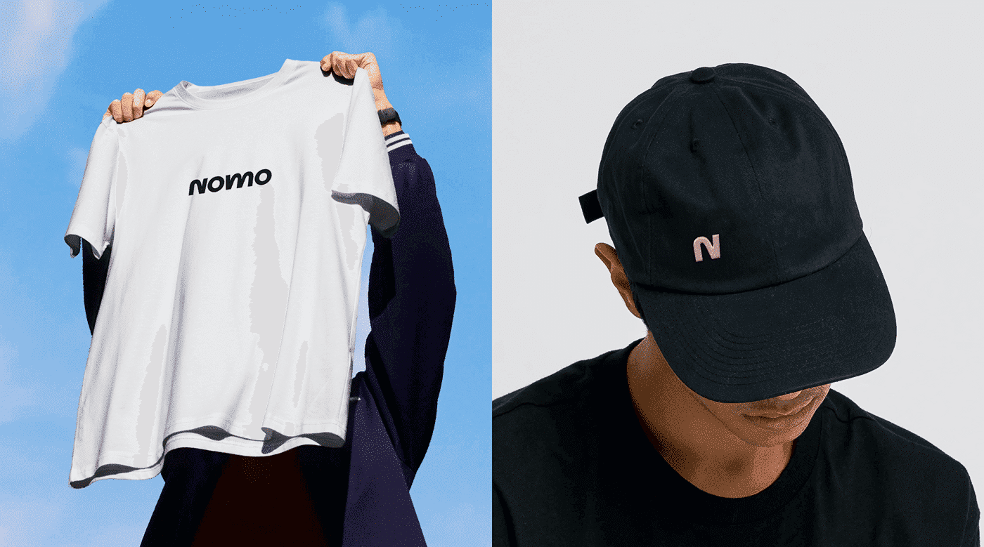
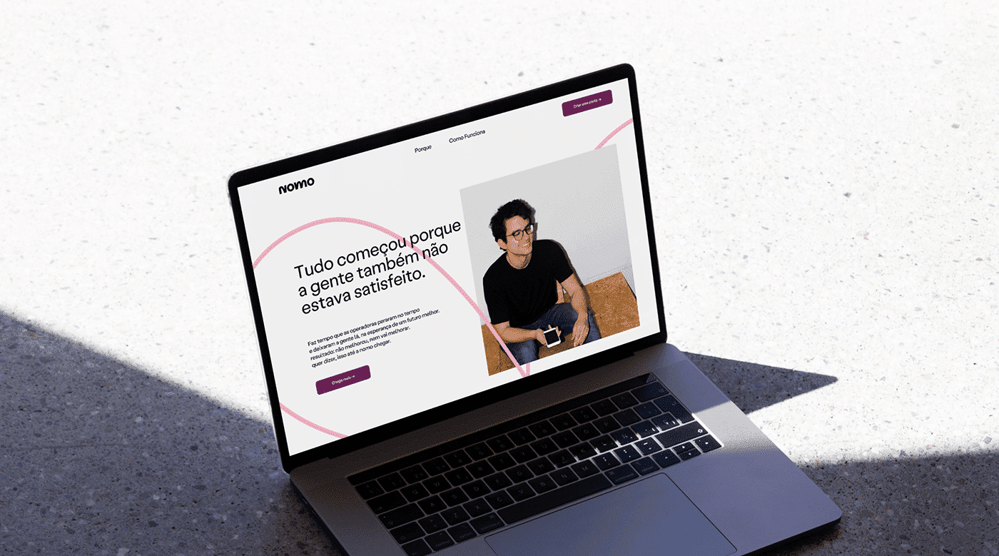
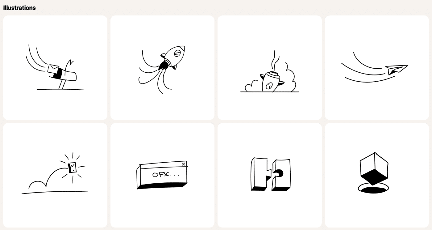
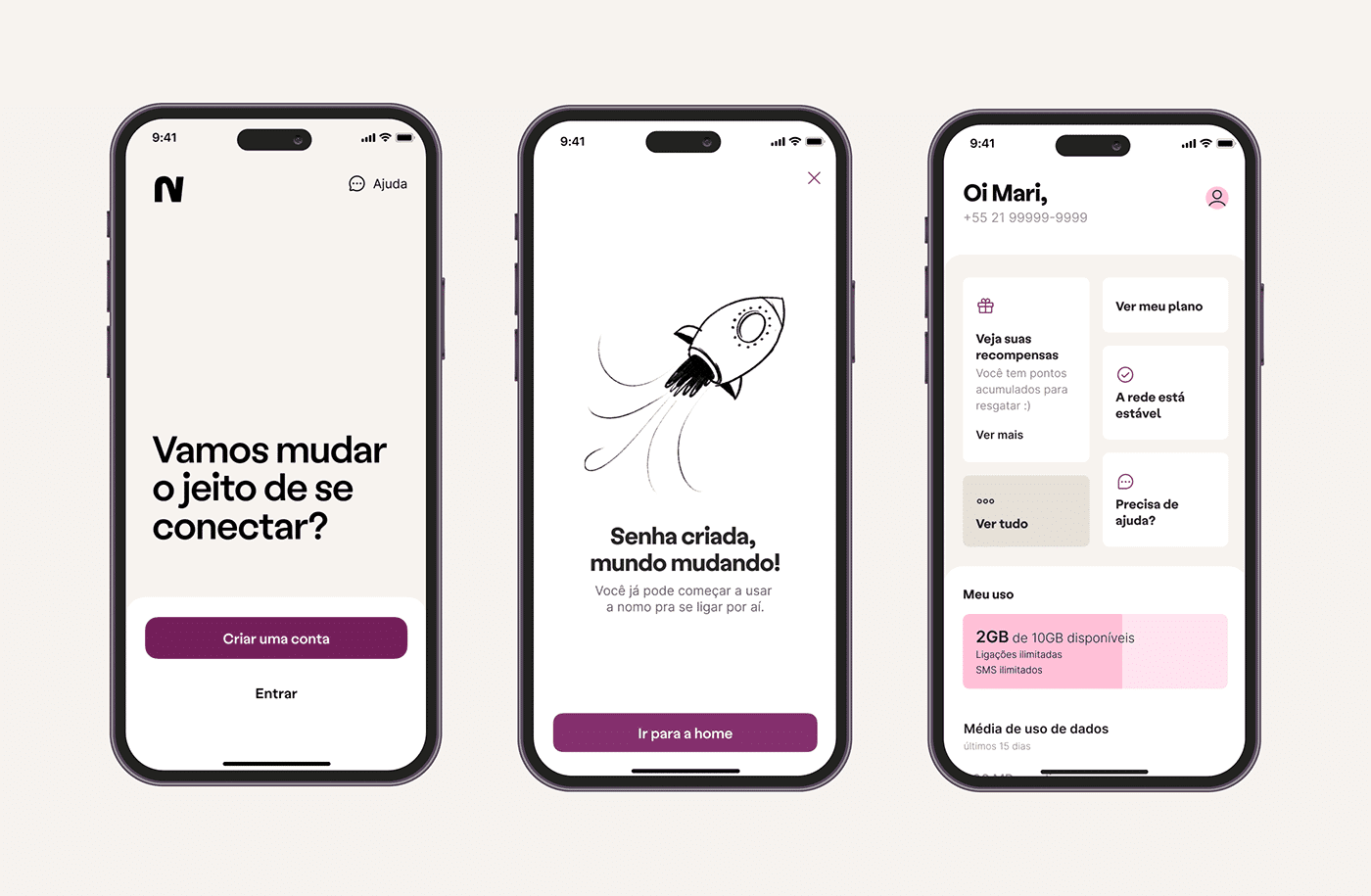
The custom logotype for the project has the gesture of something leaping in a direction, like the letter N itself, or the synthesis of a rubber ball in motion. From these observations, the letters N and M carry the brand's personality, and from these elements of extreme simplicity and strength, the entire visual expression of the brand unfolds — from the typographic treatments that follow the impulse of non-conformity, to the hand-drawn illustrations, to how this language integrates into the app's loading screen through animations.

Brave
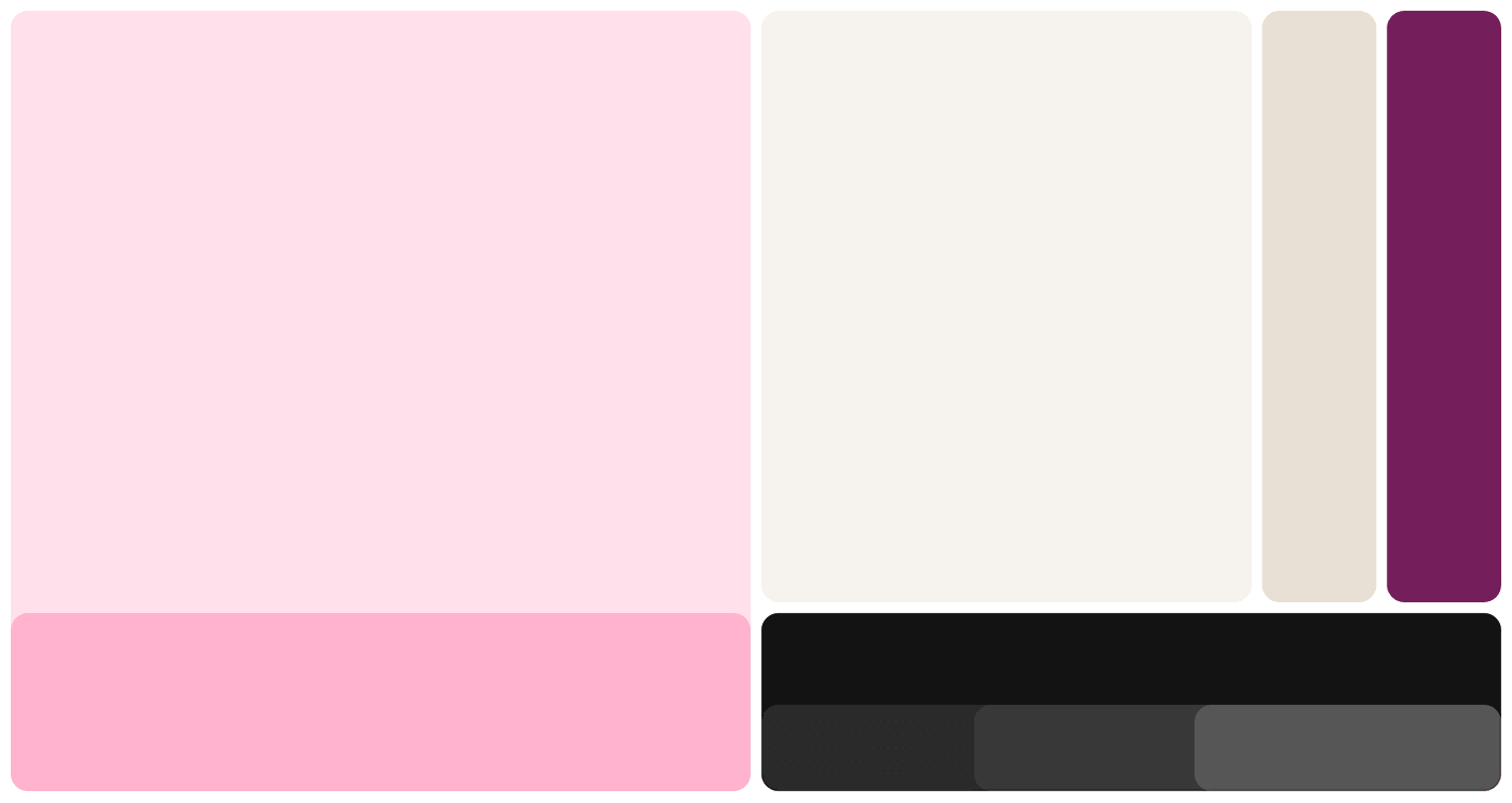
Pink is for the brave; for those who are not scared of the future.
What the client says
“It was incredible to participate in such a special project. BR/BAUEN managed to translate all the personality in a unique way, bringing all the spirit of change and movement that is at the core of the Nomo brand.”

Design Manager, Nomo
Impact
Recognition
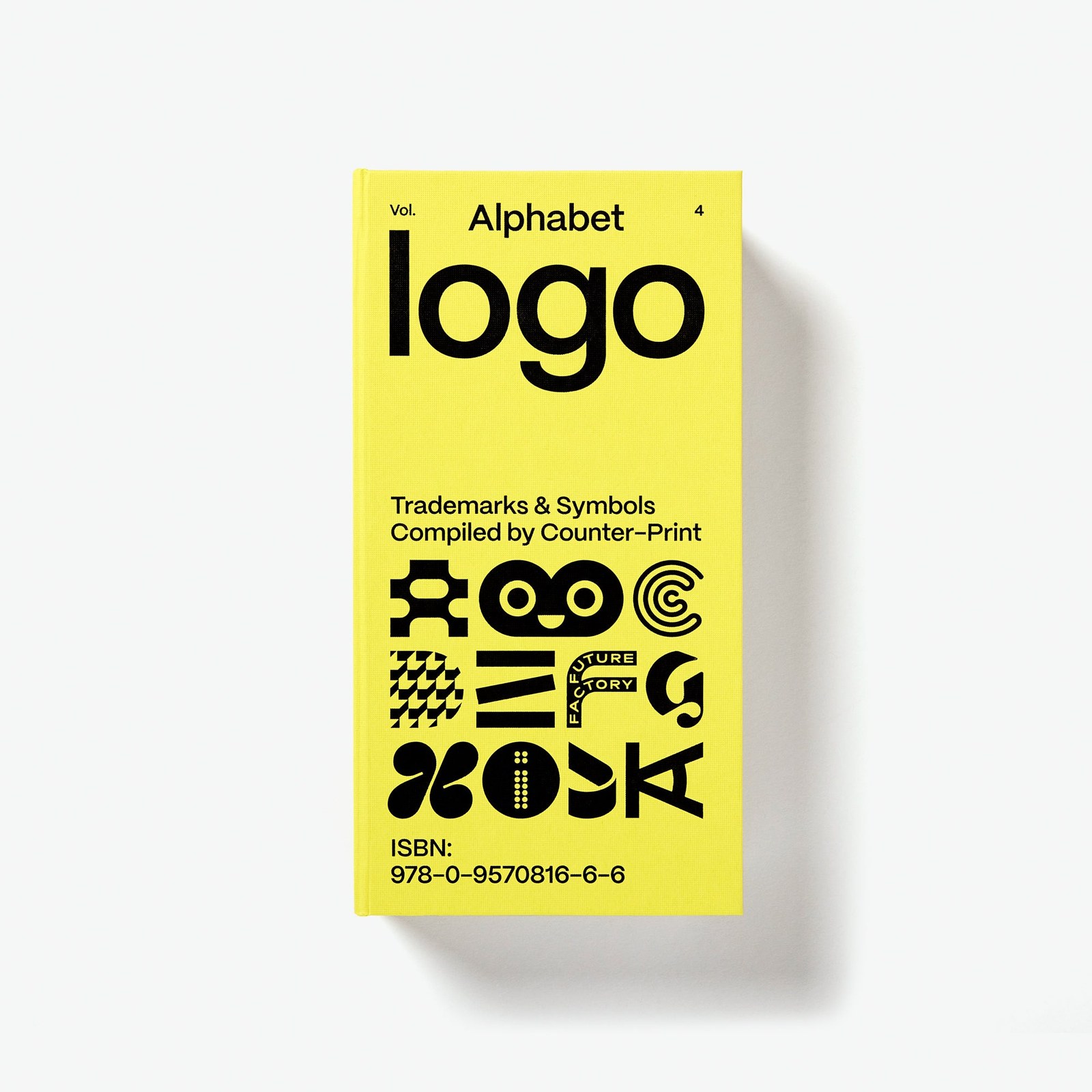 Alphabet Logo, Counter-Print · 2025
 Type Directors Club NYC, TDC69 · 2023Beyond winning, the project received the jury's mention among the winners and was published in World's Best Typography #44. See it on TDC → · Read the news →
 Latin American Design Awards 2023
- Latin American Design Awards 2023
 Brasil Design Award 2022
 World's Best Typography #44 · 2023The Type Directors Club annual with the TDC69 winners. Read the news →
- Behance, 2023
Select work
Tilix
A fintech getting ready for the future, positioned and given an identity and illustrations
More Info →