Nake
Nake
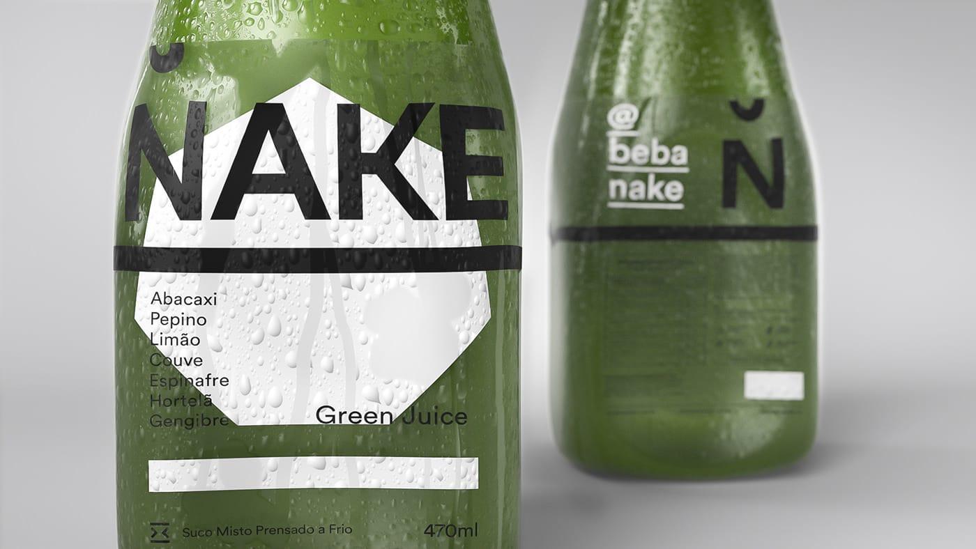
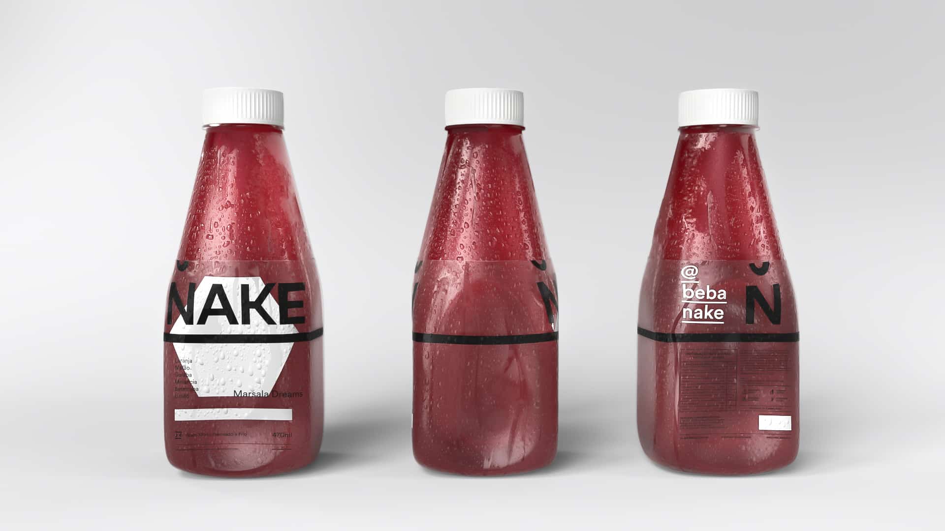
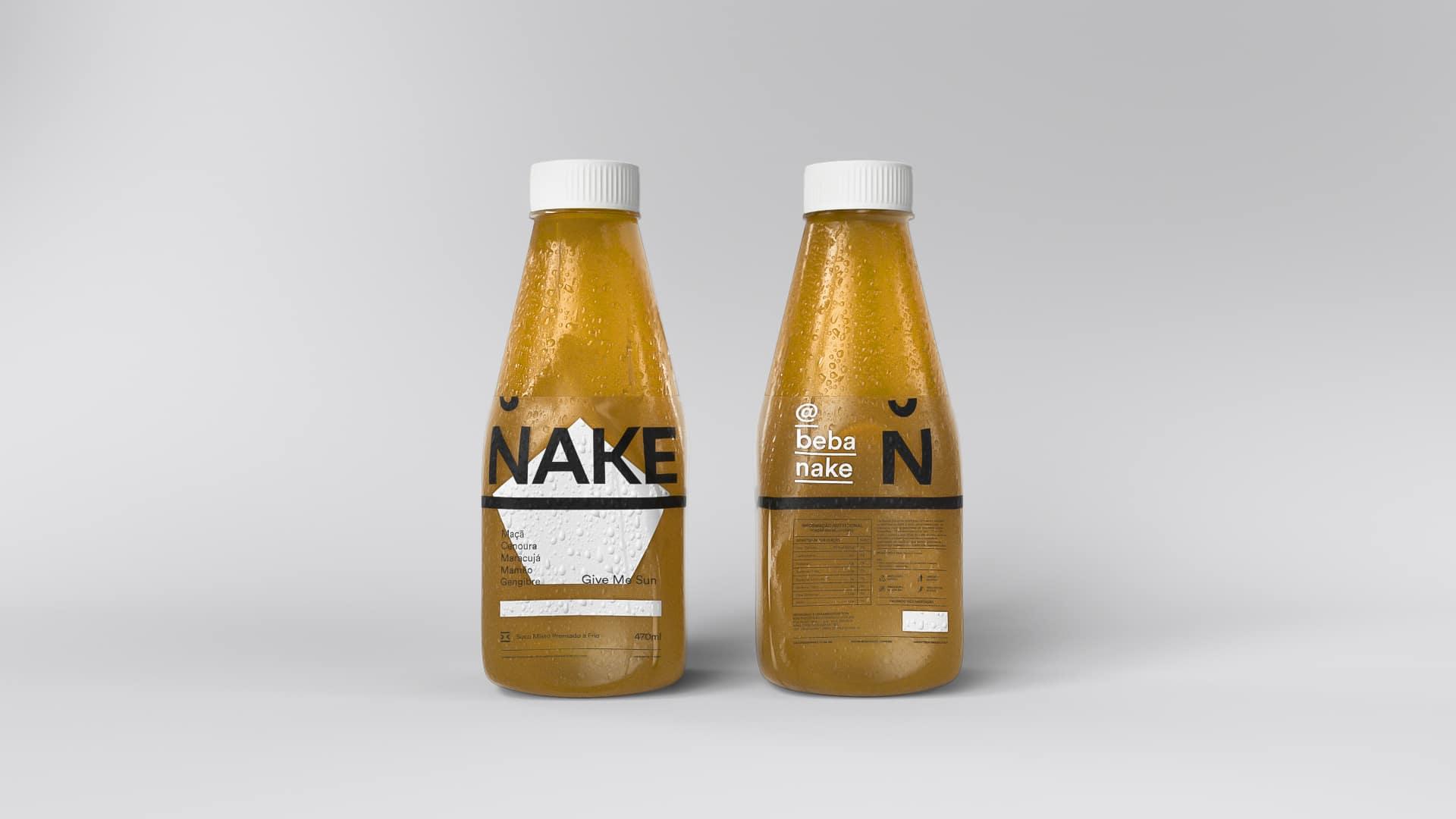
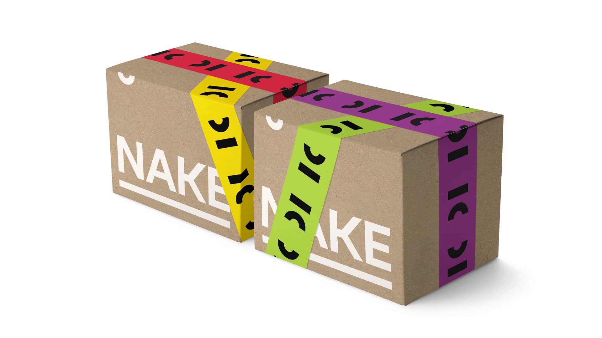
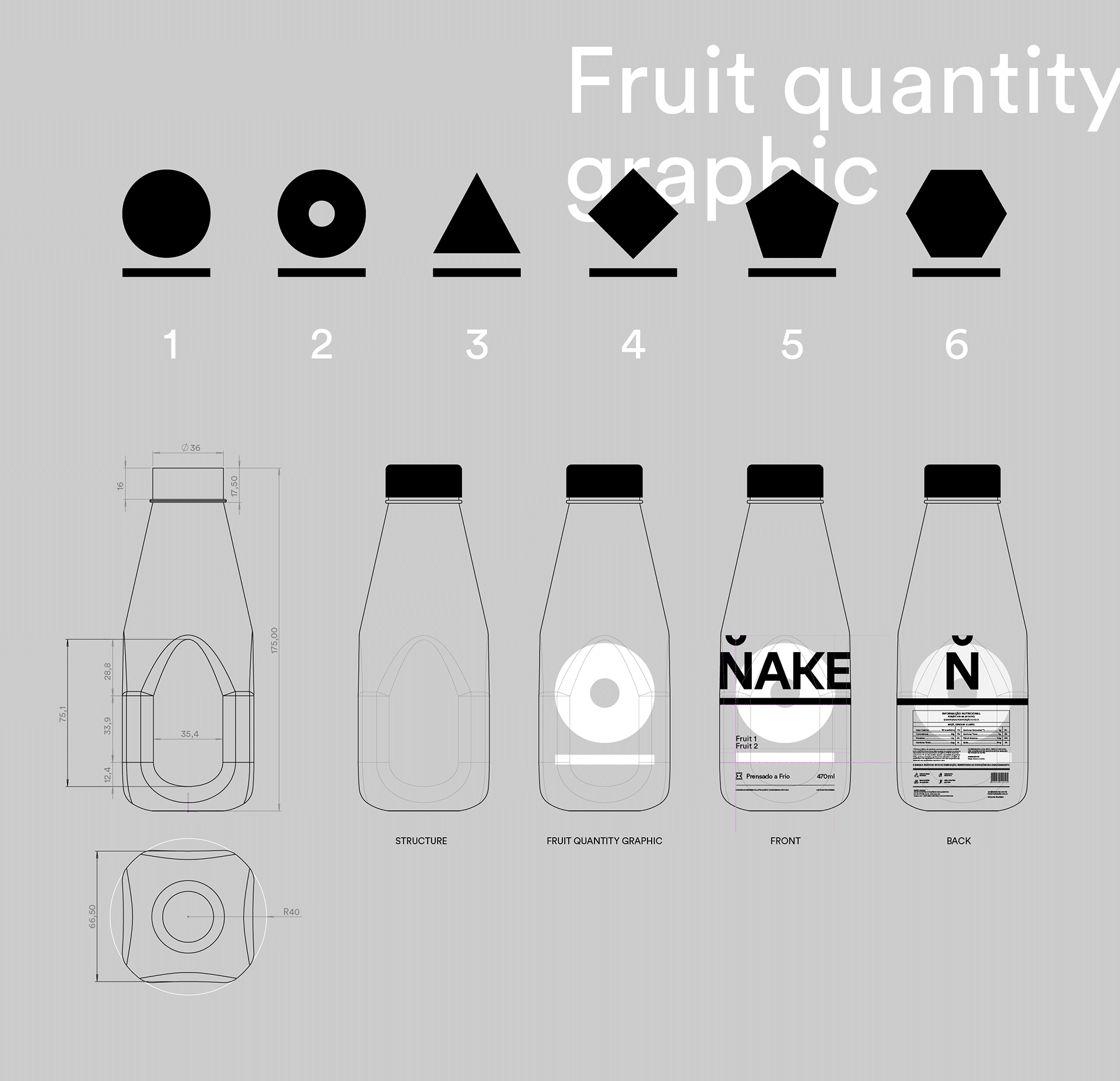
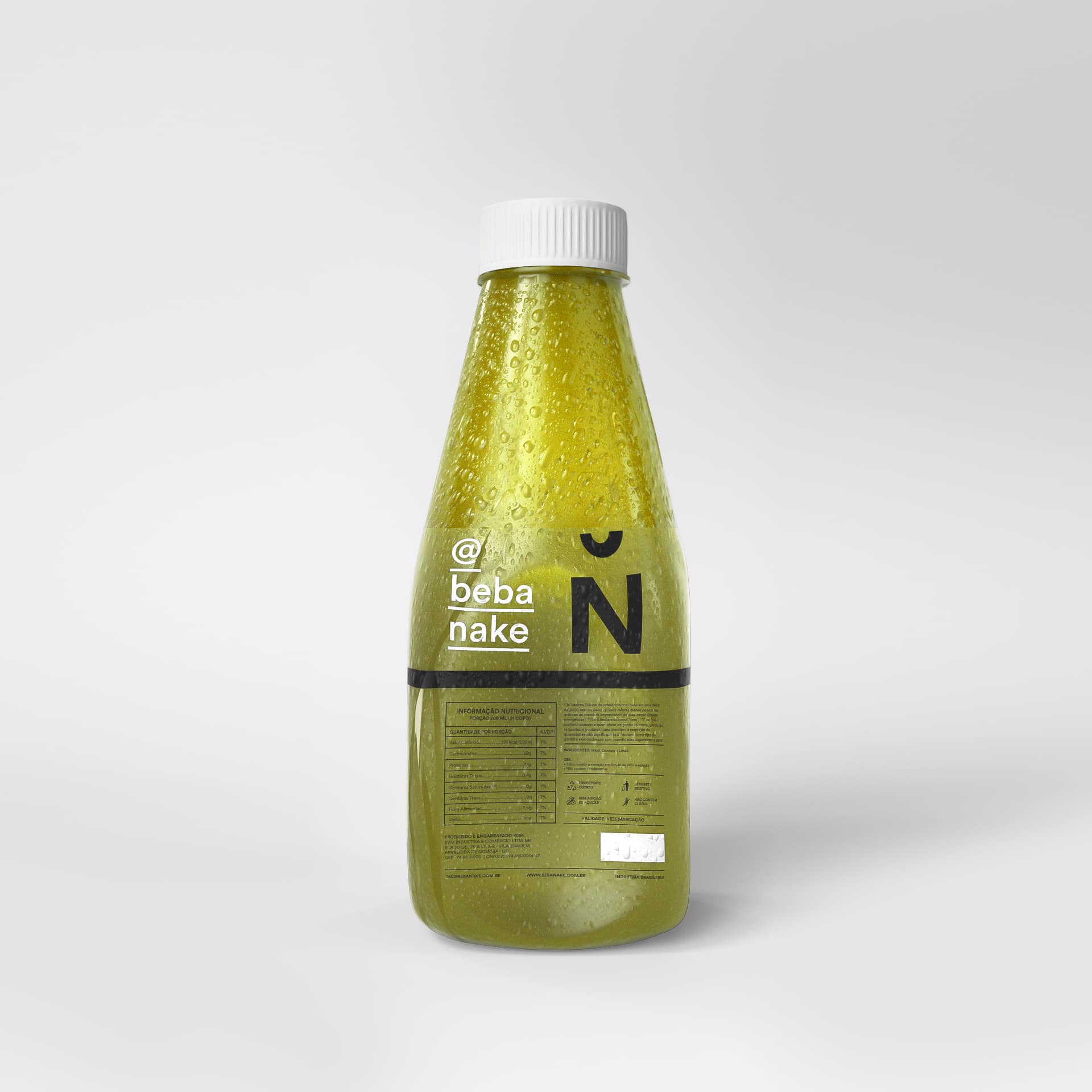
Nake is a cold-pressed juice brand built on purity, simplicity and function. BRBAUEN created the name, the brand and the packaging, with a signalling system in which geometric shapes indicate each juice's composition on the transparent pack. Launched in November 2016, the brand was well received and went on to be sold in more than 15 stores.
About
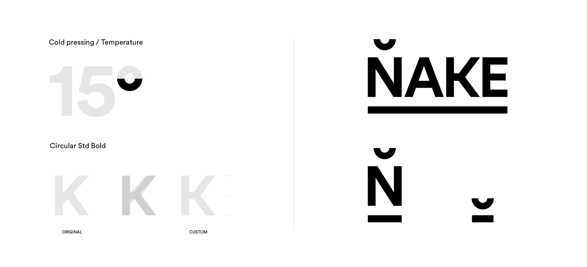
Created to accompany new perspectives and new consumption habits around food, the Nake brand carries in its identity the ultimate purpose of its product: Purity, simplicity, and function. The project aims to bring personality to its communication to stand out in the juice segment. Under this concept of purity and functionality, we brought to the development of the visual/verbal narrative and especially the packaging, an objective cleanliness that conveys the sophistication of product preparation, while remaining friendly and natural.
- Client
- Nake
- Year
- 2016
- Sector
- Food & Beverage
- Services
- NamingDesign de EmbalagemBrandingIdentidade VisualBrand Guidelines
Abordagem
Approach
Nake's production process has as its differentiator the ability to preserve the nutritional characteristics of each ingredient in its composition, being produced through cold-pressing — a process with no blades for cutting, pasteurization, or chemical treatment of the liquid. It is worth highlighting the high value added to the product by the absence of water, using only high-quality fruits and vegetables.
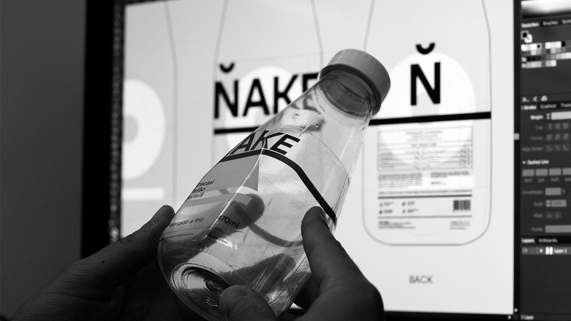
The challenge was then to develop, design, and align a visual and verbal narrative for a new product on the market. We developed the name, brand, and packaging to reflect its personality, conceptual clarity, and benefits.
Resultados
Results
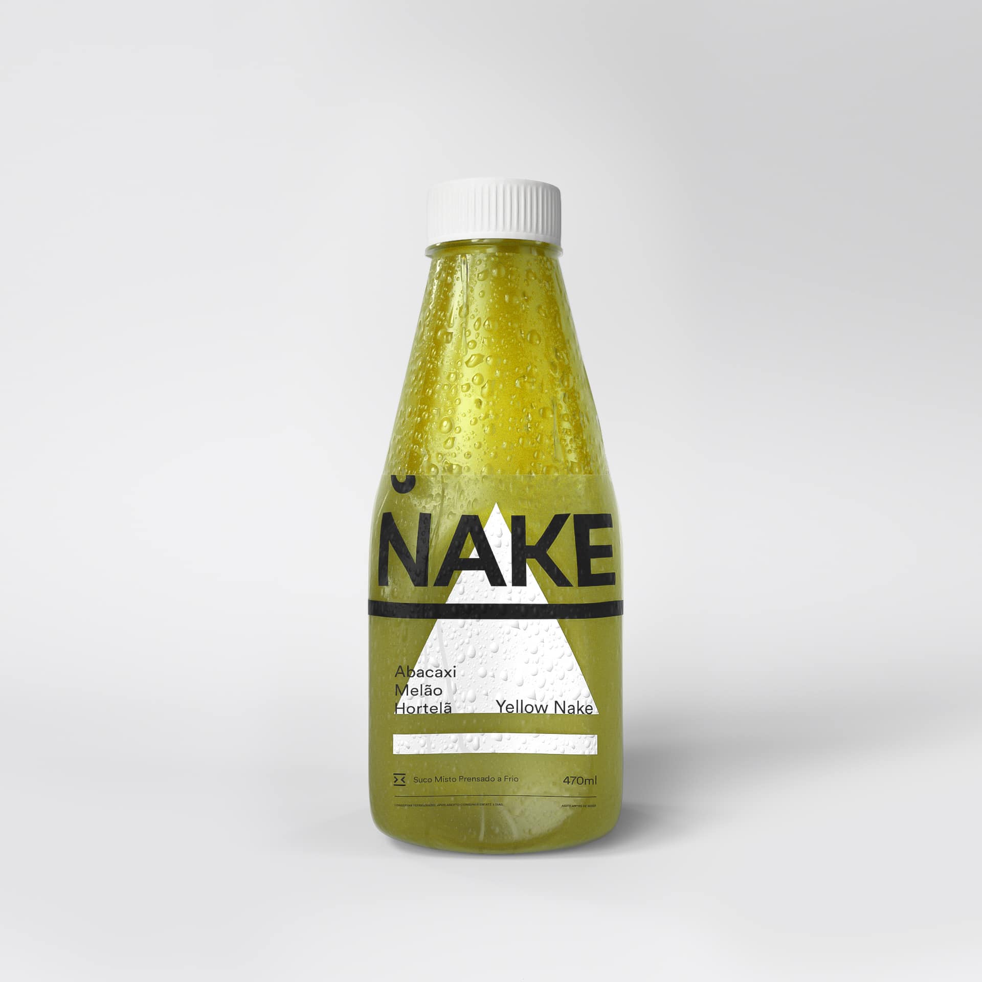
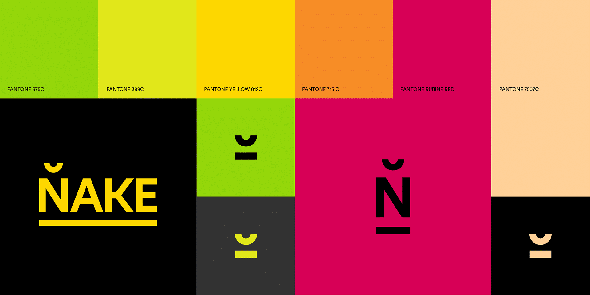
The identity and packaging addressed the product composition in a very practical way. A composition signaling system was developed, where geometric shapes indicate the number of ingredients in each blend. The packaging as a whole is transparent and composed of these elements; shelf differentiation is provided by the colors of each liquid.
The brand began commercial sales in November 2016, and after 5 months has seen great acceptance and interest not only from end consumers, but also from franchises and stores in the healthy food segment, currently totaling sales in over 15 stores.
Impact
Recognition
 From Latin America, Counter-Print · 2019
 Brasil Design Award 2018
 12th Brazilian Graphic Design Biennial, 2017
- The Dieline, 2016
- Behance, 2016
Select work
Abaceria
An artisanal food store and restaurant, given an identity and packaging
More Info →