Hercules — What moves us is keeping you in motion
Hercules
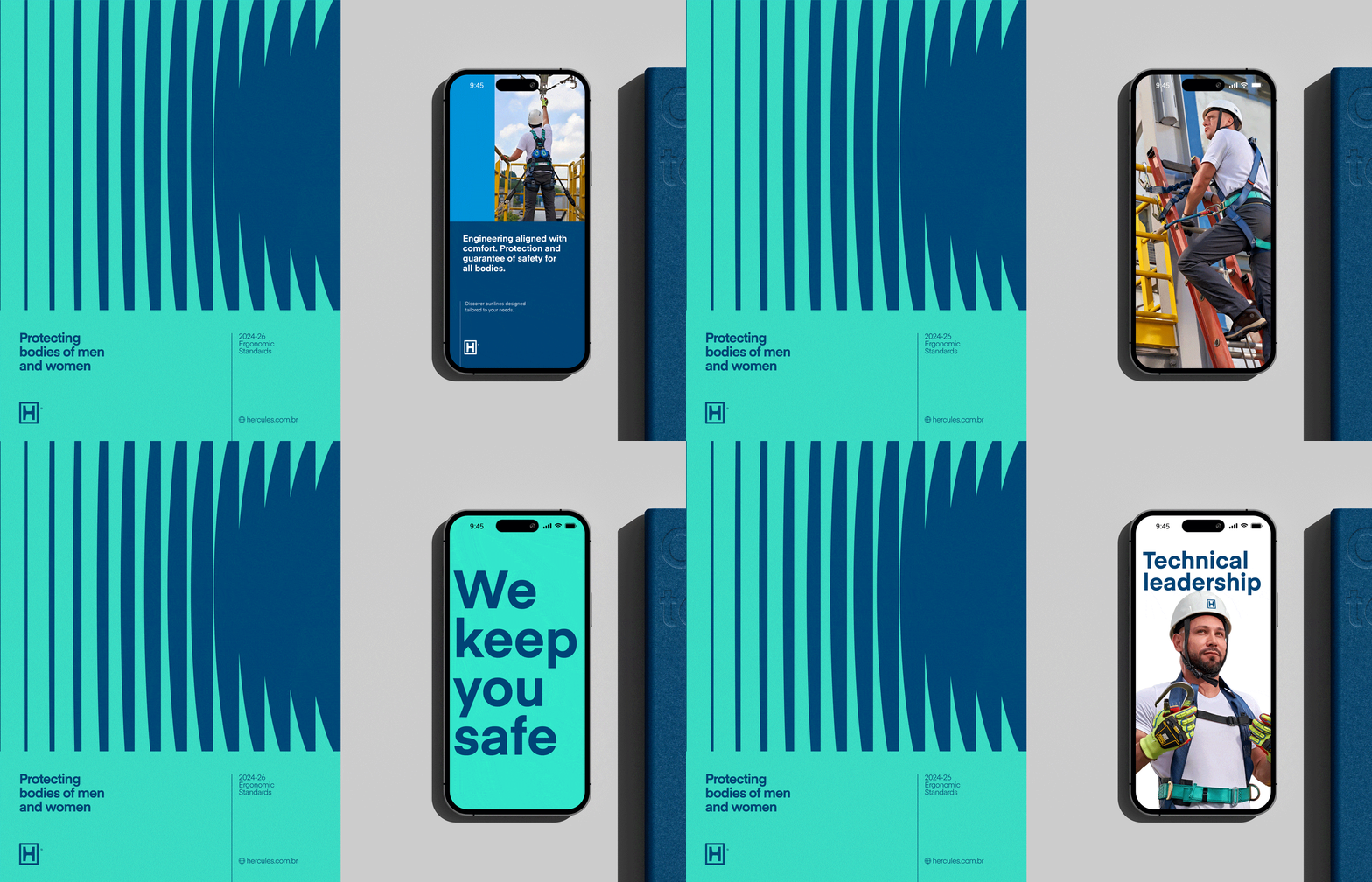
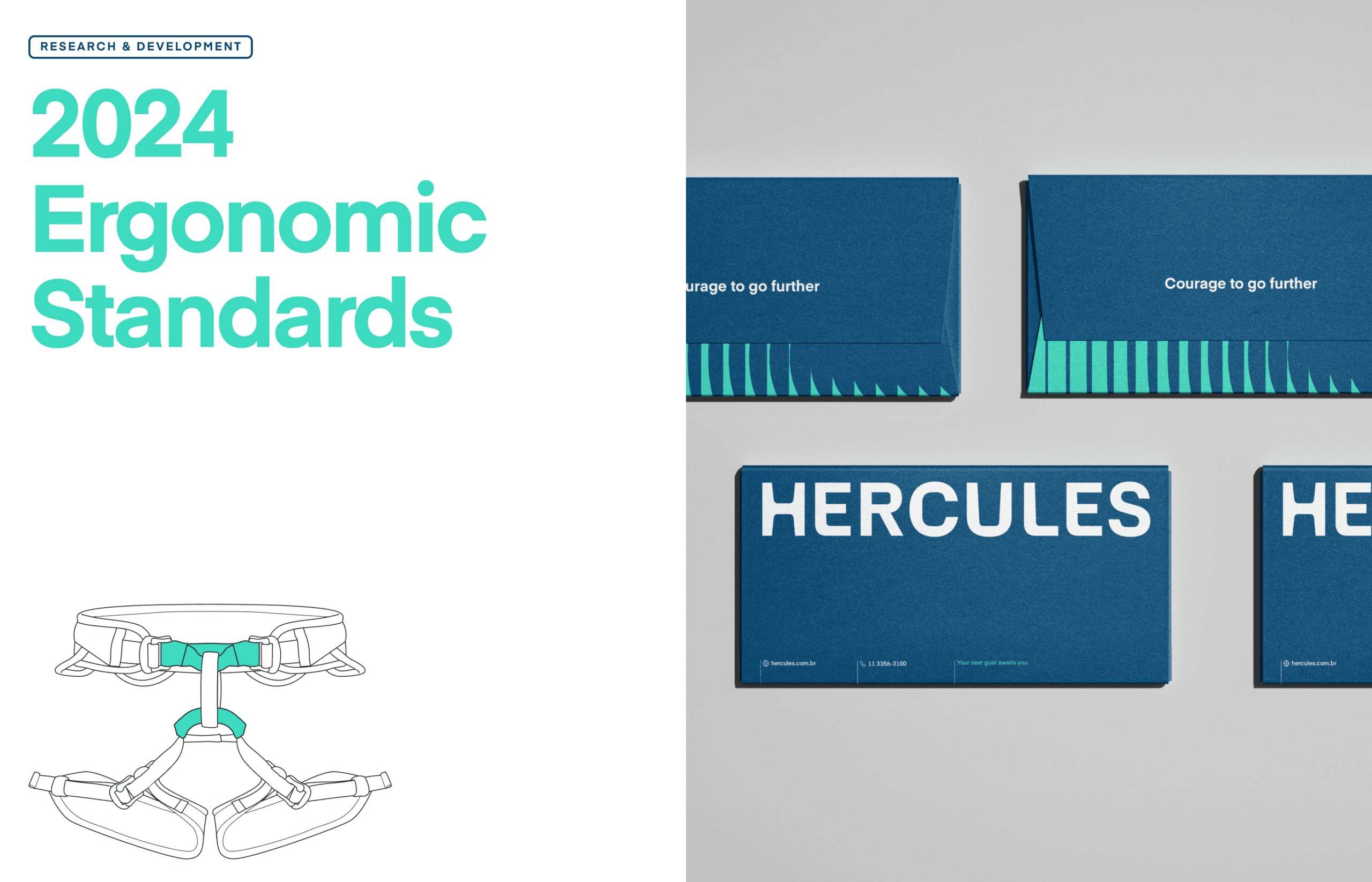
Hercules has two decades of leadership in personal protective equipment for extreme environments in Brazil and, since 2013, is part of Ansell. Facing internationalisation, BRBAUEN led the rebranding while preserving the recognition it had earned — evolving the logo and the verbal platform around 'Courage to go further' — with brand strategy, verbal and visual language and guidelines.
Hercules has an established two decades of market leadership in extreme workplace safety equipment across Brazil — a reputation as strong as its name that was built by more than just developing safety equipment — Hercules focuses on understanding and educating the entire value chain within its reach.
In 2013 Hercules was acquired by Ansell; a global leader in protection solutions with 1.4BI USD in global revenue.


- Client
- Ansell Hercules
- Year
- 2024
- Sector
- Manufacturing & Industry
- Services
- Brand StrategyVerbal LanguageVisual LanguageBrand Guidelines
Challenge
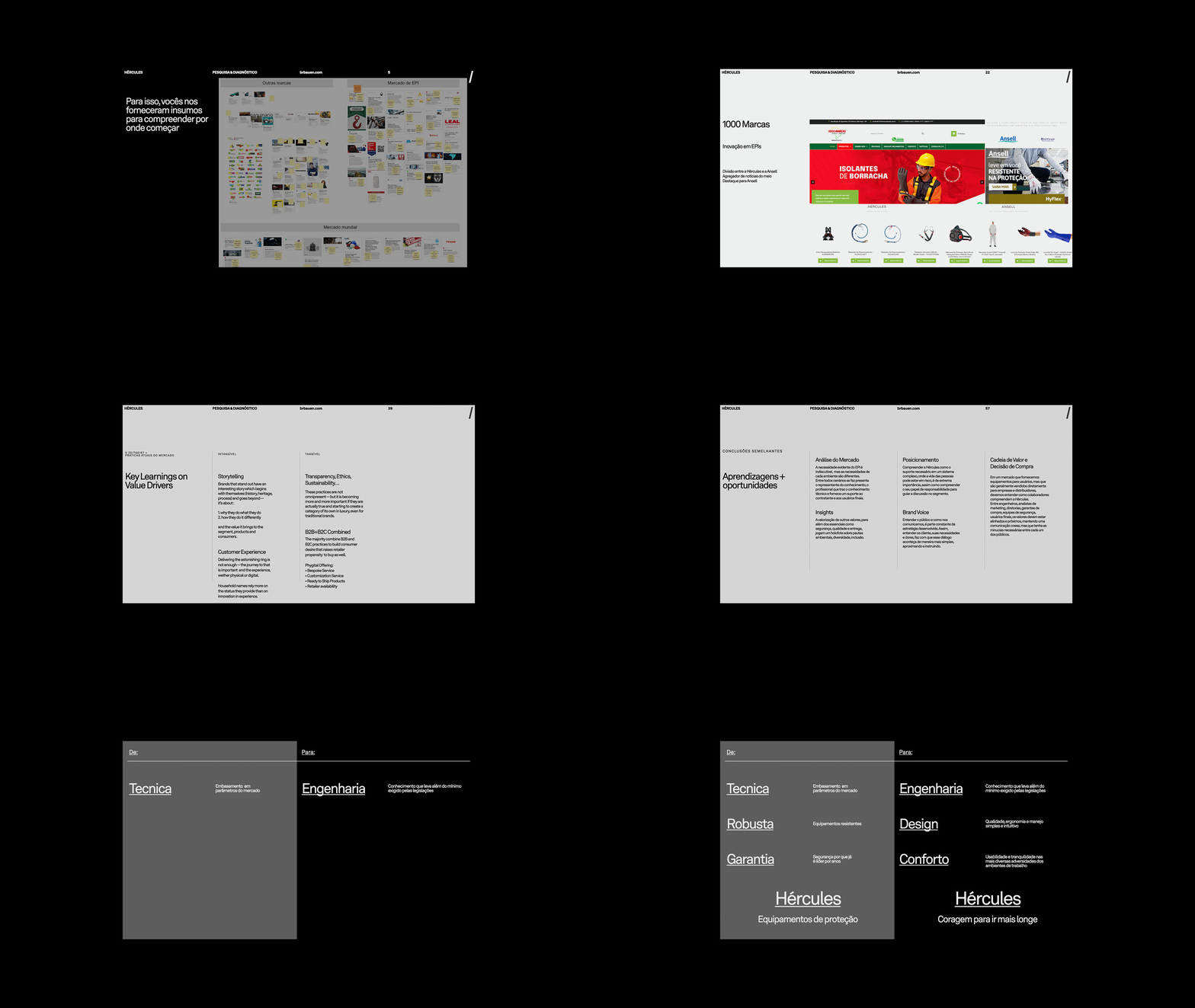
Faced with its biggest challenge so far, Hercules' rebrand comes at a crucial moment for the brand's internationalization. Ansell Hercules' latam team reached out to us to begin a rebranding process after the completion of Ansell's acquisition and the decision to keep it as an endorsed brand for the south american market.

Newchallenge
A new challenge on the horizon
A strategic evolution
Along with Ansell Hercules' latam team we understood it was the smarter and more cost-efficient move to keep certain characteristics of the previous brand to minimize the rebrand impacts on awareness and recognition.
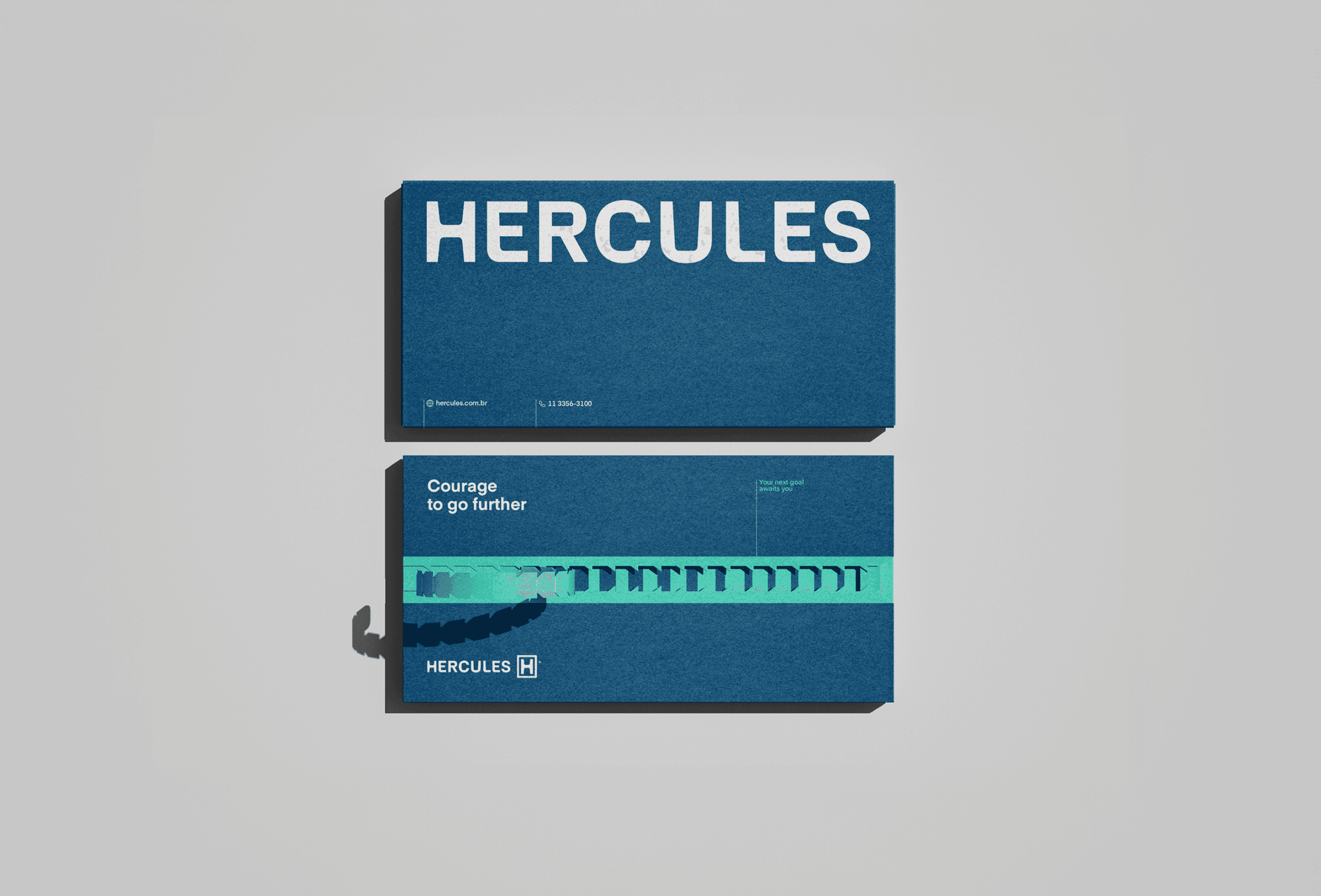
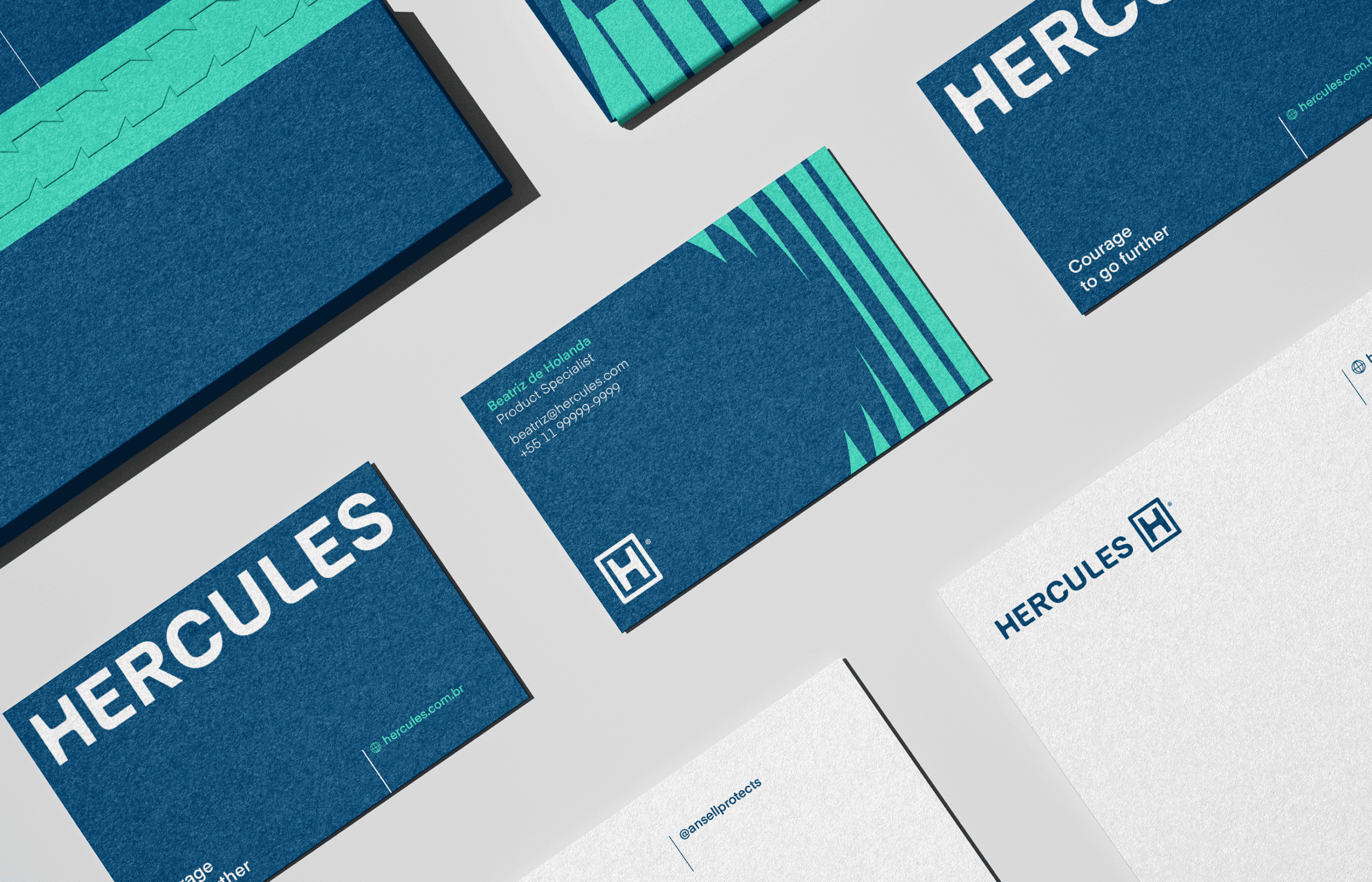
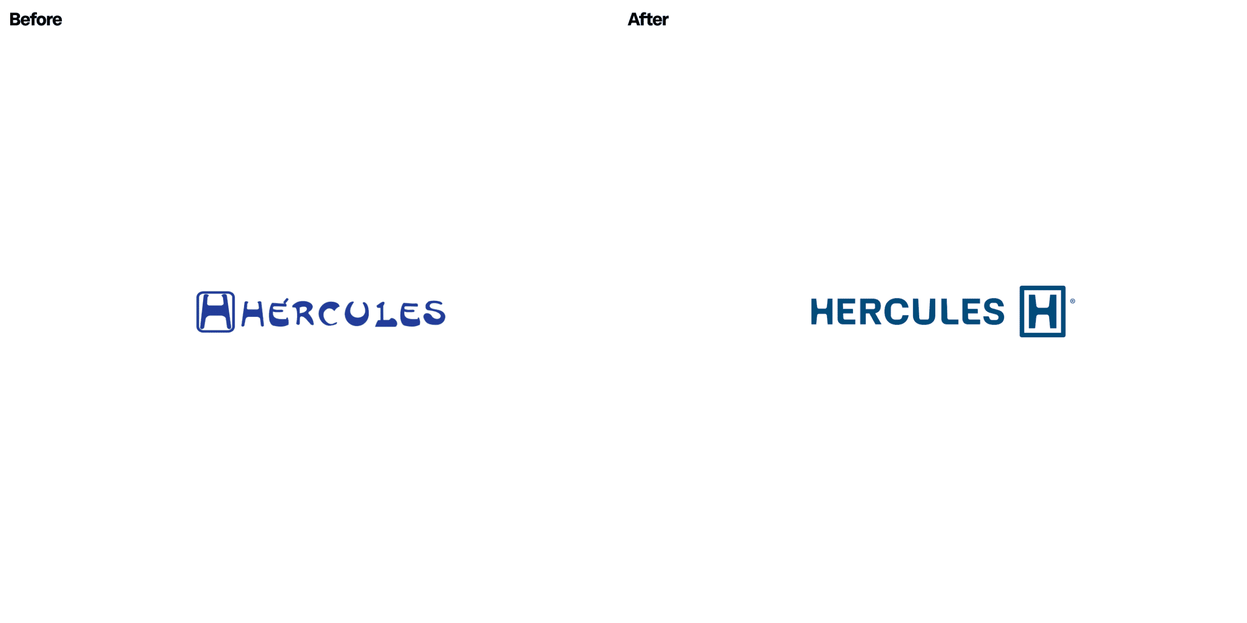
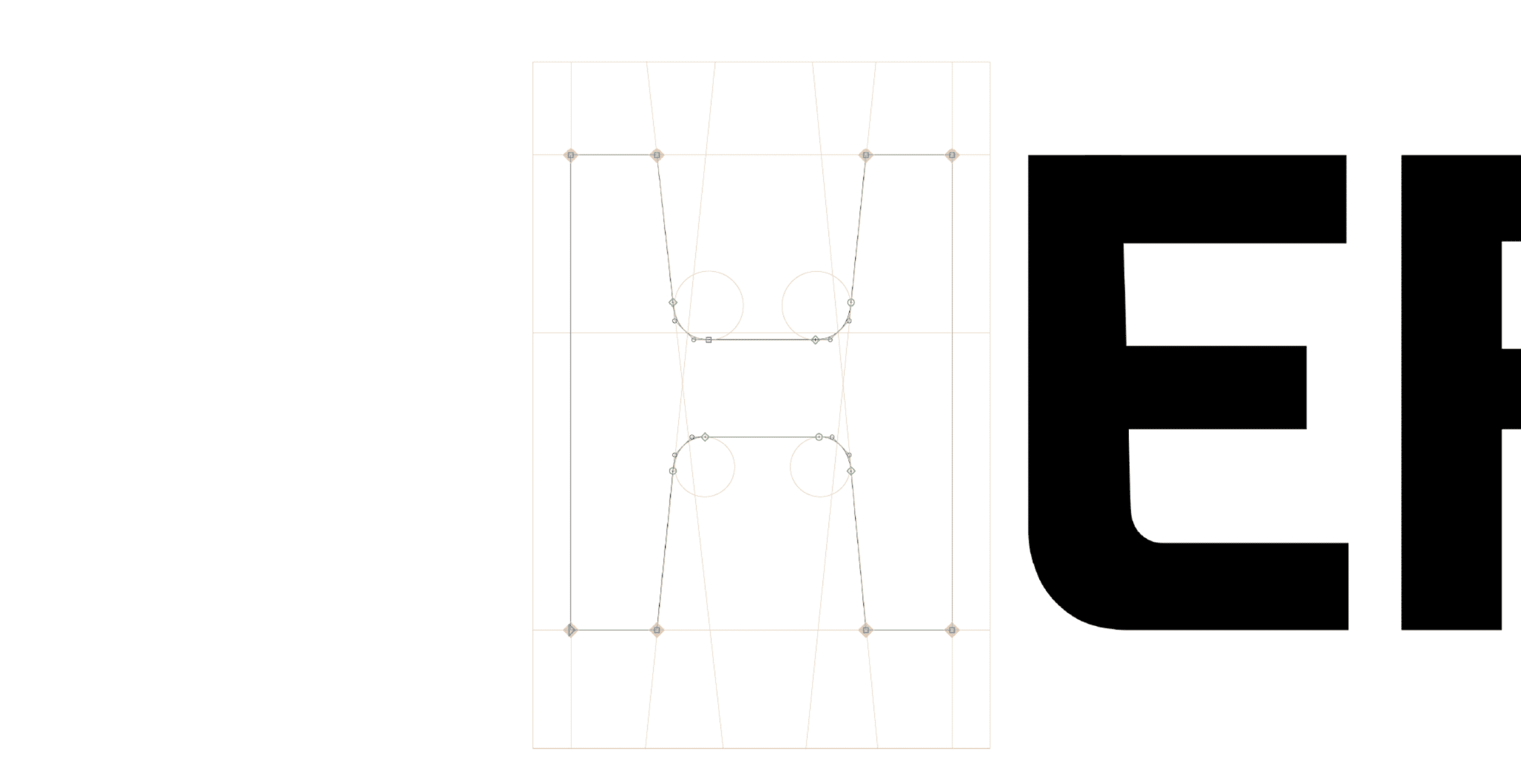
The new logotype respects the previous one despite its flaws and looks within it for key characteristics to expand on. Due to the internationalization need we advised the accent on "Hércules" to be removed — and as it did before, the same "H" present on the word mark continues to be isolated in a protective rectangle — but now it's moved to the right of the word mark to avoid a double H reading.
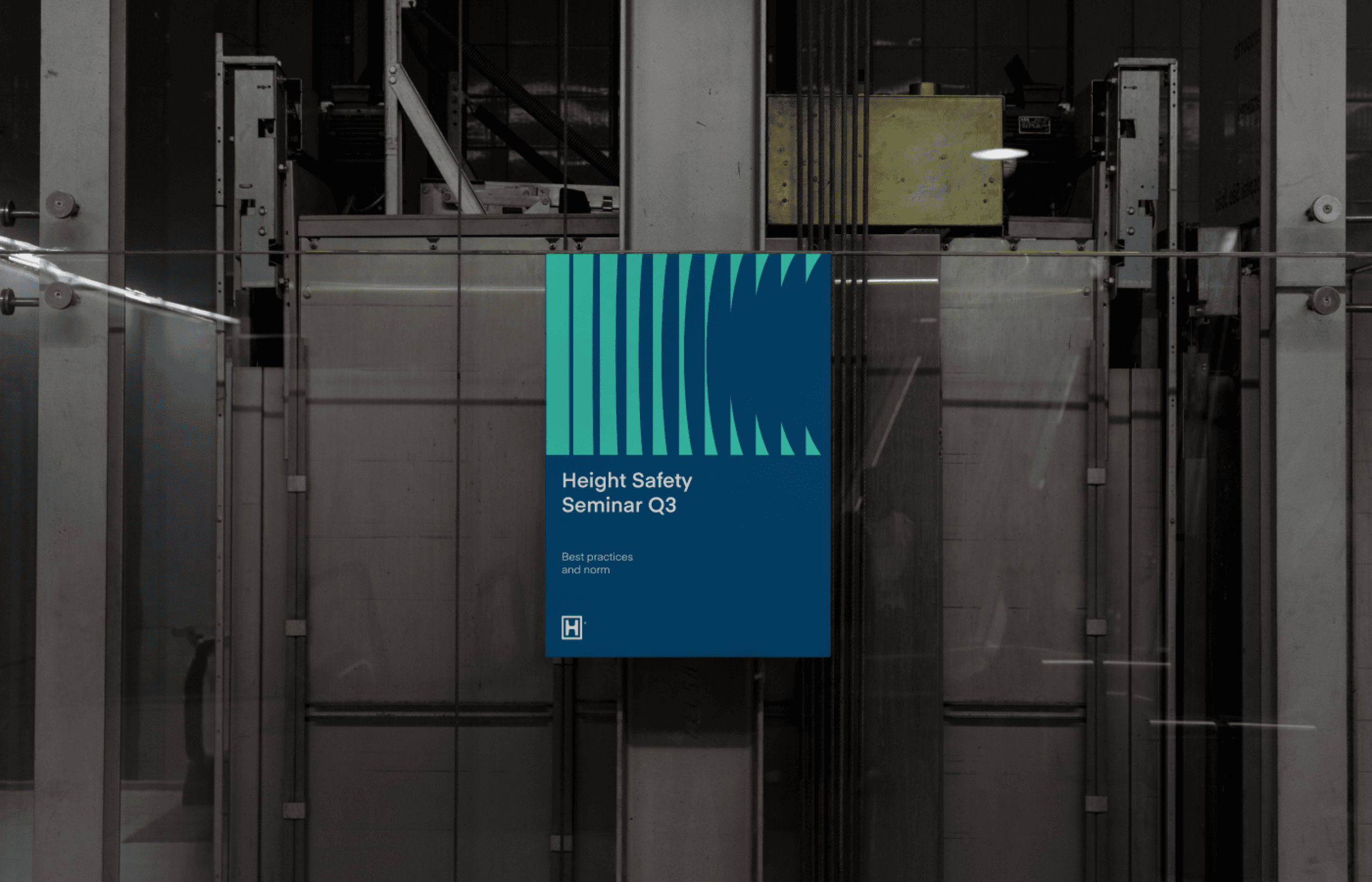
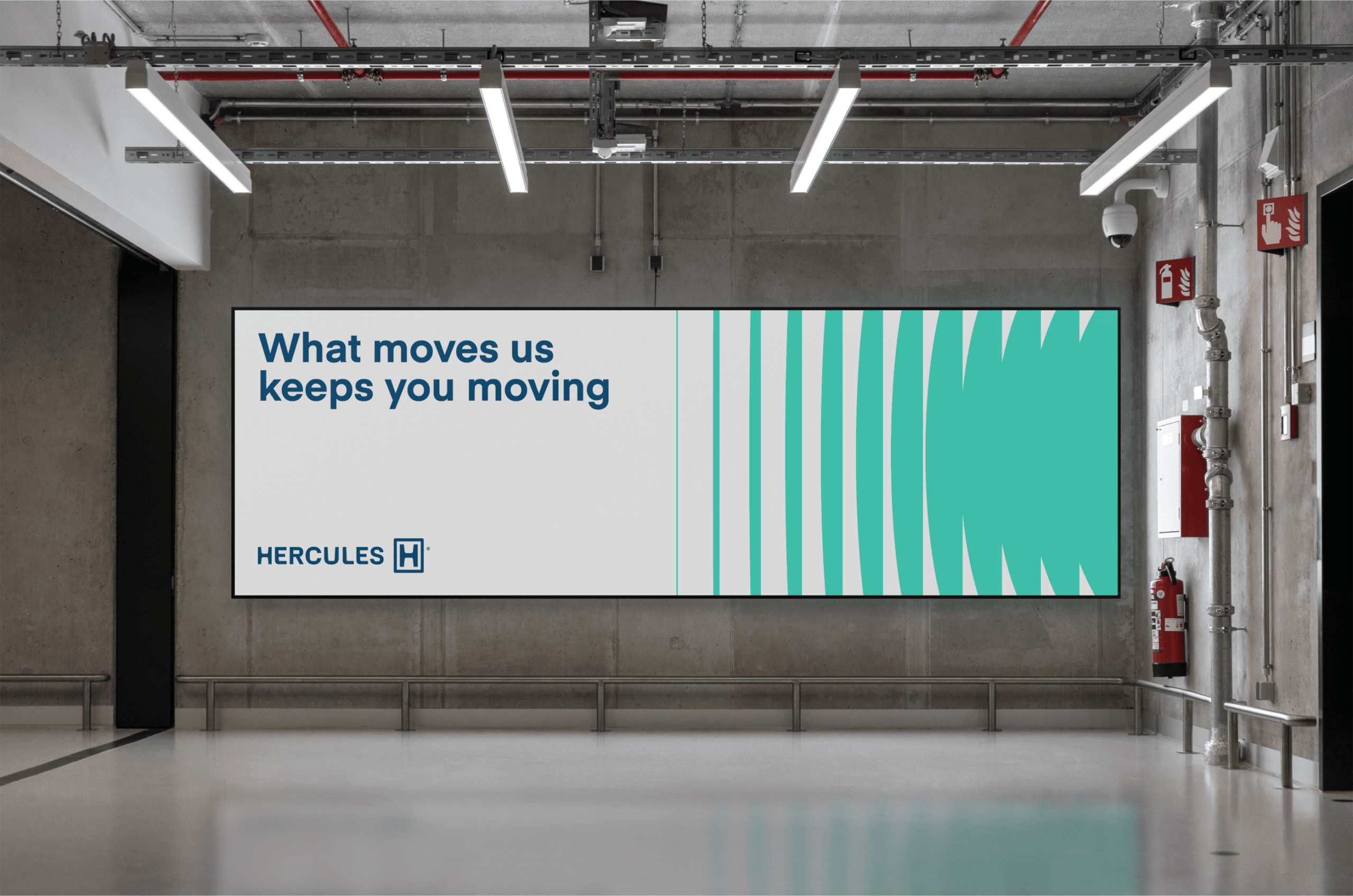
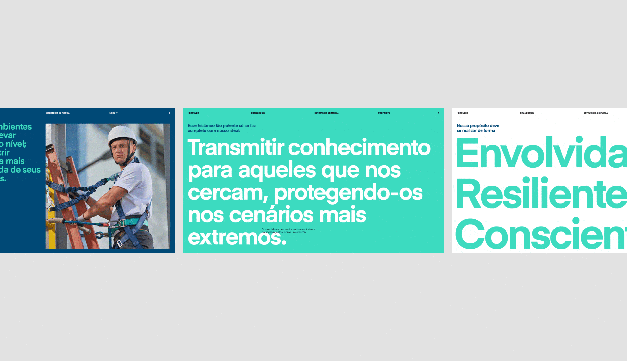
Hercules' verbal language also evolves to speak about its challenges and roles front and center around the idea of "Courage to go further" — one that embraces how serious the challenge of protecting bodies of men and women on a daily basis.

Impact
Recognition
 Brand New, 2024"Everything has a professional look… better suited to present Hercules to new markets." — Armin Vit, editor-in-chief. Read the article → Read the news →
- World Brand Design Society, 2024
- Behance, 2025
Team
Select work
Hauforge
An animal-nutrition maker with a technical name, renamed and packed to stand out on shelves
More Info →