Brava
Brava
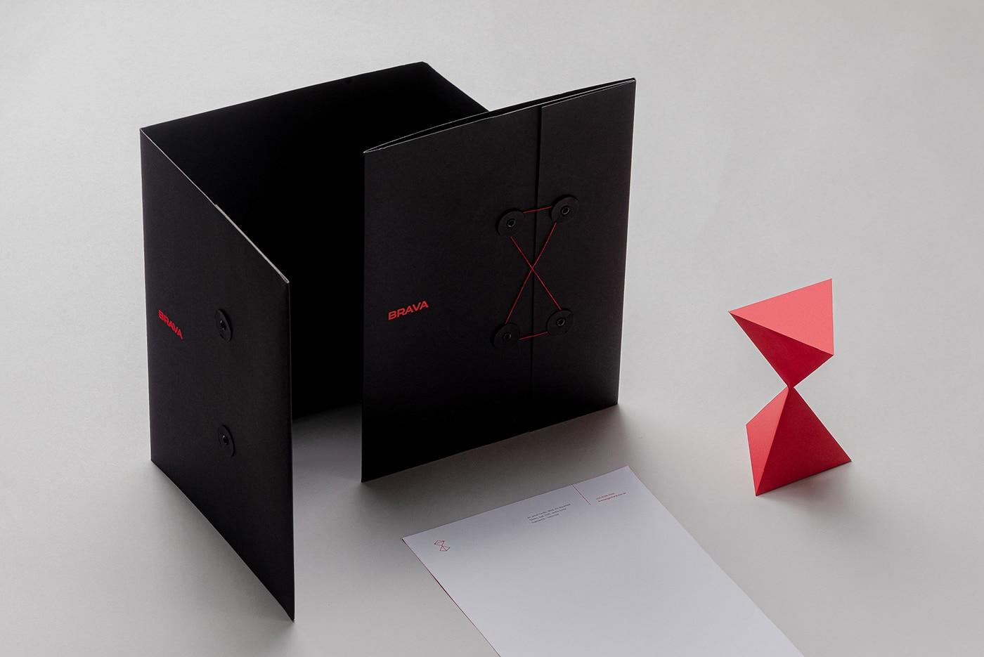
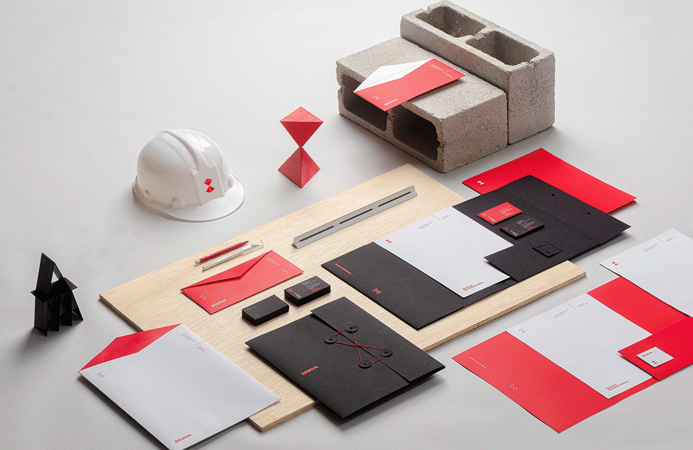
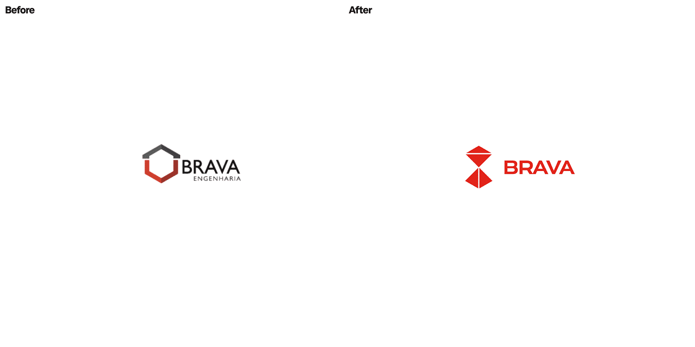
Brava is a commercial construction company known for meeting deadlines and for modern solutions, but with a visual identity that didn't match that reputation. BRBAUEN redesigned the identity to convey technology, modularity and security without feeling rigid or dated, moving the brand closer to the world of business rather than the heavy clichés of engineering.
About
Brava has created a unique reputation in the development of commercial construction, standing out for its guarantee of deadlines and its modernity, both by the team and by the construction solutions. Since it was founded in 2010, the brand's 'business' language has attracted attention, sounding more contemporary and sophisticated in its territory.
- Client
- Brava
- Year
- 2020
- Sector
- Professional Services
- Services
- Identidade de MarcaAplicaçõesWeb Design
Abordagem
Approach
However, Brava used a non-authentic visual language that did not align with this already established reputation and that was why it was necessary to align this perception, as its identity did not bring such clarity to the brand communication.
Based on a segment analysis where we understand the market positioning of engineering brands, we developed an identity that produced distinction and contrast, so that Brava stands out in this scenario saturated with attributes such as rigidity, security and tradition that end up being interpreted as "bureaucratic, time-consuming and old". This was the way to be avoided.
Resultados
Results
Balancing the perceived attributes of the company with the interpretation needs of this area, we take the concepts of knowledge, development and time to the visual identity. Our role was to balance the brand image with its reputation already created, bringing visual elements that convey technology, modularity and security without looking dated or rigid, to its identity.
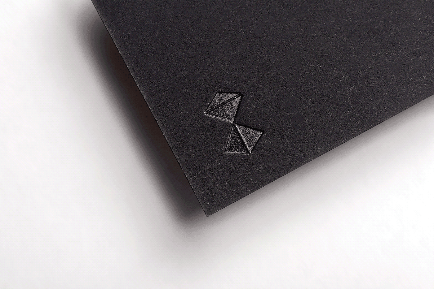
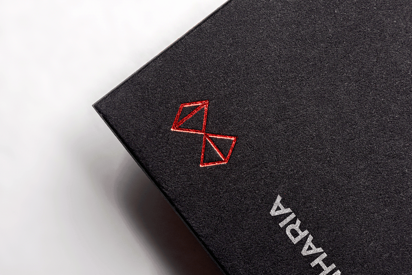
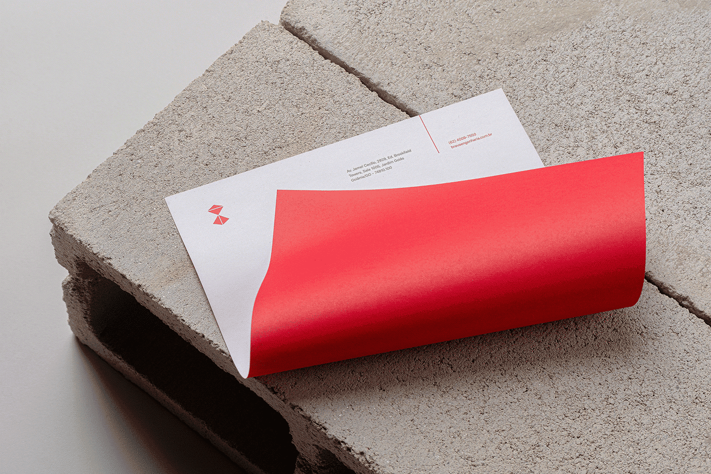
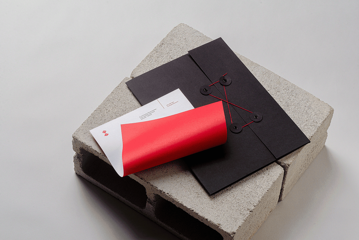
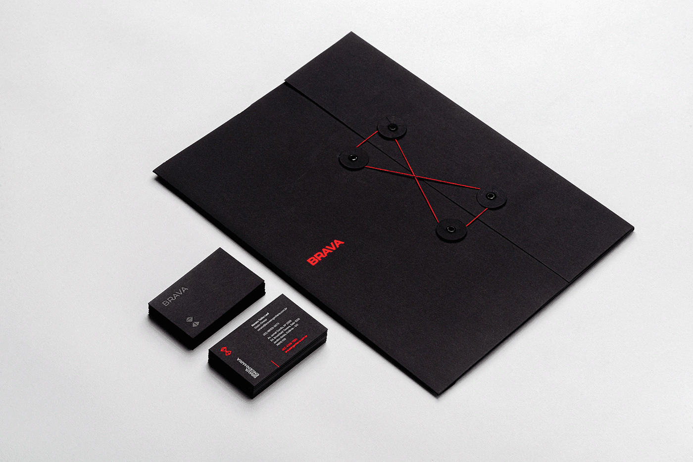
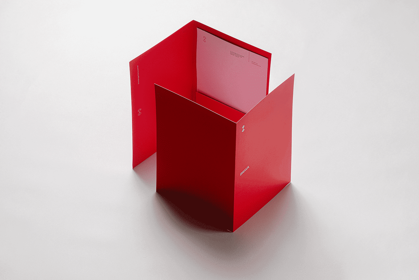
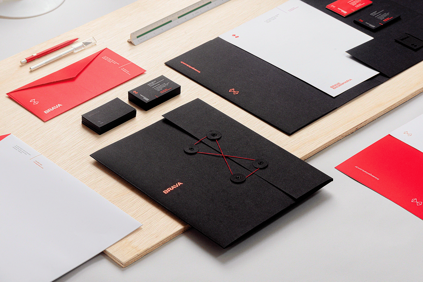
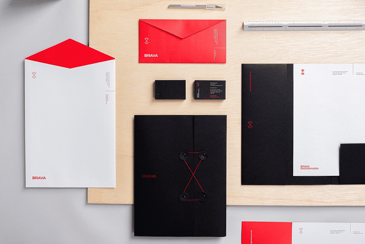
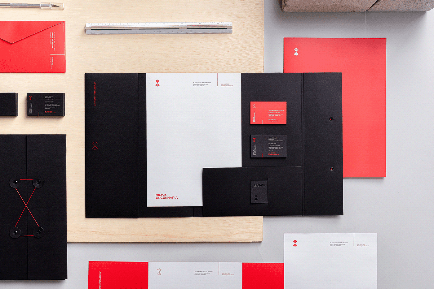
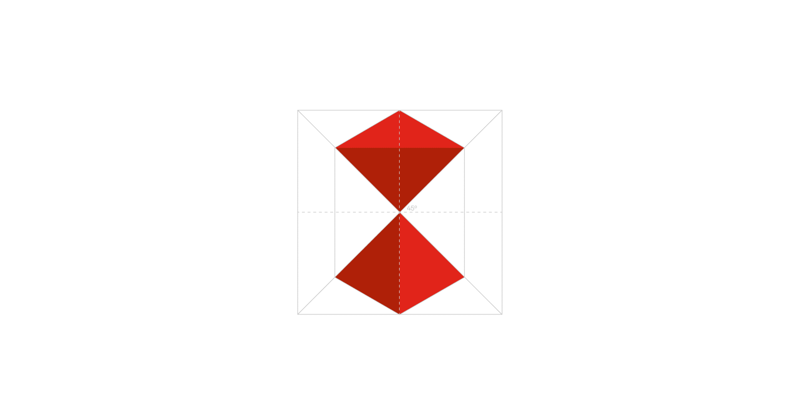
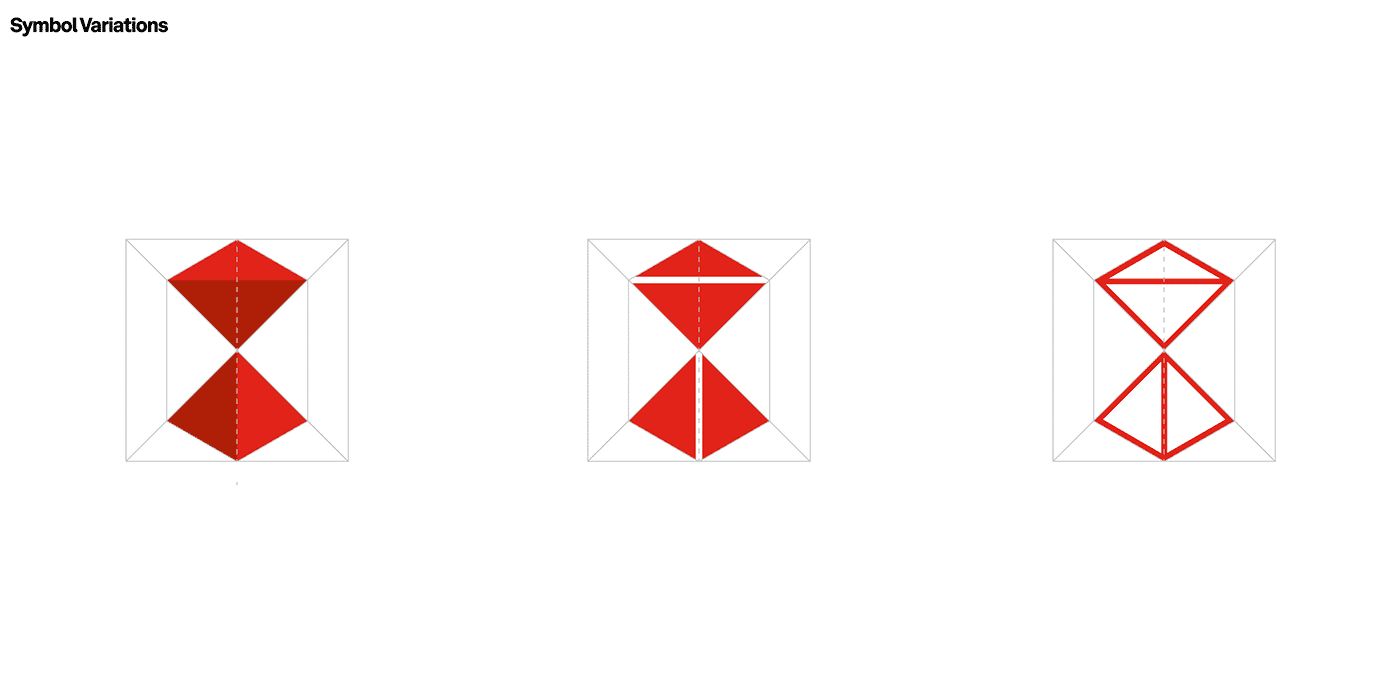
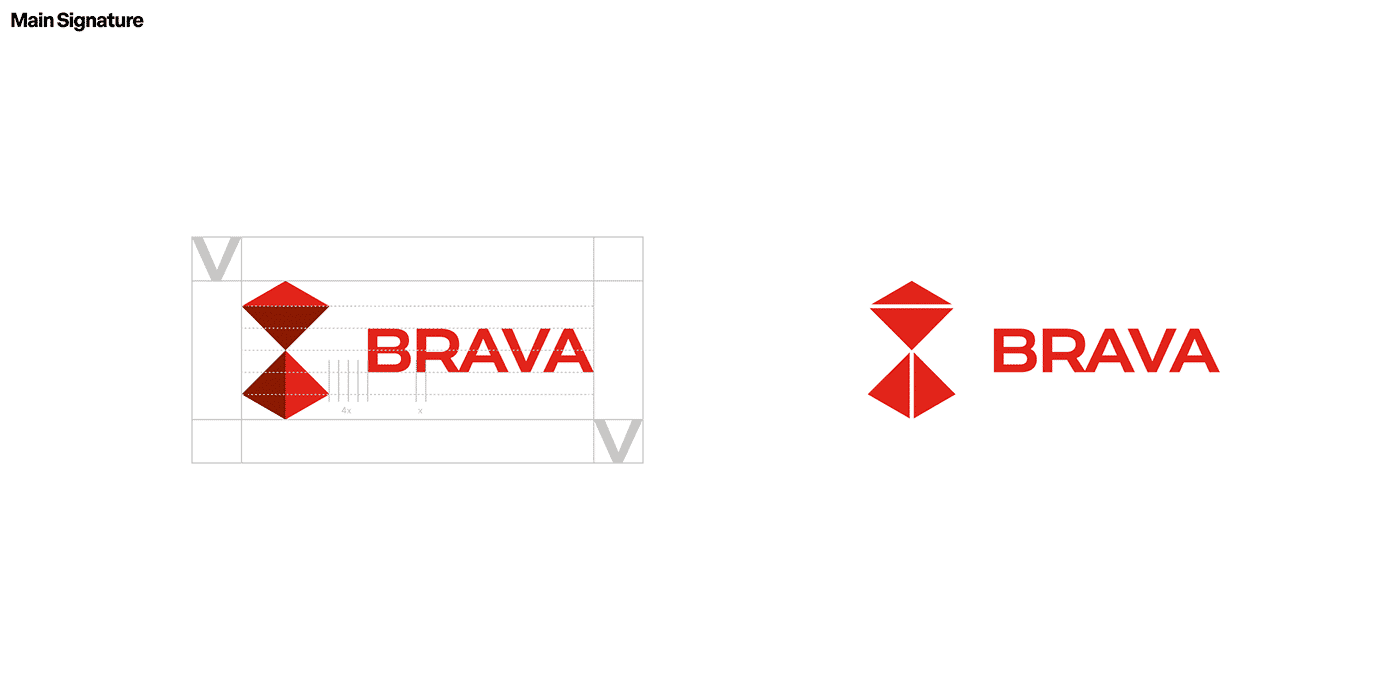
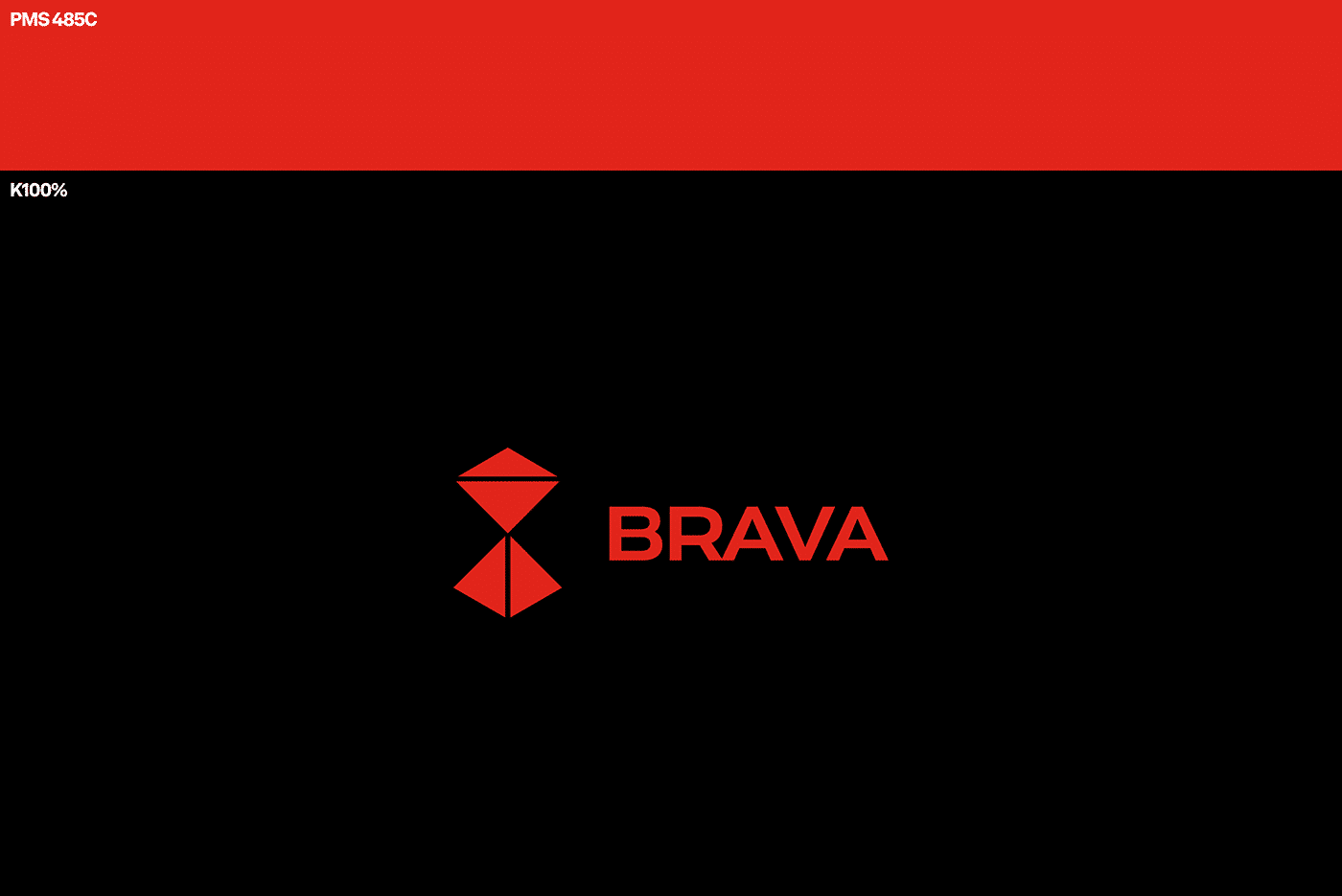
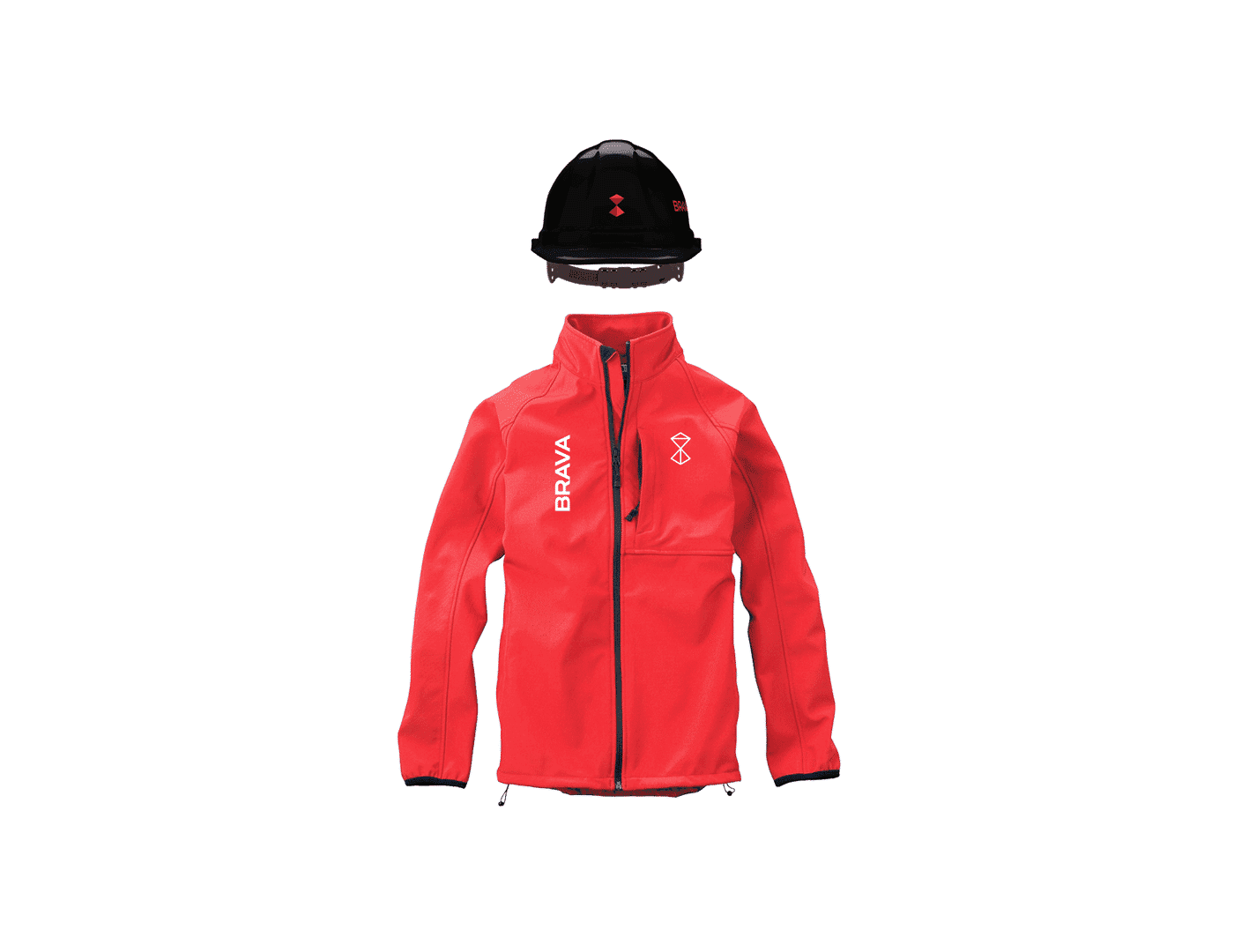
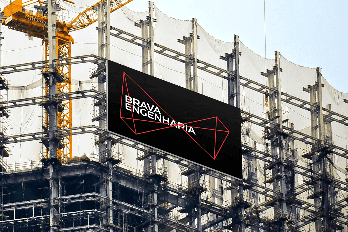
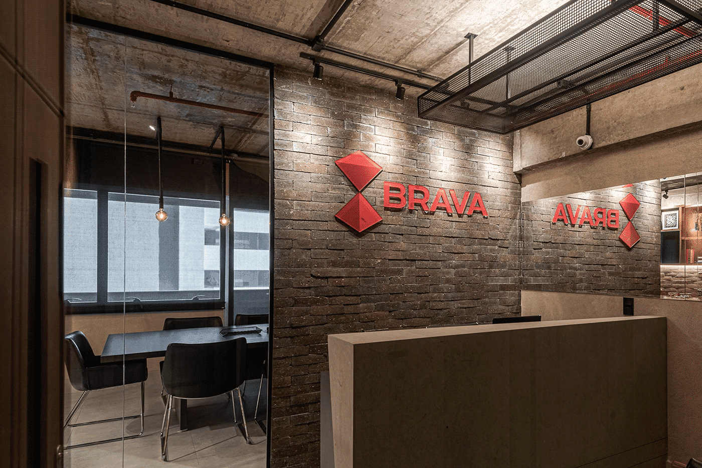
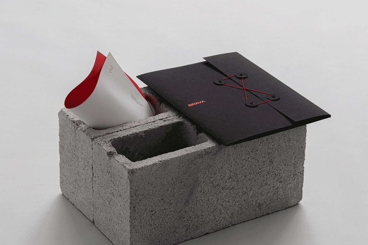
The typographic choice for the logotype features a strong weight and angular structure that guarantees the corporate impression, contextualizing their work vision. With this robustness present in the logo, we can design a more contemporary and distinctive element for the symbol. From structures and materials that generate stability and balance in constructions, we arrive at the abstraction of a harmonic and at the same time modular symbol, as can be seen the use of this as an element of composition in Identity; The symbol, displayed in a more formal and corporate way, also allowed us to work as a form of composition within the Identity, from distortions and geometric perspectives of the symbol. Red was already the institutional colour of the brand and in this we evolved to a more original and less used shade of red in its work environment. We added black into the composition to help the development of a more sophisticated and corporate feel.
Simbolo
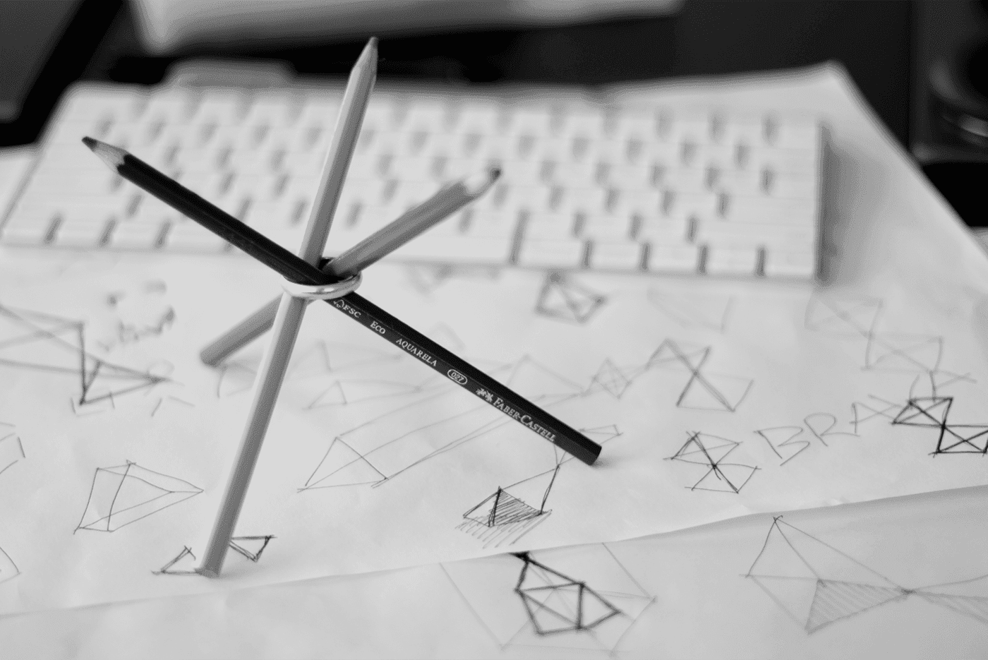
Symbol — Concept / Stable & Efficient Structures
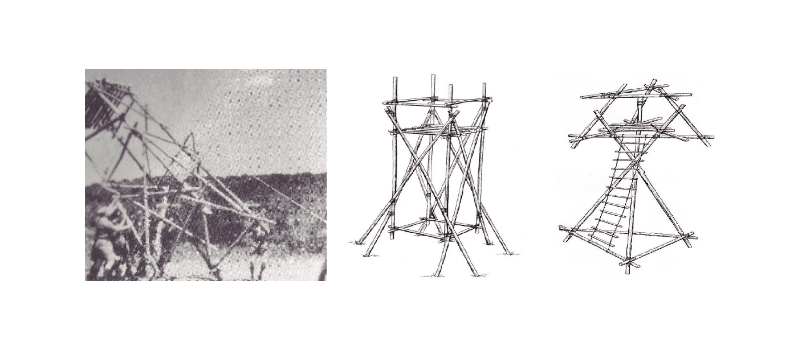
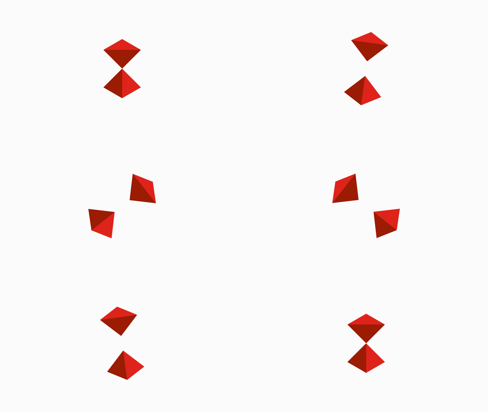
Brava's direct and time-efficient construction approach took us down the road of studying minimal although efficient physical structures from engineering, architecture and even rudimentary ways of building towers, houses or anything that needs to hold itself together with as little of a structure as possible. Triangular based structures are the ones we see all around us to this day. Triangles allow for rigid although dynamic structural development, hence the variability of stable but different Platonic solids.
Impact
Recognition
 Abstract Logo, Counter-Print · 2024
 Latin American Design Awards 2021
- Behance, 2020
Team
Select work
Cirgráfica
A printing company without distinction in its field, repositioned and given a clear identity
More Info →